4 DBSCAN exercises with PBMC3k
4.1 The dataset
These exercises use PBMC3k, a collection of 2,638 peripheral blood mononuclear cells from a healthy donor. The dataset was produced with the 10x Genomics platform and later processed as part of a widely used Scanpy teaching workflow.
The downloadable file contains the following information.
- Ten principal component scores named
pca1throughpca10 - Two UMAP coordinates named
umap1andumap2 - A reference cell-type annotation for every cell
- Three quality-control measurements. They are the number of detected genes, the total UMI count, and the fraction of counts from mitochondrial genes. Despite its historical name,
percent_mitois stored as a fraction, so0.02means 2 percent
DBSCAN will use the ten principal component scores. UMAP will only be used to draw the results.
The cell_type labels are useful reference annotations, not independently measured ground truth. They were derived from Louvain communities in the processed PBMC3k dataset, then given cell-type names after marker-gene inspection. DBSCAN does not receive these labels. We compare with them only after fitting the model.
Calculating a meaningful PCA from the original expression counts would require a complete single-cell preprocessing workflow. That includes quality control, normalization, selection of variable genes, scaling, and decisions about technical effects. Repeating those steps in both R and Python would shift the focus away from DBSCAN and could give the two languages different inputs.
The supplied scores come from the PCA stored with the processed PBMC3k dataset. We use the first ten components as a fixed, compact representation. Ten is not a universal choice for single-cell data, and changing that number would change the distances. Here it is fixed before the reference annotations are examined.
4.2 Loading the data
Place the CSV inside a folder named data beside your script or notebook.
library(dbscan)

pbmc <- read.csv("data/pbmc3k.csv")
dim(pbmc)
table(pbmc$cell_type)
[1] 2638 17
B cells CD14+ Monocytes CD4 T cells CD8 T cells
342 480 1144 316
Dendritic cells FCGR3A+ Monocytes Megakaryocytes NK cells
37 150 15 154import pandas as pd
from sklearn.cluster import DBSCAN
pbmc = pd.read_csv("data/pbmc3k.csv")
print(pbmc.shape)
print(pbmc["cell_type"].value_counts())(2638, 17)
cell_type
CD4 T cells 1144
CD14+ Monocytes 480
B cells 342
CD8 T cells 316
NK cells 154
FCGR3A+ Monocytes 150
Dendritic cells 37
Megakaryocytes 15
Name: count, dtype: int644.3 Exercise 1. Explore the UMAP display
Task. Plot the UMAP coordinates and colour each cell by its reference annotation. Which annotations occupy distinct parts of the display? Which ones overlap or meet along gradual transitions?
Remember what this plot can and cannot tell you. It is a two-dimensional summary of the data. It provides context for the later results, but DBSCAN will not use these coordinates.
A scatter plot of umap1 against umap2 is enough. Use a different colour for each value of cell_type. Look closely at the T-cell and NK-cell region, and then at the two monocyte annotations.
cell_type <- factor(pbmc$cell_type)
plot(pbmc$umap1, pbmc$umap2,
     col = cell_type, pch = 19, cex = 0.5,
     xlab = "UMAP1", ylab = "UMAP2")
legend("topright", legend = levels(cell_type),
       col = seq_along(levels(cell_type)), pch = 19, cex = 0.6)
import matplotlib.pyplot as plt
fig, ax = plt.subplots(figsize=(7, 6))
for cell_type, cells in pbmc.groupby("cell_type"):
ax.scatter(cells["umap1"], cells["umap2"],
s=8, label=cell_type, alpha=0.8)
ax.set_xlabel("UMAP1")
ax.set_ylabel("UMAP2")
ax.legend(markerscale=2, fontsize=8, bbox_to_anchor=(1.0, 1.0))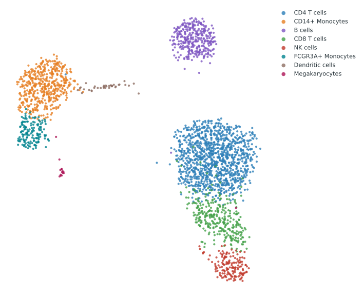
B cells and Megakaryocytes occupy compact islands in this display. The two monocyte annotations lie beside one another. CD4 T cells, CD8 T cells, and NK cells share a broader region and meet without large empty gaps.
4.4 Exercise 2. Choose an initial eps
Task. Build a matrix from pca1 through pca10. Use MinPts = 10 and make a sorted k-distance plot. Because the point itself counts toward MinPts, use the distance to the ninth nearest other cell. What range of eps values looks reasonable for an initial fit?
Do not use the reference annotations to choose the radius. The aim is to inspect the geometry available to DBSCAN before looking at agreement with another partition.
MinPts = 10 is also a starting choice. It asks for more local support than the two-dimensional examples earlier in the course, but it is not determined automatically by the number of components. Exercise 6 will vary it.
The PCA scores should not be standardized again. Their different variances are part of the PCA representation. Giving every component unit variance would give the later, weaker components as much influence as the first component and would define a different distance.
The curve in this dataset bends gradually. Look for a plausible interval rather than one exact answer.
pc_cols <- paste0("pca", 1:10)
X <- as.matrix(pbmc[, pc_cols])

kdist <- dbscan::kNNdist(X, k = 9)
kdist_sorted <- sort(kdist)
round(quantile(kdist, c(0.70, 0.80, 0.90)), 4)

plot(kdist_sorted, type = "l",
     xlab = "Cells, sorted by distance",
     ylab = "Distance to the 9th nearest other cell")
abline(h = 3.8, lty = 2)
70% 80% 90%
3.7750 4.2341 4.9700import numpy as np
from sklearn.neighbors import NearestNeighbors
pc_cols = [f"pca{i}" for i in range(1, 11)]
X = pbmc[pc_cols].to_numpy()
nn = NearestNeighbors(n_neighbors=10).fit(X)
dist, _ = nn.kneighbors(X)
kdist_sorted = np.sort(dist[:, 9])
print(np.round(np.quantile(kdist_sorted, [0.70, 0.80, 0.90]), 4))
fig, ax = plt.subplots(figsize=(7, 5))
ax.plot(np.arange(1, len(kdist_sorted) + 1), kdist_sorted)
ax.axhline(3.8, linestyle="--")
ax.set_xlabel("Cells, sorted by distance")
ax.set_ylabel("Distance to the 9th nearest other cell")[3.775 4.2341 4.97 ]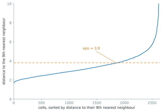
There is no sharp corner in Figure 4.2. Around 70 percent of the cells have their ninth other neighbour within a distance of 3.775. That distance rises to 4.234 at 80 percent and 4.970 at 90 percent. The curve supports a range of starting values rather than one automatic answer.
We will begin with eps = 3.8, close to the 70th percentile. This deliberately conservative choice leaves much of the sparse tail outside core neighbourhoods. It is not an estimate of a uniquely correct radius. Exercise 6 tests nearby values.
4.5 Exercise 3. Fit DBSCAN to the PCA scores
Task. Fit DBSCAN to X with eps = 3.8 and MinPts = 10. Report the number of clusters and noise cells. Then classify every cell as core, border, or noise. Display the cluster assignments on the UMAP coordinates.
The fit uses X, which contains ten PCA columns. The scatter plot uses umap1 and umap2. Keep separate objects for those two jobs so that the plotting coordinates cannot accidentally become the clustering input.
res <- dbscan::dbscan(X, eps = 3.8, minPts = 10)
n_clusters <- length(setdiff(unique(res$cluster), 0))

core <- dbscan::is.corepoint(X, eps = 3.8, minPts = 10)
kind <- ifelse(res$cluster == 0, "noise",
               ifelse(core, "core", "border"))

cat("clusters:", n_clusters,
    " noise:", sum(res$cluster == 0), "\n")
table(kind)
clusters: 4 noise: 391
kind
border core noise
375 1872 391db = DBSCAN(eps=3.8, min_samples=10).fit(X)
n_clusters = len(set(db.labels_)) - (1 if -1 in db.labels_ else 0)
core = np.zeros(len(X), dtype=bool)
core[db.core_sample_indices_] = True
noise = db.labels_ == -1
border = (~core) & (~noise)
kind = np.where(noise, "noise", np.where(core, "core", "border"))
print("clusters:", n_clusters, " noise:", noise.sum())
print(pd.Series(kind).value_counts().reindex(["core", "border", "noise"]))clusters: 4 noise: 391
core 1872
border 375
noise 391
Name: count, dtype: int64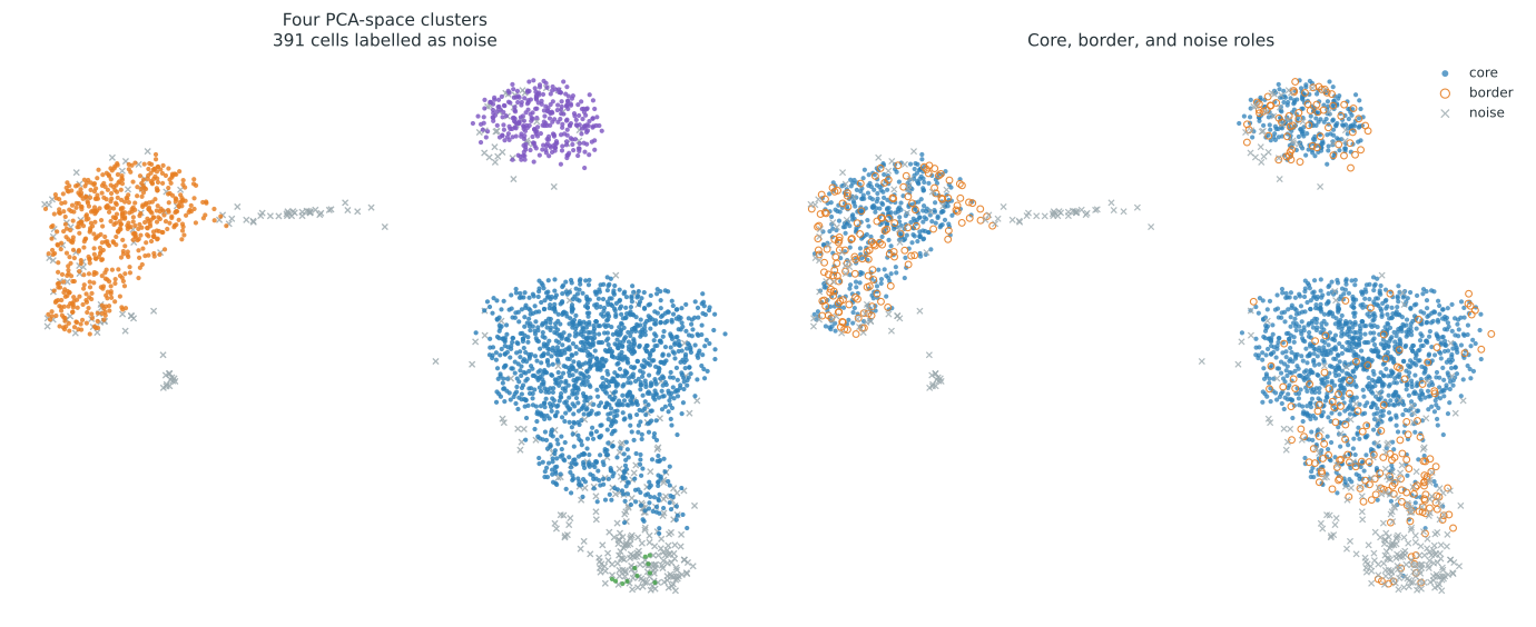
The fit finds four clusters and assigns 2,247 of the 2,638 cells to one of them. The remaining 391 cells, about 15 percent of the dataset, are noise under these settings. Most assigned cells are core points. Another 375 are border points, which means they are within eps of a core point but do not meet MinPts themselves.
The UMAP coordinates in Figure 4.3 are only used to display these PCA-space labels.
4.6 Exercise 4. Compare with the reference labels
Task. Cross-tabulate the DBSCAN labels against cell_type and calculate the adjusted Rand index. Also report the percentage of cells assigned to a cluster and the ARI after excluding noise. Which broad populations did DBSCAN recover? Which annotations were combined or left mostly as noise?
The full-data ARI treats every DBSCAN noise point as having the same predicted label. The assigned-only ARI removes those cells before comparison. Report both because they answer different questions. The assigned-only value describes the partition among retained cells, but it can look better simply because difficult cells were excluded.
ari <- function(a, b) {
  tab <- table(a, b)
  n <- sum(tab)
  sum_comb <- function(v) sum(choose(v, 2))
  index <- sum_comb(tab)
  expected <- sum_comb(rowSums(tab)) * sum_comb(colSums(tab)) / choose(n, 2)
  maximum <- (sum_comb(rowSums(tab)) + sum_comb(colSums(tab))) / 2
  (index - expected) / (maximum - expected)
}

comparison <- table(DBSCAN = res$cluster,
                    reference = pbmc$cell_type)
comparison

assigned <- res$cluster != 0
cat("assigned:", round(100 * mean(assigned), 2), "%\n")
cat("ARI, all cells:", round(ari(res$cluster, pbmc$cell_type), 4), "\n")
cat("ARI, assigned cells:",
    round(ari(res$cluster[assigned], pbmc$cell_type[assigned]), 4), "\n")
assigned: 85.18 %
ARI, all cells: 0.6812
ARI, assigned cells: 0.729from sklearn.metrics import adjusted_rand_score
comparison = pd.crosstab(db.labels_, pbmc["cell_type"])
print(comparison)
assigned = db.labels_ != -1
print("assigned:", round(100 * assigned.mean(), 2), "%")
print("ARI, all cells:",
round(adjusted_rand_score(pbmc["cell_type"], db.labels_), 4))
print("ARI, assigned cells:",
round(adjusted_rand_score(pbmc.loc[assigned, "cell_type"],
db.labels_[assigned]), 4))assigned: 85.18 %
ARI, all cells: 0.6812
ARI, assigned cells: 0.729| DBSCAN result | Nonzero reference counts |
|---|---|
| Noise | 36 B, 36 CD14+ Monocytes, 30 CD4 T, 72 CD8 T, 34 Dendritic, 25 FCGR3A+ Monocytes, 15 Megakaryocytes, 143 NK |
| T-cell cluster | 1,114 CD4 T, 244 CD8 T |
| Monocyte cluster | 444 CD14+ Monocytes, 125 FCGR3A+ Monocytes, 3 Dendritic |
| B-cell cluster | 306 B |
| Small NK cluster | 11 NK |
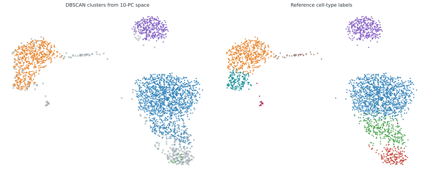
Three of the four DBSCAN clusters correspond to broad, recognizable groups. One contains 1,114 CD4 T cells and 244 CD8 T cells. A second consists mainly of 444 CD14+ Monocytes and 125 FCGR3A+ Monocytes, along with 3 Dendritic cells. A third contains 306 B cells. The fourth cluster contains only 11 NK cells. The remaining 143 NK cells are noise.
This explains the difference between the two ARI values. Among assigned cells, the broad groups produce an ARI of 0.729 against the reference partition. The method combines related annotations within the T-cell and monocyte groups, and it leaves many cells from smaller or less dense annotations unassigned. The value is a descriptive comparison, not evidence that either partition is the biological truth.
The baseline settings were chosen before this comparison and were not revised afterward.
4.7 Exercise 5. Who was labelled as noise?
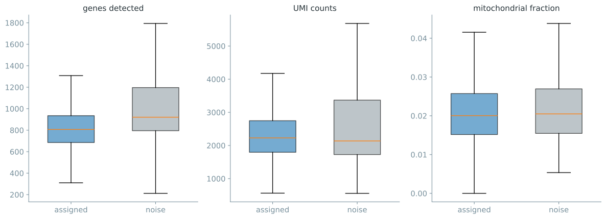
Task. Calculate the number and percentage of noise cells within each reference annotation. Then compare n_genes, n_counts, and percent_mito between assigned and noise cells. Use boxplots and a Mann-Whitney test. Does DBSCAN noise simply identify low-quality cells?
Keep the interpretation narrow. A DBSCAN noise label means that a cell was not density-connected to a core region under these settings. Quality-control measurements can help describe those cells, but they cannot tell us why every cell received its label.
is_noise <- res$cluster == 0
noise_tab <- table(pbmc$cell_type, is_noise)
noise_by_type <- data.frame(
  cell_type = rownames(noise_tab),
  cells = rowSums(noise_tab),
  noise = noise_tab[, "TRUE"],
  noise_percent = round(100 * noise_tab[, "TRUE"] / rowSums(noise_tab), 1)
)
noise_by_type

aggregate(cbind(n_genes, n_counts, percent_mito) ~ is_noise,
          data = data.frame(pbmc, is_noise = is_noise), median)

par(mfrow = c(1, 3))
for (column in c("n_genes", "n_counts", "percent_mito")) {
  boxplot(pbmc[[column]] ~ is_noise,
          names = c("assigned", "noise"), main = column)
}

for (column in c("n_genes", "n_counts", "percent_mito")) {
  test <- wilcox.test(pbmc[[column]][is_noise],
                      pbmc[[column]][!is_noise], exact = FALSE)
  cat(sprintf("%s p = %.4g\n", column, test$p.value))
}
is_noise n_genes n_counts percent_mito
1 FALSE 807 2228 0.02003643
2 TRUE 921 2136 0.02048705
n_genes p = 5.274e-26
n_counts p = 0.246
percent_mito p = 0.3245from scipy import stats
pbmc["is_noise"] = noise
noise_by_type = (
pbmc.groupby("cell_type")["is_noise"]
.agg(cells="size", noise="sum", noise_percent="mean")
)
noise_by_type["noise_percent"] *= 100
print(noise_by_type.round(1))
print(pbmc.groupby("is_noise")
[["n_genes", "n_counts", "percent_mito"]].median())
fig, axes = plt.subplots(1, 3, figsize=(12, 4))
for ax, column in zip(axes, ["n_genes", "n_counts", "percent_mito"]):
assigned_values = pbmc.loc[~pbmc.is_noise, column]
noise_values = pbmc.loc[pbmc.is_noise, column]
ax.boxplot([assigned_values, noise_values],
tick_labels=["assigned", "noise"], showfliers=False)
ax.set_title(column)
for column in ["n_genes", "n_counts", "percent_mito"]:
a = pbmc.loc[pbmc.is_noise, column]
b = pbmc.loc[~pbmc.is_noise, column]
_, p = stats.mannwhitneyu(a, b, alternative="two-sided")
print(f"{column} p = {p:.4g}") n_genes n_counts percent_mito
is_noise
False 807 2228 0.020036
True 921 2136 0.020487
n_genes p = 5.274e-26
n_counts p = 0.246
percent_mito p = 0.3245| Reference annotation | Cells | Noise | Noise percent |
|---|---|---|---|
| B cells | 342 | 36 | 10.5 |
| CD14+ Monocytes | 480 | 36 | 7.5 |
| CD4 T cells | 1,144 | 30 | 2.6 |
| CD8 T cells | 316 | 72 | 22.8 |
| Dendritic cells | 37 | 34 | 91.9 |
| FCGR3A+ Monocytes | 150 | 25 | 16.7 |
| Megakaryocytes | 15 | 15 | 100.0 |
| NK cells | 154 | 143 | 92.9 |
Noise is concentrated in a few reference populations. Every Megakaryocyte and almost every NK or Dendritic cell is noise, while only 2.6 percent of CD4 T cells are. Under this fit, rare or diffuse groups are often unassigned.
The quality-control results do not support the simple claim that noise cells are poor-quality cells. Noise cells have more detected genes at the median. Their total UMI counts and mitochondrial fractions are not detectably different in these comparisons. The dataset had already passed the original workflow’s quality filters, so this comparison only describes variation among retained cells. It cannot show how DBSCAN would behave on unfiltered droplets.
These measurements also do not justify calling the noise cells doublets. That would require dedicated evidence such as a doublet score or marker pattern. In this fit, DBSCAN noise is not simply a low-quality-cell category.
4.8 Exercise 6. Test nearby parameter settings
Task. Sweep eps over {3.4, 3.6, 3.8, 4.0, 4.2} and MinPts over {5, 10, 15, 20, 25}. Record the number of clusters, the number of noise cells, and the ARI against the reference annotations. Look for regions where these summaries are similar. Do not select a setting only because it has the largest ARI.
Check all three summaries together. Two settings can produce the same number of clusters while assigning different cells or leaving very different numbers of cells as noise. This grid measures parameter sensitivity, not complete membership stability.
grid <- expand.grid(
  eps = c(3.4, 3.6, 3.8, 4.0, 4.2),
  minPts = c(5, 10, 15, 20, 25)
)
grid$clusters <- NA_integer_
grid$noise <- NA_integer_
grid$ari <- NA_real_

for (i in seq_len(nrow(grid))) {
  fit <- dbscan::dbscan(X, eps = grid$eps[i], minPts = grid$minPts[i])
  grid$clusters[i] <- length(setdiff(unique(fit$cluster), 0))
  grid$noise[i] <- sum(fit$cluster == 0)
  grid$ari[i] <- ari(fit$cluster, pbmc$cell_type)
}

cat("Clusters\n")
xtabs(clusters ~ minPts + eps, grid)
cat("Noise cells\n")
xtabs(noise ~ minPts + eps, grid)
cat("ARI\n")
round(xtabs(ari ~ minPts + eps, grid), 3)
Clusters
eps
minPts 3.4 3.6 3.8 4.0 4.2
5 7 7 5 5 3
10 4 3 4 3 3
15 5 4 3 3 2
20 4 4 4 3 2
25 3 4 3 4 3
Noise cells
eps
minPts 3.4 3.6 3.8 4.0 4.2
5 486 379 300 230 182
10 621 481 391 313 259
15 745 577 454 373 318
20 832 684 508 406 342
25 924 739 560 455 369
ARI
eps
minPts 3.4 3.6 3.8 4.0 4.2
5 0.463 0.467 0.437 0.413 0.399
10 0.641 0.666 0.681 0.470 0.435
15 0.621 0.662 0.680 0.687 0.467
20 0.601 0.656 0.691 0.691 0.473
25 0.574 0.639 0.677 0.707 0.694rows = []
for eps in [3.4, 3.6, 3.8, 4.0, 4.2]:
for min_samples in [5, 10, 15, 20, 25]:
fit = DBSCAN(eps=eps, min_samples=min_samples).fit(X)
labels = fit.labels_
rows.append({
"eps": eps,
"MinPts": min_samples,
"clusters": len(set(labels)) - (1 if -1 in labels else 0),
"noise": int((labels == -1).sum()),
"ARI": adjusted_rand_score(pbmc["cell_type"], labels),
})
grid = pd.DataFrame(rows)
for value in ["clusters", "noise", "ARI"]:
print(value)
print(grid.pivot(index="MinPts", columns="eps", values=value).round(3))clusters
eps 3.4 3.6 3.8 4.0 4.2
MinPts
5 7 7 5 5 3
10 4 3 4 3 3
15 5 4 3 3 2
20 4 4 4 3 2
25 3 4 3 4 3
noise
eps 3.4 3.6 3.8 4.0 4.2
MinPts
5 486 379 300 230 182
10 621 481 391 313 259
15 745 577 454 373 318
20 832 684 508 406 342
25 924 739 560 455 369
ARI
eps 3.4 3.6 3.8 4.0 4.2
MinPts
5 0.463 0.467 0.437 0.413 0.399
10 0.641 0.666 0.681 0.470 0.435
15 0.621 0.662 0.680 0.687 0.467
20 0.601 0.656 0.691 0.691 0.473
25 0.574 0.639 0.677 0.707 0.694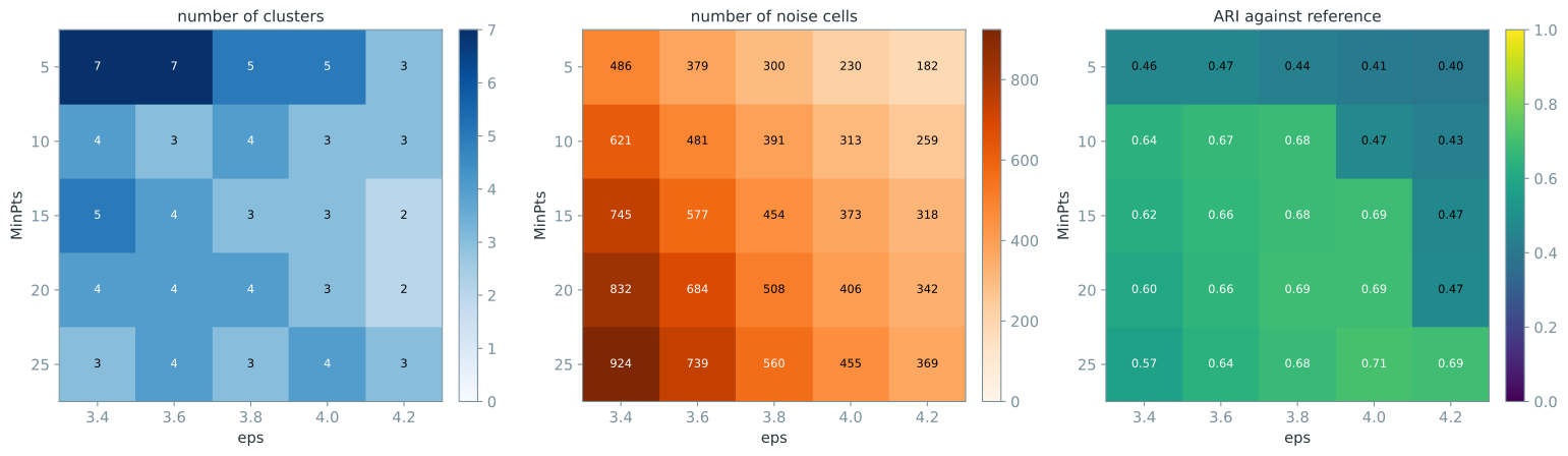
Noise follows a clear pattern. It decreases as eps increases and rises as MinPts increases. Cluster count is less regular and ranges from two to seven. Several settings with eps between 3.6 and 4.0 and MinPts of at least 10 give ARI values from about 0.64 to 0.71. The maximum ARI of 0.707 leaves 455 cells as noise, so it is not an obvious winner. The baseline lies within this broader range and leaves 391 cells as noise.
Because this grid reports ARI against Louvain-derived annotations, it is a descriptive comparison rather than an unsupervised selection rule or an unbiased performance estimate. Similar summary values also do not prove that the same individual cells stay together. Every result remains conditional on the fixed ten-component representation.