1 Spectral clustering
1.1 A dataset that gives ordinary clustering trouble :)
Suppose we have 300 observations, each measured on two continuous variables. Nothing exotic. You could imagine them as cells positioned by two markers, patients positioned by two clinical scores, or just two numbers per observation with no story attached yet.
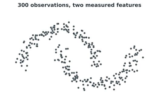
Have a look at Figure 1.1 before reading on. What would you say the natural groups are? Most people looking at this picture immediately see two curved bands, one nested inside the other. That answer feels obvious once you see it. The interesting question is why it is not obvious to an algorithm that only knows about distance.
1.2 Why k-means struggles here
K-means is the tool most people reach for first, so let’s actually run it and look at what happens.
K-means picks a number of centers, in this case two, and assigns every point to whichever center is closest. It then moves each center to the average position of the points assigned to it, and repeats. The result is a partition of the data into round-ish regions, because “closest to this one center” naturally carves space into blobs.
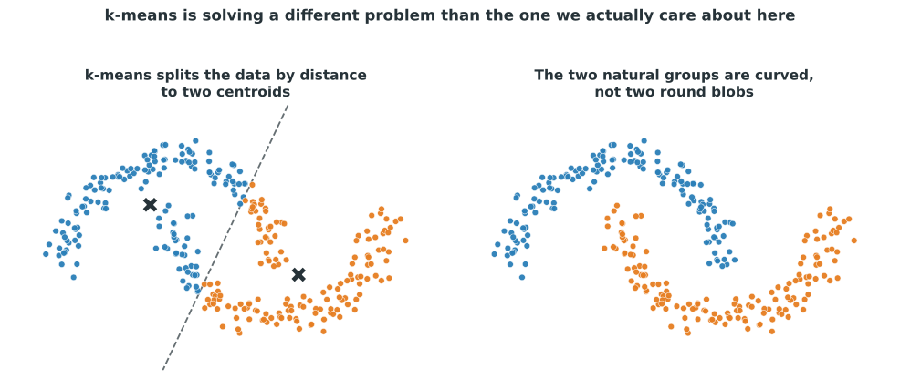
Look at the left panel of Figure 1.2. K-means has drawn a more or less straight line through the middle of the data, and each crescent gets chopped in half. Compare that to the right panel, which shows the two crescent shapes we actually wanted. K-means did not make a mistake. It correctly found two centroids and assigned every point to its closest one. It simply solved a different problem than the one we care about here: it is built to find round groups defined by a center, and these groups are not round.
1.3 Coordinates to relationships
Here is the idea we are going to build on for the rest of this chapter. Instead of asking where each point sits, let’s ask who is close to whom.
Take every observation and connect it to its nearest neighbors. Not to every other point, just the handful that are close to it. Suddenly we are no longer looking at 300 isolated dots. We are looking at a network in which each observation is a node, and a line between two nodes means those two observations are close to each other.
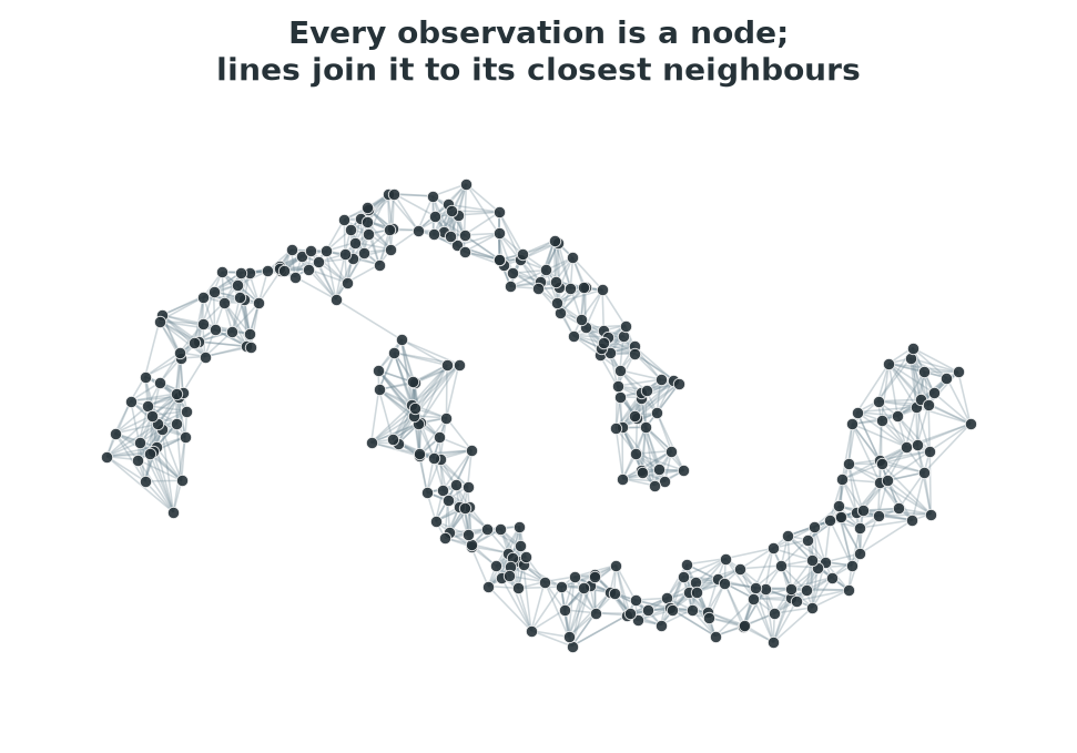
In Figure 1.3 we have only decided to draw a line between points that are close together. But already the two crescents are much easier to see, because the lines follow the curve of each shape. A network built purely out of local closeness has, almost by accident, traced out the global shape of the data.
1.4 A chain of short steps can cover a long distance
Here is something that local connections make possible and raw distance does not: two observations can belong together even if they are nowhere near each other.
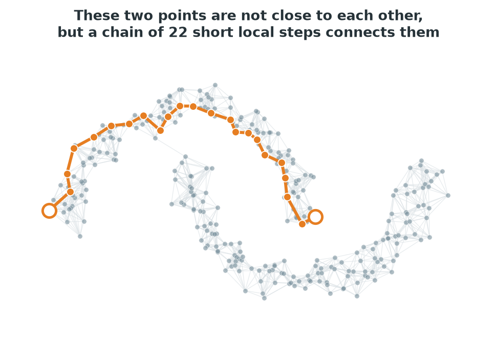
Figure 1.4 highlights two points sitting at opposite ends of the same crescent. Measured directly, they are quite far apart, further apart in fact than some pairs of points that belong to different crescents. But you do not need a direct connection to argue that two points belong together. You only need a chain: this point is close to that one, which is close to the next one, and so on, all the way along the curve. Follow that chain in the figure and you cover the whole arc using nothing but short, local steps.
1.5 Two neighborhoods
Now look at the same network again, this time with the two crescents colored separately.
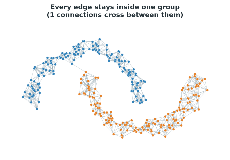
Figure 1.5 shows the point we have been building toward. Inside each crescent, the network is dense: plenty of points are close enough to their neighbors to be connected. Between the two crescents, there is almost nothing. A handful of points from one crescent pass close to the other, but at this neighborhood size there simply are no edges crossing over.
So we now have a network with two regions. Each region is internally well connected, meaning you can reach any point in it from any other point through a chain of short steps. The two regions are only weakly linked to each other, if at all.
1.6 What makes something a cluster, on a network
Before going back to the crescents, let’s pin down what we just did in words, using a smaller example where every connection can be seen at once.
Suppose we only had six observations, A through F, and we knew how strongly each pair was related.
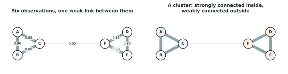
In the left panel of Figure 1.6, A, B, and C are all strongly linked to each other. D, E, and F are all strongly linked to each other. There is exactly one thin, weak connection between the two groups, joining C and F. We can easily say which observations belong together, because the network makes it visible: a cluster is a part of the network where the connections inside are strong, and the connections leading out are weak.
1.7 Giving every observation a new position
Here is the central idea of spectral clustering, and it is easier to say in words than you might expect.
What if we gave every observation a brand new position, based on who it is connected to in the network, rather than where it originally sat?
Think about what we would want from such a position. Two observations that are strongly connected, directly or through a short chain of neighbors, should end up close together in this new arrangement. Two observations that are only weakly connected, or not connected at all, should be free to end up far apart.
Notice that this is exactly the property that failed us back in Figure 1.2. The original coordinates put some points from the same crescent far apart, and some points from different crescents close together, at least locally. A position based on connectivity does not have that problem, because it is not built from the original coordinates at all. It is built entirely from the network.
1.8 The spectral representation
Let’s see what that idea produces when we actually apply it to the crescents.
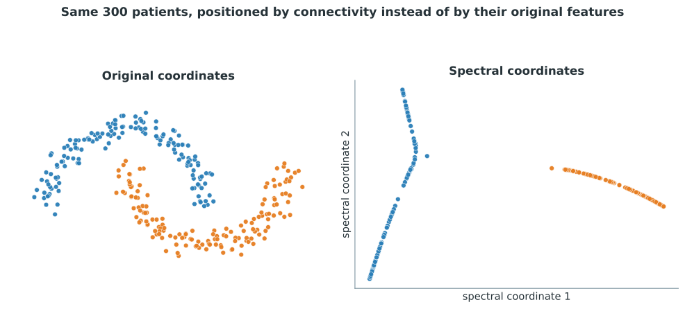
This is probably the single most important figure in the whole course, so look at it carefully. On the left of Figure 1.7 is the data exactly as we started, the two interleaving crescents. On the right is the same 300 observations, now given new coordinates based on connectivity in the network from the previous figures.
Something remarkable happened. The two crescents, which wrap around each other and cannot be separated by any straight line, have become two short, compact, clearly separated bands. Every point that used to belong to one crescent now sits in one tight group, and every point from the other crescent sits in a completely different part of the picture. Nothing about the underlying observations changed. What changed is the coordinate system, and the new coordinate system was built entirely from the network of local relationships.
1.9 Now k-means can do its job
Remember that k-means was never the problem. It is a perfectly good method for finding round groups defined by a center. The issue was that the crescents were not round groups in the original coordinates. Now that we have new coordinates where the groups genuinely are compact and separated, k-means should work.
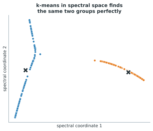
In Figure 1.8 K-means runs on the new coordinates, finds the two centroids and assigns every point correctly, matching the two crescents perfectly. Nothing about k-means changed between Figure 1.2 and this figure. What changed is where it was allowed to look. Spectral clustering did the hard part, turning a curved problem into a simple one, and left k-means to do the easy part it was always good at.
1.10 The whole pipeline
Let’s see the entire sequence side by side, start to finish, so the pieces do not stay separate in your head.
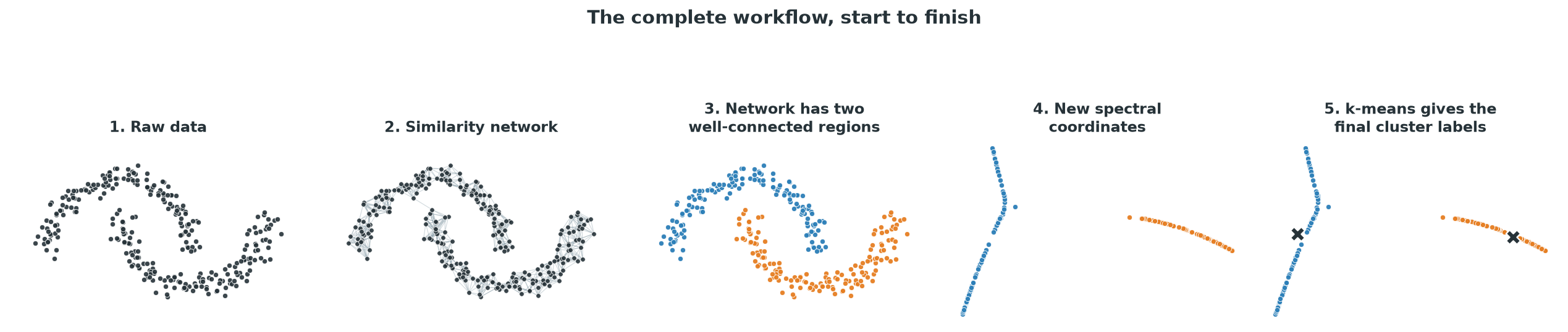
Read Figure 1.9 from left to right. We started with observations that only had coordinates. We turned those coordinates into a network of local relationships. We noticed the network has two regions that are well connected inside and weakly connected between. We used that structure to build a new coordinate for every observation. Finally, we ran an ordinary clustering method on the new coordinates to get cluster labels. That is spectral clustering!!
1.11 The network you build is the network you get ;)
Everything so far worked because we connected each point to a sensible number of its nearest neighbors. It is worth being honest that this choice matters enormously, and that spectral clustering can fail badly if the network is built carelessly.
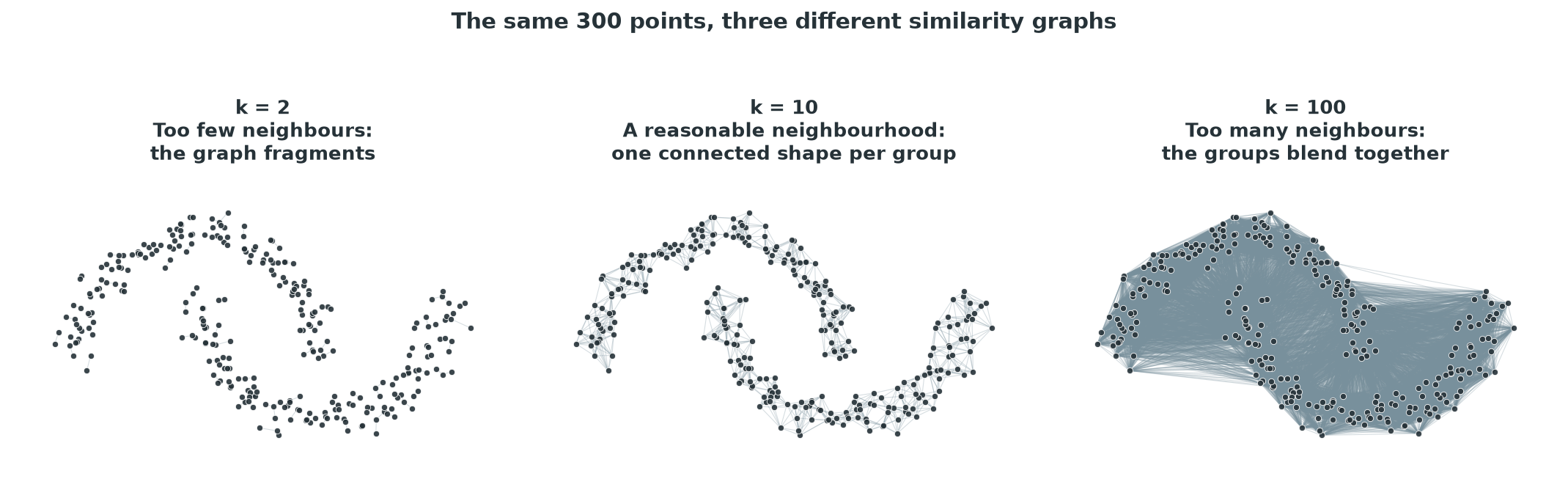
With too few neighbors, the left panel of Figure 1.10 shows that the network does not even hold each crescent together. It breaks into a scattering of small disconnected pieces, and there is no longer one coherent network per group, only fragments. In the middle panel, a reasonable neighborhood size gives us exactly the two clean, connected shapes we have been using throughout this chapter. In the right panel, the neighborhood is far too generous. So many long-range connections appear that the two crescents are no longer distinguishable inside the network. Everything is connected to almost everything else, and the structure we cared about disappears into a dense blur.
TThe method finds structure in the network you give it, not in some deeper truth about the data. If the network is wrong, badly fragmented or badly over-connected, the resulting coordinates will be wrong too, no matter how carefully the rest of the method is carried out. We will come back to this when we look at real code in the next chapter, because choosing how to build the similarity network is one of the few really important decisions you have to make.
A network is not the only way to decide who is “close enough” to connect. A common alternative is to connect any pair of points whose similarity, often computed with a smoothly decaying function of distance, is above some level, rather than fixing a set number of neighbors per point. Both approaches are trying to answer the same question: which relationships are strong enough to trust? The nearest-neighbor approach used throughout this chapter is simply the easiest one to reason about.
Yu are now ready for the next chapter, which shows how to actually run spectral clustering in R and in Python.