1 Understanding cluster evaluation
1.1 Three validation questions
Suppose we measure gene expression in several hundred tumour samples. We reduce the expression matrix to an informative PCA space and cluster the samples. The algorithm returns groups. The remaining problem is that we do not yet know whether three, four, or five groups give a useful representation of the data.
There are three separate questions.
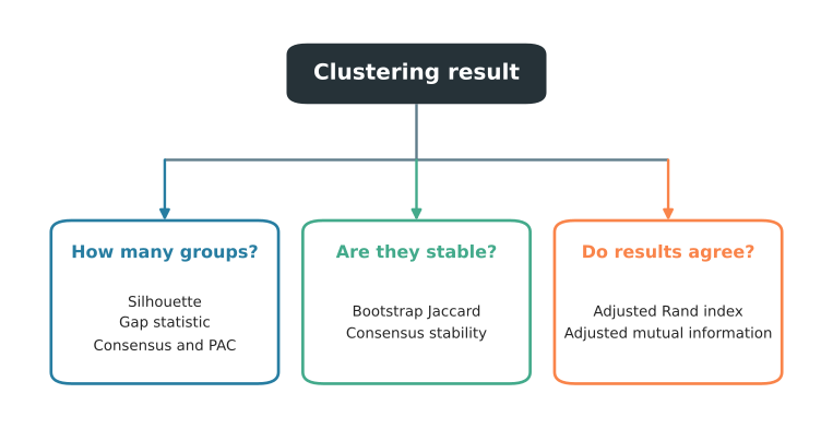
The first branch in Figure 1.1 concerns geometric separation and the clustering resolution. The second concerns sensitivity to perturbation. The third compares completed partitions. Each branch requires evidence suited to its question.
1.2 Internal validation with silhouettes
Start with one tumour sample inside one assigned cluster. A sensible assignment should place it close to other samples in that cluster. It should also keep it far from the nearest competing cluster. Silhouette analysis turns that comparison into one value for every sample.
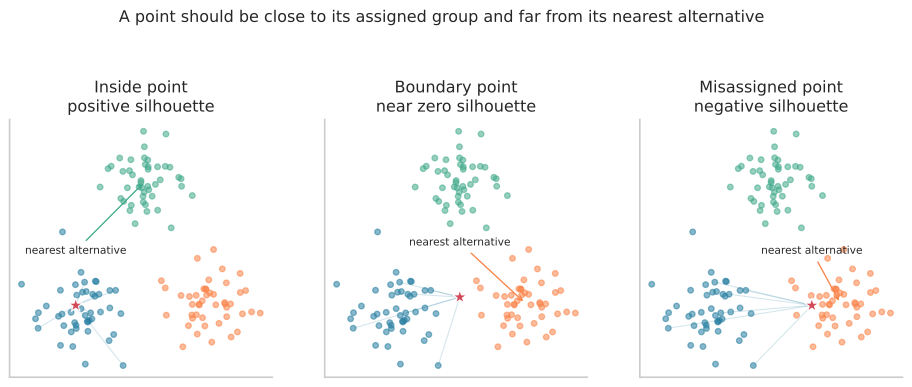
The left panel of Figure 1.2 shows a sample well inside its assigned group. Its silhouette is positive and relatively large. The middle sample lies near a boundary, so its own group and the nearest alternative look similarly plausible. Its silhouette is near zero. The sample on the right has been assigned to the blue group even though the orange group is closer. Its silhouette is negative.
This is already more useful than one score for the whole clustering. It identifies uncertain observations and shows which cluster contains them.
1.2.1 Reading a silhouette profile
A full silhouette plot places one horizontal bar at the silhouette value of every observation. Bars are sorted and grouped by cluster.
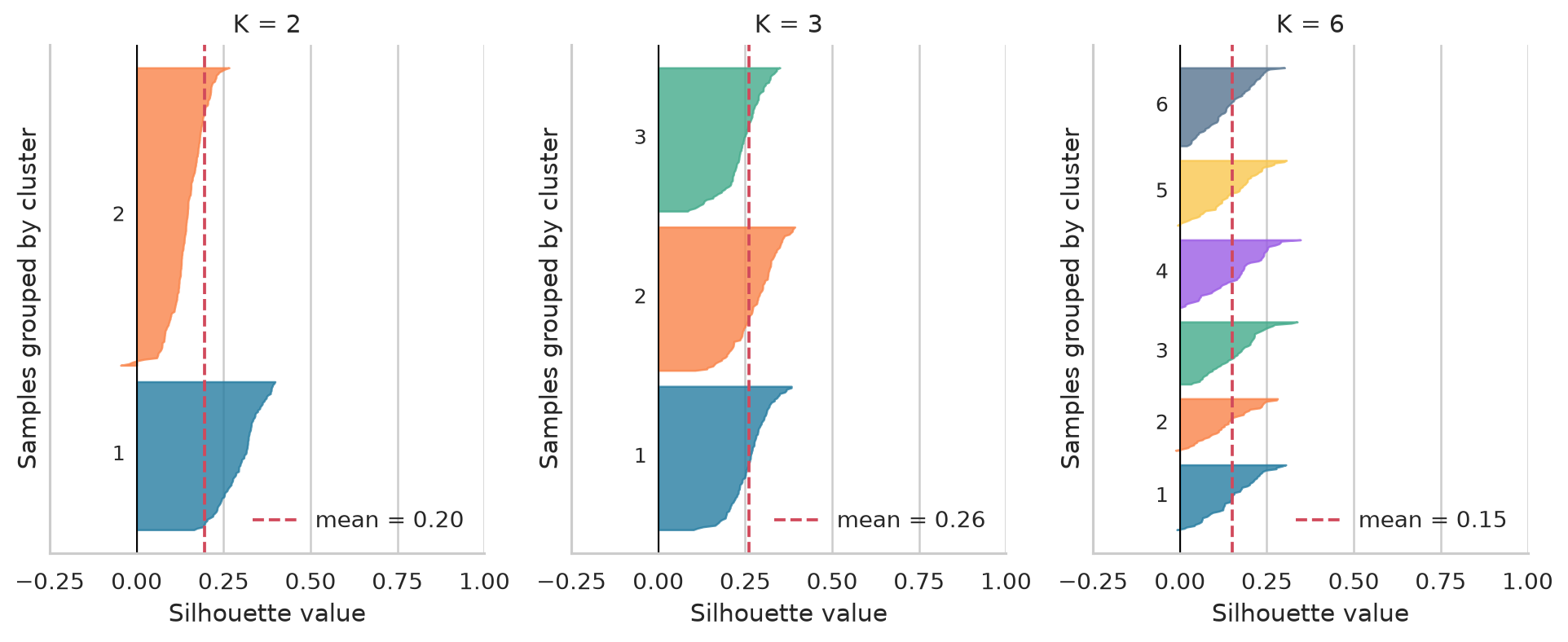
When reading Figure 1.3, inspect more than the dashed mean.
- Most bars should be positive.
- Strongly negative bars identify observations that are closer, on average, to another group.
- A cluster with consistently long bars is better separated than a cluster whose bars gather near zero.
- A very narrow band may be a real rare population, an unstable fragment, or an outlier group. Its biology and stability need separate checks.
- One weak cluster can be hidden by a reasonable global mean when the other clusters are large.
The mean silhouette can then summarize candidate values of \(K\), the requested number of clusters.
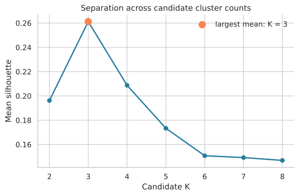
The largest value in Figure 1.4 identifies the partition that best satisfies this compactness and separation criterion. It is a candidate, not an automatic biological decision. A small, coherent population can matter even when its contribution barely changes a global average.
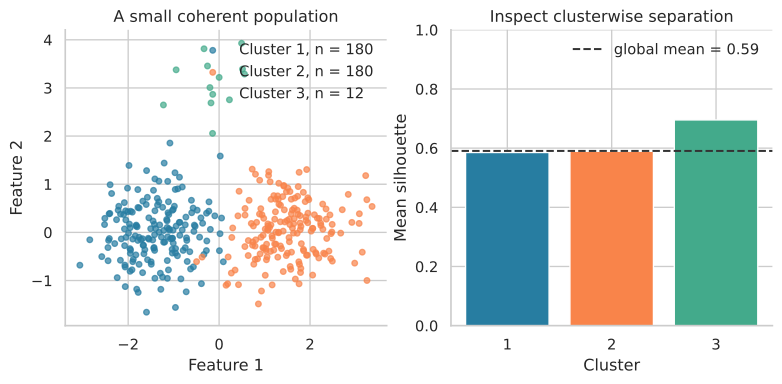
The 12 observations in Figure 1.5 contribute little to the global mean because the two large groups contain 360 observations. Their clusterwise silhouette nevertheless shows that the rare group is coherent and separated in this representation. A small cluster should not be accepted automatically, but neither should it be rejected because a global index is dominated by larger groups. Its stability, technical composition, and markers require separate inspection.
1.2.2 Representation and distance
Silhouette evaluates distances. It therefore inherits the representation and distance used to calculate them. Euclidean distance in ten selected PCs asks whether observations form compact, separated groups in that PCA space. Correlation distance across gene profiles asks a different question.
Calculating every pairwise distance across 20,000 raw genes is usually not the default for omics data. Noise genes can dominate and high dimensional distances can become difficult to distinguish. An informative representation used by the clustering procedure, such as selected PCA scores, is often more appropriate. This is not a rule that PCA is always correct. The representation defines what separation means.
1.2.3 Curves and continuous biology
Euclidean silhouette often favours compact groups. Consider a differentiation process in which expression changes smoothly along pseudotime. A clustering algorithm can cut the curve into segments, and a validation index can prefer one such cut.
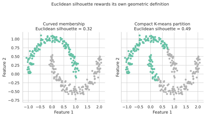
The left partition in Figure 1.6 follows two curved populations. The right partition cuts across both curves to form compact regions. Euclidean silhouette is larger on the right because that partition better matches Euclidean compactness. The score has evaluated its stated geometry correctly. It has not identified the scientifically intended shape. A graph based distance or a representation learned by spectral clustering would ask a different geometric question.
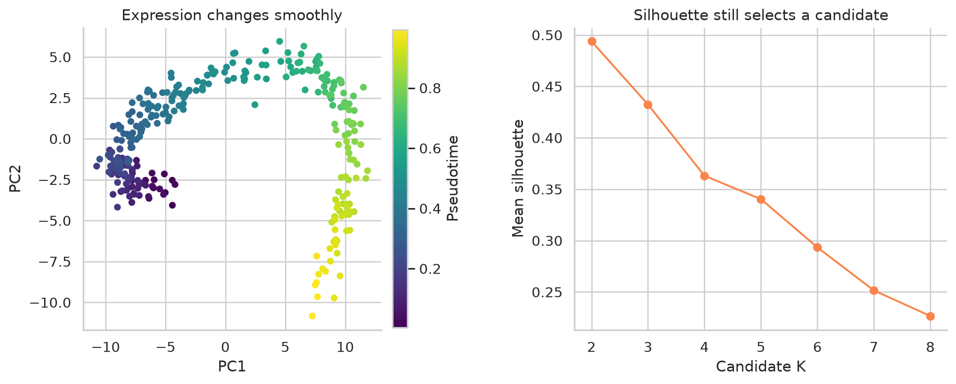
The optimum in Figure 1.7 means that one partition is geometrically preferable under this criterion. It does not show that the trajectory contains that many discrete biological populations. The same caution applies to curved and density based structures. A compact partition may receive a better Euclidean silhouette than a partition that follows the scientifically relevant shape.
1.3 Gap statistic
Within cluster variation nearly always falls when more clusters are requested. With enough clusters, each observation can approach a cluster of its own. Decreasing variation alone therefore cannot determine \(K\).
The Gap statistic supplies a reference question. Is the reduction in within cluster variation larger than we would obtain by dividing an unstructured cloud with comparable overall spread into the same number of groups?
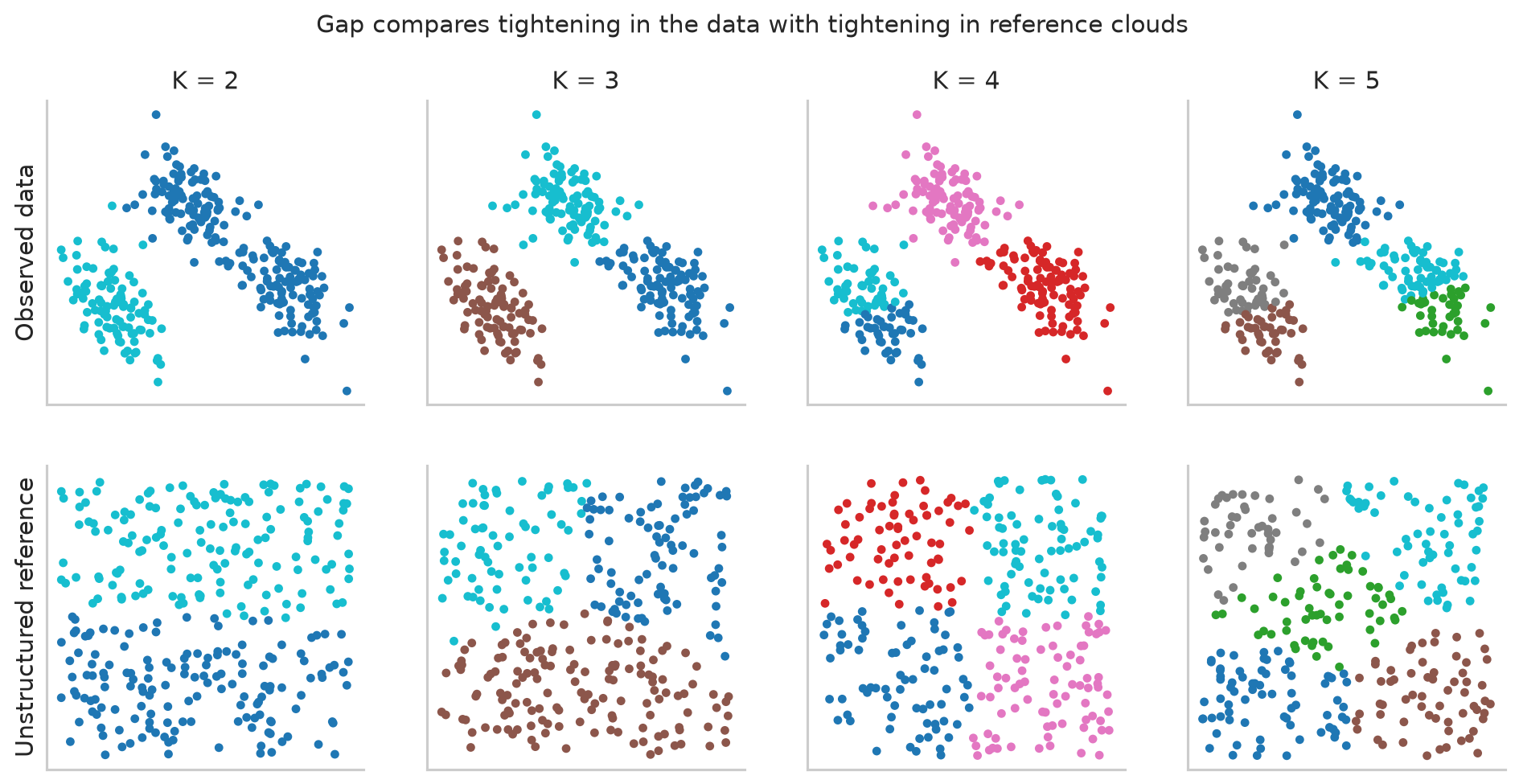
Both rows in Figure 1.8 become tighter as \(K\) increases. The important evidence is whether the observed row improves more than its reference row.
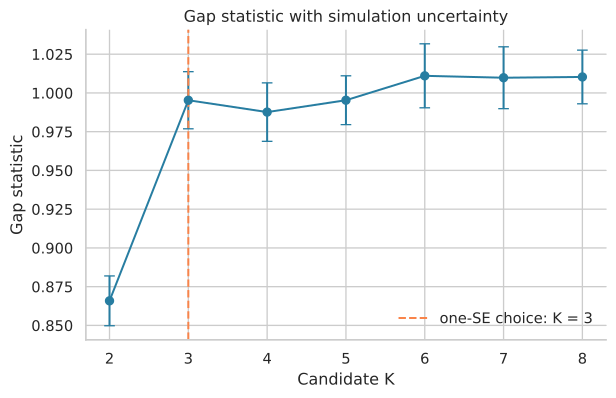
The error bars in Figure 1.9 come from repeatedly generating reference data. The original one standard error rule chooses the smallest \(K\) whose Gap is not convincingly worse than the value at the next \(K\). In ordinary language, stop adding groups when the next split does not provide a clear improvement beyond simulation uncertainty. This is different from always taking the maximum.
The conclusion depends on the reference distribution. A bounding box, a PCA aligned box, and another model of unstructured data do not express exactly the same null comparison. Gap identifies structure relative to that chosen reference. It does not establish a universal biological truth.
1.4 Consensus clustering
Consensus clustering asks a specific stability question: if the dataset is perturbed by subsampling, do the same pairs of samples continue to be placed together? The answer is not tied to arbitrary numeric cluster labels. A pair can remain together even when its cluster is called 1 in one run and 3 in another.
For each candidate value of \(K\), the procedure is run separately:
- Draw a subset of the samples, often 80 percent without replacement.
- Apply the same preprocessing, distance, and clustering method to that subset.
- Record which sampled pairs were assigned to the same cluster.
- Repeat the subsampling and clustering many times.
- Combine the pairwise records into a consensus matrix.
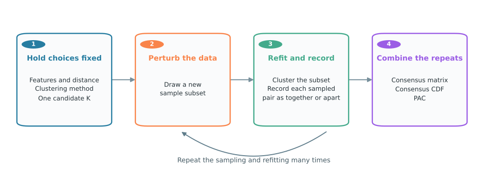
Figure 1.10 shows the full workflow. The features, distance, clustering method, and candidate \(K\) remain fixed. Only the sampled observations change across repetitions. Each repetition contributes together or apart decisions for the pairs that were sampled. Combining those decisions produces the matrix and its summaries.
The result therefore describes the stability of an entire analysis pipeline, not an intrinsic property of the dataset alone. Changing the features, distance, algorithm, subsampling fraction, or randomization can change the result.
1.4.1 What one matrix entry means
Consider samples A and B. Two counts are maintained across the repeated runs: the number of runs in which both samples were present and the number of those runs in which they were clustered together. Their consensus value is the second count divided by the first.
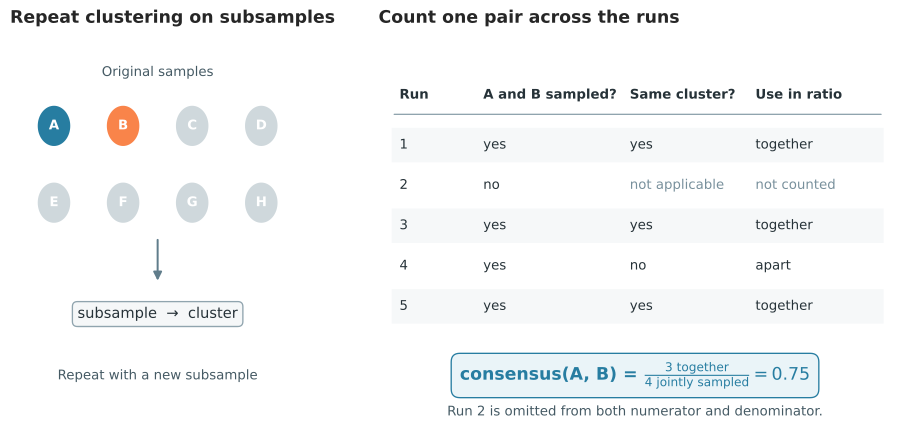
In Figure 1.11, A and B are both present in four runs and are together in three of those runs. Their consensus is therefore 3/4, or 0.75. It is not 3/5. The run that omitted one of the samples provides no information about whether the pair would have clustered together.
The calculation is repeated for every pair. The resulting consensus matrix has the same samples on its rows and columns. Each cell reports the stability of one pair:
- Values near 1 mean a pair was almost always clustered together.
- Values near 0 mean a pair was almost always separated.
- Intermediate values mean the pair changed between together and apart across resamples.
The matrix is symmetric because comparing A with B is identical to comparing B with A. Its diagonal is always 1 because a sample is always in the same cluster as itself. Diagonal values are therefore excluded when the distribution of consensus values is summarized.
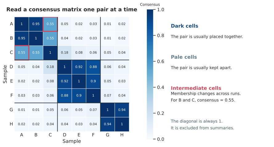
Read Figure 1.12 at two levels. First, inspect individual cells. For example, the highlighted value for B and C is 0.55. This means that B and C were clustered together in 55 percent of the runs in which both appeared. Second, look for square blocks along the diagonal. A dark block means that a set of samples repeatedly stays together. Pale regions between blocks mean that the sets repeatedly stay apart.
1.4.2 Comparing candidate values of K
Consensus matrices are usually reordered so that samples with similar consensus profiles are adjacent. Reordering reveals blocks but does not change any consensus value. The same color scale must be used when candidate values of \(K\) are compared.
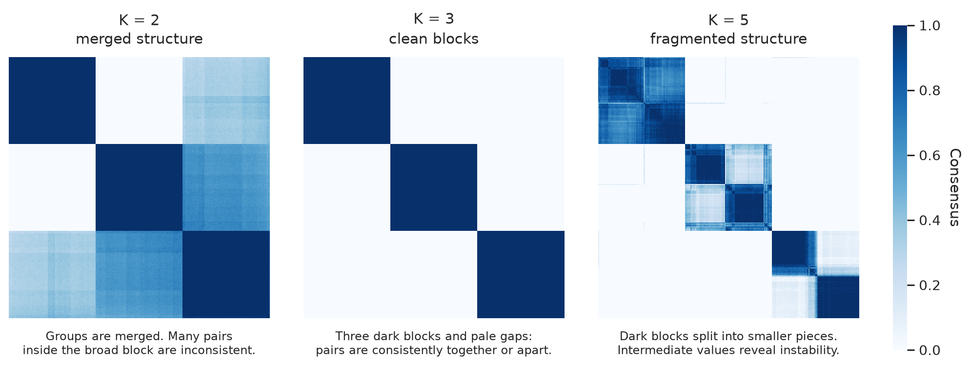
The three panels in Figure 1.13 come from the same simulated dataset.
- At \(K=2\), the algorithm must merge structure. The broad regions with intermediate shades show pairs whose relationship changes across subsamples.
- At \(K=3\), the matrix has three internally dark blocks and pale regions between them. Most pairs are consistently together or consistently apart.
- At \(K=5\), some of those blocks are split. The intermediate regions inside the larger structure show that the added divisions are not reproduced consistently.
This interpretation is more useful than searching for the darkest heatmap. Increasing \(K\) changes the number and sizes of pairs within groups and between groups. Matrices should therefore be judged by coherent blocks and ambiguity, not by average color. The heatmap also locates unstable samples, which a single summary score cannot do.
1.4.3 Consensus CDF
The empirical cumulative distribution function, or CDF, summarizes all consensus values outside the diagonal. At a horizontal axis value \(x\), the curve height is the fraction of sample pairs with consensus less than or equal to \(x\).
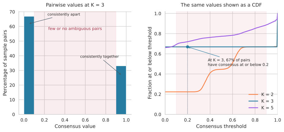
The left panel of Figure 1.14 shows what the CDF summarizes. At \(K=3\), most pairwise values lie near 0 or 1, with almost none in the shaded middle. On the right, the point at \(x=0.2\) and \(y=0.67\) says that 67 percent of pairs have consensus at or below 0.2. These are mainly pairs that are consistently separated.
A stable block pattern produces a large rise near 0, a relatively flat middle, and another rise near 1. A curve that continues to rise through the middle indicates many pairs with inconsistent assignments. The CDF does not reveal which pairs are ambiguous. Return to the matrix for that information.
Some consensus clustering workflows compare the area under the CDF and the change in area as \(K\) increases. A plateau can suggest that increasing \(K\) changes the distribution little. This criterion is indirect. CDF area is not the fraction of ambiguous pairs, and a small change in area does not by itself identify the best \(K\).
1.4.4 Proportion of ambiguous clustering
The proportion of ambiguous clustering, or PAC, directly counts pairs with intermediate values. Choose lower and upper bounds and calculate the fraction of pairwise values outside the diagonal that fall between them. Bounds of 0.1 and 0.9 are common for descriptive analysis.
- A consensus at or below 0.1 is treated as consistently apart.
- A consensus at or above 0.9 is treated as consistently together.
- A consensus between 0.1 and 0.9 is treated as ambiguous.
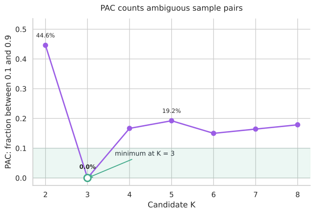
In Figure 1.15, \(K=2\) has PAC 0.446: about 45 percent of pairs fall in the ambiguous interval. This agrees with the unstable merged structure in its heatmap. At \(K=3\), PAC is 0 in this simulation, so no evaluated pair lies strictly between 0.1 and 0.9. At \(K=5\), PAC rises to 0.192 because the added splits are not consistently reproduced. On this stability criterion, \(K=3\) is the clearest candidate.
Low PAC means fewer ambiguous pairs under the selected bounds. It does not mean that every consensus value equals exactly 0 or 1, and it does not attach biological meaning to the clusters. The bounds are conventions rather than biological constants. Report them and check whether nearby choices, such as 0.05 to 0.95 or 0.2 to 0.8, change the ranking.
1.4.5 What consensus stability does not establish
Consensus clustering changes the question from compactness to repeatability. It does not test whether discrete populations exist. A deterministic or strongly biased algorithm can repeatedly divide a unimodal cloud in a similar place.
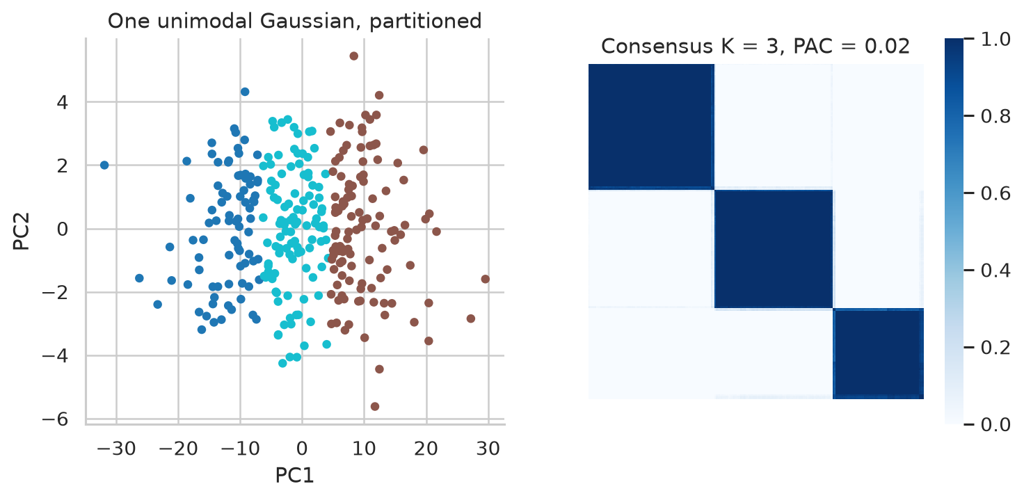
The data in Figure 1.16 were generated from one multivariate Gaussian distribution. There is no mixture of populations. K means must still return three groups when asked for three, and repeated subsampling preserves much of that forced partition. Its PAC is 0.02, which looks excellent despite the absence of true clusters. This is a limitation of what the method measures rather than a software error.
Stability says that an analysis procedure repeats a partition under a specified perturbation. Cluster existence and biological meaning require additional evidence.
1.5 Bootstrap stability of individual clusters
Consensus clustering asks whether sample pairs recur. Bootstrap Jaccard stability asks a more local question: does each original cluster reappear after the data are perturbed? One cluster can be stable while another cluster in the same partition repeatedly dissolves.
Start by fitting the complete clustering pipeline once. This produces the reference partition whose clusters will be evaluated. Then, for one bootstrap run:
- Sample observations with replacement until the bootstrap dataset has the original sample size. Some observations appear more than once and others are absent.
- Refit preprocessing and clustering on that bootstrap dataset.
- Compare one reference cluster with every cluster produced by the refit.
- For each possible match, calculate Jaccard similarity: the number of shared members divided by the number of distinct members in either cluster.
- Keep the largest Jaccard value as the reference cluster’s score for this run.
The refitted cluster numbers are irrelevant. A reference cluster called 1 can match a bootstrap cluster called 3 if their memberships overlap most strongly.
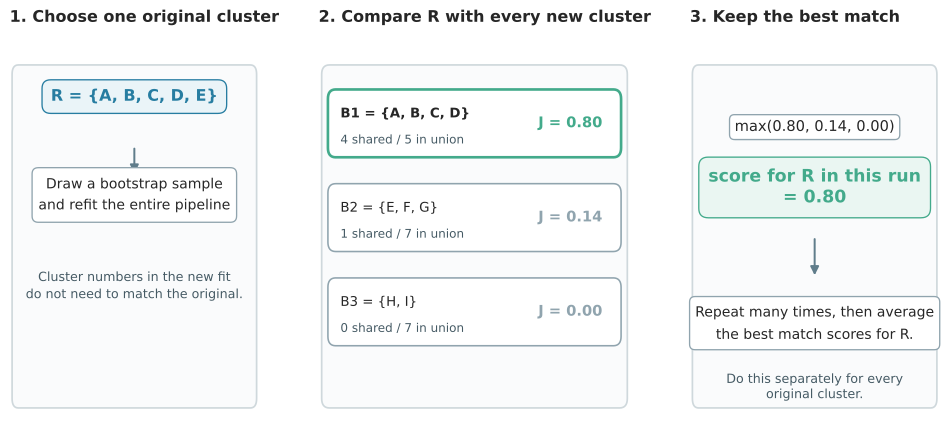
In Figure 1.17, the reference cluster is \(R=\{A,B,C,D,E\}\). The first candidate from the refit shares four members with \(R\), and their union contains five distinct members, so its Jaccard similarity is 4/5, or 0.80. The other candidates score 1/7 and 0/7. The best match is therefore the first candidate, and 0.80 is recorded for \(R\) in this run.
The maximum is taken separately for every reference cluster. It is not a one to one label matching exercise. The goal is to ask how well each original membership set can be recovered. The whole procedure is then repeated on many bootstrap samples.
1.5.1 Summarizing bootstrap runs
After many refits, every reference cluster has a distribution of best match Jaccard scores. The average summarizes recurrence, while the distribution shows whether poor recovery is rare or frequent.
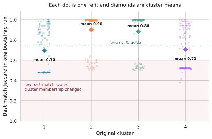
Each dot in Figure 1.18 is the best match from one refit. Clusters 2 and 3 are recovered almost perfectly in many runs. Clusters 1 and 4 have more runs with low scores, so their membership is more sensitive to the bootstrap sample. The diamonds report the means, but the dots explain those means.
The fpc::clusterboot literature often treats a mean Jaccard value around 0.75 or above as reasonably stable and a value above about 0.85 as highly stable. Values below about 0.6 raise concern. These are rough interpretive conventions, not universal cutoffs. A mean near 0.75 can arise from consistently moderate recovery or from a mixture of perfect and failed recoveries. The distribution distinguishes those cases.
A low score does not say why a cluster failed. It may split into several refitted clusters, merge with a neighbor, or lose boundary samples. Inspect the memberships from runs with low scores when the failure mode matters.
1.5.2 Choosing the resampling unit
Resampling samples assesses sensitivity to which samples were observed. Feature resampling assesses sensitivity to which genes were measured or selected. They are different analyses.
For single cell data from several donors, resampling individual cells does not capture donor to donor variation. Thousands of stable cell memberships can still depend on one donor or one processing batch. When the scientific unit is the donor, donor aware resampling or validation in an independent cohort may be more relevant.
Bootstrap duplicates are repeated appearances of the same observed unit. They are not new independent biological samples. Stability is always conditional on the perturbation that was used.
1.6 Comparing two completed partitions
The third evaluation question no longer uses distances or resampling. It starts with two completed label vectors for the same samples. The partitions might come from different algorithms, parameter settings, datasets measured on the same cases, or a clustering and an external annotation.
The printed cluster names carry no information. What matters is which samples share a cluster.
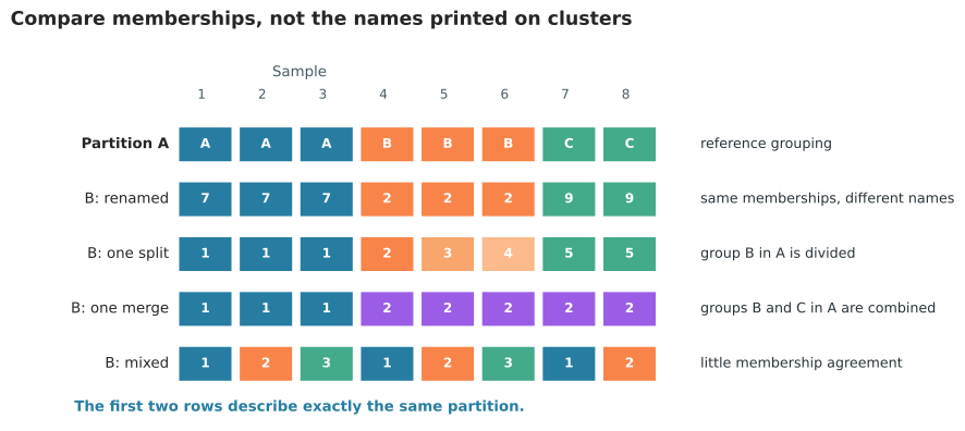
In the first two rows of Figure 1.19, samples 1 to 3, 4 to 6, and 7 to 8 remain together even though the labels change from A, B, and C to 7, 2, and 9. These are identical partitions and must receive perfect agreement. The remaining rows show the three main sources of disagreement: a group can split, groups can merge, or memberships can mix.
1.6.1 Adjusted Rand index
The Rand approach converts the comparison into decisions about every unordered pair of samples. For each pair, ask whether its two samples are together or apart in each partition. This creates four cases:
- Together in both partitions means agreement.
- Apart in both partitions means agreement.
- Together only in partition A means that B split the pair.
- Together only in partition B means that B merged the pair.
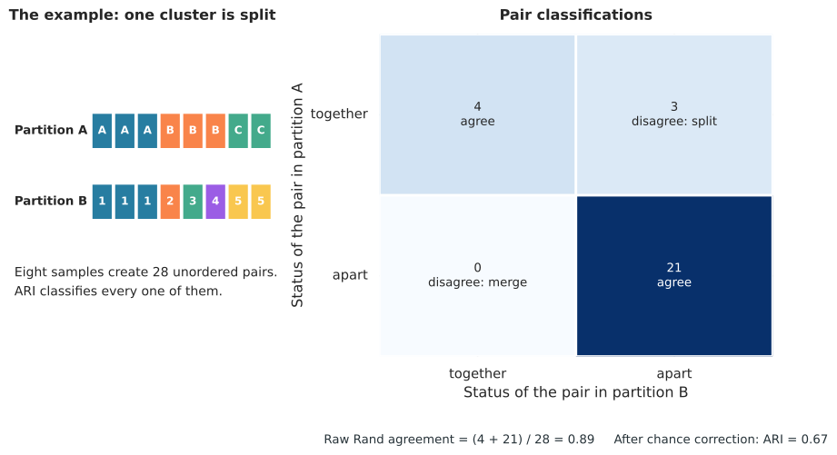
The example in Figure 1.20 has eight samples, so there are 28 unordered pairs. Twenty-five pairs agree and three disagree, producing raw Rand agreement of 25/28, or 0.89. Most of the agreement comes from the 21 pairs that are apart in both partitions. Such agreements can be numerous even for unrelated partitions, especially when there are many small clusters.
Adjusted Rand index, or ARI, removes the pair agreement expected under a chance model that preserves the partition sizes. The worked example falls from raw agreement 0.89 to ARI 0.67 after that correction. An ARI of 1 means identical memberships up to label renaming. Values around 0 indicate chance level agreement under the model, and negative values mean less agreement than expected by chance.
An ARI of 0.67 does not mean that 67 percent of labels are correct. There is no class designated as the correct answer in this calculation. ARI is a chance corrected summary of pair decisions.
1.6.2 Adjusted mutual information
Information based comparison starts from a contingency table. Rows are clusters from partition A, columns are clusters from partition B, and each cell counts shared samples. Then ask: after learning a sample’s cluster in A, how much uncertainty remains about its cluster in B?
If each row is concentrated in one column, knowing A nearly determines B. If each row is spread across several columns, knowing A provides little help. This interpretation is unchanged when cluster names are relabeled.
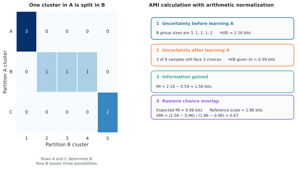
Figure 1.21 uses the same split example as the ARI calculation. The five groups in B have sizes 3, 1, 1, 1, and 2. Their proportions are therefore 3/8, 1/8, 1/8, 1/8, and 2/8. Applying entropy to those proportions gives 2.16 bits of uncertainty before A is known.
Once A is known, row A predicts label 1 and row C predicts label 5. Those rows leave no uncertainty. Only the three samples in the middle row remain uncertain among three equally likely labels. The remaining uncertainty is therefore \((3/8)\log_2(3) = 0.59\) bits.
The information gained is therefore 2.16 minus 0.59, which is 1.56 bits.
To understand the chance value, imagine writing the B labels on eight cards. There are three cards labelled 1, one each labelled 2, 3, and 4, and two labelled 5. Shuffle those cards across the eight samples while leaving the A labels fixed. Each shuffle preserves all group sizes. Build a new contingency table and calculate its mutual information. Repeating this over every possible shuffle gives an average of 0.96 bits. Software obtains the same expectation exactly from the possible contingency tables and their probabilities.
The observed 1.56 bits therefore exceeds chance by 0.60 bits. Under the arithmetic normalization shown in the figure, the largest available amount above chance is 1.86 minus 0.96, or 0.90 bits. AMI is the observed 0.60 divided by the available 0.90, which equals 0.67. This calculation explains why the expected information is subtracted from both the numerator and the reference scale.
Raw mutual information is the reduction in uncertainty. It has no simple common scale. Normalized mutual information, or NMI, rescales it. Several normalization conventions exist, so the software setting should be reported. NMI does not correct for chance and can be inflated when many clusters create accidental overlap.
Adjusted mutual information, or AMI, subtracts the mutual information expected from random partitions with the same cluster size structure. AMI equals 1 for identical memberships, is around 0 for chance level information, and can be negative. It is usually preferable to NMI when the two solutions have substantially different numbers of clusters.
ARI and AMI often tell similar stories, but they weight discrepancies differently. ARI counts pair decisions. AMI measures reduction in uncertainty. Report the contingency table when a scalar score is not enough: it reveals exactly which groups split, merge, or mix. Neither measure uses expression values, distances, or geometry after the two label vectors have been produced, and high agreement does not prove biological correctness.
1.7 Summary
How many compact, separated groups? Inspect full silhouette profiles, mean silhouette across the candidate range, and the Gap statistic with its uncertainty. Consensus and PAC add evidence about recurring pairwise structure.
Does the grouping recur under perturbation? Inspect consensus matrices, PAC, and clusterwise bootstrap Jaccard stability. State what was resampled.
Do two partitions agree? Use ARI and AMI, supported by a contingency table. Use NMI only with a clear normalization convention and remember that it lacks chance correction.