4 Exercise: evaluating NCI60 clusters
4.1 The dataset and label handling
NCI60 contains 6,830 expression measurements for 64 cancer cell line profiles (Ross et al. 2000). The small sample count permits exact diagnostics, while the number of genes makes the representation decision realistic.
The R ISLR2::NCI60 and Python ISLP teaching datasets derive from the same data. To prevent package version differences, this module supplies one exported copy:
The file contains 64 profiles. Four names mark repeat measurements of two cell lines. We group K562A-repro and K562B-repro with LEUKEMIA. We group MCF7A-repro and MCF7D-repro with BREAST. The one profile labelled UNKNOWN is omitted when clustering is compared with cancer type, leaving 63 profiles. The resulting labels are available in nci60_labels_analysis.csv.
The labels may be inspected for counts during setup. Put them aside before preprocessing and do not use them to choose PCs, \(K\), algorithm, or stability settings.
4.2 Exercise 1. Prepare an unsupervised representation
- Load the expression matrix and analysis labels.
- Confirm the dimensions and cancer type frequencies.
- Remove the
UNKNOWNrow using the supplied analysis file. - Standardize each gene across retained profiles.
- Perform PCA and retain the first 15 PCs for this exercise.
- Inspect the explained variance. State one advantage and one limitation of this representation.
Use analysis_label only for the frequency table. Do not attach it to the PCA or clustering input.
expression <- read.csv("data/nci60_expression.csv", check.names = FALSE)
metadata <- read.csv("data/nci60_labels_analysis.csv")

keep <- metadata$cancer_type != "UNKNOWN"
X <- as.matrix(expression[keep, ])
metadata <- metadata[keep, ]

dim(X)
table(metadata$analysis_label)

set.seed(42)
pca <- prcomp(X, center = TRUE, scale. = TRUE)
pcs <- pca$x[, 1:15]
variance <- pca$sdev^2 / sum(pca$sdev^2)
round(cumsum(variance[1:15]), 3)
plot(cumsum(variance[1:20]), type = "b",
     xlab = "Number of PCs", ylab = "Cumulative variance explained")
[1] 63 6830
BREAST CNS COLON LEUKEMIA MELANOMA NSCLC OVARIAN PROSTATE RENAL
9 5 7 8 8 9 6 2 9
[1] 0.115 0.183 0.241 0.283 0.321 0.358 0.387 0.414 0.439 0.463 0.487 0.508
[13] 0.529 0.549 0.568import numpy as np
import pandas as pd
import matplotlib.pyplot as plt
from sklearn.decomposition import PCA
from sklearn.preprocessing import StandardScaler
expression = pd.read_csv("data/nci60_expression.csv")
metadata = pd.read_csv("data/nci60_labels_analysis.csv")
keep = metadata["cancer_type"] != "UNKNOWN"
X = expression.loc[keep].to_numpy()
metadata = metadata.loc[keep].reset_index(drop=True)
print(X.shape)
print(metadata["analysis_label"].value_counts())
pca = PCA(n_components=15, random_state=42)
pcs = pca.fit_transform(StandardScaler().fit_transform(X))
print(np.round(np.cumsum(pca.explained_variance_ratio_), 3))
plt.plot(np.arange(1, 16), np.cumsum(pca.explained_variance_ratio_), marker="o")
plt.xlabel("Number of PCs")
plt.ylabel("Cumulative variance explained")
plt.show()(63, 6830)
analysis_label
BREAST 9
CNS 5
COLON 7
LEUKEMIA 8
MELANOMA 8
NSCLC 9
OVARIAN 6
PROSTATE 2
RENAL 9
[0.115 0.183 0.241 0.283 0.321 0.358 0.387 0.414 0.439 0.463 0.487 0.508
0.529 0.549 0.567]The dimensions and label counts agree in both languages. The first 15 PCs retain about 57 percent of the standardized expression variance. Standardization prevents high variance genes from controlling Euclidean distances simply because of scale. It can also amplify noisy low variance genes. PCA concentrates major correlated expression patterns, but retaining 15 PCs can discard weaker expression patterns. The chosen scaling and number of PCs should therefore be reported with the clustering results.
4.3 Exercise 2. Evaluate geometric separation
- Fit K means for (K=2,,10) with a fixed seed and multiple starts.
- Plot mean silhouette across \(K\).
- Inspect full silhouette profiles for at least three candidates. Include one low, one intermediate, and one high resolution.
- Record negative observations and identify the clusters containing them.
- Calculate the Gap statistic with a PCA aligned reference distribution and at least 100 simulations.
- Apply the original one standard error rule.
- Write down the values of \(K\) supported by silhouette and Gap. Do not use cancer type labels.
library(cluster)
set.seed(42)

candidate_k <- 2:10
fits <- lapply(candidate_k, function(k) {
  set.seed(42 + k)
  kmeans(pcs, centers = k, nstart = 50)$cluster
})
sil <- lapply(fits, function(z) silhouette(z, dist(pcs)))
mean_sil <- vapply(sil, function(z) mean(z[, "sil_width"]), numeric(1))
round(setNames(mean_sil, candidate_k), 3)
plot(candidate_k, mean_sil, type = "b",
     xlab = "K", ylab = "Mean silhouette")

par(mfrow = c(1, 3))
for (k in c(2, 5, 10)) {
  i <- which(candidate_k == k)
  plot(sil[[i]], main = paste("NCI60, K =", k), border = NA)
}

lapply(c(2, 5, 10), function(k) {
  z <- sil[[which(candidate_k == k)]]
  table(cluster = z[z[, "sil_width"] < 0, "cluster"])
})

set.seed(42)
gap <- clusGap(
  pcs,
  FUNcluster = function(x, k) list(cluster = kmeans(x, k, nstart = 50)$cluster),
  K.max = 10, B = 100, spaceH0 = "scaledPCA"
)
gap$Tab
maxSE(gap$Tab[, "gap"], gap$Tab[, "SE.sim"], method = "Tibs2001SEmax")
2 3 4 5 6 7 8 9 10
0.177 0.174 0.178 0.186 0.193 0.226 0.231 0.216 0.231
Negative silhouettes by cluster
K = 2: cluster 2 has 2
K = 5: cluster 1 has 2, cluster 5 has 5
K = 10: cluster 1 has 2, cluster 3 has 2, cluster 7 has 1
gap SE.sim
[1,] 0.344 0.018
[2,] 0.352 0.017
[3,] 0.387 0.018
[4,] 0.414 0.019
[5,] 0.439 0.019
[6,] 0.460 0.019
[7,] 0.485 0.019
[8,] 0.507 0.019
[9,] 0.524 0.019
[10,] 0.538 0.019
[1] 1from sklearn.cluster import KMeans
from sklearn.metrics import silhouette_score, silhouette_samples
from yellowbrick.cluster import SilhouetteVisualizer
from gapstatistics.gapstatistics import GapStatistics
candidate_k = range(2, 11)
fits = {
k: KMeans(k, n_init=50, random_state=42 + k).fit_predict(pcs)
for k in candidate_k
}
mean_sil = {k: silhouette_score(pcs, z) for k, z in fits.items()}
print({k: round(v, 3) for k, v in mean_sil.items()})
plt.plot(mean_sil.keys(), mean_sil.values(), marker="o")
plt.xlabel("K")
plt.ylabel("Mean silhouette")
plt.show()
fig, axes = plt.subplots(1, 3, figsize=(12, 4))
for ax, k in zip(axes, [2, 5, 10]):
visualizer = SilhouetteVisualizer(
KMeans(k, n_init=50, random_state=42 + k),
ax=ax,
force_model=True,
colors=[
"#3B82F6", "#F59E0B", "#10B981", "#8B5CF6", "#EC4899",
"#14B8A6", "#F97316", "#6366F1", "#84CC16", "#D946EF"
]
)
visualizer.fit(pcs)
visualizer.finalize()
ax.get_legend().remove()
ax.set_title(f"NCI60, K = {k}")
ax.set(xlabel="Silhouette value", ylabel="Cluster", xlim=(-0.25, 0.9))
ax.set_xticks(np.arange(-0.2, 1.0, 0.2))
print("profile mean", k, round(visualizer.silhouette_score_, 3))
plt.show()
for k in [2, 5, 10]:
values = silhouette_samples(pcs, fits[k])
counts = pd.Series(fits[k][values < 0] + 1).value_counts().sort_index()
print(k, "negative:", int((values < 0).sum()), "by cluster:", counts.to_dict())
np.random.seed(42)
gap = GapStatistics(pca_sampling=True, return_params=True)
gap_choice, gap_params = gap.fit_predict(K=10, X=pcs, n_iterations=100)
gap_table = pd.DataFrame({
"K": range(1, 11),
"Gap": gap_params["gaps"],
"SE": gap_params["sim_sks"]
})
print(gap_table.round(3).to_string(index=False))
print("one-SE choice:", gap_choice)
gap.plot(){2: 0.179, 3: 0.174, 4: 0.180, 5: 0.187, 6: 0.202, 7: 0.215,
8: 0.215, 9: 0.232, 10: 0.255}
profile mean 2 0.179
profile mean 5 0.187
profile mean 10 0.255
2 negative: 2 by cluster: {1: 2}
5 negative: 7 by cluster: {1: 5, 2: 2}
10 negative: 4 by cluster: {6: 2, 7: 2}
K Gap SE
1 0.834 0.014
2 0.857 0.015
3 0.900 0.016
4 0.926 0.016
5 0.964 0.017
6 0.974 0.017
7 1.025 0.017
8 1.047 0.017
9 1.042 0.017
10 1.077 0.018
one-SE choice: 5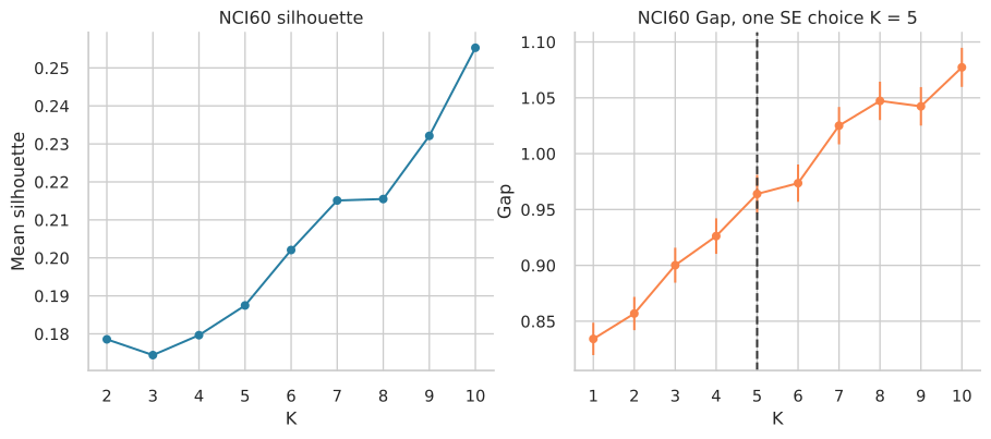
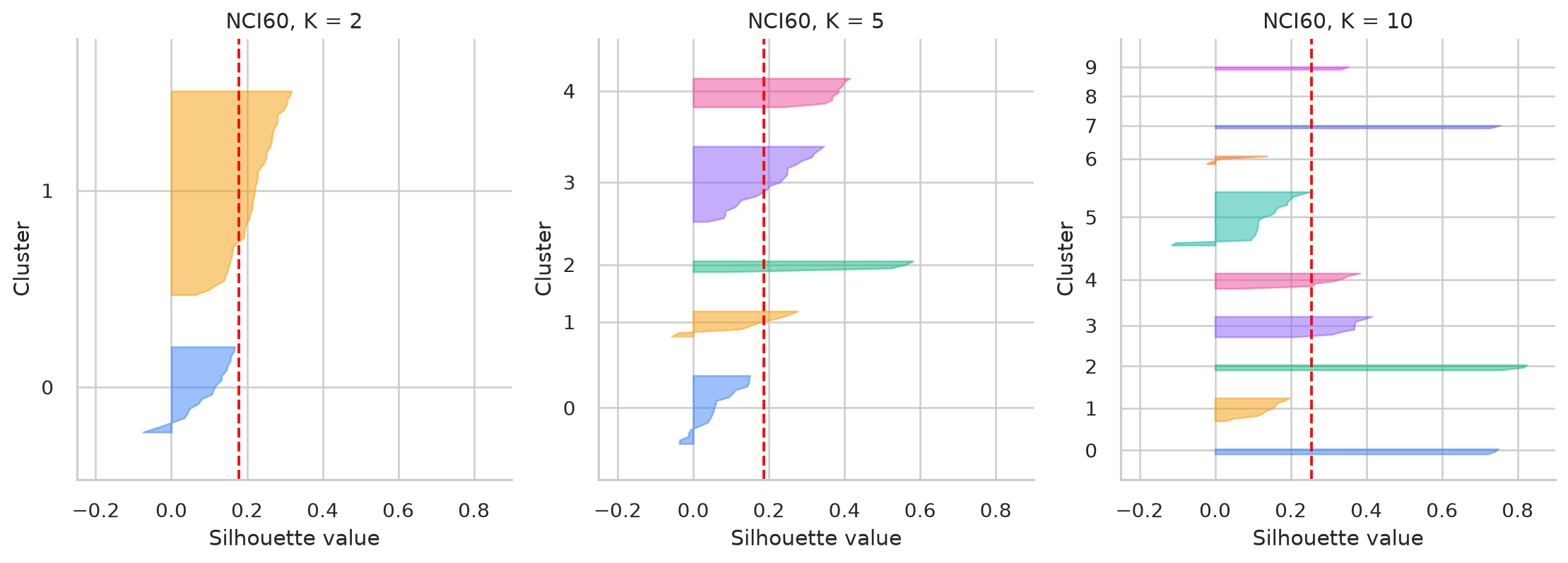
Mean silhouette reaches its largest displayed value at \(K=10\) in both runs. This is the upper boundary of the search. The R Gap calculation selects \(K=1\), while gapstatistics selects \(K=5\). The packages use different definitions of within cluster dispersion and different reference generators. Their values should not be treated as two implementations of one identical calculation. The negative silhouette counts also show that the largest mean does not make every assignment convincing.
4.4 Exercise 3. Evaluate recurrence and cluster stability
- Run consensus clustering for (K=2,,10) using an 80 percent sample fraction.
- Inspect consensus matrices for at least (K=2), (K=5), and (K=10).
- Plot consensus CDF curves.
- Calculate PAC with bounds 0.1 and 0.9.
- Select two or three plausible resolutions using internal and consensus evidence together.
- In R, calculate bootstrap Jaccard stability by original cluster. In Python, use
skstabto compare complete partitions from paired subsamples. - Explain what each stability output measures before interpreting it.
library(ConsensusClusterPlus)
library(fpc)

set.seed(42)
cc <- ConsensusClusterPlus(
  t(pcs), maxK = 10, reps = 500,
  pItem = 0.8, pFeature = 1,
  clusterAlg = "km", distance = "euclidean",
  seed = 42, plot = NULL, verbose = FALSE
)

pacs <- sapply(2:10, function(k) {
  values <- cc[[k]]$consensusMatrix[upper.tri(cc[[k]]$consensusMatrix)]
  mean(values > 0.1 & values < 0.9, na.rm = TRUE)
})
round(setNames(pacs, 2:10), 3)
plot(2:10, pacs, type = "b", xlab = "K", ylab = "PAC")

for (k in c(2, 5, 10)) {
  set.seed(42)
  stability <- clusterboot(
    pcs, B = 300, bootmethod = "boot",
    clustermethod = kmeansCBI, krange = k,
    seed = 42, runs = 50, count = FALSE,
    dissolution = 0.5, recover = 0.75
  )
  cat("K =", k, "\n")
  print(round(stability$bootmean, 3))
}
2 3 4 5 6 7 8 9 10
0.651 0.645 0.583 0.419 0.386 0.333 0.285 0.252 0.215
K = 2
[1] 0.906 0.810
K = 5
[1] 0.805 0.702 0.966 0.651 0.587
K = 10
[1] 0.613 0.583 0.967 0.638 0.653 0.817 0.763 0.651 0.915 0.786from consensusclustering import ConsensusClustering
from skstab import ModelExplorer
cc_py = ConsensusClustering(
KMeans(n_init=20, random_state=42),
min_clusters=2,
max_clusters=10,
n_resamples=200,
resample_frac=0.8,
rng=42
)
cc_py.fit(pcs)
auc_py = {k: cc_py.area_under_cdf(k) for k in cc_py.cluster_range_}
pacs_py = {}
for k in cc_py.cluster_range_:
matrix = cc_py.consensus_k(k)
values = matrix[np.triu_indices_from(matrix, 1)]
pacs_py[k] = np.mean((values > 0.1) & (values < 0.9))
print("CDF area", {k: round(v, 3) for k, v in auc_py.items()})
print("PAC", {k: round(v, 3) for k, v in pacs_py.items()})
print("CDF knee:", cc_py.best_k(method="knee"))
cc_py.plot_cdf()
cc_py.plot_clustermap(2, cmap="Blues", vmin=0, vmax=1)
np.random.seed(42)
stability_py = ModelExplorer(
pcs,
KMeans,
param_name="n_clusters",
param_values=[2, 5, 10],
f=0.8,
runs=50,
algo_kwargs={"n_init": 20, "random_state": 42},
n_jobs=1
)
print("skstab", dict(zip([2, 5, 10], np.round(stability_py.score().squeeze(), 3))))CDF area {2: 0.483, 3: 0.634, 4: 0.695, 5: 0.738, 6: 0.776,
7: 0.813, 8: 0.845, 9: 0.864, 10: 0.876}
PAC {2: 0.221, 3: 0.364, 4: 0.308, 5: 0.374, 6: 0.381,
7: 0.351, 8: 0.307, 9: 0.267, 10: 0.236}
CDF knee: 4
skstab {2: 0.66, 5: 0.04, 10: 0.00}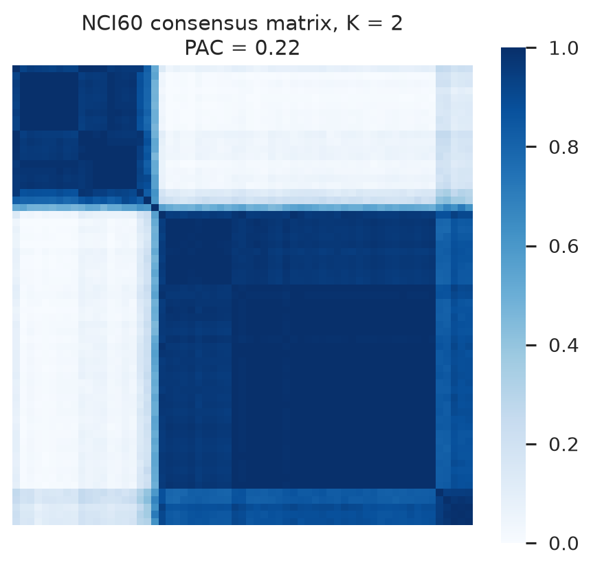
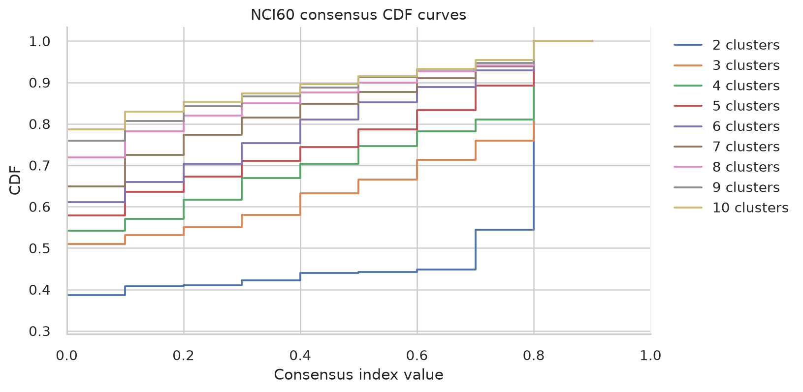
The Python consensus run has its lowest PAC at \(K=2\) and a CDF knee at \(K=4\). The R PAC curve decreases across the tested range and reaches its lowest displayed value at \(K=10\). The skstab score is 0.66 for \(K=2\), 0.04 for \(K=5\), and 0 for \(K=10\). These are whole partition stability scores from paired subsamples. The R Jaccard values describe individual clusters and reveal uneven stability inside the more detailed solutions. Report the two forms of stability separately.
4.5 Exercise 4. Reveal the annotation and compare partitions
Only after completing Exercises 1 through 3 should the cancer type annotation be brought back.
- Display PC1 and PC2 coloured by cancer type. Treat this as interpretation, not parameter selection.
- For each shortlisted K means solution, calculate ARI and AMI against cancer type.
- Make a contingency table or heatmap of cluster by cancer type.
- Identify types that remain together, types split across clusters, and clusters mixing several types.
- Fit Ward hierarchical clustering at the same shortlisted resolutions.
- Calculate ARI and AMI between K means and Ward solutions.
- Compare the solution supported by internal criteria with the solution showing greatest agreement with annotation.
library(aricode)

type <- metadata$analysis_label
type_id <- as.integer(factor(type))
plot(pcs[, 1], pcs[, 2], col = as.integer(factor(type)), pch = 19,
     xlab = "PC1", ylab = "PC2")

compare_k <- function(k) {
  km <- fits[[which(candidate_k == k)]]
  ward <- cutree(hclust(dist(pcs), method = "ward.D2"), k = k)
  c(
    ARI_km_type = ARI(km, type_id),
    AMI_km_type = AMI(km, type_id),
    ARI_km_ward = ARI(km, ward),
    AMI_km_ward = AMI(km, ward)
  )
}
comparison <- t(sapply(c(2, 5, 10), compare_k))
rownames(comparison) <- c("K2", "K5", "K10")
round(comparison, 3)

selected <- fits[[which(candidate_k == 5)]]
table(cluster = selected, cancer_type = type)
ARI_km_type AMI_km_type ARI_km_ward AMI_km_ward
K2 0.129 0.213 1.000 1.000
K5 0.300 0.407 0.601 0.696
K10 0.410 0.540 0.614 0.689
cancer_type
cluster BREAST CNS COLON LEUKEMIA MELANOMA NSCLC OVARIAN PROSTATE RENAL
1 0 0 0 8 0 0 0 0 0
2 2 0 0 0 7 0 0 0 0
3 4 0 0 0 0 0 0 0 0
4 0 0 7 0 0 5 3 1 0
5 3 5 0 0 1 4 3 1 9from sklearn.cluster import AgglomerativeClustering
from sklearn.metrics import adjusted_rand_score, adjusted_mutual_info_score
type_label = metadata["analysis_label"].to_numpy()
for cancer_type in sorted(np.unique(type_label)):
use = type_label == cancer_type
plt.scatter(pcs[use, 0], pcs[use, 1], label=cancer_type)
plt.legend(bbox_to_anchor=(1.02, 1), loc="upper left")
plt.xlabel("PC1")
plt.ylabel("PC2")
plt.show()
rows = []
for k in [2, 5, 10]:
km = fits[k]
ward = AgglomerativeClustering(k, linkage="ward").fit_predict(pcs)
rows.append({
"K": k,
"ARI K means/type": adjusted_rand_score(type_label, km),
"AMI K means/type": adjusted_mutual_info_score(
type_label, km, average_method="max"
),
"ARI K means/Ward": adjusted_rand_score(km, ward),
"AMI K means/Ward": adjusted_mutual_info_score(
km, ward, average_method="max"
)
})
print(pd.DataFrame(rows).round(3).to_string(index=False))
table = pd.crosstab(pd.Series(fits[5] + 1, name="cluster"),
pd.Series(type_label, name="cancer_type"))
print(table) K ARI K means/type AMI K means/type ARI K means/Ward AMI K means/Ward
2 0.129 0.213 1.000 1.000
5 0.315 0.418 0.470 0.652
10 0.242 0.369 0.556 0.629
cancer_type BREAST CNS COLON LEUKEMIA MELANOMA NSCLC OVARIAN PROSTATE RENAL
cluster
1 3 5 0 0 0 3 1 0 8
2 0 0 0 8 0 0 0 0 0
3 4 0 0 0 0 0 0 0 0
4 0 0 7 0 1 6 5 2 1
5 2 0 0 0 7 0 0 0 0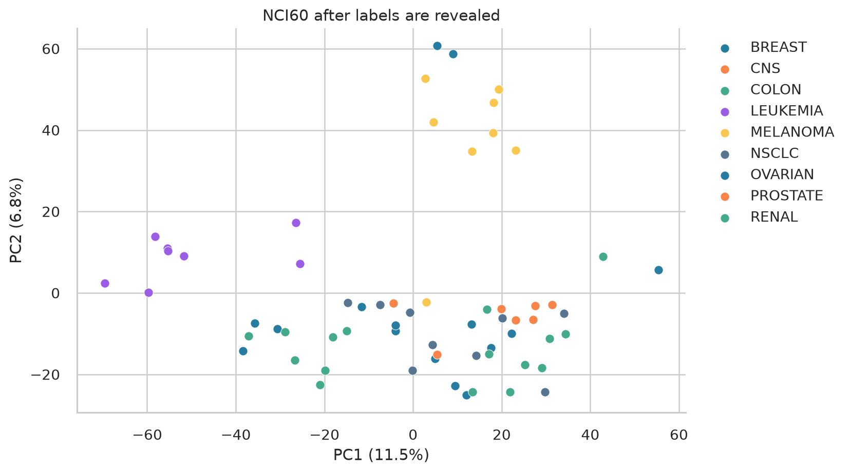
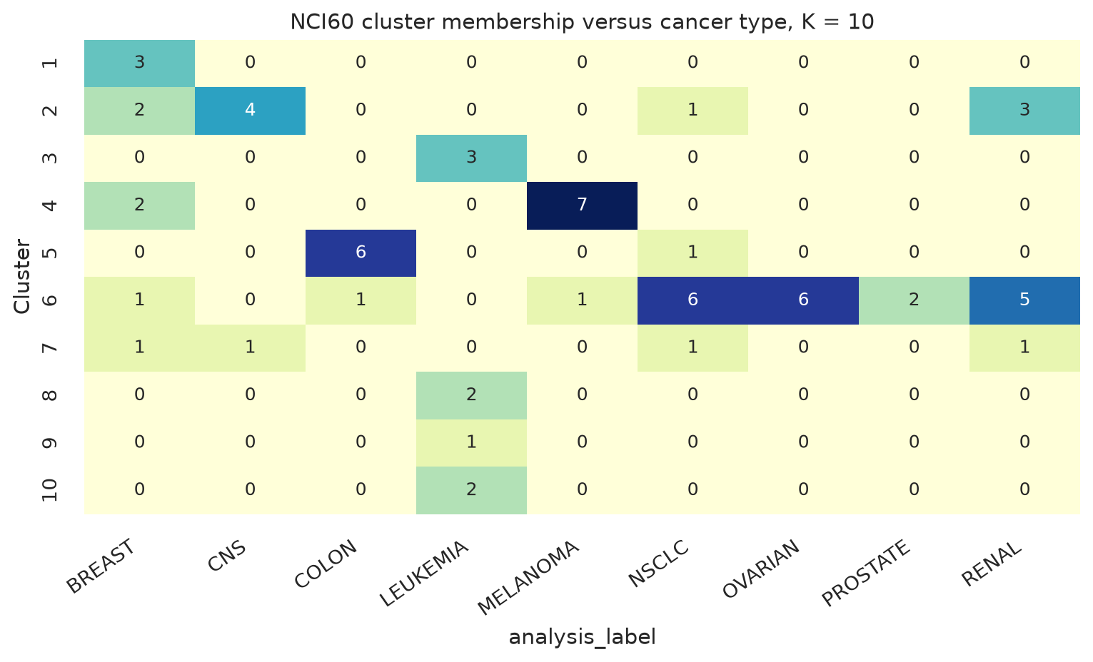
The Python AMI call uses the maximum entropy normalizer so it matches the convention in aricode. At \(K=2\), both languages find the same K means partition and produce the same external ARI and AMI. At \(K=10\), the Python K means solution has ARI 0.242 and AMI 0.369 against cancer type. Its agreement with Ward is higher, with ARI 0.556 and AMI 0.629. The R fit gives ARI 0.410 and AMI 0.540 against cancer type. Its agreement with Ward is ARI 0.614 and AMI 0.689. The K means implementations reached different local solutions at the larger resolutions, so their agreement values differ.
The cancer labels describe tissue of origin. Expression can also capture lineage, cell line adaptation, and technical effects. Conversely, one cancer type can contain genuine molecular subgroups. The annotation is an external reference, not infallible truth.