3 Decision trees
Decision tree modelling is one of the most intuitive and easy to understand modelling techniques used in statistics. They have minimum requirements for data pre-processing, little assumption about the data distribution, missing value handling and many other benefits.
Let first have a look at some terminology:
library(DiagrammeR)

nodes <- create_node_df(n = 9, type = "number",label = c("A","B","C","D","E","F","G","H","I"))

edges <- create_edge_df(from = c(1, 1, 2, 2, 3, 3,6,6),
                        to = c(2, 3, 4, 5, 6, 7,8,9),
                       rel = "leading to")

graph <- create_graph(nodes_df = nodes, attr_theme = "tb",
                      edges_df = edges,
                  )

render_graph(graph)
Figure 3.1: The example of an imaginary decision tree
Each circle is a called a node and each line is called an edge. The very first node in top of the tree is called a root node (A). Nodes that are not root but have out going connections are called child node (B,C,F). The nodes at the bottom of the tree are called leaf nodes or terminal nodes whereas the nodes in the middle of the tree are called internal nodes. We tend to say that node B is child of node A because there is incoming connection from A to B. The same applies to C. Similarly, we say A is the parent of B and C. The same naming applies throughout the tree. For example H is a leaf node that is the child of F. Finally, we sometime say that A has been split to B and C which obviously means it has two child nodes. That was it. Let’s continue to see what trees are!
3.1 Intuition
Decision trees are normally built through sequentially segmenting the data using simple rules until reaching some criteria for stooping. Let’s try to develop an intuition about them using our dataset. Here we focus on classification and later extend it to the regression.
In Figure 3.2, we have plotted our AD data (only AD and controls). On the \(x\) axis we have \(A\beta\) and on the \(y\) axis we have t tau.
# Select variable
variableIndex<-"abeta"
variableIndex2<-"t_tau"
# plot the data for both of the variables
plot(limited_data[,variableIndex],limited_data[,variableIndex2],xlab =variableIndex,ylab = variableIndex2,
    col=as.factor(limited_data$group),pch=as.numeric(as.factor(limited_data$group)))
legend("topleft",legend = levels(as.factor(limited_data$group)),
       col=as.factor(levels(as.factor(limited_data$group))),
       pch=as.factor(levels(as.factor(limited_data$group))))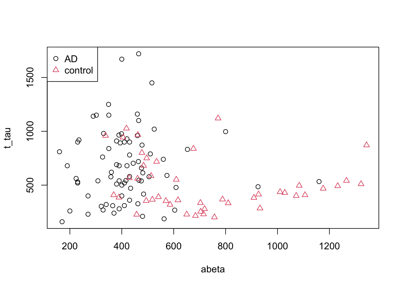
Figure 3.2: The example of two variables measured on a number of samples.
Now we want to cut our data based on our variables into AD and controls and we are only allowed to draw a single vertical (\(x\) axis) or horizontal (\(y\) axis) line. Maybe we can draw a line like this:
# Select variable
variableIndex<-"abeta"
variableIndex2<-"t_tau"
# plot the data for both of the variables
plot(limited_data[,variableIndex],limited_data[,variableIndex2],xlab =variableIndex,ylab = variableIndex2,
    col=as.factor(limited_data$group),pch=as.numeric(as.factor(limited_data$group)))
legend("topleft",legend = levels(as.factor(limited_data$group)),
       col=as.factor(levels(as.factor(limited_data$group))),pch=as.factor(levels(as.factor(limited_data$group))))
abline(v=250,col="red")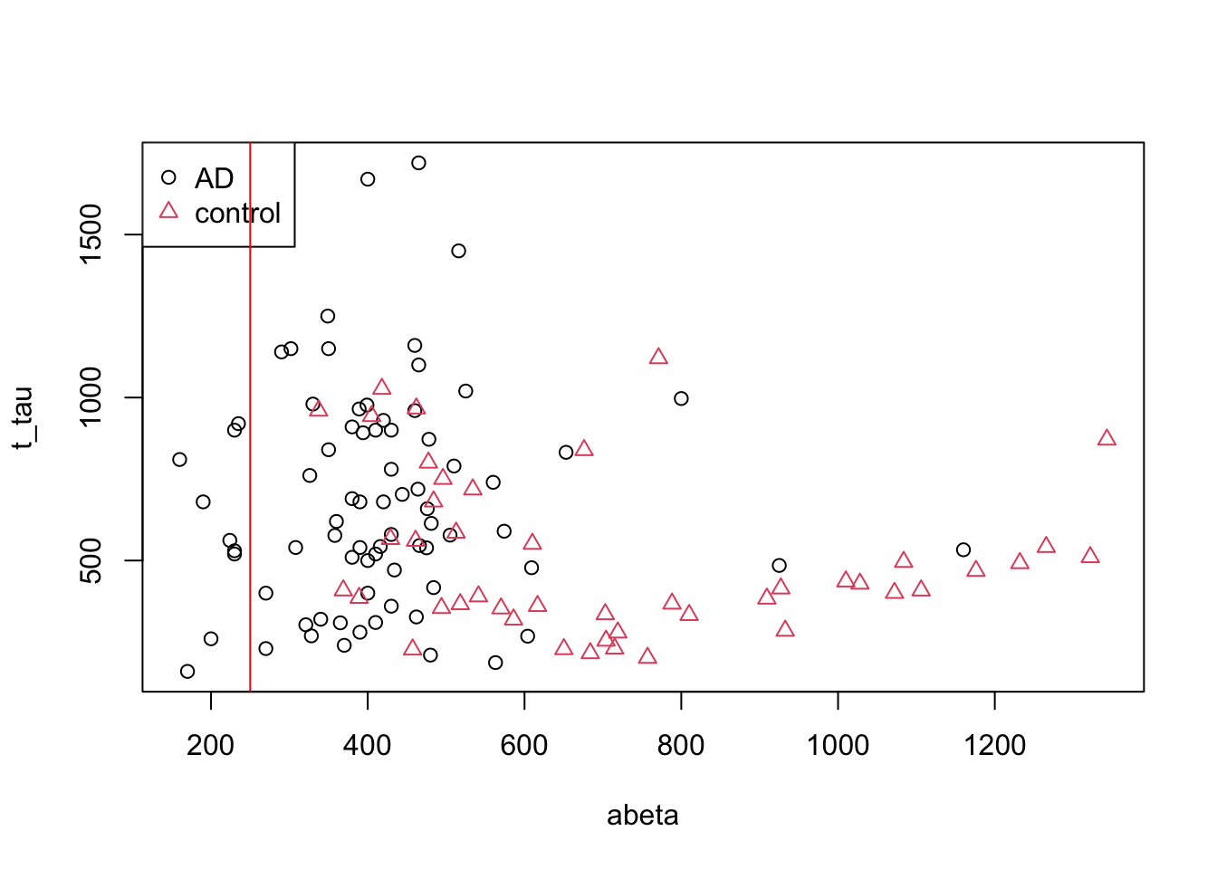
Figure 3.3: The example of two variables measured on a number of samples. Cut on abeta=250
Well! That is OK we have only AD patients on the left side of the red line but on the right side we have a huge mix of AD and controls. Maybe we could do a bit better. Let’s put the line a bit further.
# Select variable
variableIndex<-"abeta"
variableIndex2<-"t_tau"
# plot the data for both of the variables
plot(limited_data[,variableIndex],limited_data[,variableIndex2],xlab =variableIndex,ylab = variableIndex2,
    col=as.factor(limited_data$group),pch=as.numeric(as.factor(limited_data$group)))
legend("topleft",legend = levels(as.factor(limited_data$group)),
       col=as.factor(levels(as.factor(limited_data$group))),pch=as.factor(levels(as.factor(limited_data$group))))
abline(v=610,col="red",lwd=3)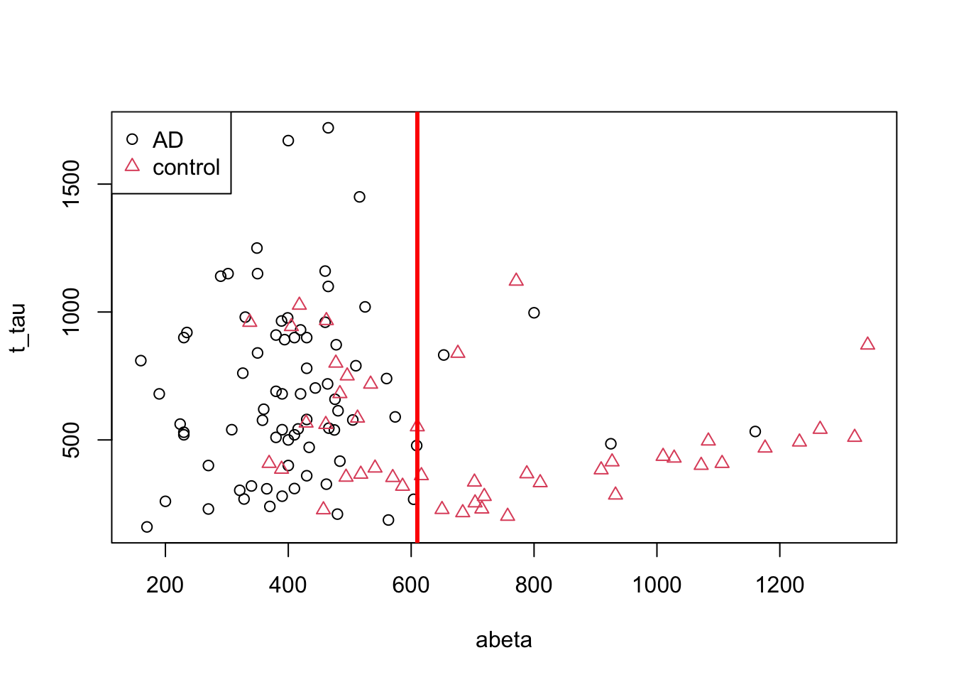
Figure 3.4: The example of two variables measured on a number of samples. Cut on abeta=610
That is much better. Let’s try to separate the data on the left and right sides of the line into two plots.
# Select variable
variableIndex<-"abeta"
variableIndex2<-"t_tau"
# plot the data for both of the variables

library(grid)      ## <-- My addition
library(gridBase)  ## <-- My addition
layout(matrix(c(0,1,0,2,0,3), 2, 3, byrow = TRUE))
plot(limited_data[,variableIndex],limited_data[,variableIndex2],xlab =variableIndex,ylab = variableIndex2,
    col=as.factor(limited_data$group),pch=as.numeric(as.factor(limited_data$group)))
usr1 <- par("usr")
vps1 <- do.call(vpStack, baseViewports())
abline(v=610,col="red",lwd=3)
plot(limited_data[limited_data$abeta<610,variableIndex],limited_data[limited_data$abeta<610,variableIndex2],xlab =variableIndex,ylab = variableIndex2,
    col=as.factor(limited_data[limited_data$abeta<610,]$group),pch=as.numeric(as.factor(limited_data[limited_data$abeta<610,]$group)),main="abeta<610")
usr2 <- par("usr")
vps2 <- do.call(vpStack, baseViewports())

plot(limited_data[limited_data$abeta>=610,variableIndex],limited_data[limited_data$abeta>=610,variableIndex2],xlab =variableIndex,ylab = variableIndex2,
    col=as.factor(limited_data[limited_data$abeta>=610,]$group),pch=as.numeric(as.factor(limited_data[limited_data$abeta>=610,]$group)),main="abeta>=610")

vps3 <- do.call(vpStack, baseViewports())

grid.move.to(x = unit(0.5, "npc"), y = -0.4, vp = vps1)
grid.line.to(x = unit(0.5, "npc"), y = unit(1, "npc"), vp = vps3,
             gp = gpar(col = "red"))


grid.move.to(x = unit(0.5, "npc"), y = -0.4, vp = vps1)
grid.line.to(x = unit(0.5, "npc"), y = unit(1, "npc"), vp = vps2,
             gp = gpar(col = "red"))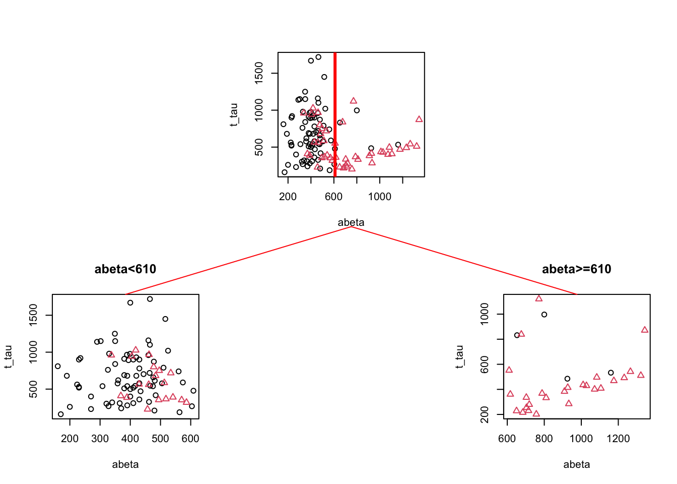
Figure 3.5: The example of two variables measured on a number of samples. Cut on abeta=610. The top plot shows all the data. The left figure shows the data points where abeta is <610 and the right plot shows the data points with abeta >=610
We can see in Figure 3.5 that both plots are a bit “cleaner” than the original plot with respect to the group distribution. This is probably a bit more clear if we look at the distribution of different groups.
# Select variable
variableIndex<-"abeta"
variableIndex2<-"t_tau"
# plot the data for both of the variables

library(grid)      ## <-- My addition
library(gridBase)  ## <-- My addition
layout(matrix(c(0,1,0,2,0,3), 2, 3, byrow = TRUE))
barplot(prop.table(table(limited_data$group)),ylim = c(0,1))
usr1 <- par("usr")
vps1 <- do.call(vpStack, baseViewports())

barplot(prop.table(table(limited_data[limited_data$abeta<610,]$group)),main="abeta<610",ylim = c(0,1))

usr2 <- par("usr")
vps2 <- do.call(vpStack, baseViewports())

barplot(prop.table(table(limited_data[limited_data$abeta>=610,]$group)),main="abeta<610",ylim = c(0,1))

vps3 <- do.call(vpStack, baseViewports())

grid.move.to(x = unit(0.5, "npc"), y = -0.1, vp = vps1)
grid.line.to(x = unit(0.5, "npc"), y = unit(1, "npc"), vp = vps3,
             gp = gpar(col = "red"))


grid.move.to(x = unit(0.5, "npc"), y = -0.1, vp = vps1)
grid.line.to(x = unit(0.5, "npc"), y = unit(1, "npc"), vp = vps2,
             gp = gpar(col = "red"))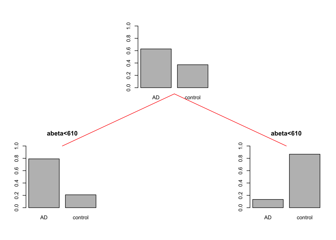
Figure 3.6: The example of two variables measured on a number of samples. Cut on abeta=610. The top plot shows all the data. The left figure shows the data points where abeta is <610 and the right plot shows the data points with abeta >=610
So we can conclude that the data is a bit cleaner or purer with respect to the group distribution. That is great. What we can do now? We can either say, that is good enough! Or we can continue with each of the segments. Let’s continue and do one more round of segmentation. We start with the data points where \(A\beta<610\).
par(mfrow=c(1,1))

plot(limited_data[limited_data$abeta<610,variableIndex],limited_data[limited_data$abeta<610,variableIndex2],xlab =variableIndex,ylab = variableIndex2,
    col=as.factor(limited_data[limited_data$abeta<610,]$group),pch=as.numeric(as.factor(limited_data[limited_data$abeta<610,]$group)),main="abeta<610")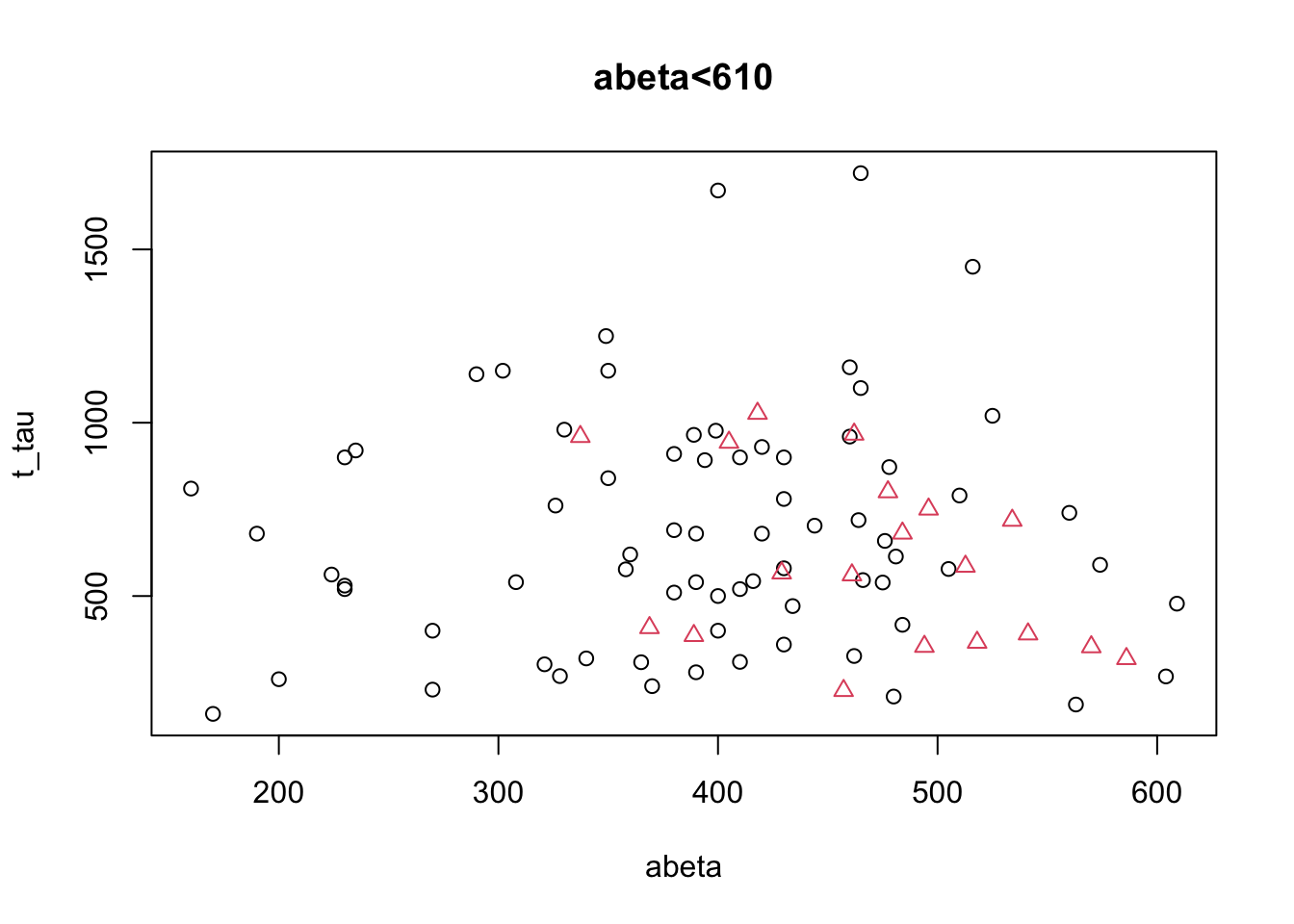
Figure 3.7: The example of two variables measured on a number of samples. Cut on abeta<610.
That does not look so easy. Let’s instead look at the distribution of each of the variables alone and decide
par(mfrow=c(1,2))

d <- density(limited_data[limited_data$abeta<610 & limited_data$group=="control",variableIndex])
d2<-density(limited_data[limited_data$abeta<610 & limited_data$group=="AD",variableIndex])
plot(d, main="Kernel Density of abeta",xlab="abeta")
lines(d2)
polygon(d, col=rgb(0,0,1,0.5))
polygon(d2, col=rgb(1,0,0,0.5))
legend("topleft",legend = c("AD","Control"),fill = c(rgb(1,0,0,0.5),rgb(0,0,1,0.5)))
abline(v=480,col="green",lwd=3)

d <- density(limited_data[limited_data$abeta<610 & limited_data$group=="control",variableIndex2])
d2<-density(limited_data[limited_data$abeta<610 & limited_data$group=="AD",variableIndex2])
plot(d, main="Kernel Density of t tau",xlab="t-tau")
lines(d2)
polygon(d, col=rgb(0,0,1,0.5))
polygon(d2, col=rgb(1,0,0,0.5))
legend("topleft",legend = c("AD","Control"),fill = c(rgb(1,0,0,0.5),rgb(0,0,1,0.5)))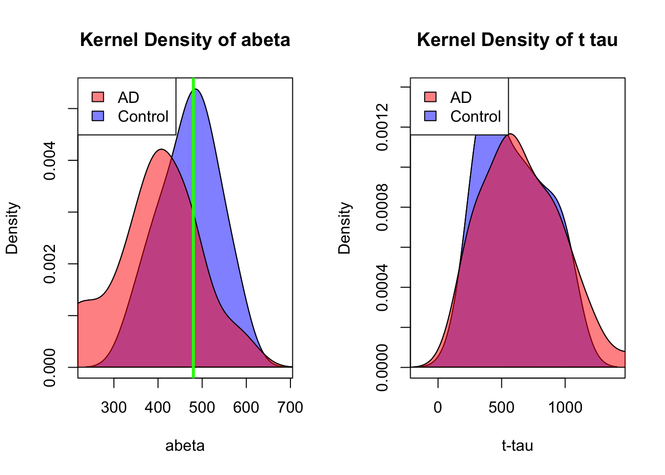
Figure 3.8: Distribution of abeta and t tau for data points with abeta<610.
honestly, it’s difficult to separate AD from control in t-tau but we might have a shot in \(A\beta\). Somewhere around 480 close to the peak of control (the green line) might give us a reasonable segment. This will separate our data like this:
par(mfrow=c(1,1))

plot(limited_data[limited_data$abeta<610,variableIndex],limited_data[limited_data$abeta<610,variableIndex2],xlab =variableIndex,ylab = variableIndex2,
    col=as.factor(limited_data[limited_data$abeta<610,]$group),pch=as.numeric(as.factor(limited_data[limited_data$abeta<610,]$group)),main="abeta<610")
abline(v=480,col="green",lwd=3)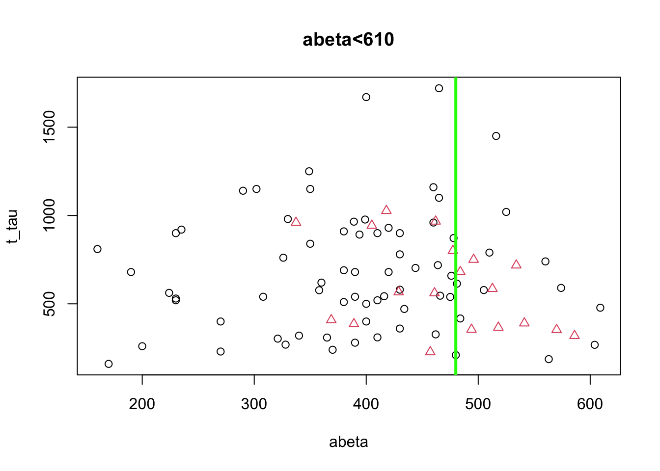
Figure 3.9: The example of two variables measured on a number of samples. Cut on abeta<480.
Now let’s look at the previous segments together and see where we are:
# Select variable
variableIndex<-"abeta"
variableIndex2<-"t_tau"
# plot the data for both of the variables

library(grid)      ## <-- My addition
library(gridBase)  ## <-- My addition

layout(matrix(c(0,0,0,1,0,0,0,
                0,2,0,0,0,3,0,
                4,0,5,0,6,0,7), 3, 7, byrow = TRUE))

limited_data2<-limited_data[limited_data$abeta<610,]
plot(limited_data[,variableIndex],limited_data[,variableIndex2],xlab =variableIndex,ylab = variableIndex2,
    col=as.factor(limited_data$group),pch=as.numeric(as.factor(limited_data$group)))
usr1 <- par("usr")
vps1 <- do.call(vpStack, baseViewports())
abline(v=610,col="red",lwd=3)
plot(limited_data[limited_data$abeta<610,variableIndex],limited_data[limited_data$abeta<610,variableIndex2],xlab =variableIndex,ylab = variableIndex2,
    col=as.factor(limited_data[limited_data$abeta<610,]$group),pch=as.numeric(as.factor(limited_data[limited_data$abeta<610,]$group)),main="abeta<610")
usr2 <- par("usr")
vps2 <- do.call(vpStack, baseViewports())
abline(v=480,col="green",lwd=3)
plot(limited_data[limited_data$abeta>=610,variableIndex],limited_data[limited_data$abeta>=610,variableIndex2],xlab =variableIndex,ylab = variableIndex2,
    col=as.factor(limited_data[limited_data$abeta>=610,]$group),pch=as.numeric(as.factor(limited_data[limited_data$abeta>=610,]$group)),main="abeta>=610")

vps3 <- do.call(vpStack, baseViewports())


plot(limited_data2[limited_data2$abeta<480,variableIndex],limited_data2[limited_data2$abeta<480,variableIndex2],xlab =variableIndex,ylab = variableIndex2,
    col=as.factor(limited_data2[limited_data2$abeta<480,]$group),pch=as.numeric(as.factor(limited_data2[limited_data2$abeta<480,]$group)),main="abeta<480")

vps4 <- do.call(vpStack, baseViewports())


plot(limited_data2[limited_data2$abeta>=480,variableIndex],limited_data2[limited_data2$abeta>=480,variableIndex2],xlab =variableIndex,ylab = variableIndex2,
    col=as.factor(limited_data2[limited_data2$abeta>=480,]$group),pch=as.numeric(as.factor(limited_data2[limited_data2$abeta>=480,]$group)),main="abeta>=480")

vps5 <- do.call(vpStack, baseViewports())


grid.move.to(x = unit(0.5, "npc"), y = -0.4, vp = vps1)
grid.line.to(x = unit(0.5, "npc"), y = unit(1, "npc"), vp = vps3,
             gp = gpar(col = "red"))


grid.move.to(x = unit(0.5, "npc"), y = -0.4, vp = vps1)
grid.line.to(x = unit(0.5, "npc"), y = unit(1, "npc"), vp = vps2,
             gp = gpar(col = "red"))


grid.move.to(x = unit(0.5, "npc"), y = -0.4, vp = vps2)
grid.line.to(x = unit(0.5, "npc"), y = unit(1, "npc"), vp = vps4,
             gp = gpar(col = "red"))

grid.move.to(x = unit(0.5, "npc"), y = -0.4, vp = vps2)
grid.line.to(x = unit(0.5, "npc"), y = unit(1, "npc"), vp = vps5,
             gp = gpar(col = "red"))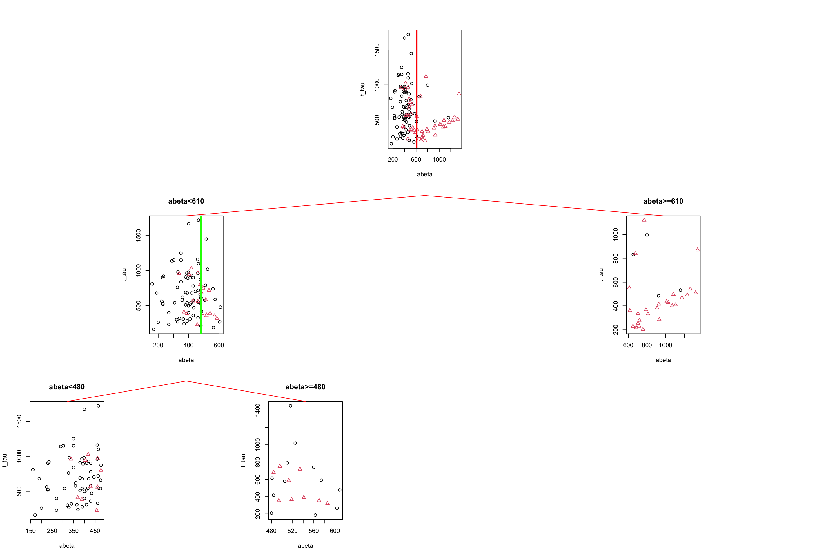
Figure 3.10: The example of two variables measured on a number of samples. Cut on abeta=610 and abeta=480.
If we read Figure 3.10 from top to bottom, we first started with all the data, we then segment the data based on abeta=610, giving us two segments of the original data. We then took the left segment (abeta<610) and did another round of segmentation giving us two more subgroups of the data.
We can now continue with the right subgroup (abeta>=610) similar to the left subgroup. This subgroup looks quite clean already but we can probably make it slightly better but putting a cutoff on t-tau. This time we place our segmentation line on 475.
par(mfrow=c(1,1))

plot(limited_data[limited_data$abeta>=610,variableIndex],limited_data[limited_data$abeta>=610,variableIndex2],xlab =variableIndex,ylab = variableIndex2,
    col=as.factor(limited_data[limited_data$abeta>=610,]$group),pch=as.numeric(as.factor(limited_data[limited_data$abeta>=610,]$group)),main="abeta<610")
abline(h=475,col="blue",lwd=2)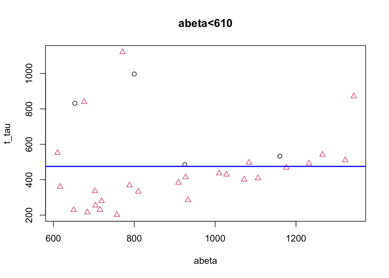
Figure 3.11: The example of two variables measured on a number of samples. Cut on abeta=610.
# Select variable
variableIndex<-"abeta"
variableIndex2<-"t_tau"
# plot the data for both of the variables

library(grid)      ## <-- My addition
library(gridBase)  ## <-- My addition

layout(matrix(c(0,0,0,1,0,0,0,
                0,2,0,0,0,3,0,
                4,0,5,0,6,0,7), 3, 7, byrow = TRUE))

limited_data2<-limited_data[limited_data$abeta<610,]
limited_data3<-limited_data[limited_data$abeta>=610,]
plot(limited_data[,variableIndex],limited_data[,variableIndex2],xlab =variableIndex,ylab = variableIndex2,
    col=as.factor(limited_data$group),pch=as.numeric(as.factor(limited_data$group)))
usr1 <- par("usr")
vps1 <- do.call(vpStack, baseViewports())
abline(v=610,col="red",lwd=3)
plot(limited_data[limited_data$abeta<610,variableIndex],limited_data[limited_data$abeta<610,variableIndex2],xlab =variableIndex,ylab = variableIndex2,
    col=as.factor(limited_data[limited_data$abeta<610,]$group),pch=as.numeric(as.factor(limited_data[limited_data$abeta<610,]$group)),main="abeta<610")
usr2 <- par("usr")
vps2 <- do.call(vpStack, baseViewports())
abline(v=480,col="green",lwd=3)
plot(limited_data[limited_data$abeta>=610,variableIndex],limited_data[limited_data$abeta>=610,variableIndex2],xlab =variableIndex,ylab = variableIndex2,
    col=as.factor(limited_data[limited_data$abeta>=610,]$group),pch=as.numeric(as.factor(limited_data[limited_data$abeta>=610,]$group)),main="abeta>=610")

vps3 <- do.call(vpStack, baseViewports())
abline(h=475,col="blue",lwd=3)


plot(limited_data2[limited_data2$abeta<480,variableIndex],limited_data2[limited_data2$abeta<480,variableIndex2],xlab =variableIndex,ylab = variableIndex2,
    col=as.factor(limited_data2[limited_data2$abeta<480,]$group),pch=as.numeric(as.factor(limited_data2[limited_data2$abeta<480,]$group)),main="abeta<480")

vps4 <- do.call(vpStack, baseViewports())


plot(limited_data2[limited_data2$abeta>=480,variableIndex],limited_data2[limited_data2$abeta>=480,variableIndex2],xlab =variableIndex,ylab = variableIndex2,
    col=as.factor(limited_data2[limited_data2$abeta>=480,]$group),pch=as.numeric(as.factor(limited_data2[limited_data2$abeta>=480,]$group)),main="abeta>=480")

vps5 <- do.call(vpStack, baseViewports())


plot(limited_data3[limited_data3$t_tau<475,variableIndex],limited_data3[limited_data3$t_tau<475,variableIndex2],xlab =variableIndex,ylab = variableIndex2,
    col=2,pch=2,main="t-tau<480")

vps6 <- do.call(vpStack, baseViewports())


plot(limited_data3[limited_data3$t_tau>=475,variableIndex],limited_data3[limited_data3$t_tau>=475,variableIndex2],xlab =variableIndex,ylab = variableIndex2,
    col=as.factor(limited_data3[limited_data3$t_tau>=475,]$group),pch=as.numeric(as.factor(limited_data3[limited_data3$t_tau>=475,]$group)),main="t-tau>=480")

vps7 <- do.call(vpStack, baseViewports())


grid.move.to(x = unit(0.5, "npc"), y = -0.4, vp = vps1)
grid.line.to(x = unit(0.5, "npc"), y = unit(1, "npc"), vp = vps3,
             gp = gpar(col = "red"))


grid.move.to(x = unit(0.5, "npc"), y = -0.4, vp = vps1)
grid.line.to(x = unit(0.5, "npc"), y = unit(1, "npc"), vp = vps2,
             gp = gpar(col = "red"))


grid.move.to(x = unit(0.5, "npc"), y = -0.4, vp = vps2)
grid.line.to(x = unit(0.5, "npc"), y = unit(1, "npc"), vp = vps4,
             gp = gpar(col = "red"))

grid.move.to(x = unit(0.5, "npc"), y = -0.4, vp = vps2)
grid.line.to(x = unit(0.5, "npc"), y = unit(1, "npc"), vp = vps5,
             gp = gpar(col = "red"))

grid.move.to(x = unit(0.5, "npc"), y = -0.4, vp = vps3)
grid.line.to(x = unit(0.5, "npc"), y = unit(1, "npc"), vp = vps6,
             gp = gpar(col = "red"))

grid.move.to(x = unit(0.5, "npc"), y = -0.4, vp = vps3)
grid.line.to(x = unit(0.5, "npc"), y = unit(1, "npc"), vp = vps7,
             gp = gpar(col = "red"))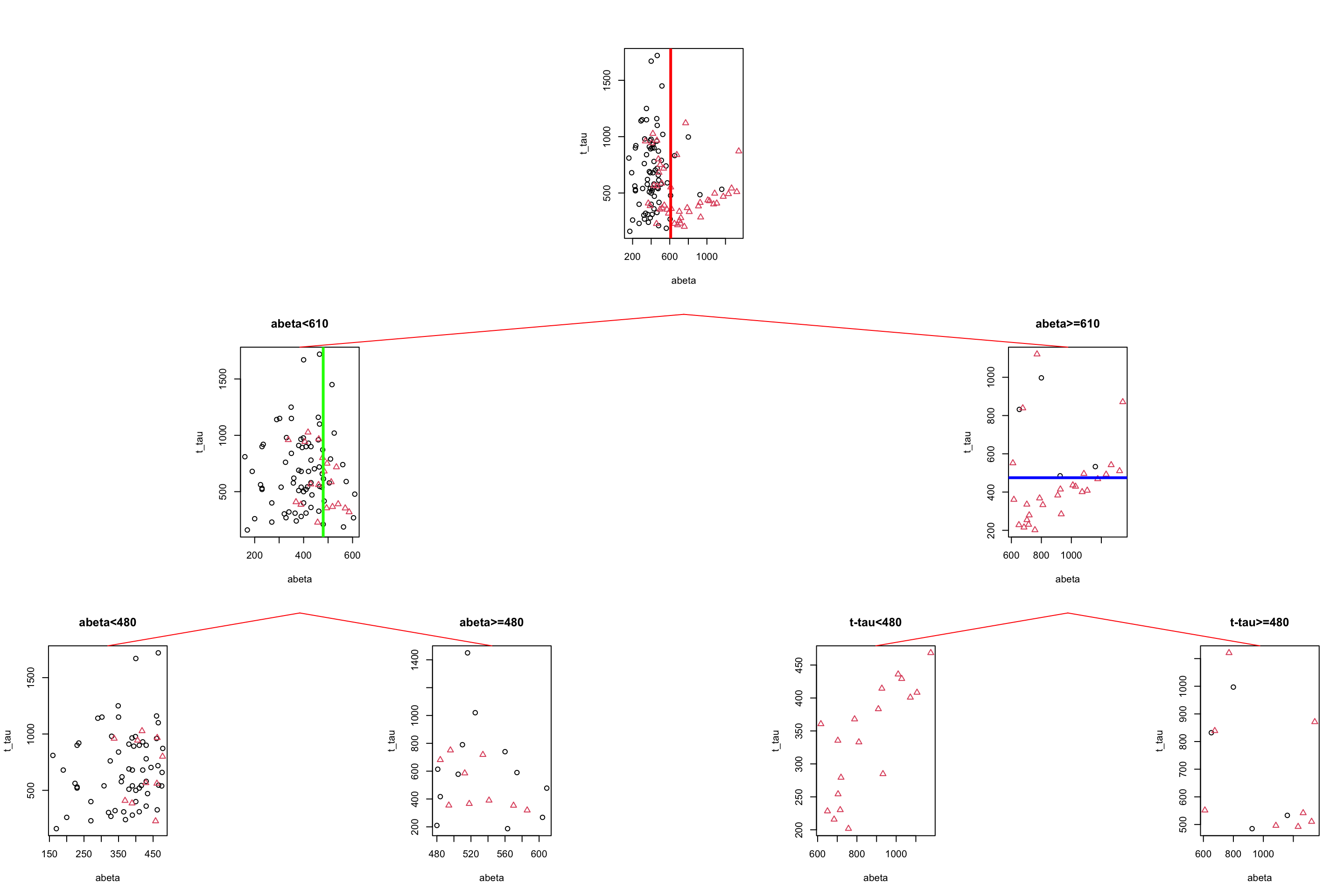
Figure 3.12: The example of two variables measured on a number of samples. Cut on abeta=610 and abeta=480.
We choose to stop now. We have a tree with four leaves (plots at the bottom) but how do we do prediction? We first have a look at the group distribution in the leaves of the tree. The first two leaves on the left have AD as the most common group so any new samples that can reach these leaves can be classified as AD. Similarly, any new sample that reaches the two right leaves can be classified as control.
# Select variable
variableIndex<-"abeta"
variableIndex2<-"t_tau"
# plot the data for both of the variables

library(grid)      ## <-- My addition
library(gridBase)  ## <-- My addition

layout(matrix(c(0,0,0,1,0,0,0,
                0,2,0,0,0,3,0,
                4,0,5,0,6,0,7), 3, 7, byrow = TRUE))

limited_data2<-limited_data[limited_data$abeta<610,]
limited_data3<-limited_data[limited_data$abeta>=610,]

barplot(prop.table(table(limited_data$group)),ylim = c(0,1))

usr1 <- par("usr")
vps1 <- do.call(vpStack, baseViewports())
barplot(prop.table(table(limited_data[limited_data$abeta<610,]$group)),ylim = c(0,1),main="abeta<610")
usr2 <- par("usr")
vps2 <- do.call(vpStack, baseViewports())


barplot(prop.table(table(limited_data[limited_data$abeta>=610,]$group)),ylim = c(0,1),main="abeta>=610")
vps3 <- do.call(vpStack, baseViewports())


barplot(prop.table(table(limited_data2[limited_data2$abeta<480,]$group)),ylim = c(0,1),main="abeta<480")

vps4 <- do.call(vpStack, baseViewports())

barplot(prop.table(table(limited_data2[limited_data2$abeta>=480,]$group)),ylim = c(0,1),main="abeta>=480")
vps5 <- do.call(vpStack, baseViewports())


barplot(prop.table(table(limited_data3[limited_data3$t_tau<475,]$group)),ylim = c(0,1),main="t-tau<480")

vps6 <- do.call(vpStack, baseViewports())


barplot(prop.table(table(limited_data3[limited_data3$t_tau>=475,]$group)),ylim = c(0,1),main="t-tau>=480")

vps7 <- do.call(vpStack, baseViewports())


grid.move.to(x = unit(0.5, "npc"), y = -0.4, vp = vps1)
grid.line.to(x = unit(0.5, "npc"), y = unit(1, "npc"), vp = vps3,
             gp = gpar(col = "red"))


grid.move.to(x = unit(0.5, "npc"), y = -0.4, vp = vps1)
grid.line.to(x = unit(0.5, "npc"), y = unit(1, "npc"), vp = vps2,
             gp = gpar(col = "red"))


grid.move.to(x = unit(0.5, "npc"), y = -0.4, vp = vps2)
grid.line.to(x = unit(0.5, "npc"), y = unit(1, "npc"), vp = vps4,
             gp = gpar(col = "red"))

grid.move.to(x = unit(0.5, "npc"), y = -0.4, vp = vps2)
grid.line.to(x = unit(0.5, "npc"), y = unit(1, "npc"), vp = vps5,
             gp = gpar(col = "red"))

grid.move.to(x = unit(0.5, "npc"), y = -0.4, vp = vps3)
grid.line.to(x = unit(0.5, "npc"), y = unit(1, "npc"), vp = vps6,
             gp = gpar(col = "red"))

grid.move.to(x = unit(0.5, "npc"), y = -0.4, vp = vps3)
grid.line.to(x = unit(0.5, "npc"), y = unit(1, "npc"), vp = vps7,
             gp = gpar(col = "red"))

grid.text("AD",x = unit(0.5, "npc"),y=unit(-0.25, "npc"),vp=vps4,gp = gpar(col="red"))
grid.text("AD",x = unit(0.5, "npc"),y=unit(-0.25, "npc"),vp=vps5,gp = gpar(col="red"))
grid.text("Control",x = unit(0.5, "npc"),y=unit(-0.25, "npc"),vp=vps6,gp = gpar(col="red"))
grid.text("Control",x = unit(0.5, "npc"),y=unit(-0.25, "npc"),vp=vps7,gp = gpar(col="red"))
Figure 3.13: The example of two variables measured on a number of samples. Cut on abeta=610 and abeta=480.
To do the classification, we just need to follow the rules we have derived in the previous steps. At the very beginning (the root of the tree), we used \(A\beta=610\), on the left-hand side we used \(A\beta=480\) and on the right-hand side, we used \(t-tau=475\). So for a new sample, we first test where its \(A\beta\) is lower than 610, if yes, it goes to the left of the tree otherwise it will go to the right side. If for example, it goes to the left side, we again test \(A\beta\) and send the sample to the suitable leaf. The label of the leaf will show the classification of this new sample. The decision rules are shown in figure 3.14.
limited_data2<-limited_data
limited_data2$group<-factor(limited_data2$group)
tt<-tree::tree(group~abeta+t_tau,data=limited_data2,split="gini",mincut=12)

tt$frame[1,5][1]<-"<610"
tt$frame[2,5][1]<-"<480"
tt$frame[11,5][1]<-"<475"

tt$frame[3,1]<-"<leaf>"
tt$frame[3,5]<-tt$frame[4,5]

tt$frame<-tt$frame[-c(5:10),]
rownames(tt$frame)[4]<-"5"
plot(tt)
text(tt,pretty=1)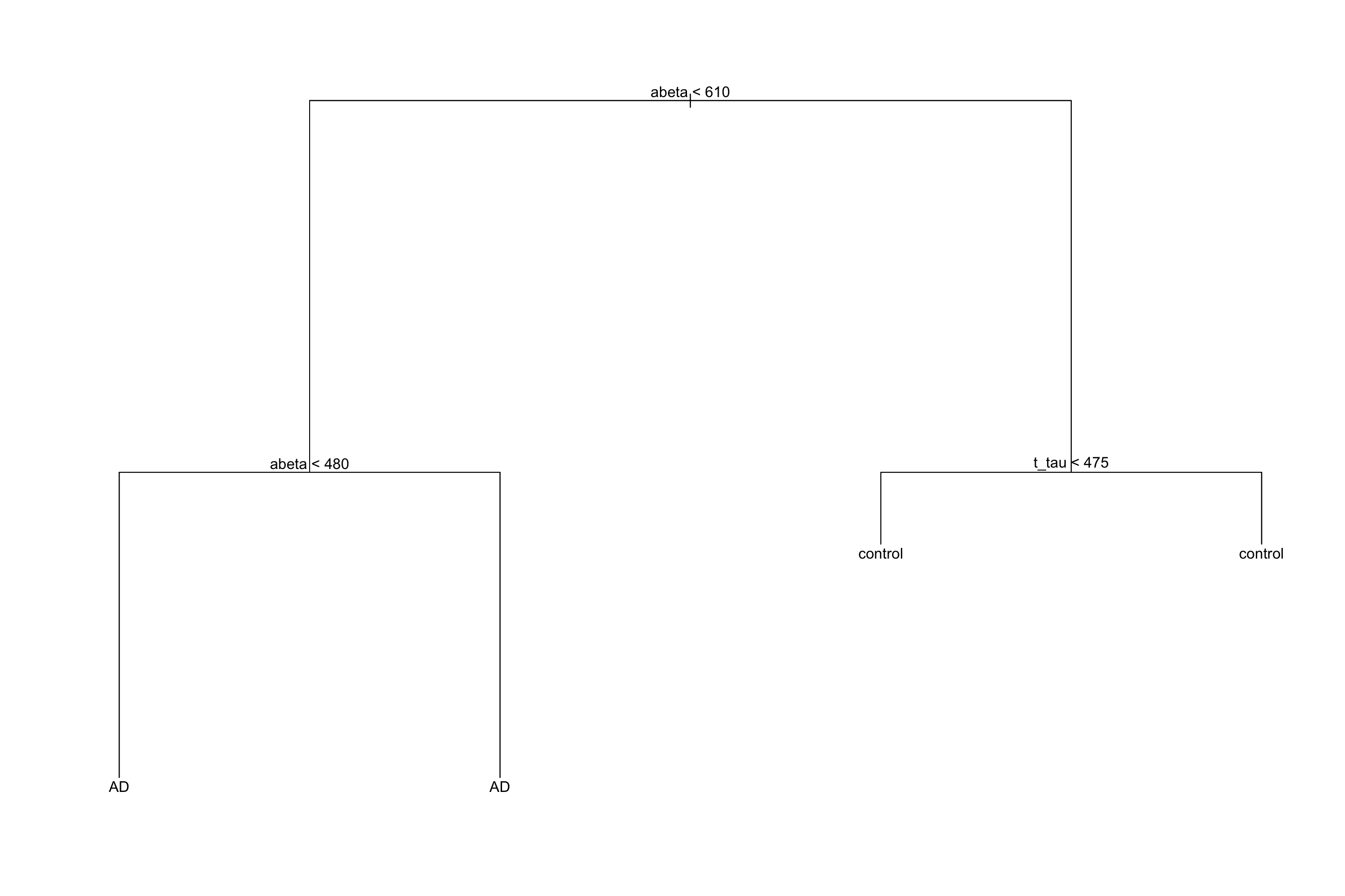
Figure 3.14: The example of rules derived for the tree
In the beginning, we said that decision trees segments our data. We can have a look at our toy example and see how this segmentation has been done:
par(mfrow=c(1,1))
plot(limited_data[,variableIndex],limited_data[,variableIndex2],xlab =variableIndex,ylab = variableIndex2,
    col=as.factor(limited_data$group),pch=as.numeric(as.factor(limited_data$group)))
abline(v=610,col="red",lwd=3)
abline(v=480,col="green",lwd=3)
lines(x=c(610,10000),y=c(475,610),col="blue",lwd=3)
legend("topleft",legend = levels(as.factor(limited_data$group)),
       col=as.factor(levels(as.factor(limited_data$group))),
       pch=as.factor(levels(as.factor(limited_data$group))))

text(300,1000,"AD",font=4)
text(550,1000,"AD",font=4)
text(1000,1000,"Control",font=4)
text(1000,300,"Control",font=4)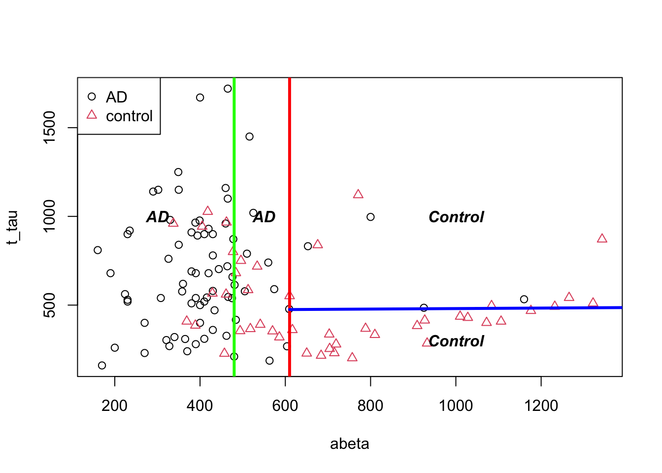
Figure 3.15: The example of two variables measured on a number of samples. Cut on abeta=610 and abeta=480.
3.2 Classification
Now that we could build a tree by hand, let’s try to formally define how we can automatically do that. I guess you have noticed that, for a small number of samples and two classes, it’s relatively simple to derive segmentation rules. But look at the figure below, it’s certainly a big task to find a line to best separate the groups.
par(mfrow=c(1,1))
# Select variable
variableIndex<-"abeta"
variableIndex2<-"t_tau"
# plot the data for both of the variables
plot(data[,variableIndex],data[,variableIndex2],xlab =variableIndex,ylab = variableIndex2,
    col=as.factor(data$group),pch=as.numeric(as.factor(data$group)))
legend("topleft",legend = levels(as.factor(data$group)),
       col=as.factor(levels(as.factor(data$group))),
       pch=as.factor(levels(as.factor(data$group))))
Figure 3.16: The example of two variables measured on a number of samples. All the groups are shown!
There are many measures that can be used to derive the rules. Two of the most used ones are Gini impurity and information gain.
3.2.1 Gini index, Gini impurity and Gini gain
Let’s one more time have a look at our limited dataset (only two groups) but with respect to two tree variables.
# Select variable
variableIndex<-"abeta"
variableIndex2<-"t_tau"
variableIndex2<-"p_tau"
# plot the data for both of the variables
plot(limited_data[,variableIndex],limited_data[,variableIndex2],xlab =variableIndex,ylab = variableIndex2,
    col=as.factor(limited_data$group),pch=as.numeric(as.factor(limited_data$group)))
legend("topleft",legend = levels(as.factor(limited_data$group)),
       col=as.factor(levels(as.factor(limited_data$group))),
       pch=as.factor(levels(as.factor(limited_data$group))))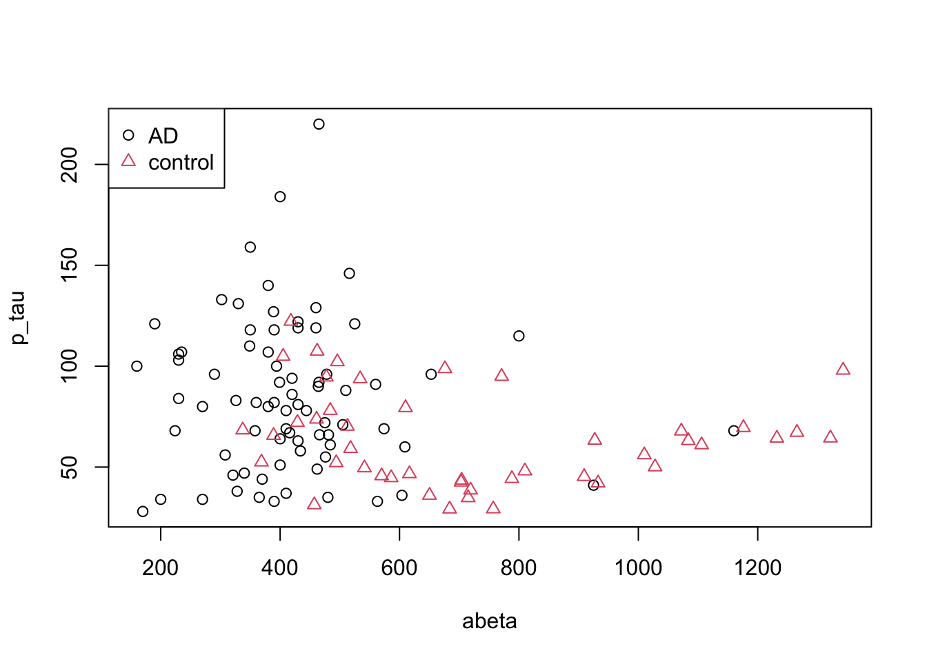
Figure 3.17: The example of two variables measured on a number of samples.
What is the probability of selecting an AD sample just by chance? Well, that is simple, we could just take the number of AD cases and divided by the total number of cases \(p(AD)=\frac{\text{number of AD}}{\text{total number of cases}}=\) 0.63. Gini index ask what is the chance of randomly picking two data points from the same group? Well, if our draws are independent, then it’s simply squared what we have calculated before so \(p(AD)^2\). Now we have two classes, so we have to do this for the control as well: \(p(control)=\frac{\text{number of controls}}{\text{total number of cases}}=\) 0.37. We can now combine these two just by summing them up, giving us the probability of selecting two random samples with the same group: \(p=p(AD)^2+p(control)^2\). What is the probability of selecting two points with different groups? That is simply \(1-(p(AD)^2+p(control)^2)\). This is Gini impurity. It just tells the probability of classifying a random point incorrectly. We can extend this to any number of classes using:
\[\text{Gini impurity}=1-\sum_{i}^{C}{p(i)^2}\] Where \(i\) is a group or a class of observation. But how we are going to use this in decision trees? We first calculate Gini impurity for the whole dataset: In our case, Gini impurity is 0.4671812.
Now we have to decide which variable to select for segmenting our data and where to cut that variable. In this stage, we will go through all variables and all different cut points and calculate the total impurity of the resulting segments. For example, let’s take our previous example:
# Select variable
variableIndex<-"abeta"
variableIndex2<-"t_tau"
# plot the data for both of the variables

library(grid)      ## <-- My addition
library(gridBase)  ## <-- My addition
layout(matrix(c(0,1,0,2,0,3), 2, 3, byrow = TRUE))
plot(limited_data[,variableIndex],limited_data[,variableIndex2],xlab =variableIndex,ylab = variableIndex2,
    col=as.factor(limited_data$group),pch=as.numeric(as.factor(limited_data$group)))
usr1 <- par("usr")
vps1 <- do.call(vpStack, baseViewports())
abline(v=610,col="red",lwd=3)
plot(limited_data[limited_data$abeta<610,variableIndex],limited_data[limited_data$abeta<610,variableIndex2],xlab =variableIndex,ylab = variableIndex2,
    col=as.factor(limited_data[limited_data$abeta<610,]$group),pch=as.numeric(as.factor(limited_data[limited_data$abeta<610,]$group)),main="abeta<610",sub=paste("Gini impurity =",round(mltools::gini_impurity(limited_data[limited_data$abeta<610,]$group),2)))
usr2 <- par("usr")
vps2 <- do.call(vpStack, baseViewports())

plot(limited_data[limited_data$abeta>=610,variableIndex],limited_data[limited_data$abeta>=610,variableIndex2],xlab =variableIndex,ylab = variableIndex2,
    col=as.factor(limited_data[limited_data$abeta>=610,]$group),pch=as.numeric(as.factor(limited_data[limited_data$abeta>=610,]$group)),main="abeta>=610",sub=paste("Gini impurity=",round(mltools::gini_impurity(limited_data[limited_data$abeta>=610,]$group),2)))

vps3 <- do.call(vpStack, baseViewports())

grid.move.to(x = unit(0.5, "npc"), y = -0.4, vp = vps1)
grid.line.to(x = unit(0.5, "npc"), y = unit(1, "npc"), vp = vps3,
             gp = gpar(col = "red"))


grid.move.to(x = unit(0.5, "npc"), y = -0.4, vp = vps1)
grid.line.to(x = unit(0.5, "npc"), y = unit(1, "npc"), vp = vps2,
             gp = gpar(col = "red"))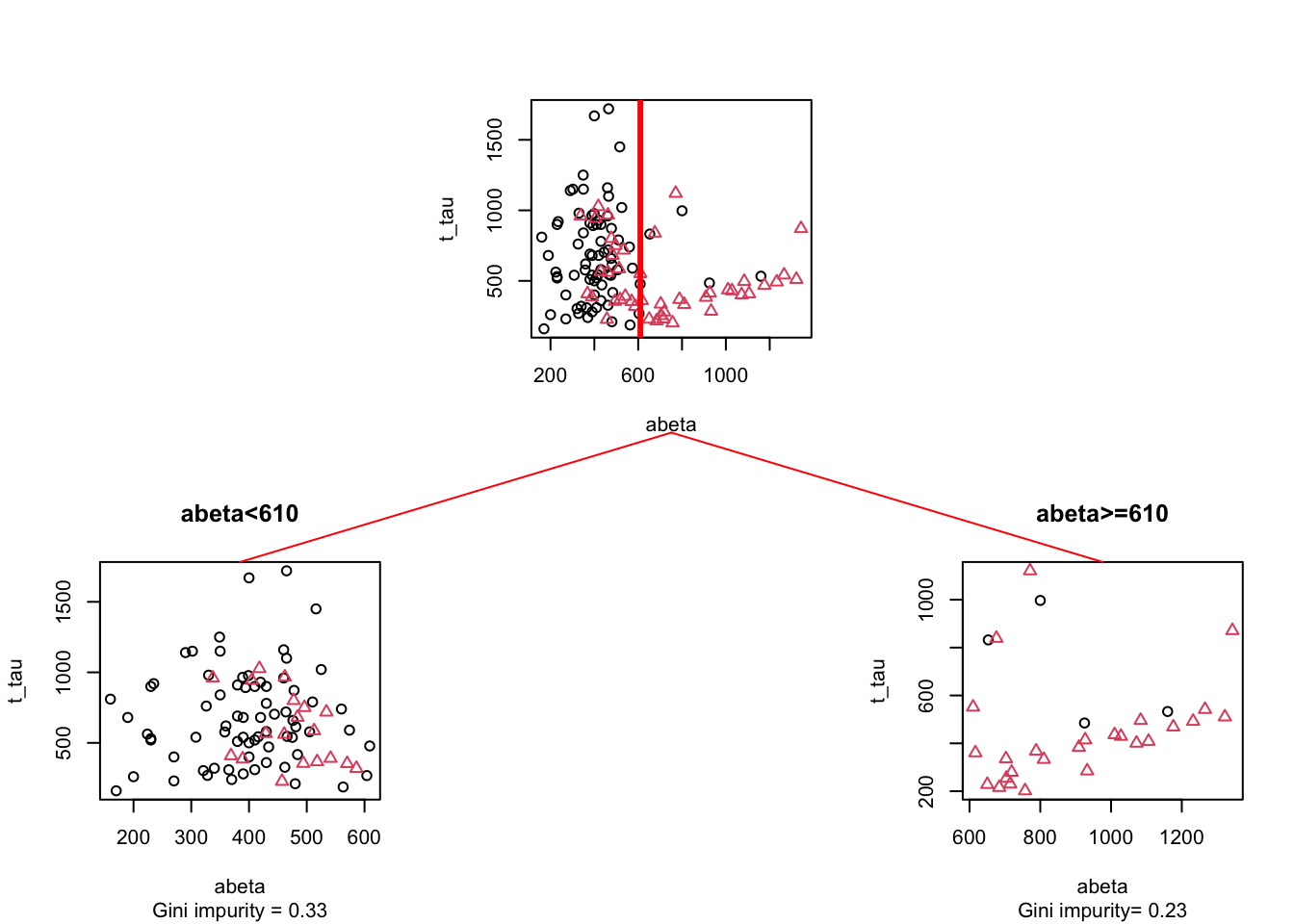
Figure 3.18: The example of two variables measured on a number of samples. Cut on abeta=610. The top plot shows all the data. The left figure shows the data points where abeta is <610 and the right plot shows the data points with abeta >=610
Here we split the data at \(A\beta=610\) giving us two segments (left and right). Let’s start with the left one and calculate its Gini impurity(\(GI_\text{left}=\) 0.33) and do the similar thing with the plot on the right (\(GI_\text{right}=\) 0.33). Now we simply weight these two numbers by the fraction of the total data in each of the segments. The left plot has 91 data points so the fraction becomes \(w_\text{left}=\) 91/121= 0.75 and the right plot has 30 points so the fraction becomes \(w_\text{righ}=\) 30/121= 0.25. Our final total Gini impurity is calculated as \(GI_\text{left}*w_\text{left}+GI_\text{right}*w_\text{right}=\) 0.3306818
Now we have the impurity of the segmentation. The question is how much of impurity we have removed from the original data? We can simply subtract Our original Gini impurity by \(GI_\text{left}*w_\text{left}+GI_\text{right}*w_\text{right}=\) so it will become 0.1614021. This is known as Gini Gain. The higher this value, the better the split would be. Here is a little function that does the Gini gain calculation (click on the code button!).
gini_gain<-function(x,group,cutoff){

  if(is.character(cutoff))
  {
  original_gini<-mltools::gini_impurity(group)
  gini_left<-mltools::gini_impurity(group[which(x%in%cutoff)])
  gini_right<-mltools::gini_impurity(group[which(!x%in%cutoff)])
  weight_left<-length(group[which(x%in%cutoff)])/length(group)
   weight_right<-length(group[which(!x%in%cutoff)])/length(group)

  }else{
  original_gini<-mltools::gini_impurity(group)
  gini_left<-mltools::gini_impurity(group[which(x<cutoff)])
  gini_right<-mltools::gini_impurity(group[which(x>=cutoff)])
  weight_left<-length(group[which(x<cutoff)])/length(group)
   weight_right<-length(group[which(x>=cutoff)])/length(group)
  }
   return(original_gini-(gini_left*weight_left+gini_right*weight_right))
}
3.2.2 Entropy and information gain
Similar to the Gini index, entropy is an information theory metric that measures the impurity of a set of observations with respect to a grouping variable. The way to calculate entropy and information gain is very similar to Gini.
\[\text{Entropy}=1-\sum_{i}^{C}{p(i)log{_2}{p(i)}}\] Where \(i\) can be any classes from a total of \(C\) classes. The rest of the calculations are similar to Gini. We can calculate the information gain of a parent node simply but subtracting the entropy of the child nodes from the entropy of the parent. In practice, both of these methods result in very similar splits but Gini is faster and is often preferred for this reason.
3.3 Regression
A decision tree can also be used where your \(y\) variable is continuous. In this case, you are doing a regression. The good part is that doing regression using decision trees is not that different from doing classification. The only thing we have to change is our measure for determining the split. In classification, we used Gini or entropy but in regression, we use Mean Square Error (MSE) or similar measures.
Let’s have a look at our data again but this time instead of looking at the group (e.g., AD or control) we will have a look at the MMT score.
# Select variable
variableIndex<-"abeta"
variableIndex2<-"t_tau"
# create color gradient
par(mfrow=c(1,2))
grad <- colorRampPalette(c('red','blue'))
colors<-grad(10)[as.numeric(cut(limited_data$mmt,breaks = 10))]
# plot the data for both of the variables
plot(limited_data[,variableIndex],limited_data[,variableIndex2],xlab =variableIndex,ylab = variableIndex2,
    col=colors,pch=15)

legend_image <- as.raster(matrix(grad(10), ncol=1))
plot(c(0,2),c(0,1),type = 'n', axes = F,xlab = '', ylab = '', main = 'MMT score')
text(x=1.5, y = seq(0,1,l=5), labels = seq(max(limited_data$mmt),min(limited_data$mmt),l=5))
rasterImage(legend_image, 0, 0, 1,1)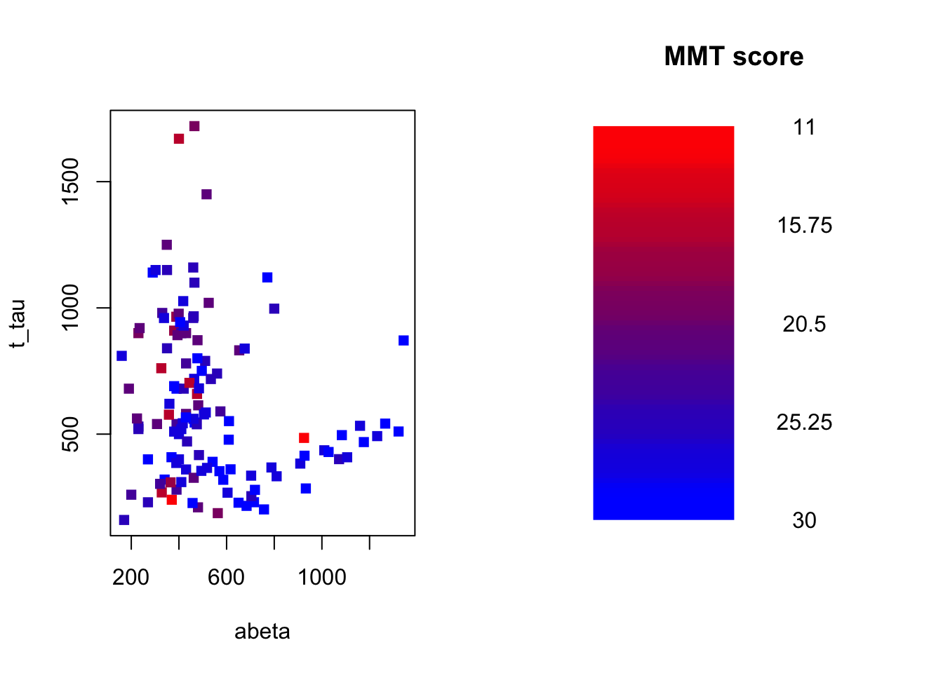
Figure 3.19: The example of two variables measured on a number of samples. The MMT score is shown as a gradient from red (lowest score) to blue (highest score)
Our goal here is to use \(A\beta\) and t-tau to predict MMT scores for individuals. To do that, we first define our measure for where to segment the data. As pointed out before, we use MSE:
\[MSE=\frac{1}{n}\sum_{i=1}^{n}{(y_i-\bar{y_i})^2}\]
This essentially calculates the squared differences between each of our \(y\) and the mean of all the ys (\(\bar{y}\)). For example, if we want to calculate the MSE of our MMT scores for our entire dataset, we can calculate mean our MMSs=25.338843 then we subtract every single of our MMT scores from this mean and square them. Finally, we take the average of this value: 17.5298135
Now how to use MSE to build a decision tree? We start by calculating MSE for our entire dataset like we did before: 17.5298135 We now select a variable, let’s say \(A\beta\) and split it at some value:
# Select variable
variableIndex<-"abeta"
variableIndex2<-"t_tau"
# create color gradient
par(mfrow=c(1,2))
grad <- colorRampPalette(c('red','blue'))
colors<-grad(10)[as.numeric(cut(limited_data$mmt,breaks = 10))]
# plot the data for both of the variables
plot(limited_data[,variableIndex],limited_data[,variableIndex2],xlab =variableIndex,ylab = variableIndex2,
    col=colors,pch=15,main=paste("MSE=",round(mean((limited_data$mmt-mean(limited_data$mmt))^2),2)))
abline(v=650,lwd=3,col="red")
legend_image <- as.raster(matrix(grad(10), ncol=1))
plot(c(0,2),c(0,1),type = 'n', axes = F,xlab = '', ylab = '', main = 'MMT score')
text(x=1.5, y = seq(0,1,l=5), labels = seq(max(limited_data$mmt),min(limited_data$mmt),l=5))
rasterImage(legend_image, 0, 0, 1,1)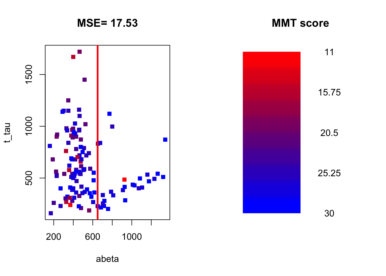
Figure 3.20: The example of two variables measured on a number of samples. The MMT score is shown as a gradient from red (lowest score) to blue (highest score)
We now calculate the MSE of MMT for the left and right parts of the plot.
# Select variable
variableIndex<-"abeta"
variableIndex2<-"t_tau"
# create color gradient
par(mfrow=c(1,2))
grad <- colorRampPalette(c('red','blue'))
colors<-grad(10)[as.numeric(cut(limited_data$mmt,breaks = 10))]
# plot the data for both of the variables
plot(limited_data[,variableIndex],limited_data[,variableIndex2],xlab =variableIndex,ylab = variableIndex2,
    col=colors,pch=15,main=paste("MSE=",round(mean((limited_data$mmt-mean(limited_data$mmt))^2),2)))
abline(v=650,lwd=3,col="red")
text(x=300,y=1500,paste("MSE=",round(mean((limited_data[limited_data$abeta<650,]$mmt-mean(limited_data[limited_data$abeta<650,]$mmt))^2),2)))
text(x=1000,y=1500,paste("MSE=",round(mean((limited_data[limited_data$abeta>=650,]$mmt-mean(limited_data[limited_data$abeta>=650,]$mmt))^2),2)))
legend_image <- as.raster(matrix(grad(10), ncol=1))
plot(c(0,2),c(0,1),type = 'n', axes = F,xlab = '', ylab = '', main = 'MMT score')
text(x=1.5, y = seq(0,1,l=5), labels = seq(max(limited_data$mmt),min(limited_data$mmt),l=5))
rasterImage(legend_image, 0, 0, 1,1)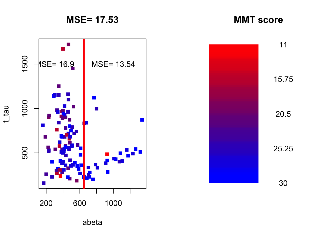
Figure 3.21: The example of two variables measured on a number of samples. The MMT score is shown as a gradient from red (lowest score) to blue (highest score)
(round(mean((limited_data[limited_data$abeta<650,]$mmt-mean(limited_data[limited_data$abeta<650,]$mmt))^2),2)*(sum(limited_data$abeta<650)/length(limited_data$abeta)))+(round(mean((limited_data[limited_data$abeta>=650,]$mmt-mean(limited_data[limited_data$abeta>=650,]$mmt))^2),2)*(sum(limited_data$abeta>=650)/length(limited_data$abeta)))## [1] 16.12248We now weight the two MSEs by the proportion of the number of data points on each side of the split and sum them up (exactly like total Gini): \(MSE_\text{left}*w_\text{left}+MSE_\text{right}*w_\text{right}= 16.9 \times \frac{93}{121} + 13.54 \times \frac{28}{121}=16.12\)
Now we have the MSE of the split. We will go ahead and subtract the MSE for the entire dataset by the MSE of the split: \(MSE_{parent}-MSE_{split}=17.53-16.12=1.41\)
Our aim is every time we want to do a split in the tree, we select a variable and a cut point that maximize variance reduction. The rest of the story is almost exactly like the classification. The only big difference is that when we go to the leaf of the tree and want to do a prediction. We use the average of \(y\) variable in that leaf as the predicted value. For example. Let’s say we build a tree and it looks like this:
# Select variable
variableIndex<-"abeta"
variableIndex2<-"t_tau"
# plot the data for both of the variables

library(grid)      ## <-- My addition
library(gridBase)  ## <-- My addition

layout(matrix(c(0,0,0,1,0,0,0,
                0,2,0,0,0,3,0,
                4,0,5,0,6,0,7), 3, 7, byrow = TRUE))

grad <- colorRampPalette(c('red','blue'))
colors<-grad(10)[as.numeric(cut(limited_data$mmt,breaks = 10))]

limited_data2<-limited_data[limited_data$abeta<610,]
limited_data3<-limited_data[limited_data$abeta>=610,]
plot(limited_data[,variableIndex],limited_data[,variableIndex2],xlab =variableIndex,ylab = variableIndex2,
    col=colors,pch=15)
usr1 <- par("usr")
vps1 <- do.call(vpStack, baseViewports())
abline(v=610,col="red",lwd=3)


colors<-grad(10)[as.numeric(cut(limited_data[limited_data$abeta<610,]$mmt,breaks = 10))]

plot(limited_data[limited_data$abeta<610,variableIndex],limited_data[limited_data$abeta<610,variableIndex2],xlab =variableIndex,ylab = variableIndex2,
    col=colors,pch=15,main="abeta<610")
usr2 <- par("usr")
vps2 <- do.call(vpStack, baseViewports())
abline(v=480,col="green",lwd=3)
colors<-grad(10)[as.numeric(cut(limited_data[limited_data$abeta>=610,]$mmt,breaks = 10))]
plot(limited_data[limited_data$abeta>=610,variableIndex],limited_data[limited_data$abeta>=610,variableIndex2],xlab =variableIndex,ylab = variableIndex2,
    col=colors,pch=15,main="abeta>=610")

vps3 <- do.call(vpStack, baseViewports())
abline(h=475,col="blue",lwd=3)

colors<-grad(10)[as.numeric(cut(limited_data[limited_data$abeta<480,]$mmt,breaks = 10))]
plot(limited_data2[limited_data2$abeta<480,variableIndex],limited_data2[limited_data2$abeta<480,variableIndex2],xlab =variableIndex,ylab = variableIndex2,
    col=colors,pch=15,main="abeta<480")

vps4 <- do.call(vpStack, baseViewports())

colors<-grad(10)[as.numeric(cut(limited_data[limited_data$abeta>=480,]$mmt,breaks = 10))]
plot(limited_data2[limited_data2$abeta>=480,variableIndex],limited_data2[limited_data2$abeta>=480,variableIndex2],xlab =variableIndex,ylab = variableIndex2,
    col=colors,pch=15,main="abeta>=480")

vps5 <- do.call(vpStack, baseViewports())


colors<-grad(10)[as.numeric(cut(limited_data[limited_data$t_tau<475,]$mmt,breaks = 10))]
plot(limited_data3[limited_data3$t_tau<475,variableIndex],limited_data3[limited_data3$t_tau<475,variableIndex2],xlab =variableIndex,ylab = variableIndex2,
    col=colors,pch=15,main="t-tau<480")

vps6 <- do.call(vpStack, baseViewports())

colors<-grad(10)[as.numeric(cut(limited_data[limited_data$t_tau>=475,]$mmt,breaks = 10))]
plot(limited_data3[limited_data3$t_tau>=475,variableIndex],limited_data3[limited_data3$t_tau>=475,variableIndex2],xlab =variableIndex,ylab = variableIndex2,
    col=colors,pch=15,main="t-tau>=480")

vps7 <- do.call(vpStack, baseViewports())


grid.move.to(x = unit(0.5, "npc"), y = -0.4, vp = vps1)
grid.line.to(x = unit(0.5, "npc"), y = unit(1, "npc"), vp = vps3,
             gp = gpar(col = "red"))


grid.move.to(x = unit(0.5, "npc"), y = -0.4, vp = vps1)
grid.line.to(x = unit(0.5, "npc"), y = unit(1, "npc"), vp = vps2,
             gp = gpar(col = "red"))


grid.move.to(x = unit(0.5, "npc"), y = -0.4, vp = vps2)
grid.line.to(x = unit(0.5, "npc"), y = unit(1, "npc"), vp = vps4,
             gp = gpar(col = "red"))

grid.move.to(x = unit(0.5, "npc"), y = -0.4, vp = vps2)
grid.line.to(x = unit(0.5, "npc"), y = unit(1, "npc"), vp = vps5,
             gp = gpar(col = "red"))

grid.move.to(x = unit(0.5, "npc"), y = -0.4, vp = vps3)
grid.line.to(x = unit(0.5, "npc"), y = unit(1, "npc"), vp = vps6,
             gp = gpar(col = "red"))

grid.move.to(x = unit(0.5, "npc"), y = -0.4, vp = vps3)
grid.line.to(x = unit(0.5, "npc"), y = unit(1, "npc"), vp = vps7,
             gp = gpar(col = "red"))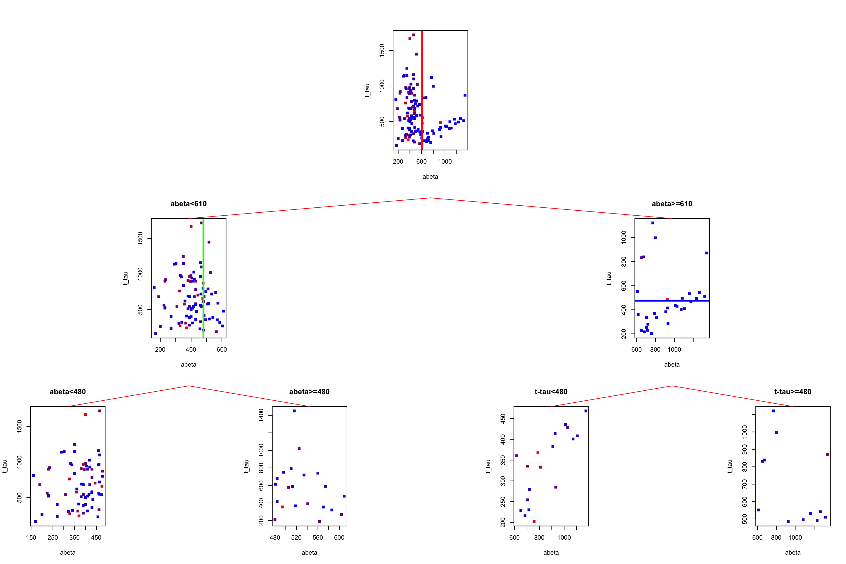
Figure 3.22: The example of two variables measured on a number of samples. Cut on abeta=610 and abeta=480.
Now we have to predict the MMT score for a patient with \(A\beta=1080\) and t-tau=350. We start from the root. The root tells us to go to the left if \(A\beta\) is less than 610 otherwise go to the right. Our \(A\beta\) is 1080 so we go to the right. Now the tree tells us to go to the left if t-tau is less than 480 which is the case for our patient. We go to the left and end up in a leaf node. What is the predicted MMT score? It is simply the average of all the MMT scores in that leaf: 28.3888889. In this case, i know the true value of the MMT for that patient: 30. This is the path we have been going through:
# Select variable
variableIndex<-"abeta"
variableIndex2<-"t_tau"
# plot the data for both of the variables

library(grid)      ## <-- My addition
library(gridBase)  ## <-- My addition

layout(matrix(c(0,0,0,1,0,0,0,
                0,2,0,0,0,3,0,
                4,0,5,0,6,0,7), 3, 7, byrow = TRUE))

grad <- colorRampPalette(c('red','blue'))
colors<-grad(10)[as.numeric(cut(limited_data$mmt,breaks = 10))]

limited_data2<-limited_data[limited_data$abeta<610,]
limited_data3<-limited_data[limited_data$abeta>=610,]
plot(limited_data[,variableIndex],limited_data[,variableIndex2],xlab =variableIndex,ylab = variableIndex2,
    col=colors,pch=15)
usr1 <- par("usr")
vps1 <- do.call(vpStack, baseViewports())
abline(v=610,col="red",lwd=3)


colors<-grad(10)[as.numeric(cut(limited_data[limited_data$abeta<610,]$mmt,breaks = 10))]

plot(limited_data[limited_data$abeta<610,variableIndex],limited_data[limited_data$abeta<610,variableIndex2],xlab =variableIndex,ylab = variableIndex2,
    col=colors,pch=15,main="abeta<610")
usr2 <- par("usr")
vps2 <- do.call(vpStack, baseViewports())
abline(v=480,col="green",lwd=3)
colors<-grad(10)[as.numeric(cut(limited_data[limited_data$abeta>=610,]$mmt,breaks = 10))]
plot(limited_data[limited_data$abeta>=610,variableIndex],limited_data[limited_data$abeta>=610,variableIndex2],xlab =variableIndex,ylab = variableIndex2,
    col=colors,pch=15,main="abeta>=610")

vps3 <- do.call(vpStack, baseViewports())
abline(h=475,col="blue",lwd=3)

colors<-grad(10)[as.numeric(cut(limited_data[limited_data$abeta<480,]$mmt,breaks = 10))]
plot(limited_data2[limited_data2$abeta<480,variableIndex],limited_data2[limited_data2$abeta<480,variableIndex2],xlab =variableIndex,ylab = variableIndex2,
    col=colors,pch=15,main="abeta<480")

vps4 <- do.call(vpStack, baseViewports())

colors<-grad(10)[as.numeric(cut(limited_data[limited_data$abeta>=480,]$mmt,breaks = 10))]
plot(limited_data2[limited_data2$abeta>=480,variableIndex],limited_data2[limited_data2$abeta>=480,variableIndex2],xlab =variableIndex,ylab = variableIndex2,
    col=colors,pch=15,main="abeta>=480")

vps5 <- do.call(vpStack, baseViewports())


colors<-grad(10)[as.numeric(cut(limited_data[limited_data$t_tau<475,]$mmt,breaks = 10))]
plot(limited_data3[limited_data3$t_tau<475,variableIndex],limited_data3[limited_data3$t_tau<475,variableIndex2],xlab =variableIndex,ylab = variableIndex2,
    col=colors,pch=15,main="t-tau<480")

vps6 <- do.call(vpStack, baseViewports())

colors<-grad(10)[as.numeric(cut(limited_data[limited_data$t_tau>=475,]$mmt,breaks = 10))]
plot(limited_data3[limited_data3$t_tau>=475,variableIndex],limited_data3[limited_data3$t_tau>=475,variableIndex2],xlab =variableIndex,ylab = variableIndex2,
    col=colors,pch=15,main="t-tau>=480")

vps7 <- do.call(vpStack, baseViewports())


grid.move.to(x = unit(0.5, "npc"), y = -0.4, vp = vps1)
grid.line.to(x = unit(0.5, "npc"), y = unit(1, "npc"), vp = vps3,
             gp = gpar(col = "blue",lwd=3))


grid.move.to(x = unit(0.5, "npc"), y = -0.4, vp = vps1)
grid.line.to(x = unit(0.5, "npc"), y = unit(1, "npc"), vp = vps2,
             gp = gpar(col = "red"))


grid.move.to(x = unit(0.5, "npc"), y = -0.4, vp = vps2)
grid.line.to(x = unit(0.5, "npc"), y = unit(1, "npc"), vp = vps4,
             gp = gpar(col = "red"))

grid.move.to(x = unit(0.5, "npc"), y = -0.4, vp = vps2)
grid.line.to(x = unit(0.5, "npc"), y = unit(1, "npc"), vp = vps5,
             gp = gpar(col = "red"))

grid.move.to(x = unit(0.5, "npc"), y = -0.4, vp = vps3)
grid.line.to(x = unit(0.5, "npc"), y = unit(1, "npc"), vp = vps6,
             gp = gpar(col = "blue",lwd=3))

grid.move.to(x = unit(0.5, "npc"), y = -0.4, vp = vps3)
grid.line.to(x = unit(0.5, "npc"), y = unit(1, "npc"), vp = vps7,
             gp = gpar(col = "red"))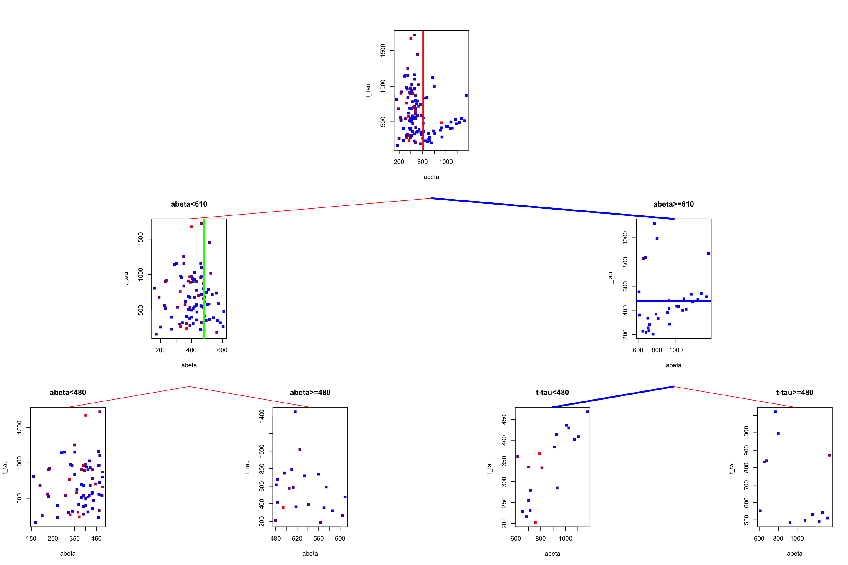
Figure 3.23: The example of two variables measured on a number of samples. Cut on abeta=610 and abeta=480. Tha path is show by blue lines between the plots
Alright. We now know how to build a decision tree and how to do predictions. But there is one more thing to know before going ahead. That is when do we stop growing the tree. If we really continue splitting the variables, in the end, we end up with a tree that has a leaf for each patient. When the tree is very large, it is more likely that it will capture noise instead of a global pattern of the data. In this case, we say that the tree is overfitted. Fortunately, there are ways to avoid that to some extent and they are called pruning methods.
3.4 Pre-pruning
Pre-pruning refers to a situation that at every single split we check a set of criteria telling us whether this split is allowed or now. For example, we could set that we want the minimum number of samples in each node or leaf to be 5. In this case, if a split leading to a leaf with less than 5 samples will be ignored. Another rule is to set the maximum size of the tree which obviously prevents the tree from growing beyond that size. Another criterion is to stop spiting a node if the improvement in purity or variance does not reach a pre-defined value. All of these methods can be set in most of the software packages such as rpart or tree.
As an example, look at our previous tree:
# Select variable
variableIndex<-"abeta"
variableIndex2<-"t_tau"
# plot the data for both of the variables

library(grid)      ## <-- My addition
library(gridBase)  ## <-- My addition

layout(matrix(c(0,0,0,1,0,0,0,
                0,2,0,0,0,3,0,
                4,0,5,0,6,0,7), 3, 7, byrow = TRUE))

limited_data2<-limited_data[limited_data$abeta<610,]
limited_data3<-limited_data[limited_data$abeta>=610,]

barplot(prop.table(table(limited_data$group)),ylim = c(0,1))

usr1 <- par("usr")
vps1 <- do.call(vpStack, baseViewports())
barplot(prop.table(table(limited_data[limited_data$abeta<610,]$group)),ylim = c(0,1),main="abeta<610")
usr2 <- par("usr")
vps2 <- do.call(vpStack, baseViewports())


barplot(prop.table(table(limited_data[limited_data$abeta>=610,]$group)),ylim = c(0,1),main="abeta>=610")
vps3 <- do.call(vpStack, baseViewports())


barplot(prop.table(table(limited_data2[limited_data2$abeta<480,]$group)),ylim = c(0,1),main="abeta<480")

vps4 <- do.call(vpStack, baseViewports())

barplot(prop.table(table(limited_data2[limited_data2$abeta>=480,]$group)),ylim = c(0,1),main="abeta>=480")
vps5 <- do.call(vpStack, baseViewports())


barplot(prop.table(table(limited_data3[limited_data3$t_tau<475,]$group)),ylim = c(0,1),main="t-tau<480")

vps6 <- do.call(vpStack, baseViewports())


barplot(prop.table(table(limited_data3[limited_data3$t_tau>=475,]$group)),ylim = c(0,1),main="t-tau>=480")

vps7 <- do.call(vpStack, baseViewports())


grid.move.to(x = unit(0.5, "npc"), y = -0.4, vp = vps1)
grid.line.to(x = unit(0.5, "npc"), y = unit(1, "npc"), vp = vps3,
             gp = gpar(col = "red"))


grid.move.to(x = unit(0.5, "npc"), y = -0.4, vp = vps1)
grid.line.to(x = unit(0.5, "npc"), y = unit(1, "npc"), vp = vps2,
             gp = gpar(col = "red"))


grid.move.to(x = unit(0.5, "npc"), y = -0.4, vp = vps2)
grid.line.to(x = unit(0.5, "npc"), y = unit(1, "npc"), vp = vps4,
             gp = gpar(col = "red"))

grid.move.to(x = unit(0.5, "npc"), y = -0.4, vp = vps2)
grid.line.to(x = unit(0.5, "npc"), y = unit(1, "npc"), vp = vps5,
             gp = gpar(col = "red"))

grid.move.to(x = unit(0.5, "npc"), y = -0.4, vp = vps3)
grid.line.to(x = unit(0.5, "npc"), y = unit(1, "npc"), vp = vps6,
             gp = gpar(col = "red"))

grid.move.to(x = unit(0.5, "npc"), y = -0.4, vp = vps3)
grid.line.to(x = unit(0.5, "npc"), y = unit(1, "npc"), vp = vps7,
             gp = gpar(col = "red"))

grid.text("AD",x = unit(0.5, "npc"),y=unit(-0.25, "npc"),vp=vps4,gp = gpar(col="red"))
grid.text("AD",x = unit(0.5, "npc"),y=unit(-0.25, "npc"),vp=vps5,gp = gpar(col="red"))
grid.text("Control",x = unit(0.5, "npc"),y=unit(-0.25, "npc"),vp=vps6,gp = gpar(col="red"))
grid.text("Control",x = unit(0.5, "npc"),y=unit(-0.25, "npc"),vp=vps7,gp = gpar(col="red"))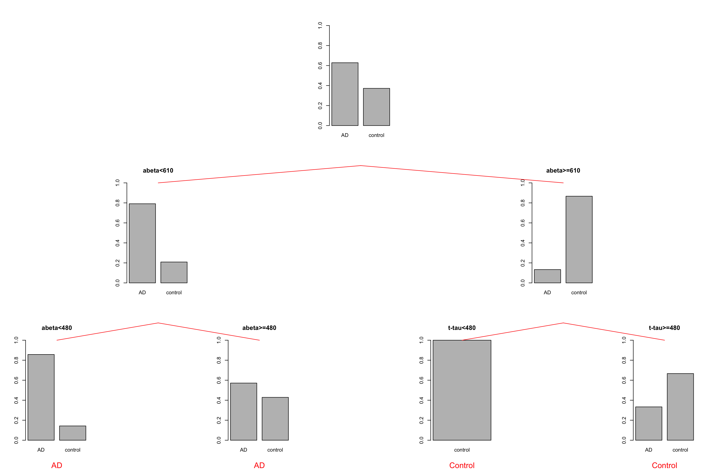
Figure 3.24: The example of two variables measured on a number of samples. Cut on abeta=610 and abeta=480.
We see that the first two leaves on the left are both showing that AD is a major class. So maybe they are not needed. Instead, we could just stop at \(A\beta<610\) and assign every sample landing there as AD. There is however a big problem here. The tree generating methods are often greedy or short-sighted. This means that at each node, they only care about a single next move. They really don’t deal with what will happen after 10 splits from now. As a result, the tree does not know that there is a chance that a variable that is now being ignored might come up as important later down the tree. Post-pruning methods deal with that situation!
3.5 Post-pruning
Post-pruning lets us grow the tree as much as we want but after the building is over it goes through the tree and prunes off the branches that are either redundant or might give us an overfitting problem. There are multiple methods for doing that. We will go through one of the most popular ones that is called “Weakest-Link Cutting”. Before going forward we will have to introduce some math notations so it will be easier to follow the rest.
Similar to other machine learning techniques, decision trees can also be thought to optimize a function. For example, in the case of classification, we can say that we want to minimize the misclassification error rate. We define misclassification of a single node on the training data by:
\[R(t)=(1-max_j\frac{N_j(t)}{N(t)})\times \frac{N(t)}{N}\]
where \(max_j\) denote the class \(j\) which has the majority of the members of that node. \(N_j(t)\) is the number of members with class \(j\) at node \(t\). \(N(t)\) is the total number of samples at node \(t\) and \(N\) is the total number of samples in each dataset. Please remember that that \(R(t)\) only concerns a node without considering the leaves.
For a tree or a subtree, we define:
\[R(T_k)=\sum_{t\in\tilde{T_k}}{R(t)}\]
where \(\tilde{T}\) is the set of leaves of the subtree root that \(k\).
What \(R(t)\) tells you is that for any node, if you want to calculate the training error rate, calculate 1 minus the total number of samples with majority classes divide by the total number of samples at this node. Then weigh the whole thing by the proportion of the samples going to that node. For example, if I have data set with 20 samples where 10 of them are AD and the rest control. Then I make a decision tree giving me a node with 5 AD and 3 controls. The \(R(t)\) of that node becomes \((1-\frac{5}{8})\times\frac{8}{20}=0.15\).
For calculating the \(R(T_k)\), imagine i have a tree that looks like this:
library(DiagrammeR)

nodes <- create_node_df(n = 7, type = "number",label = c("1","2","3","4\nAD:3","5\nAD:1\nC:5","6\nAD:1\nC:2","7\nAD:5\nC:3"))

edges <- create_edge_df(from = c(1, 1, 2, 2, 3, 3),
                        to = c(2, 3, 4, 5, 6, 7),
                       rel = "leading to")

graph <- create_graph(nodes_df = nodes, attr_theme = "tb",
                      edges_df = edges,
                  )

render_graph(graph)
Figure 3.25: The example of an imaginary decision tree
Let say I want to calculate \(R(T_3)\) which means i want to find misclassification rate for the subtree starting from node \(3\). The subtree has two leaves \(6\) and \(7\). I will start with the \(6\) and calculate \(R(6)=(1-\frac{2}{3})\times\frac{3}{20}=0.049\) and i do it for the right branch also \(R(7)=(1-\frac{5}{8})\times\frac{8}{20}=0.15\). For calculating \(R(T_3)\) i simply add up \(0.049\) and \(0.15\) so \(R(T_3)=0.2\)
At this stage, we have to introduce our penalty term into \(R(T)\) so it becomes: \[R_{\alpha}(T)=R(T)+\alpha.|\tilde{T}|\] where alpha is our complexity parameter and \(|\tilde{T}|\) is the total number of leaf nodes in the tree. What this equation tells us is that, as we grow a bigger and bigger tree with a lot of leaf nodes, our misclassification error rate will increase. We should tune the cost complexity parameter to give us a good minimum \(R_{\alpha}(T)\). How do we tune this? Weakest-Link Cutting is a method for doing that. As the name suggests we will have to identify the “weakest link” subtree in the whole tree and that is given by a subtree which the minimum of
\[g(t)\left\{\begin{matrix}\frac{R(t)-R(T_t)}{|\tilde{T}_t|-1}, & t \notin \tilde{T}_t \\ +\infty, & t \in \tilde{T}_t\end{matrix}\right.\]
What this is telling us is that for a subtree rooting at node \(t\) we can calculate \(g(t)\) but subtracting the error rate of the node (\(R(t)\)) by the total error rate of its leaf nodes (\(R(T_t)\)) divided by the total number of its leaf node minus one (if \(t\) is not a lead node itself, otherwise it becomes infinity). Let’s see how we use this in practice. Look at the previous example:
library(DiagrammeR)

nodes <- create_node_df(n = 7, type = "number",label = c("1\nAD:10\nC:10","2\nAD:4\nC:5","3\nAD:6\nC:5","4\nAD:3","5\nAD:1\nC:5","6\nAD:1\nC:2","7\nAD:5\nC:3"))

edges <- create_edge_df(from = c(1, 1, 2, 2, 3, 3),
                        to = c(2, 3, 4, 5, 6, 7),
                       rel = "leading to")

graph <- create_graph(nodes_df = nodes, attr_theme = "tb",
                      edges_df = edges,
                  )

render_graph(graph)
Figure 3.26: The example of an imaginary decision tree. AD: Alzheimers disease and C: control. We call this T1
As you see, we have three nodes that are not leaf nodes (1,2, and 3). For each of these nodes we calculate their \(g(t)\):
Let’s start with the first node and set \(\alpha_1=0\): \[R(T_1)=((1-\frac{3}{3})\times \frac{3}{20})+((1-\frac{5}{6})\times \frac{6}{20})+((1-\frac{2}{3})\times \frac{3}{20})+((1-\frac{5}{8})\times \frac{8}{20})=0.25\]
\[R(1)=(1-\frac{10}{20})\times\frac{20}{20}=0.5\] \[g(1)=\frac{0.5-0.25}{4-1}=0.083\] We now do the same for node 2:
\[R(T_2)=((1-\frac{3}{3})\times \frac{3}{20})+((1-\frac{5}{6})\times \frac{6}{20})=0.05\]
\[R(2)=(1-\frac{4}{9})\times\frac{9}{20}=0.25\] \[g(2)=\frac{0.2-0.05}{2-1}=0.15\] And finally for node 3: \[R(T_3)=((1-\frac{2}{3})\times \frac{3}{20})+((1-\frac{5}{8})\times \frac{8}{20})=0.2\]
\[R(3)=(1-\frac{6}{11})\times\frac{11}{20}=0.25\] \[g(3)=\frac{0.25-0.2}{2-1}=0.05\] So we have \(g(1)=0.083\), \(g(2)=0.15\), and \(g(3)=0.05\). We see that \(g(3)\) is the minimum so the weakest link. we will prune at node 3. So our tree becomes:
library(DiagrammeR)

nodes <- create_node_df(n = 5, type = "number",label = c("1\nAD:10\nC:10","2\nAD:4\nC:5","3\nAD:6\nC:5","4\nAD:3","5\nAD:1\nC:5"))

edges <- create_edge_df(from = c(1, 1, 2, 2),
                        to = c(2, 3, 4, 5),
                       rel = "leading to")

graph <- create_graph(nodes_df = nodes, attr_theme = "tb",
                      edges_df = edges,
                  )

render_graph(graph)
Figure 3.27: The example of an imaginary decision tree. AD: Alzheimers disease and C: control. We call this T2
Please note that the node 3 is now a leaf node. We set \(\alpha_2=g(3)=0.05\) and continue with our new tree:
\[R(T_1)=((1-\frac{3}{3})\times \frac{3}{20})+((1-\frac{5}{6})\times \frac{6}{20})+((1-\frac{6}{11})\times \frac{11}{20})=0.3\]
\[R(1)=(1-\frac{10}{20})\times\frac{20}{20}=0.5\]
\[g(1)=\frac{0.5-0.3}{2-1}=0.2\] We now do the same for node 2:
\[R(T_2)=((1-\frac{3}{3})\times \frac{3}{20})+((1-\frac{5}{6})\times \frac{6}{20})=0.05\]
\[R(2)=(1-\frac{4}{9})\times\frac{9}{20}=0.25\]
\[g(2)=\frac{0.2-0.05}{2-1}=0.15\] So our \(g(2)\) is the smallest. We do another pruning here:
library(DiagrammeR)

nodes <- create_node_df(n = 3, type = "number",label = c("1\nAD:10\nC:10","2\nAD:4\nC:5","3\nAD:6\nC:5"))

edges <- create_edge_df(from = c(1, 1),
                        to = c(2, 3),
                       rel = "leading to")

graph <- create_graph(nodes_df = nodes, attr_theme = "tb",
                      edges_df = edges,
                  )

render_graph(graph)
Figure 3.28: The example of an imaginary decision tree. AD: Alzheimers disease and C: control. We call this T3
we now set \(\alpha_3=g(2)=0.15\) and continue with our final node (the root):
\[R(T_1)=((1-\frac{5}{9})\times \frac{9}{20})+((1-\frac{6}{11})\times \frac{11}{20})=0.45\]
\[R(1)=(1-\frac{10}{20})\times\frac{20}{20}=0.5\]
\[g(1)=\frac{0.5-0.45}{2-1}=0.05\] So we set the \(\alpha_4=g(1)=0.05\)
At the end of this story, we have \(\alpha_1=0\), \(\alpha_2=0.05\), \(\alpha_3=0.15\) and \(\alpha_4=0.05\). Now we define rules for selecting the best tree: If \(0\geq \alpha <0.05\) then we use our largest tree: T1. If \(\alpha=0.05\) then we can use T2. If \(0.05< \alpha <0.15\) we use T3.
The question is how do we select \(\alpha\)? The answer is cross-validation. Let’s go through it briefly.
3.6 Cross validation
Cross-validation refers to various different ways to estimate whether a statistical model can generalize to an independent dataset. The reason that we do cross-validation is that statistical models tend to fit the data points so perfectly that instead of capturing a global pattern of interest in the data, they start following the noise associated with individual data points. As a result of capturing noise, they cannot perform well when we give them a new sample to predict.
Let’s have a look at an example where we want to predict t-tau based on p-tau:
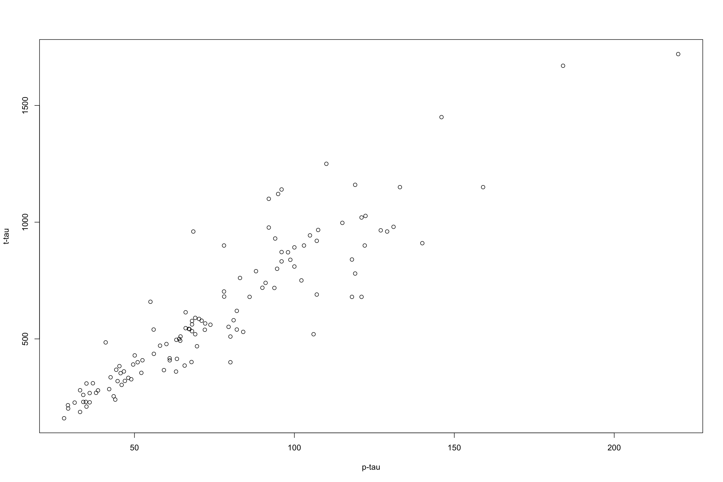
Figure 3.29: plot of p-tau vs t-tau.
I will remove a chunk of the data randomly to be used for testing later. For the reaming data, i will fit a flexible regression model (LOESS) and one with less flexibility.
par(mfrow=c(1,2))
set.seed(20)
testing_index<-sample(1:length(limited_data$p_tau),50,replace = F)

limited_data4_training<-limited_data[-testing_index,]
limited_data4_testing<-limited_data[testing_index,]


lw1 <- loess(t_tau ~ p_tau,data=limited_data4_training,span = 0.1)
cor1<-cor(limited_data4_testing$t_tau,predict(lw1,limited_data4_testing$p_tau),use = "p")^2

j <- order(limited_data4_training$p_tau)
plot(limited_data4_training$p_tau,limited_data4_training$t_tau,xlab = "p-tau",ylab = "t-tau",main = paste("R2:", round(cor1,digits = 2)))

lines(limited_data4_training$p_tau[j],lw1$fitted[j],col="red",lwd=3)


lw1 <- loess(t_tau ~ p_tau,data=limited_data4_training,span = 0.6)
cor2<-cor(limited_data4_testing$t_tau,predict(lw1,limited_data4_testing$p_tau),use = "p")^2
plot(limited_data4_training$p_tau,limited_data4_training$t_tau,xlab = "p-tau",ylab = "t-tau",main = paste("R2:", round(cor2,digits = 2)))
j <- order(limited_data4_training$p_tau)
lines(limited_data4_training$p_tau[j],lw1$fitted[j],col="red",lwd=3)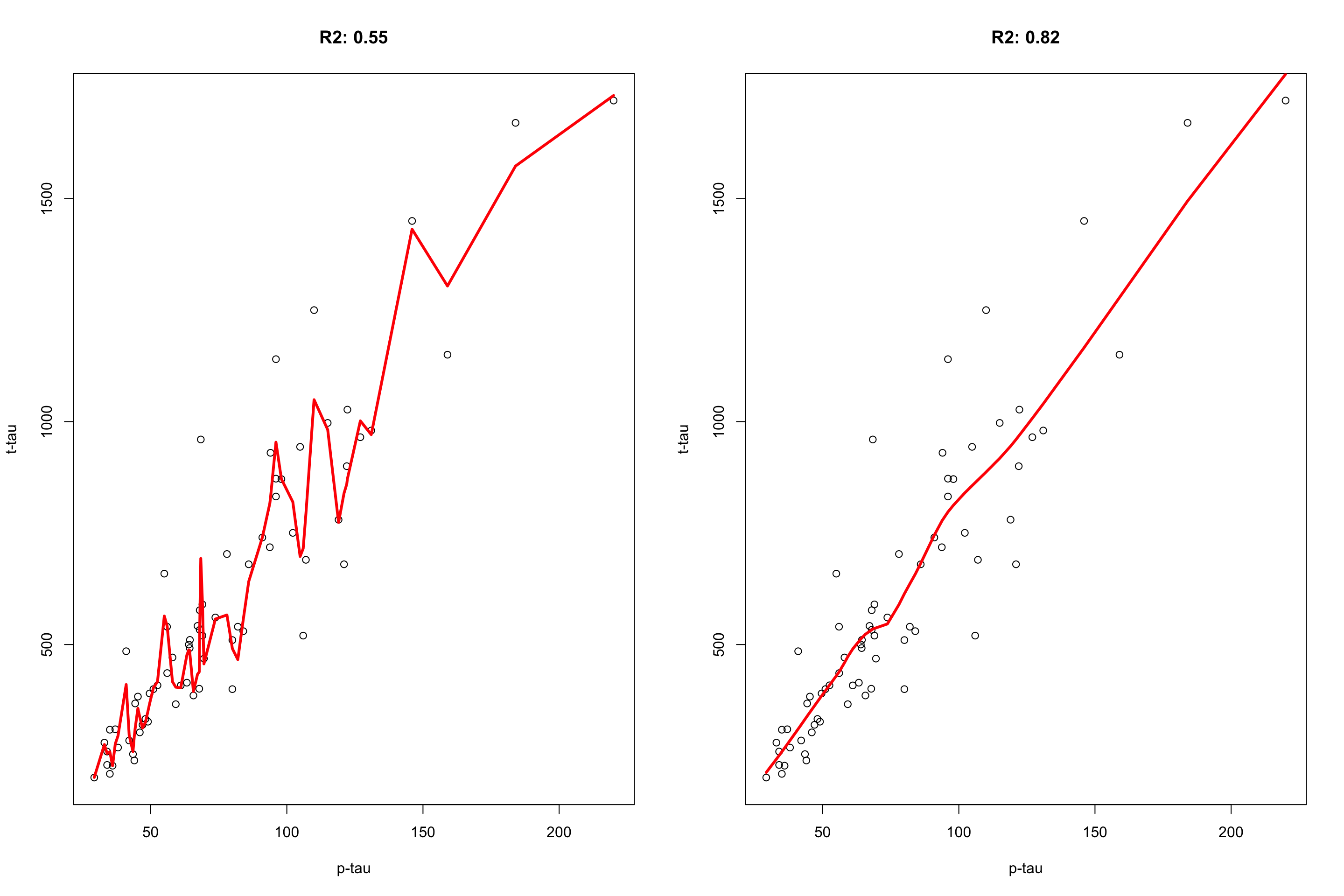
Figure 3.30: plot of p-tau vs t-tau using two models. The model on the left has span of 0.1 and the model on the right has the span of 0.6.
It is clear that the flexible model on the left is following individual data point and lower \(R^2=0.55\) whereas the restricted model on the right captures the pattern and get a better \(R^2=0.82\). Cross-validation can be used to figure out whether our model suffers from the sample problem or not.
The way that the cross-validation is performed is to randomly divide the dataset into several smaller subsets. They do the statistical modelling several times, each time, one subset is used as a validation set and the rest for training. Formally, we divide our dataset into \(k\) different subsets and do the following
- Take one subset of our data and keep it as the validation set.
- Take the remaining \(k-1\) subset and train the model on them
- Take the validation set and measure the performance of the model
- Repeat steps one to 3 but take another set as validation
In the end, the error of the model is the average of all the errors from the cross-validation scheme.
Now the question is, how does this have to do with complexity parameters and decision trees?
The answer is, we can do cross-validation, and every time we build a new model calculate the complexity parameter, then pick the complexity parameter that both minimize the error of the model but also size of the tree. Let’s have a look and see how we can do it in practice. We keep a small part of the data outside of the modelling and will use it for testing later.
par(mfrow=c(1,2))
set.seed(50)
testing_index<-sample(1:nrow(limited_data),20,replace = F)
data2<-limited_data[-testing_index,]
data2$group<-factor(data2$group)
data2$gender<-factor(data2$gender)


tt<-tree::tree(group~abeta+t_tau,data=data2,split="gini")
plot(tt)
text(tt,pretty=1)

set.seed(10)
cv_res = tree::cv.tree(tt, FUN = prune.misclass)

plot(cv_res$size, cv_res$dev / nrow(data2), type = "b",
     xlab = "Tree Size", ylab = "CV Misclassification Rate")
mtext("complexity parameter", side = 3, line = 3)
axis(3,labels = round(cv_res$k,2),at=cv_res$size, cex.axis=0.8)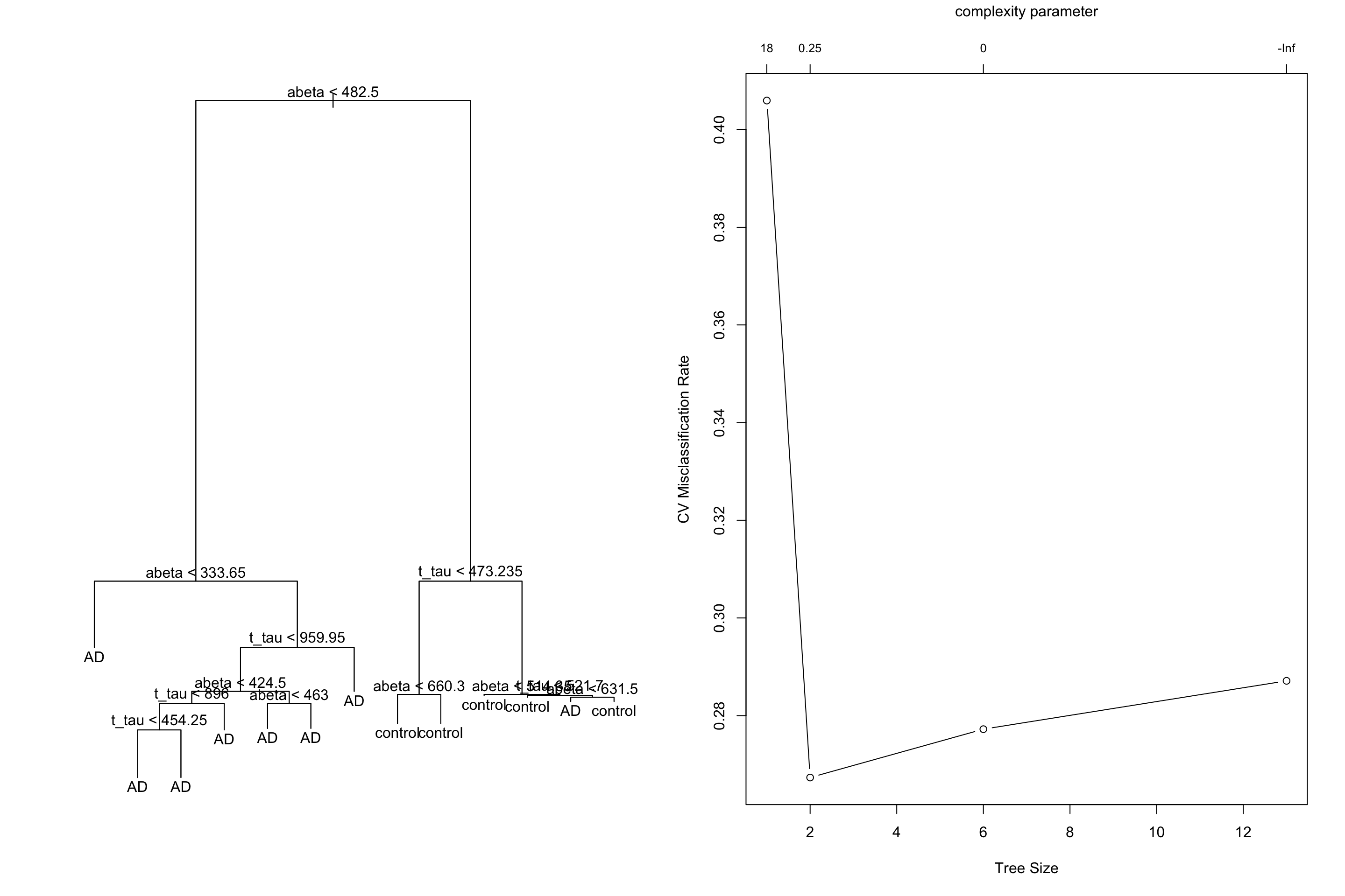
Figure 3.31: Cross validation on a tree build on the limited dataset
We see that our lowest missclassification error rate is coming from 0.25 leading to a tree with size 2. Let’s do the pruning:
library(tree)
par(mfrow=c(1,1))

tt2<-tree::prune.misclass(tt,k=cv_res$k[which.min(cv_res$dev)])
plot(tt2)
text(tt2,pretty=1)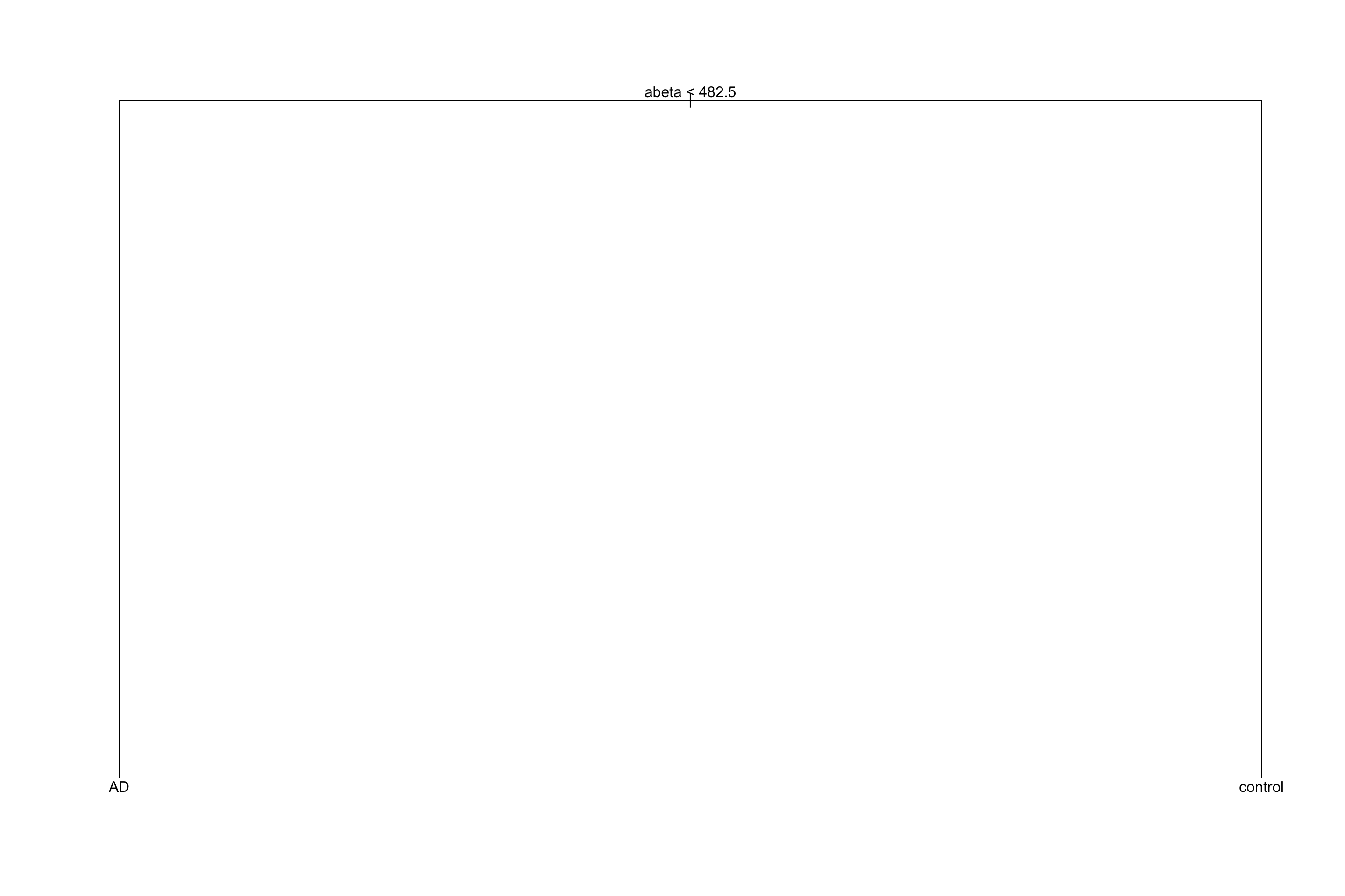
Figure 3.32: Pruned tree with the chosen complexity parameter
The original tree had an accuracy of 0.75 and the pruned tree has 0.75. Not that much different!? But the pruned tree is obviously more interpretable than the original one. This is what pruning does!
Similar methods that we discussed can be used for regression by changing the MSE to for example:
\[MSE_{\alpha}=\frac{1}{n}\sum_{i=1}^{n}{(y_i-\bar{y_i})^2}+\alpha.|\tilde{T}|\] We are now almost ready to go through bagging!