4 Diffusion maps exercises
4.1 The dataset
These exercises use the mouse embryo qPCR dataset from Guo et al. (2010). It contains measurements of 48 genes in 428 individual cells collected at six developmental stages, from the 2 cell stage to the 64 cell stage. Its modest size makes it suitable for comparing diffusion map results with known stage labels.
The processed matrix used here is the guo_norm object distributed with the R package destiny. It contains normalized qPCR expression values and an annotation column, num_cells, that records the collection stage as 2, 4, 8, 16, 32, or 64 cells. The dataset does not contain an independent lineage label, so a structure that looks like a branch cannot be assigned a biological identity from these data alone.
The course copy is stored in data/guo_embryo_qpcr.csv and is used by both sets of examples.
4.2 Exercise 1. Inspect the data
Task. Load data/guo_embryo_qpcr.csv. Report its dimensions. Identify which columns are gene measurements and which are annotations. Tabulate the num_cells stages present.
Two columns are not gene measurements: cell_id, a text identifier, and num_cells, the developmental stage annotation. Every other column is one of the 48 measured genes.
df <- read.csv("data/guo_embryo_qpcr.csv", stringsAsFactors = FALSE)
dim(df)
colnames(df)[1:5]
table(df$num_cells)
gene_cols <- setdiff(colnames(df), c("cell_id", "num_cells"))
length(gene_cols)
[1] 428 50
[1] "cell_id" "num_cells" "Actb" "Ahcy" "Aqp3"
2 4 8 16 32 64
19 23 43 75 109 159
[1] 48import pandas as pd
df = pd.read_csv("data/guo_embryo_qpcr.csv")
df.shape
df.columns[:5].tolist()
df["num_cells"].value_counts().sort_index()
gene_cols = [c for c in df.columns if c not in ("cell_id", "num_cells")]
len(gene_cols)(428, 50)
['cell_id', 'num_cells', 'Actb', 'Ahcy', 'Aqp3']
num_cells
2 19
4 23
8 43
16 75
32 109
64 159
48The number of observations differs across stages, from 19 cells at the 2 cell stage to 159 cells at the 64 cell stage. Keep this imbalance in mind when interpreting local density.
4.3 Exercise 2. Build a diffusion map
Task. Construct a diffusion map from the 48 gene columns. Use \(k=20\) neighbors and plot the eigenvalue spectrum. Does the spectrum contain a distinct gap that suggests where to truncate the coordinates?
The file already contains normalized qPCR measurements. The examples below do not apply additional scaling.
library(destiny)

gene_cols <- setdiff(colnames(df), c("cell_id", "num_cells"))
X <- as.matrix(df[, gene_cols])

set.seed(1)
dm <- DiffusionMap(X, k = 20, n_eigs = 10)
evals <- eigenvalues(dm)
round(evals[1:8], 4)

plot(seq_along(evals), evals,
     type = "b", xlab = "Nonstationary component",
     ylab = "Eigenvalue")
DC1 DC2 DC3 DC4 DC5 DC6 DC7 DC8
0.9915 0.9758 0.9320 0.9191 0.8874 0.8439 0.8126 0.7954import scanpy as sc
import anndata as ad
import matplotlib.pyplot as plt
X = df[gene_cols].to_numpy()
adata = ad.AnnData(X=X.astype("float32"))
sc.pp.neighbors(adata, n_neighbors=20, use_rep="X")
sc.tl.diffmap(adata, n_comps=10)
evals = adata.uns["diffmap_evals"]
evals[1:9].round(4)
fig, ax = plt.subplots()
ax.plot(range(1, len(evals)), evals[1:], "o-")
ax.set(xlabel="Nonstationary component", ylabel="Eigenvalue")
plt.show()array([0.9924, 0.9816, 0.9521, 0.9401, 0.9134, 0.8916, 0.8666, 0.8514])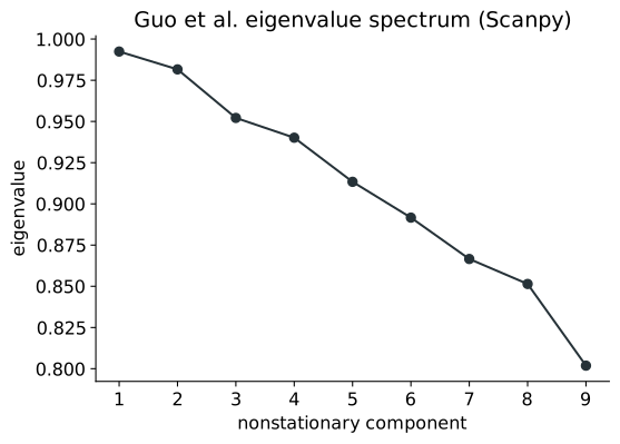
There is no sharp elbow, so the spectrum does not identify one truncation point. Several leading eigenvalues are close to one, followed by a gradual decline. The spectrum shows how quickly the modes decay, but the number of components to retain should also be checked against the structure and the downstream task.
Scanpy includes the stationary eigenvalue, \(\lambda_0=1\), as its first entry. The Python code omits that entry so that the displayed values correspond to the nonstationary components shown by destiny.
4.4 Exercise 3. DC1, DC2, and branching
Task. Plot DC1 against DC2, and separately DC1 against DC3, coloring both by num_cells. Which component tracks overall developmental stage more closely? Does either plot suggest branching?
dc <- eigenvectors(dm)
cor(dc[, 1], df$num_cells, method = "spearman")
cor(dc[, 2], df$num_cells, method = "spearman")

stage_index <- match(df$num_cells, sort(unique(df$num_cells)))
stage_colors <- hcl.colors(length(unique(df$num_cells)), "viridis")
par(mfrow = c(1, 2))
plot(dc[, 1], dc[, 2], col = stage_colors[stage_index],
     pch = 16, xlab = "DC1", ylab = "DC2")
plot(dc[, 1], dc[, 3], col = stage_colors[stage_index],
     pch = 16, xlab = "DC1", ylab = "DC3")
legend("topright", legend = sort(unique(df$num_cells)),
       col = stage_colors, pch = 16, cex = 0.7, title = "Stage")
par(mfrow = c(1, 1))
[1] 0.192
[1] -0.819from scipy.stats import spearmanr
dc1 = adata.obsm["X_diffmap"][:, 1]
dc2 = adata.obsm["X_diffmap"][:, 2]
dc3 = adata.obsm["X_diffmap"][:, 3]
spearmanr(dc1, df["num_cells"]).correlation
spearmanr(dc2, df["num_cells"]).correlation
fig, axes = plt.subplots(1, 2, constrained_layout=True)
points = axes[0].scatter(dc1, dc2, c=df["num_cells"], cmap="viridis", s=12)
axes[0].set(xlabel="DC1", ylabel="DC2")
axes[1].scatter(dc1, dc3, c=df["num_cells"], cmap="viridis", s=12)
axes[1].set(xlabel="DC1", ylabel="DC3")
fig.colorbar(points, ax=axes, label="Cell stage")
plt.show()-0.185
0.809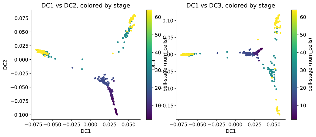
DC2 tracks developmental stage more closely than DC1. Its Spearman correlation with stage has magnitude about \(0.82\), compared with about \(0.2\) for DC1. The sign differs between implementations because an eigenvector and its negative describe the same axis.
The plots also show separation among some cells from later stages along DC1. This may suggest branching, but the stage labels cannot establish what the separated groups represent. The result illustrates that DC1 is the most persistent nonstationary mode, not necessarily the coordinate most closely related to developmental progression.
4.5 Exercise 4. Relate DPT to developmental stage
Task. Run Diffusion Pseudotime with a root cell chosen from the earliest stage. Compare the resulting pseudotime with num_cells. Does pseudotime generally increase across the observed stages? What variation within a stage is hidden by the correlation coefficient?
root <- which.min(df$num_cells)
dpt <- DPT(dm, tips = root)
cor(dpt$DPT1, df$num_cells, method = "spearman")

set.seed(1)
plot(jitter(log2(df$num_cells), amount = 0.12), dpt$DPT1,
     pch = 16, xlab = "Observed stage (log2 cell count)",
     ylab = "DPT pseudotime")
[1] 0.841import scanpy as sc
import anndata as ad
import numpy as np
adata = ad.AnnData(X=X.astype("float32"))
sc.pp.neighbors(adata, n_neighbors=20, use_rep="X")
sc.tl.diffmap(adata, n_comps=10)
root = int(df["num_cells"].idxmin())
adata.uns["iroot"] = root
sc.tl.dpt(adata, n_branchings=0)
from scipy.stats import spearmanr
spearmanr(adata.obs["dpt_pseudotime"], df["num_cells"]).correlation
rng = np.random.default_rng(0)
x = np.log2(df["num_cells"].to_numpy()) + rng.normal(0, 0.12, len(df))
fig, ax = plt.subplots()
ax.scatter(x, adata.obs["dpt_pseudotime"], s=12)
ax.set(xlabel="Observed stage (log2 cell count)", ylabel="DPT pseudotime")
plt.show()0.843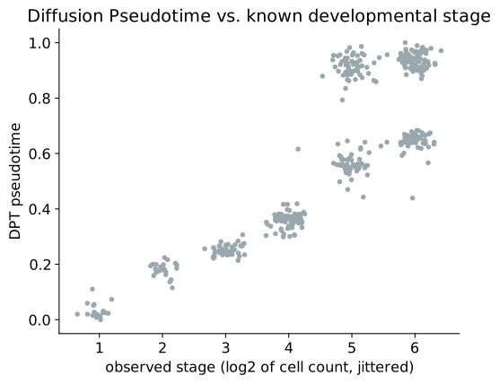
DPT pseudotime has a Spearman correlation of about 0.84 with the observed stage in both implementations. The plot adds information that this single number misses. Cells from the same stage can have different pseudotime values, and the stages with 32 and 64 cells contain two visible bands. This separation is compatible with more than one path through the expression graph, but identifying a lineage split would require independent cell type or lineage information.
4.6 Exercise 5. Change the neighborhood size
Task. Rebuild the diffusion map with \(k=5\) and \(k=100\). Compare the resulting eigenvalue spectra to \(k=20\). What happens to the gap between the first few eigenvalues and the rest?
spectra <- list()
for (k_try in c(5, 20, 100)) {
  dm_k <- DiffusionMap(X, k = k_try, n_eigs = 5)
  spectra[[as.character(k_try)]] <- eigenvalues(dm_k)
  cat(k_try, ":", round(spectra[[as.character(k_try)]][1:3], 4), "\n")
}

matplot(seq_along(spectra[[1]]), do.call(cbind, spectra),
        type = "b", lty = 1, xlab = "Nonstationary component",
        ylab = "Eigenvalue")
legend("bottomleft", legend = paste("k =", names(spectra)),
       col = seq_along(spectra), lty = 1, pch = seq_along(spectra))
5 : 0.996 0.9919 0.9773
20 : 0.9915 0.9758 0.932
100 : 0.9731 0.8773 0.774spectra = {}
for k_try in (5, 20, 100):
a = ad.AnnData(X=X.astype("float32"))
sc.pp.neighbors(a, n_neighbors=k_try, use_rep="X")
sc.tl.diffmap(a, n_comps=6)
spectra[k_try] = a.uns["diffmap_evals"][1:6]
print(k_try, spectra[k_try][:3].round(4))
fig, ax = plt.subplots()
for k_try, values in spectra.items():
ax.plot(range(1, len(values) + 1), values, "o-", label=f"k = {k_try}")
ax.set(xlabel="Nonstationary component", ylabel="Eigenvalue")
ax.legend()
plt.show()5 [0.9971 0.9932 0.9841]
20 [0.9924 0.9816 0.9521]
100 [0.9835 0.9285 0.8591]The leading nonstationary eigenvalues are closer to one at the smaller neighborhood size and decay more quickly at the larger neighborhood size. This indicates faster mixing as the graph becomes more densely connected. It does not by itself show that biologically meaningful structure has been lost. That conclusion would require checking the embeddings, neighborhood composition, or stability of the downstream result.