# read the raw data
data<-read.csv("data/data.csv",sep = ";",
               stringsAsFactors = F,check.names = F,
               colClasses = c("numeric","character","numeric","numeric","numeric","numeric","numeric","character"))
# remove the index row
data<-data[,-1]
data$group[data$group=="non-demented controls"]<-"control"
# limit to AD and controls
limited_data<-data[data$group%in%c("AD","control"),]

knitr::opts_chunk$set(dev='svg')1 Introduction
In this chapter, we are going to learn about random forest for supervised classification and regression.
As you probably remember, supervised learning refers to methodologies that use some prior information about the data points (e.g. samples, patients) to create a way to connect that prior information to the data using some kind of model. In this context, classification deals with the situation where that prior information is of qualitative form. In this case, the example would be having a set of samples where half of them have a disease and the other half don’t. Given this example, the objective is to find a way to say who has the disease and who does not. The previous example was only about two groups but classification can be applied to any number of groups. In a regression setting, our prior information is continuous (numerical). In this case, our aim is to figure out a way of connecting the data pattern with the numbers.
Let’s agree from now that you want to show our data with \(X\) in which our samples are in the rows and our variables or measurements are in columns. We will also show our prior information with \(Y\). So as described above, we want to come up with a way to map our \(X\) to \(Y\):
\[Y=f(X)\]
This basically says we are after a function \(f\) that can get \(X\) (our data) and output \(Y\) (predictions). There are many methods for finding such a mapping. Linear/logistic regression, Neural Networks and Support Vector Machines are examples of such methods. Random forests algorithm can also be considered in this category. However, Random forest does not directly model \(f\) in a mathematical sense but rather come up with \(f\) using a series of segmentation as we will see soon.
In order to learn how random forest works, we will need to go through a few central topics:
- Decision trees
- Bagging
- introducing randomness
We will also use a dataset throughout this chapter, described on the Prerequisites page. We load it here, together with a version limited to only the AD and control groups:
2 Decision trees
Decision tree modelling is one of the most intuitive and easy to understand modelling techniques used in statistics. They have minimum requirements for data pre-processing, little assumption about the data distribution, missing value handling and many other benefits.
Let first have a look at some terminology:
library(DiagrammeR)

nodes <- create_node_df(n = 9, type = "number",label = c("A","B","C","D","E","F","G","H","I"))

edges <- create_edge_df(from = c(1, 1, 2, 2, 3, 3,6,6),
                        to = c(2, 3, 4, 5, 6, 7,8,9),
                       rel = "leading to")

graph <- create_graph(nodes_df = nodes, attr_theme = "tb",
                      edges_df = edges,
                  )

render_graph(graph)Each circle is a called a node and each line is called an edge. The very first node in top of the tree is called a root node (A). Nodes that are not root but have out going connections are called child node (B,C,F). The nodes at the bottom of the tree are called leaf nodes or terminal nodes whereas the nodes in the middle of the tree are called internal nodes. We tend to say that node B is child of node A because there is incoming connection from A to B. The same applies to C. Similarly, we say A is the parent of B and C. The same naming applies throughout the tree. For example H is a leaf node that is the child of F. Finally, we sometime say that A has been split to B and C which obviously means it has two child nodes. That was it. Let’s continue to see what trees are!
2.1 Intuition
Decision trees are normally built through sequentially segmenting the data using simple rules until reaching some criteria for stooping. Let’s try to develop an intuition about them using our dataset. Here we focus on classification and later extend it to the regression.
In Figure Figure 2.2, we have plotted our AD data (only AD and controls). On the \(x\) axis we have \(A\beta\) and on the \(y\) axis we have t tau.
# Select variable
variableIndex<-"abeta"
variableIndex2<-"t_tau"
# plot the data for both of the variables
plot(limited_data[,variableIndex],limited_data[,variableIndex2],xlab =variableIndex,ylab = variableIndex2,
    col=as.factor(limited_data$group),pch=as.numeric(as.factor(limited_data$group)))
legend("topleft",legend = levels(as.factor(limited_data$group)),
       col=as.factor(levels(as.factor(limited_data$group))),
       pch=as.factor(levels(as.factor(limited_data$group))))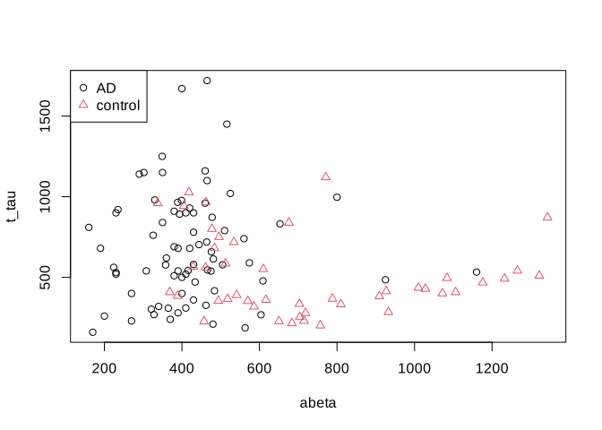
Now we want to cut our data based on our variables into AD and controls and we are only allowed to draw a single vertical (\(x\) axis) or horizontal (\(y\) axis) line. Maybe we can draw a line like this:
# Select variable
variableIndex<-"abeta"
variableIndex2<-"t_tau"
# plot the data for both of the variables
plot(limited_data[,variableIndex],limited_data[,variableIndex2],xlab =variableIndex,ylab = variableIndex2,
    col=as.factor(limited_data$group),pch=as.numeric(as.factor(limited_data$group)))
legend("topleft",legend = levels(as.factor(limited_data$group)),
       col=as.factor(levels(as.factor(limited_data$group))),pch=as.factor(levels(as.factor(limited_data$group))))
abline(v=250,col="red")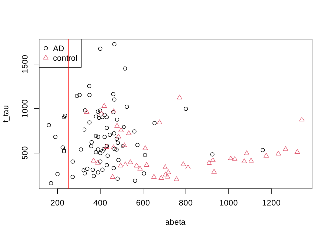
Well! That is OK we have only AD patients on the left side of the red line but on the right side we have a huge mix of AD and controls. Maybe we could do a bit better. Let’s put the line a bit further.
# Select variable
variableIndex<-"abeta"
variableIndex2<-"t_tau"
# plot the data for both of the variables
plot(limited_data[,variableIndex],limited_data[,variableIndex2],xlab =variableIndex,ylab = variableIndex2,
    col=as.factor(limited_data$group),pch=as.numeric(as.factor(limited_data$group)))
legend("topleft",legend = levels(as.factor(limited_data$group)),
       col=as.factor(levels(as.factor(limited_data$group))),pch=as.factor(levels(as.factor(limited_data$group))))
abline(v=610,col="red",lwd=3)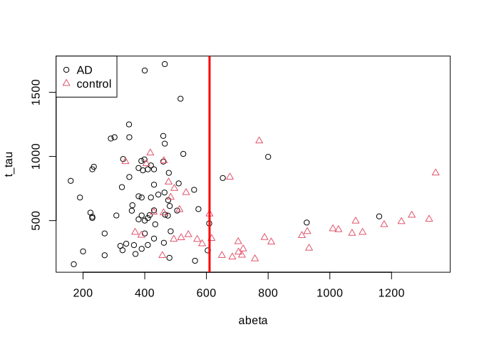
That is much better. Let’s try to separate the data on the left and right sides of the line into two plots.
# Select variable
variableIndex<-"abeta"
variableIndex2<-"t_tau"
# plot the data for both of the variables

library(grid)      ## <-- My addition
library(gridBase)  ## <-- My addition
layout(matrix(c(0,1,0,2,0,3), 2, 3, byrow = TRUE))
plot(limited_data[,variableIndex],limited_data[,variableIndex2],xlab =variableIndex,ylab = variableIndex2,
    col=as.factor(limited_data$group),pch=as.numeric(as.factor(limited_data$group)))
usr1 <- par("usr")
vps1 <- do.call(vpStack, baseViewports())
abline(v=610,col="red",lwd=3)
plot(limited_data[limited_data$abeta<610,variableIndex],limited_data[limited_data$abeta<610,variableIndex2],xlab =variableIndex,ylab = variableIndex2,
    col=as.factor(limited_data[limited_data$abeta<610,]$group),pch=as.numeric(as.factor(limited_data[limited_data$abeta<610,]$group)),main="abeta<610")
usr2 <- par("usr")
vps2 <- do.call(vpStack, baseViewports())

plot(limited_data[limited_data$abeta>=610,variableIndex],limited_data[limited_data$abeta>=610,variableIndex2],xlab =variableIndex,ylab = variableIndex2,
    col=as.factor(limited_data[limited_data$abeta>=610,]$group),pch=as.numeric(as.factor(limited_data[limited_data$abeta>=610,]$group)),main="abeta>=610")

vps3 <- do.call(vpStack, baseViewports())

grid.move.to(x = unit(0.5, "npc"), y = -0.4, vp = vps1)
grid.line.to(x = unit(0.5, "npc"), y = unit(1, "npc"), vp = vps3,
             gp = gpar(col = "red"))


grid.move.to(x = unit(0.5, "npc"), y = -0.4, vp = vps1)
grid.line.to(x = unit(0.5, "npc"), y = unit(1, "npc"), vp = vps2,
             gp = gpar(col = "red"))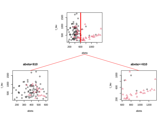
We can see in Figure Figure 2.5 that both plots are a bit “cleaner” than the original plot with respect to the group distribution. This is probably a bit more clear if we look at the distribution of different groups.
# Select variable
variableIndex<-"abeta"
variableIndex2<-"t_tau"
# plot the data for both of the variables

library(grid)      ## <-- My addition
library(gridBase)  ## <-- My addition
layout(matrix(c(0,1,0,2,0,3), 2, 3, byrow = TRUE))
barplot(prop.table(table(limited_data$group)),ylim = c(0,1))
usr1 <- par("usr")
vps1 <- do.call(vpStack, baseViewports())

barplot(prop.table(table(limited_data[limited_data$abeta<610,]$group)),main="abeta<610",ylim = c(0,1))

usr2 <- par("usr")
vps2 <- do.call(vpStack, baseViewports())

barplot(prop.table(table(limited_data[limited_data$abeta>=610,]$group)),main="abeta<610",ylim = c(0,1))

vps3 <- do.call(vpStack, baseViewports())

grid.move.to(x = unit(0.5, "npc"), y = -0.1, vp = vps1)
grid.line.to(x = unit(0.5, "npc"), y = unit(1, "npc"), vp = vps3,
             gp = gpar(col = "red"))


grid.move.to(x = unit(0.5, "npc"), y = -0.1, vp = vps1)
grid.line.to(x = unit(0.5, "npc"), y = unit(1, "npc"), vp = vps2,
             gp = gpar(col = "red"))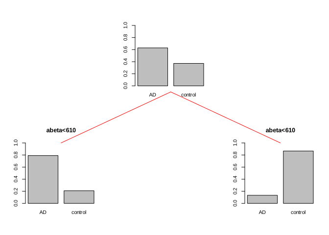
So we can conclude that the data is a bit cleaner or purer with respect to the group distribution. That is great. What we can do now? We can either say, that is good enough! Or we can continue with each of the segments. Let’s continue and do one more round of segmentation. We start with the data points where \(A\beta<610\).
par(mfrow=c(1,1))

plot(limited_data[limited_data$abeta<610,variableIndex],limited_data[limited_data$abeta<610,variableIndex2],xlab =variableIndex,ylab = variableIndex2,
    col=as.factor(limited_data[limited_data$abeta<610,]$group),pch=as.numeric(as.factor(limited_data[limited_data$abeta<610,]$group)),main="abeta<610")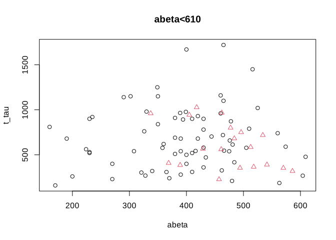
That does not look so easy. Let’s instead look at the distribution of each of the variables alone and decide
par(mfrow=c(1,2))

d <- density(limited_data[limited_data$abeta<610 & limited_data$group=="control",variableIndex])
d2<-density(limited_data[limited_data$abeta<610 & limited_data$group=="AD",variableIndex])
plot(d, main="Kernel Density of abeta",xlab="abeta")
lines(d2)
polygon(d, col=rgb(0,0,1,0.5))
polygon(d2, col=rgb(1,0,0,0.5))
legend("topleft",legend = c("AD","Control"),fill = c(rgb(1,0,0,0.5),rgb(0,0,1,0.5)))
abline(v=480,col="green",lwd=3)

d <- density(limited_data[limited_data$abeta<610 & limited_data$group=="control",variableIndex2])
d2<-density(limited_data[limited_data$abeta<610 & limited_data$group=="AD",variableIndex2])
plot(d, main="Kernel Density of t tau",xlab="t-tau")
lines(d2)
polygon(d, col=rgb(0,0,1,0.5))
polygon(d2, col=rgb(1,0,0,0.5))
legend("topleft",legend = c("AD","Control"),fill = c(rgb(1,0,0,0.5),rgb(0,0,1,0.5)))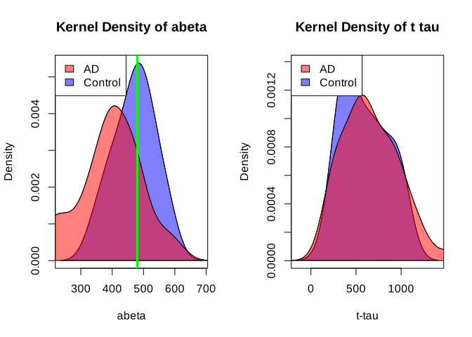
honestly, it’s difficult to separate AD from control in t-tau but we might have a shot in \(A\beta\). Somewhere around 480 close to the peak of control (the green line) might give us a reasonable segment. This will separate our data like this:
par(mfrow=c(1,1))

plot(limited_data[limited_data$abeta<610,variableIndex],limited_data[limited_data$abeta<610,variableIndex2],xlab =variableIndex,ylab = variableIndex2,
    col=as.factor(limited_data[limited_data$abeta<610,]$group),pch=as.numeric(as.factor(limited_data[limited_data$abeta<610,]$group)),main="abeta<610")
abline(v=480,col="green",lwd=3)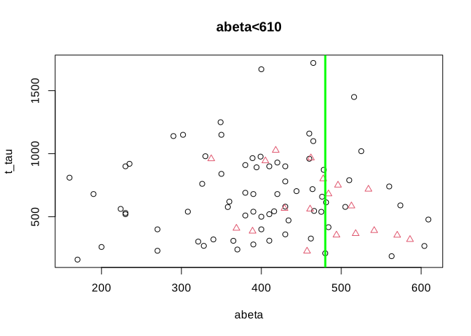
Now let’s look at the previous segments together and see where we are:
# Select variable
variableIndex<-"abeta"
variableIndex2<-"t_tau"
# plot the data for both of the variables

library(grid)      ## <-- My addition
library(gridBase)  ## <-- My addition

layout(matrix(c(0,0,0,1,0,0,0,
                0,2,0,0,0,3,0,
                4,0,5,0,6,0,7), 3, 7, byrow = TRUE))

limited_data2<-limited_data[limited_data$abeta<610,]
plot(limited_data[,variableIndex],limited_data[,variableIndex2],xlab =variableIndex,ylab = variableIndex2,
    col=as.factor(limited_data$group),pch=as.numeric(as.factor(limited_data$group)))
usr1 <- par("usr")
vps1 <- do.call(vpStack, baseViewports())
abline(v=610,col="red",lwd=3)
plot(limited_data[limited_data$abeta<610,variableIndex],limited_data[limited_data$abeta<610,variableIndex2],xlab =variableIndex,ylab = variableIndex2,
    col=as.factor(limited_data[limited_data$abeta<610,]$group),pch=as.numeric(as.factor(limited_data[limited_data$abeta<610,]$group)),main="abeta<610")
usr2 <- par("usr")
vps2 <- do.call(vpStack, baseViewports())
abline(v=480,col="green",lwd=3)
plot(limited_data[limited_data$abeta>=610,variableIndex],limited_data[limited_data$abeta>=610,variableIndex2],xlab =variableIndex,ylab = variableIndex2,
    col=as.factor(limited_data[limited_data$abeta>=610,]$group),pch=as.numeric(as.factor(limited_data[limited_data$abeta>=610,]$group)),main="abeta>=610")

vps3 <- do.call(vpStack, baseViewports())


plot(limited_data2[limited_data2$abeta<480,variableIndex],limited_data2[limited_data2$abeta<480,variableIndex2],xlab =variableIndex,ylab = variableIndex2,
    col=as.factor(limited_data2[limited_data2$abeta<480,]$group),pch=as.numeric(as.factor(limited_data2[limited_data2$abeta<480,]$group)),main="abeta<480")

vps4 <- do.call(vpStack, baseViewports())


plot(limited_data2[limited_data2$abeta>=480,variableIndex],limited_data2[limited_data2$abeta>=480,variableIndex2],xlab =variableIndex,ylab = variableIndex2,
    col=as.factor(limited_data2[limited_data2$abeta>=480,]$group),pch=as.numeric(as.factor(limited_data2[limited_data2$abeta>=480,]$group)),main="abeta>=480")

vps5 <- do.call(vpStack, baseViewports())


grid.move.to(x = unit(0.5, "npc"), y = -0.4, vp = vps1)
grid.line.to(x = unit(0.5, "npc"), y = unit(1, "npc"), vp = vps3,
             gp = gpar(col = "red"))


grid.move.to(x = unit(0.5, "npc"), y = -0.4, vp = vps1)
grid.line.to(x = unit(0.5, "npc"), y = unit(1, "npc"), vp = vps2,
             gp = gpar(col = "red"))


grid.move.to(x = unit(0.5, "npc"), y = -0.4, vp = vps2)
grid.line.to(x = unit(0.5, "npc"), y = unit(1, "npc"), vp = vps4,
             gp = gpar(col = "red"))

grid.move.to(x = unit(0.5, "npc"), y = -0.4, vp = vps2)
grid.line.to(x = unit(0.5, "npc"), y = unit(1, "npc"), vp = vps5,
             gp = gpar(col = "red"))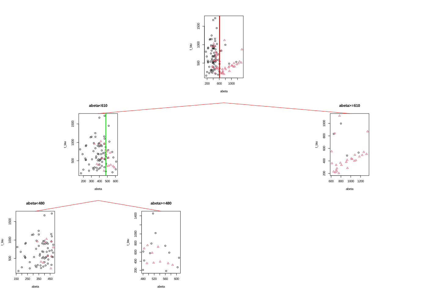
If we read Figure Figure 2.10 from top to bottom, we first started with all the data, we then segment the data based on abeta=610, giving us two segments of the original data. We then took the left segment (abeta<610) and did another round of segmentation giving us two more subgroups of the data.
We can now continue with the right subgroup (abeta>=610) similar to the left subgroup. This subgroup looks quite clean already but we can probably make it slightly better but putting a cutoff on t-tau. This time we place our segmentation line on 475.
par(mfrow=c(1,1))

plot(limited_data[limited_data$abeta>=610,variableIndex],limited_data[limited_data$abeta>=610,variableIndex2],xlab =variableIndex,ylab = variableIndex2,
    col=as.factor(limited_data[limited_data$abeta>=610,]$group),pch=as.numeric(as.factor(limited_data[limited_data$abeta>=610,]$group)),main="abeta<610")
abline(h=475,col="blue",lwd=2)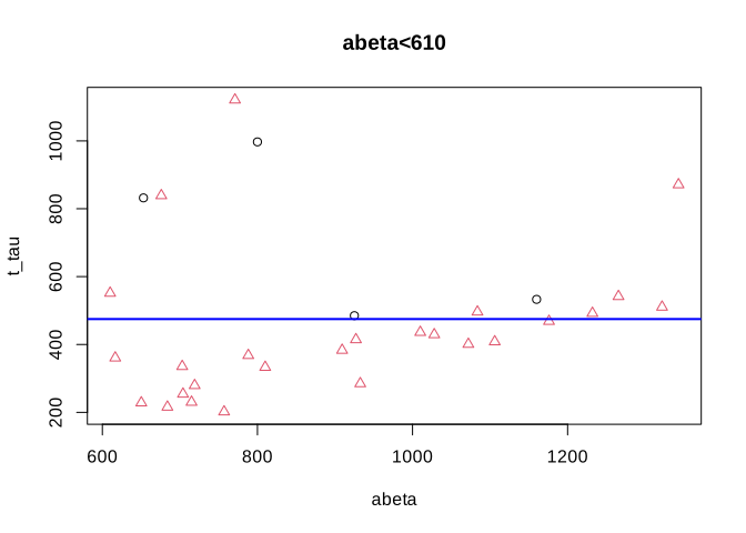
# Select variable
variableIndex<-"abeta"
variableIndex2<-"t_tau"
# plot the data for both of the variables

library(grid)      ## <-- My addition
library(gridBase)  ## <-- My addition

layout(matrix(c(0,0,0,1,0,0,0,
                0,2,0,0,0,3,0,
                4,0,5,0,6,0,7), 3, 7, byrow = TRUE))

limited_data2<-limited_data[limited_data$abeta<610,]
limited_data3<-limited_data[limited_data$abeta>=610,]
plot(limited_data[,variableIndex],limited_data[,variableIndex2],xlab =variableIndex,ylab = variableIndex2,
    col=as.factor(limited_data$group),pch=as.numeric(as.factor(limited_data$group)))
usr1 <- par("usr")
vps1 <- do.call(vpStack, baseViewports())
abline(v=610,col="red",lwd=3)
plot(limited_data[limited_data$abeta<610,variableIndex],limited_data[limited_data$abeta<610,variableIndex2],xlab =variableIndex,ylab = variableIndex2,
    col=as.factor(limited_data[limited_data$abeta<610,]$group),pch=as.numeric(as.factor(limited_data[limited_data$abeta<610,]$group)),main="abeta<610")
usr2 <- par("usr")
vps2 <- do.call(vpStack, baseViewports())
abline(v=480,col="green",lwd=3)
plot(limited_data[limited_data$abeta>=610,variableIndex],limited_data[limited_data$abeta>=610,variableIndex2],xlab =variableIndex,ylab = variableIndex2,
    col=as.factor(limited_data[limited_data$abeta>=610,]$group),pch=as.numeric(as.factor(limited_data[limited_data$abeta>=610,]$group)),main="abeta>=610")

vps3 <- do.call(vpStack, baseViewports())
abline(h=475,col="blue",lwd=3)


plot(limited_data2[limited_data2$abeta<480,variableIndex],limited_data2[limited_data2$abeta<480,variableIndex2],xlab =variableIndex,ylab = variableIndex2,
    col=as.factor(limited_data2[limited_data2$abeta<480,]$group),pch=as.numeric(as.factor(limited_data2[limited_data2$abeta<480,]$group)),main="abeta<480")

vps4 <- do.call(vpStack, baseViewports())


plot(limited_data2[limited_data2$abeta>=480,variableIndex],limited_data2[limited_data2$abeta>=480,variableIndex2],xlab =variableIndex,ylab = variableIndex2,
    col=as.factor(limited_data2[limited_data2$abeta>=480,]$group),pch=as.numeric(as.factor(limited_data2[limited_data2$abeta>=480,]$group)),main="abeta>=480")

vps5 <- do.call(vpStack, baseViewports())


plot(limited_data3[limited_data3$t_tau<475,variableIndex],limited_data3[limited_data3$t_tau<475,variableIndex2],xlab =variableIndex,ylab = variableIndex2,
    col=2,pch=2,main="t-tau<480")

vps6 <- do.call(vpStack, baseViewports())


plot(limited_data3[limited_data3$t_tau>=475,variableIndex],limited_data3[limited_data3$t_tau>=475,variableIndex2],xlab =variableIndex,ylab = variableIndex2,
    col=as.factor(limited_data3[limited_data3$t_tau>=475,]$group),pch=as.numeric(as.factor(limited_data3[limited_data3$t_tau>=475,]$group)),main="t-tau>=480")

vps7 <- do.call(vpStack, baseViewports())


grid.move.to(x = unit(0.5, "npc"), y = -0.4, vp = vps1)
grid.line.to(x = unit(0.5, "npc"), y = unit(1, "npc"), vp = vps3,
             gp = gpar(col = "red"))


grid.move.to(x = unit(0.5, "npc"), y = -0.4, vp = vps1)
grid.line.to(x = unit(0.5, "npc"), y = unit(1, "npc"), vp = vps2,
             gp = gpar(col = "red"))


grid.move.to(x = unit(0.5, "npc"), y = -0.4, vp = vps2)
grid.line.to(x = unit(0.5, "npc"), y = unit(1, "npc"), vp = vps4,
             gp = gpar(col = "red"))

grid.move.to(x = unit(0.5, "npc"), y = -0.4, vp = vps2)
grid.line.to(x = unit(0.5, "npc"), y = unit(1, "npc"), vp = vps5,
             gp = gpar(col = "red"))

grid.move.to(x = unit(0.5, "npc"), y = -0.4, vp = vps3)
grid.line.to(x = unit(0.5, "npc"), y = unit(1, "npc"), vp = vps6,
             gp = gpar(col = "red"))

grid.move.to(x = unit(0.5, "npc"), y = -0.4, vp = vps3)
grid.line.to(x = unit(0.5, "npc"), y = unit(1, "npc"), vp = vps7,
             gp = gpar(col = "red"))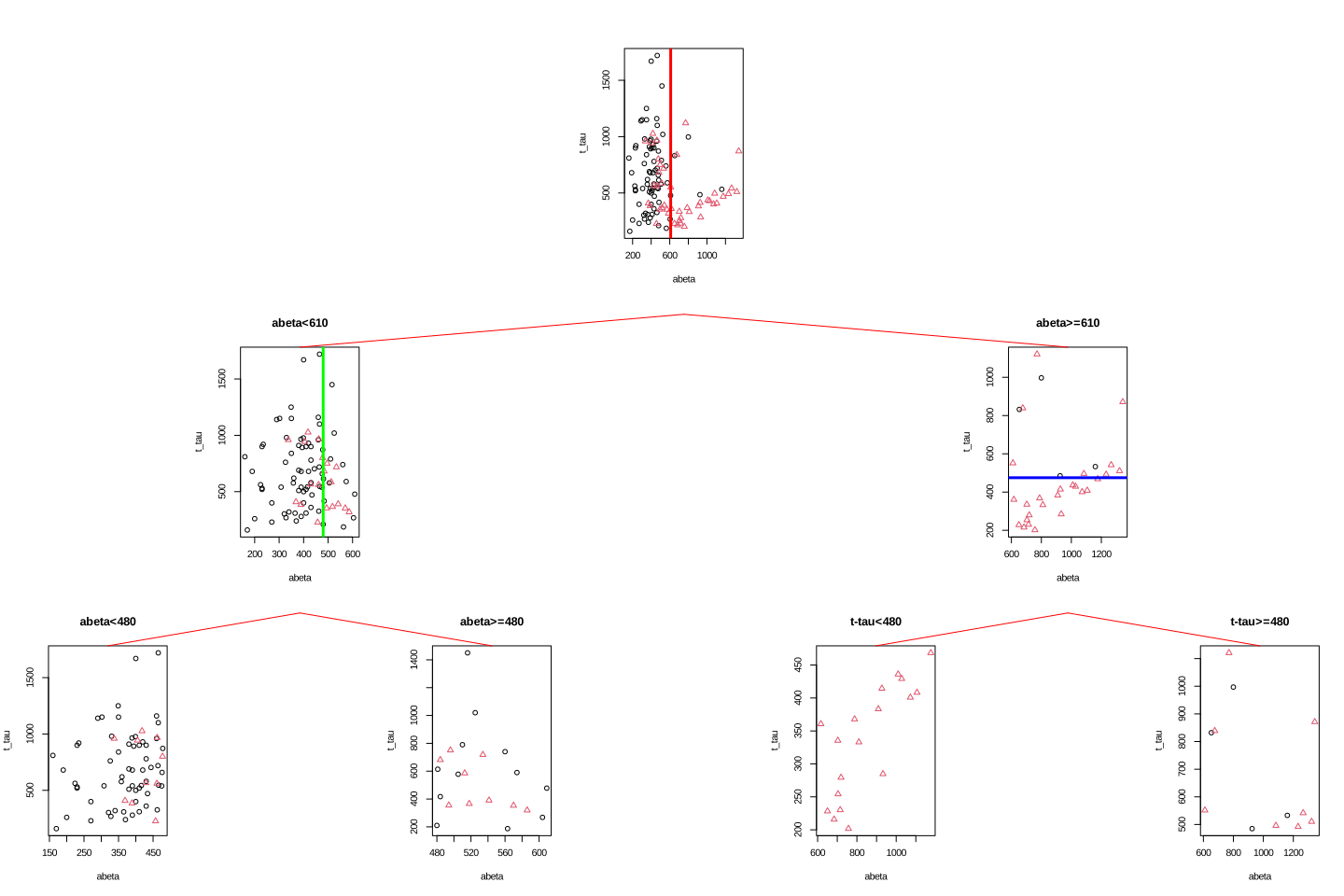
We choose to stop now. We have a tree with four leaves (plots at the bottom) but how do we do prediction? We first have a look at the group distribution in the leaves of the tree. The first two leaves on the left have AD as the most common group so any new samples that can reach these leaves can be classified as AD. Similarly, any new sample that reaches the two right leaves can be classified as control.
# Select variable
variableIndex<-"abeta"
variableIndex2<-"t_tau"
# plot the data for both of the variables

library(grid)      ## <-- My addition
library(gridBase)  ## <-- My addition

layout(matrix(c(0,0,0,1,0,0,0,
                0,2,0,0,0,3,0,
                4,0,5,0,6,0,7), 3, 7, byrow = TRUE))

limited_data2<-limited_data[limited_data$abeta<610,]
limited_data3<-limited_data[limited_data$abeta>=610,]

barplot(prop.table(table(limited_data$group)),ylim = c(0,1))

usr1 <- par("usr")
vps1 <- do.call(vpStack, baseViewports())
barplot(prop.table(table(limited_data[limited_data$abeta<610,]$group)),ylim = c(0,1),main="abeta<610")
usr2 <- par("usr")
vps2 <- do.call(vpStack, baseViewports())


barplot(prop.table(table(limited_data[limited_data$abeta>=610,]$group)),ylim = c(0,1),main="abeta>=610")
vps3 <- do.call(vpStack, baseViewports())


barplot(prop.table(table(limited_data2[limited_data2$abeta<480,]$group)),ylim = c(0,1),main="abeta<480")

vps4 <- do.call(vpStack, baseViewports())

barplot(prop.table(table(limited_data2[limited_data2$abeta>=480,]$group)),ylim = c(0,1),main="abeta>=480")
vps5 <- do.call(vpStack, baseViewports())


barplot(prop.table(table(limited_data3[limited_data3$t_tau<475,]$group)),ylim = c(0,1),main="t-tau<480")

vps6 <- do.call(vpStack, baseViewports())


barplot(prop.table(table(limited_data3[limited_data3$t_tau>=475,]$group)),ylim = c(0,1),main="t-tau>=480")

vps7 <- do.call(vpStack, baseViewports())


grid.move.to(x = unit(0.5, "npc"), y = -0.4, vp = vps1)
grid.line.to(x = unit(0.5, "npc"), y = unit(1, "npc"), vp = vps3,
             gp = gpar(col = "red"))


grid.move.to(x = unit(0.5, "npc"), y = -0.4, vp = vps1)
grid.line.to(x = unit(0.5, "npc"), y = unit(1, "npc"), vp = vps2,
             gp = gpar(col = "red"))


grid.move.to(x = unit(0.5, "npc"), y = -0.4, vp = vps2)
grid.line.to(x = unit(0.5, "npc"), y = unit(1, "npc"), vp = vps4,
             gp = gpar(col = "red"))

grid.move.to(x = unit(0.5, "npc"), y = -0.4, vp = vps2)
grid.line.to(x = unit(0.5, "npc"), y = unit(1, "npc"), vp = vps5,
             gp = gpar(col = "red"))

grid.move.to(x = unit(0.5, "npc"), y = -0.4, vp = vps3)
grid.line.to(x = unit(0.5, "npc"), y = unit(1, "npc"), vp = vps6,
             gp = gpar(col = "red"))

grid.move.to(x = unit(0.5, "npc"), y = -0.4, vp = vps3)
grid.line.to(x = unit(0.5, "npc"), y = unit(1, "npc"), vp = vps7,
             gp = gpar(col = "red"))

grid.text("AD",x = unit(0.5, "npc"),y=unit(-0.25, "npc"),vp=vps4,gp = gpar(col="red"))
grid.text("AD",x = unit(0.5, "npc"),y=unit(-0.25, "npc"),vp=vps5,gp = gpar(col="red"))
grid.text("Control",x = unit(0.5, "npc"),y=unit(-0.25, "npc"),vp=vps6,gp = gpar(col="red"))
grid.text("Control",x = unit(0.5, "npc"),y=unit(-0.25, "npc"),vp=vps7,gp = gpar(col="red"))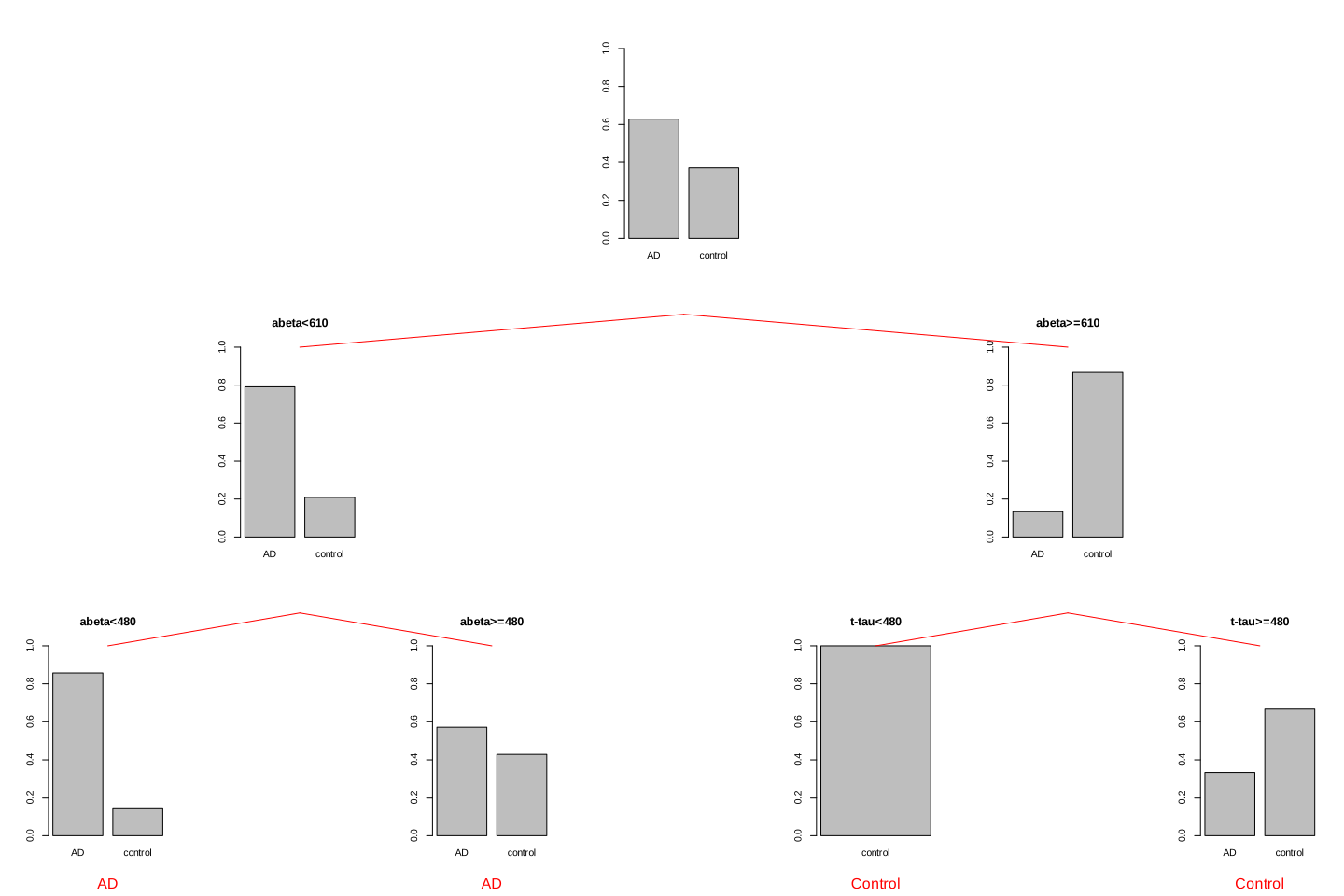
To do the classification, we just need to follow the rules we have derived in the previous steps. At the very beginning (the root of the tree), we used \(A\beta=610\), on the left-hand side we used \(A\beta=480\) and on the right-hand side, we used \(t-tau=475\). So for a new sample, we first test where its \(A\beta\) is lower than 610, if yes, it goes to the left of the tree otherwise it will go to the right side. If for example, it goes to the left side, we again test \(A\beta\) and send the sample to the suitable leaf. The label of the leaf will show the classification of this new sample. The decision rules are shown in figure Figure 2.14.
limited_data2<-limited_data
limited_data2$group<-factor(limited_data2$group)
tt<-tree::tree(group~abeta+t_tau,data=limited_data2,split="gini",mincut=12)

tt$frame[1,5][1]<-"<610"
tt$frame[2,5][1]<-"<480"
tt$frame[11,5][1]<-"<475"

tt$frame[3,1]<-"<leaf>"
tt$frame[3,5]<-tt$frame[4,5]

tt$frame<-tt$frame[-c(5:10),]
rownames(tt$frame)[4]<-"5"
plot(tt)
text(tt,pretty=1)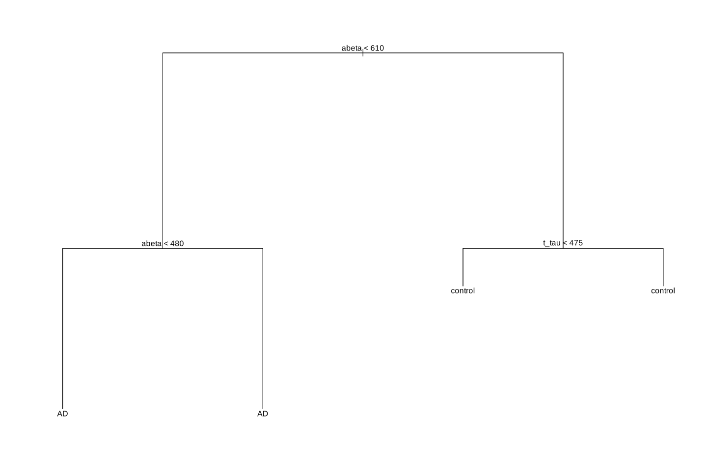
In the beginning, we said that decision trees segments our data. We can have a look at our toy example and see how this segmentation has been done:
par(mfrow=c(1,1))
plot(limited_data[,variableIndex],limited_data[,variableIndex2],xlab =variableIndex,ylab = variableIndex2,
    col=as.factor(limited_data$group),pch=as.numeric(as.factor(limited_data$group)))
abline(v=610,col="red",lwd=3)
abline(v=480,col="green",lwd=3)
lines(x=c(610,10000),y=c(475,610),col="blue",lwd=3)
legend("topleft",legend = levels(as.factor(limited_data$group)),
       col=as.factor(levels(as.factor(limited_data$group))),
       pch=as.factor(levels(as.factor(limited_data$group))))

text(300,1000,"AD",font=4)
text(550,1000,"AD",font=4)
text(1000,1000,"Control",font=4)
text(1000,300,"Control",font=4)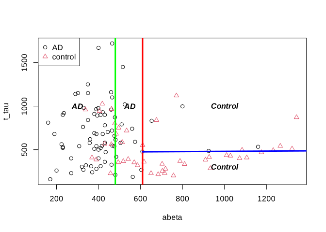
2.2 Classification
Now that we could build a tree by hand, let’s try to formally define how we can automatically do that. I guess you have noticed that, for a small number of samples and two classes, it’s relatively simple to derive segmentation rules. But look at the figure below, it’s certainly a big task to find a line to best separate the groups.
par(mfrow=c(1,1))
# Select variable
variableIndex<-"abeta"
variableIndex2<-"t_tau"
# plot the data for both of the variables
plot(data[,variableIndex],data[,variableIndex2],xlab =variableIndex,ylab = variableIndex2,
    col=as.factor(data$group),pch=as.numeric(as.factor(data$group)))
legend("topleft",legend = levels(as.factor(data$group)),
       col=as.factor(levels(as.factor(data$group))),
       pch=as.factor(levels(as.factor(data$group))))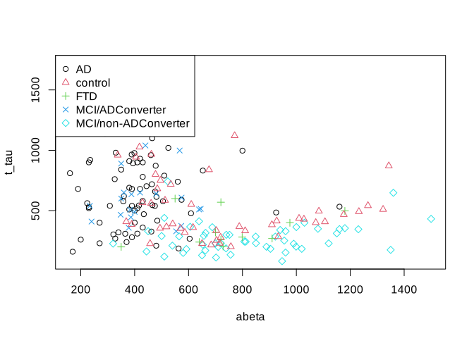
There are many measures that can be used to derive the rules. Two of the most used ones are Gini impurity and information gain.
2.2.1 Gini index, Gini impurity and Gini gain
Let’s one more time have a look at our limited dataset (only two groups) but with respect to two tree variables.
# Select variable
variableIndex<-"abeta"
variableIndex2<-"t_tau"
variableIndex2<-"p_tau"
# plot the data for both of the variables
plot(limited_data[,variableIndex],limited_data[,variableIndex2],xlab =variableIndex,ylab = variableIndex2,
    col=as.factor(limited_data$group),pch=as.numeric(as.factor(limited_data$group)))
legend("topleft",legend = levels(as.factor(limited_data$group)),
       col=as.factor(levels(as.factor(limited_data$group))),
       pch=as.factor(levels(as.factor(limited_data$group))))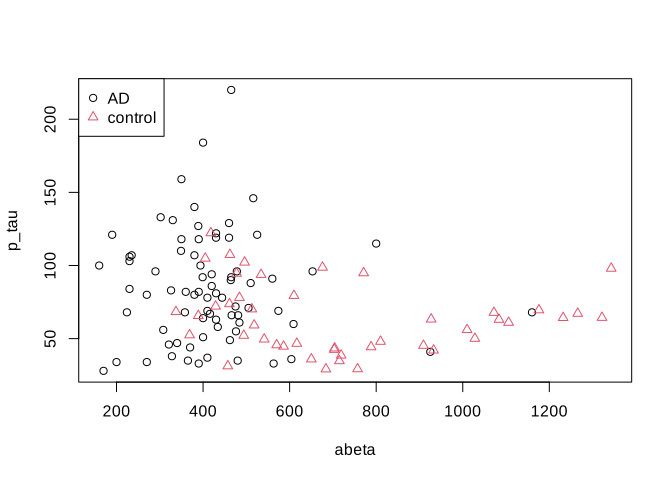
What is the probability of selecting an AD sample just by chance? Well, that is simple, we could just take the number of AD cases and divided by the total number of cases \(p(AD)=\frac{\text{number of AD}}{\text{total number of cases}}=\) 0.63. Gini index ask what is the chance of randomly picking two data points from the same group? Well, if our draws are independent, then it’s simply squared what we have calculated before so \(p(AD)^2\). Now we have two classes, so we have to do this for the control as well: \(p(control)=\frac{\text{number of controls}}{\text{total number of cases}}=\) 0.37. We can now combine these two just by summing them up, giving us the probability of selecting two random samples with the same group: \(p=p(AD)^2+p(control)^2\). What is the probability of selecting two points with different groups? That is simply \(1-(p(AD)^2+p(control)^2)\). This is Gini impurity. It just tells the probability of classifying a random point incorrectly. We can extend this to any number of classes using:
\[\text{Gini impurity}=1-\sum_{i}^{C}{p(i)^2}\] Where \(i\) is a group or a class of observation. But how we are going to use this in decision trees? We first calculate Gini impurity for the whole dataset: In our case, Gini impurity is 0.4671812.
Now we have to decide which variable to select for segmenting our data and where to cut that variable. In this stage, we will go through all variables and all different cut points and calculate the total impurity of the resulting segments. For example, let’s take our previous example:
# Select variable
variableIndex<-"abeta"
variableIndex2<-"t_tau"
# plot the data for both of the variables

library(grid)      ## <-- My addition
library(gridBase)  ## <-- My addition
layout(matrix(c(0,1,0,2,0,3), 2, 3, byrow = TRUE))
plot(limited_data[,variableIndex],limited_data[,variableIndex2],xlab =variableIndex,ylab = variableIndex2,
    col=as.factor(limited_data$group),pch=as.numeric(as.factor(limited_data$group)))
usr1 <- par("usr")
vps1 <- do.call(vpStack, baseViewports())
abline(v=610,col="red",lwd=3)
plot(limited_data[limited_data$abeta<610,variableIndex],limited_data[limited_data$abeta<610,variableIndex2],xlab =variableIndex,ylab = variableIndex2,
    col=as.factor(limited_data[limited_data$abeta<610,]$group),pch=as.numeric(as.factor(limited_data[limited_data$abeta<610,]$group)),main="abeta<610",sub=paste("Gini impurity =",round(mltools::gini_impurity(limited_data[limited_data$abeta<610,]$group),2)))
usr2 <- par("usr")
vps2 <- do.call(vpStack, baseViewports())

plot(limited_data[limited_data$abeta>=610,variableIndex],limited_data[limited_data$abeta>=610,variableIndex2],xlab =variableIndex,ylab = variableIndex2,
    col=as.factor(limited_data[limited_data$abeta>=610,]$group),pch=as.numeric(as.factor(limited_data[limited_data$abeta>=610,]$group)),main="abeta>=610",sub=paste("Gini impurity=",round(mltools::gini_impurity(limited_data[limited_data$abeta>=610,]$group),2)))

vps3 <- do.call(vpStack, baseViewports())

grid.move.to(x = unit(0.5, "npc"), y = -0.4, vp = vps1)
grid.line.to(x = unit(0.5, "npc"), y = unit(1, "npc"), vp = vps3,
             gp = gpar(col = "red"))


grid.move.to(x = unit(0.5, "npc"), y = -0.4, vp = vps1)
grid.line.to(x = unit(0.5, "npc"), y = unit(1, "npc"), vp = vps2,
             gp = gpar(col = "red"))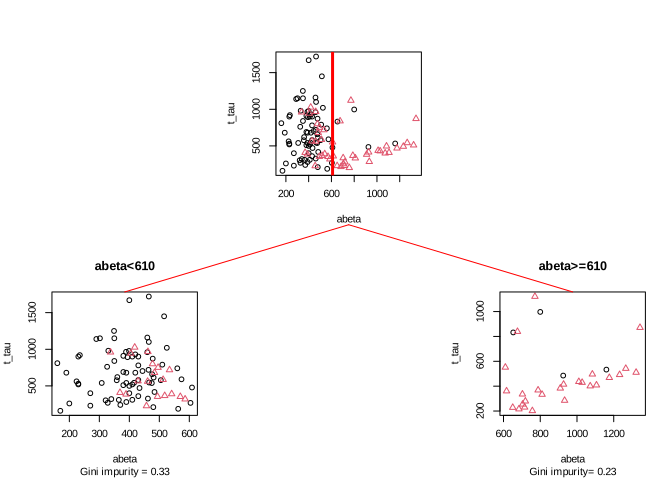
Here we split the data at \(A\beta=610\) giving us two segments (left and right). Let’s start with the left one and calculate its Gini impurity(\(GI_\text{left}=\) 0.33) and do the similar thing with the plot on the right (\(GI_\text{right}=\) 0.33). Now we simply weight these two numbers by the fraction of the total data in each of the segments. The left plot has 91 data points so the fraction becomes \(w_\text{left}=\) 91/121= 0.75 and the right plot has 30 points so the fraction becomes \(w_\text{righ}=\) 30/121= 0.25. Our final total Gini impurity is calculated as \(GI_\text{left}*w_\text{left}+GI_\text{right}*w_\text{right}=\) 0.3306818
Now we have the impurity of the segmentation. The question is how much of impurity we have removed from the original data? We can simply subtract Our original Gini impurity by \(GI_\text{left}*w_\text{left}+GI_\text{right}*w_\text{right}=\) so it will become 0.1614021. This is known as Gini Gain. The higher this value, the better the split would be. Here is a little function that does the Gini gain calculation (click on the code button!).
gini_gain<-function(x,group,cutoff){

  if(is.character(cutoff))
  {
  original_gini<-mltools::gini_impurity(group)
  gini_left<-mltools::gini_impurity(group[which(x%in%cutoff)])
  gini_right<-mltools::gini_impurity(group[which(!x%in%cutoff)])
  weight_left<-length(group[which(x%in%cutoff)])/length(group)
   weight_right<-length(group[which(!x%in%cutoff)])/length(group)

  }else{
  original_gini<-mltools::gini_impurity(group)
  gini_left<-mltools::gini_impurity(group[which(x<cutoff)])
  gini_right<-mltools::gini_impurity(group[which(x>=cutoff)])
  weight_left<-length(group[which(x<cutoff)])/length(group)
   weight_right<-length(group[which(x>=cutoff)])/length(group)
  }
   return(original_gini-(gini_left*weight_left+gini_right*weight_right))
}
2.2.2 Entropy and information gain
Similar to the Gini index, entropy is an information theory metric that measures the impurity of a set of observations with respect to a grouping variable. The way to calculate entropy and information gain is very similar to Gini.
\[\text{Entropy}=1-\sum_{i}^{C}{p(i)log{_2}{p(i)}}\] Where \(i\) can be any classes from a total of \(C\) classes. The rest of the calculations are similar to Gini. We can calculate the information gain of a parent node simply but subtracting the entropy of the child nodes from the entropy of the parent. In practice, both of these methods result in very similar splits but Gini is faster and is often preferred for this reason.
2.3 Regression
A decision tree can also be used where your \(y\) variable is continuous. In this case, you are doing a regression. The good part is that doing regression using decision trees is not that different from doing classification. The only thing we have to change is our measure for determining the split. In classification, we used Gini or entropy but in regression, we use Mean Square Error (MSE) or similar measures.
Let’s have a look at our data again but this time instead of looking at the group (e.g., AD or control) we will have a look at the MMT score.
# Select variable
variableIndex<-"abeta"
variableIndex2<-"t_tau"
# create color gradient
par(mfrow=c(1,2))
grad <- colorRampPalette(c('red','blue'))
colors<-grad(10)[as.numeric(cut(limited_data$mmt,breaks = 10))]
# plot the data for both of the variables
plot(limited_data[,variableIndex],limited_data[,variableIndex2],xlab =variableIndex,ylab = variableIndex2,
    col=colors,pch=15)

legend_image <- as.raster(matrix(grad(10), ncol=1))
plot(c(0,2),c(0,1),type = 'n', axes = F,xlab = '', ylab = '', main = 'MMT score')
text(x=1.5, y = seq(0,1,l=5), labels = seq(max(limited_data$mmt),min(limited_data$mmt),l=5))
rasterImage(legend_image, 0, 0, 1,1)
Our goal here is to use \(A\beta\) and t-tau to predict MMT scores for individuals. To do that, we first define our measure for where to segment the data. As pointed out before, we use MSE:
\[MSE=\frac{1}{n}\sum_{i=1}^{n}{(y_i-\bar{y_i})^2}\]
This essentially calculates the squared differences between each of our \(y\) and the mean of all the ys (\(\bar{y}\)). For example, if we want to calculate the MSE of our MMT scores for our entire dataset, we can calculate mean our MMSs=25.338843 then we subtract every single of our MMT scores from this mean and square them. Finally, we take the average of this value: 17.5298135
Now how to use MSE to build a decision tree? We start by calculating MSE for our entire dataset like we did before: 17.5298135 We now select a variable, let’s say \(A\beta\) and split it at some value:
# Select variable
variableIndex<-"abeta"
variableIndex2<-"t_tau"
# create color gradient
par(mfrow=c(1,2))
grad <- colorRampPalette(c('red','blue'))
colors<-grad(10)[as.numeric(cut(limited_data$mmt,breaks = 10))]
# plot the data for both of the variables
plot(limited_data[,variableIndex],limited_data[,variableIndex2],xlab =variableIndex,ylab = variableIndex2,
    col=colors,pch=15,main=paste("MSE=",round(mean((limited_data$mmt-mean(limited_data$mmt))^2),2)))
abline(v=650,lwd=3,col="red")
legend_image <- as.raster(matrix(grad(10), ncol=1))
plot(c(0,2),c(0,1),type = 'n', axes = F,xlab = '', ylab = '', main = 'MMT score')
text(x=1.5, y = seq(0,1,l=5), labels = seq(max(limited_data$mmt),min(limited_data$mmt),l=5))
rasterImage(legend_image, 0, 0, 1,1)
We now calculate the MSE of MMT for the left and right parts of the plot.
# Select variable
variableIndex<-"abeta"
variableIndex2<-"t_tau"
# create color gradient
par(mfrow=c(1,2))
grad <- colorRampPalette(c('red','blue'))
colors<-grad(10)[as.numeric(cut(limited_data$mmt,breaks = 10))]
# plot the data for both of the variables
plot(limited_data[,variableIndex],limited_data[,variableIndex2],xlab =variableIndex,ylab = variableIndex2,
    col=colors,pch=15,main=paste("MSE=",round(mean((limited_data$mmt-mean(limited_data$mmt))^2),2)))
abline(v=650,lwd=3,col="red")
text(x=300,y=1500,paste("MSE=",round(mean((limited_data[limited_data$abeta<650,]$mmt-mean(limited_data[limited_data$abeta<650,]$mmt))^2),2)))
text(x=1000,y=1500,paste("MSE=",round(mean((limited_data[limited_data$abeta>=650,]$mmt-mean(limited_data[limited_data$abeta>=650,]$mmt))^2),2)))
legend_image <- as.raster(matrix(grad(10), ncol=1))
plot(c(0,2),c(0,1),type = 'n', axes = F,xlab = '', ylab = '', main = 'MMT score')
text(x=1.5, y = seq(0,1,l=5), labels = seq(max(limited_data$mmt),min(limited_data$mmt),l=5))
rasterImage(legend_image, 0, 0, 1,1)

(round(mean((limited_data[limited_data$abeta<650,]$mmt-mean(limited_data[limited_data$abeta<650,]$mmt))^2),2)*(sum(limited_data$abeta<650)/length(limited_data$abeta)))+(round(mean((limited_data[limited_data$abeta>=650,]$mmt-mean(limited_data[limited_data$abeta>=650,]$mmt))^2),2)*(sum(limited_data$abeta>=650)/length(limited_data$abeta)))
[1] 16.12248
We now weight the two MSEs by the proportion of the number of data points on each side of the split and sum them up (exactly like total Gini): \(MSE_\text{left}*w_\text{left}+MSE_\text{right}*w_\text{right}= 16.9 \times \frac{93}{121} + 13.54 \times \frac{28}{121}=16.12\)
Now we have the MSE of the split. We will go ahead and subtract the MSE for the entire dataset by the MSE of the split: \(MSE_{parent}-MSE_{split}=17.53-16.12=1.41\)
Our aim is every time we want to do a split in the tree, we select a variable and a cut point that maximize variance reduction. The rest of the story is almost exactly like the classification. The only big difference is that when we go to the leaf of the tree and want to do a prediction. We use the average of \(y\) variable in that leaf as the predicted value. For example. Let’s say we build a tree and it looks like this:
# Select variable
variableIndex<-"abeta"
variableIndex2<-"t_tau"
# plot the data for both of the variables

library(grid)      ## <-- My addition
library(gridBase)  ## <-- My addition

layout(matrix(c(0,0,0,1,0,0,0,
                0,2,0,0,0,3,0,
                4,0,5,0,6,0,7), 3, 7, byrow = TRUE))

grad <- colorRampPalette(c('red','blue'))
colors<-grad(10)[as.numeric(cut(limited_data$mmt,breaks = 10))]

limited_data2<-limited_data[limited_data$abeta<610,]
limited_data3<-limited_data[limited_data$abeta>=610,]
plot(limited_data[,variableIndex],limited_data[,variableIndex2],xlab =variableIndex,ylab = variableIndex2,
    col=colors,pch=15)
usr1 <- par("usr")
vps1 <- do.call(vpStack, baseViewports())
abline(v=610,col="red",lwd=3)


colors<-grad(10)[as.numeric(cut(limited_data[limited_data$abeta<610,]$mmt,breaks = 10))]

plot(limited_data[limited_data$abeta<610,variableIndex],limited_data[limited_data$abeta<610,variableIndex2],xlab =variableIndex,ylab = variableIndex2,
    col=colors,pch=15,main="abeta<610")
usr2 <- par("usr")
vps2 <- do.call(vpStack, baseViewports())
abline(v=480,col="green",lwd=3)
colors<-grad(10)[as.numeric(cut(limited_data[limited_data$abeta>=610,]$mmt,breaks = 10))]
plot(limited_data[limited_data$abeta>=610,variableIndex],limited_data[limited_data$abeta>=610,variableIndex2],xlab =variableIndex,ylab = variableIndex2,
    col=colors,pch=15,main="abeta>=610")

vps3 <- do.call(vpStack, baseViewports())
abline(h=475,col="blue",lwd=3)

colors<-grad(10)[as.numeric(cut(limited_data[limited_data$abeta<480,]$mmt,breaks = 10))]
plot(limited_data2[limited_data2$abeta<480,variableIndex],limited_data2[limited_data2$abeta<480,variableIndex2],xlab =variableIndex,ylab = variableIndex2,
    col=colors,pch=15,main="abeta<480")

vps4 <- do.call(vpStack, baseViewports())

colors<-grad(10)[as.numeric(cut(limited_data[limited_data$abeta>=480,]$mmt,breaks = 10))]
plot(limited_data2[limited_data2$abeta>=480,variableIndex],limited_data2[limited_data2$abeta>=480,variableIndex2],xlab =variableIndex,ylab = variableIndex2,
    col=colors,pch=15,main="abeta>=480")

vps5 <- do.call(vpStack, baseViewports())


colors<-grad(10)[as.numeric(cut(limited_data[limited_data$t_tau<475,]$mmt,breaks = 10))]
plot(limited_data3[limited_data3$t_tau<475,variableIndex],limited_data3[limited_data3$t_tau<475,variableIndex2],xlab =variableIndex,ylab = variableIndex2,
    col=colors,pch=15,main="t-tau<480")

vps6 <- do.call(vpStack, baseViewports())

colors<-grad(10)[as.numeric(cut(limited_data[limited_data$t_tau>=475,]$mmt,breaks = 10))]
plot(limited_data3[limited_data3$t_tau>=475,variableIndex],limited_data3[limited_data3$t_tau>=475,variableIndex2],xlab =variableIndex,ylab = variableIndex2,
    col=colors,pch=15,main="t-tau>=480")

vps7 <- do.call(vpStack, baseViewports())


grid.move.to(x = unit(0.5, "npc"), y = -0.4, vp = vps1)
grid.line.to(x = unit(0.5, "npc"), y = unit(1, "npc"), vp = vps3,
             gp = gpar(col = "red"))


grid.move.to(x = unit(0.5, "npc"), y = -0.4, vp = vps1)
grid.line.to(x = unit(0.5, "npc"), y = unit(1, "npc"), vp = vps2,
             gp = gpar(col = "red"))


grid.move.to(x = unit(0.5, "npc"), y = -0.4, vp = vps2)
grid.line.to(x = unit(0.5, "npc"), y = unit(1, "npc"), vp = vps4,
             gp = gpar(col = "red"))

grid.move.to(x = unit(0.5, "npc"), y = -0.4, vp = vps2)
grid.line.to(x = unit(0.5, "npc"), y = unit(1, "npc"), vp = vps5,
             gp = gpar(col = "red"))

grid.move.to(x = unit(0.5, "npc"), y = -0.4, vp = vps3)
grid.line.to(x = unit(0.5, "npc"), y = unit(1, "npc"), vp = vps6,
             gp = gpar(col = "red"))

grid.move.to(x = unit(0.5, "npc"), y = -0.4, vp = vps3)
grid.line.to(x = unit(0.5, "npc"), y = unit(1, "npc"), vp = vps7,
             gp = gpar(col = "red"))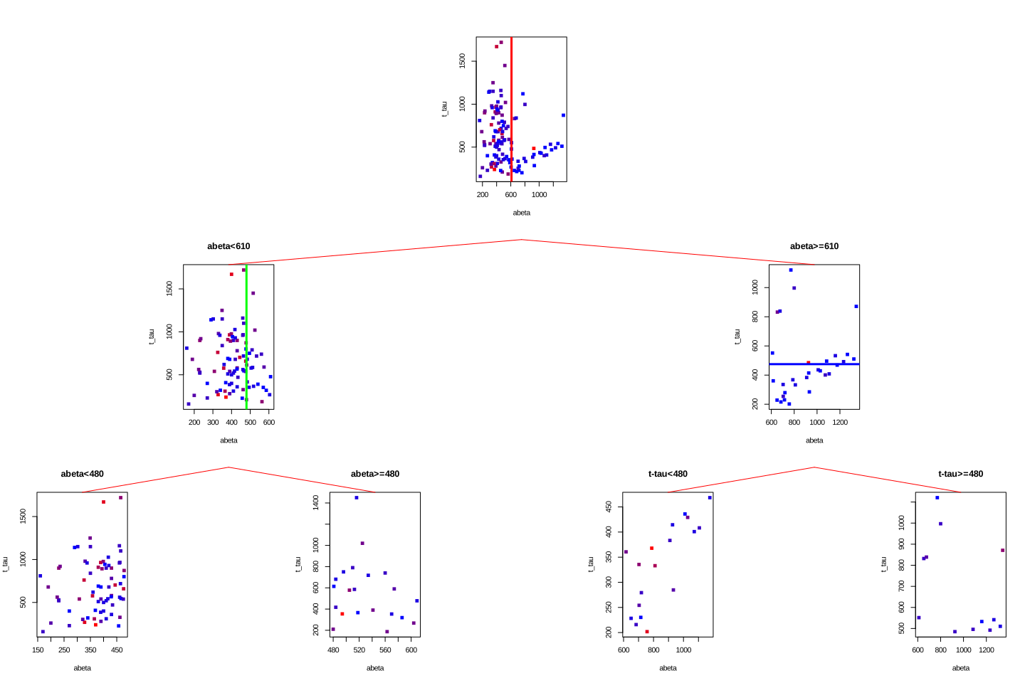
Now we have to predict the MMT score for a patient with \(A\beta=1080\) and t-tau=350. We start from the root. The root tells us to go to the left if \(A\beta\) is less than 610 otherwise go to the right. Our \(A\beta\) is 1080 so we go to the right. Now the tree tells us to go to the left if t-tau is less than 480 which is the case for our patient. We go to the left and end up in a leaf node. What is the predicted MMT score? It is simply the average of all the MMT scores in that leaf: 28.3888889. In this case, i know the true value of the MMT for that patient: 30. This is the path we have been going through:
# Select variable
variableIndex<-"abeta"
variableIndex2<-"t_tau"
# plot the data for both of the variables

library(grid)      ## <-- My addition
library(gridBase)  ## <-- My addition

layout(matrix(c(0,0,0,1,0,0,0,
                0,2,0,0,0,3,0,
                4,0,5,0,6,0,7), 3, 7, byrow = TRUE))

grad <- colorRampPalette(c('red','blue'))
colors<-grad(10)[as.numeric(cut(limited_data$mmt,breaks = 10))]

limited_data2<-limited_data[limited_data$abeta<610,]
limited_data3<-limited_data[limited_data$abeta>=610,]
plot(limited_data[,variableIndex],limited_data[,variableIndex2],xlab =variableIndex,ylab = variableIndex2,
    col=colors,pch=15)
usr1 <- par("usr")
vps1 <- do.call(vpStack, baseViewports())
abline(v=610,col="red",lwd=3)


colors<-grad(10)[as.numeric(cut(limited_data[limited_data$abeta<610,]$mmt,breaks = 10))]

plot(limited_data[limited_data$abeta<610,variableIndex],limited_data[limited_data$abeta<610,variableIndex2],xlab =variableIndex,ylab = variableIndex2,
    col=colors,pch=15,main="abeta<610")
usr2 <- par("usr")
vps2 <- do.call(vpStack, baseViewports())
abline(v=480,col="green",lwd=3)
colors<-grad(10)[as.numeric(cut(limited_data[limited_data$abeta>=610,]$mmt,breaks = 10))]
plot(limited_data[limited_data$abeta>=610,variableIndex],limited_data[limited_data$abeta>=610,variableIndex2],xlab =variableIndex,ylab = variableIndex2,
    col=colors,pch=15,main="abeta>=610")

vps3 <- do.call(vpStack, baseViewports())
abline(h=475,col="blue",lwd=3)

colors<-grad(10)[as.numeric(cut(limited_data[limited_data$abeta<480,]$mmt,breaks = 10))]
plot(limited_data2[limited_data2$abeta<480,variableIndex],limited_data2[limited_data2$abeta<480,variableIndex2],xlab =variableIndex,ylab = variableIndex2,
    col=colors,pch=15,main="abeta<480")

vps4 <- do.call(vpStack, baseViewports())

colors<-grad(10)[as.numeric(cut(limited_data[limited_data$abeta>=480,]$mmt,breaks = 10))]
plot(limited_data2[limited_data2$abeta>=480,variableIndex],limited_data2[limited_data2$abeta>=480,variableIndex2],xlab =variableIndex,ylab = variableIndex2,
    col=colors,pch=15,main="abeta>=480")

vps5 <- do.call(vpStack, baseViewports())


colors<-grad(10)[as.numeric(cut(limited_data[limited_data$t_tau<475,]$mmt,breaks = 10))]
plot(limited_data3[limited_data3$t_tau<475,variableIndex],limited_data3[limited_data3$t_tau<475,variableIndex2],xlab =variableIndex,ylab = variableIndex2,
    col=colors,pch=15,main="t-tau<480")

vps6 <- do.call(vpStack, baseViewports())

colors<-grad(10)[as.numeric(cut(limited_data[limited_data$t_tau>=475,]$mmt,breaks = 10))]
plot(limited_data3[limited_data3$t_tau>=475,variableIndex],limited_data3[limited_data3$t_tau>=475,variableIndex2],xlab =variableIndex,ylab = variableIndex2,
    col=colors,pch=15,main="t-tau>=480")

vps7 <- do.call(vpStack, baseViewports())


grid.move.to(x = unit(0.5, "npc"), y = -0.4, vp = vps1)
grid.line.to(x = unit(0.5, "npc"), y = unit(1, "npc"), vp = vps3,
             gp = gpar(col = "blue",lwd=3))


grid.move.to(x = unit(0.5, "npc"), y = -0.4, vp = vps1)
grid.line.to(x = unit(0.5, "npc"), y = unit(1, "npc"), vp = vps2,
             gp = gpar(col = "red"))


grid.move.to(x = unit(0.5, "npc"), y = -0.4, vp = vps2)
grid.line.to(x = unit(0.5, "npc"), y = unit(1, "npc"), vp = vps4,
             gp = gpar(col = "red"))

grid.move.to(x = unit(0.5, "npc"), y = -0.4, vp = vps2)
grid.line.to(x = unit(0.5, "npc"), y = unit(1, "npc"), vp = vps5,
             gp = gpar(col = "red"))

grid.move.to(x = unit(0.5, "npc"), y = -0.4, vp = vps3)
grid.line.to(x = unit(0.5, "npc"), y = unit(1, "npc"), vp = vps6,
             gp = gpar(col = "blue",lwd=3))

grid.move.to(x = unit(0.5, "npc"), y = -0.4, vp = vps3)
grid.line.to(x = unit(0.5, "npc"), y = unit(1, "npc"), vp = vps7,
             gp = gpar(col = "red"))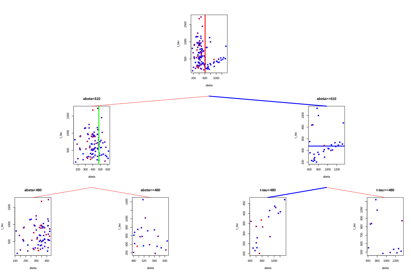
Alright. We now know how to build a decision tree and how to do predictions. But there is one more thing to know before going ahead. That is when do we stop growing the tree. If we really continue splitting the variables, in the end, we end up with a tree that has a leaf for each patient. When the tree is very large, it is more likely that it will capture noise instead of a global pattern of the data. In this case, we say that the tree is overfitted. Fortunately, there are ways to avoid that to some extent and they are called pruning methods.
2.4 Pre-pruning
Pre-pruning refers to a situation that at every single split we check a set of criteria telling us whether this split is allowed or now. For example, we could set that we want the minimum number of samples in each node or leaf to be 5. In this case, if a split leading to a leaf with less than 5 samples will be ignored. Another rule is to set the maximum size of the tree which obviously prevents the tree from growing beyond that size. Another criterion is to stop spiting a node if the improvement in purity or variance does not reach a pre-defined value. All of these methods can be set in most of the software packages such as rpart or tree.
As an example, look at our previous tree:
# Select variable
variableIndex<-"abeta"
variableIndex2<-"t_tau"
# plot the data for both of the variables

library(grid)      ## <-- My addition
library(gridBase)  ## <-- My addition

layout(matrix(c(0,0,0,1,0,0,0,
                0,2,0,0,0,3,0,
                4,0,5,0,6,0,7), 3, 7, byrow = TRUE))

limited_data2<-limited_data[limited_data$abeta<610,]
limited_data3<-limited_data[limited_data$abeta>=610,]

barplot(prop.table(table(limited_data$group)),ylim = c(0,1))

usr1 <- par("usr")
vps1 <- do.call(vpStack, baseViewports())
barplot(prop.table(table(limited_data[limited_data$abeta<610,]$group)),ylim = c(0,1),main="abeta<610")
usr2 <- par("usr")
vps2 <- do.call(vpStack, baseViewports())


barplot(prop.table(table(limited_data[limited_data$abeta>=610,]$group)),ylim = c(0,1),main="abeta>=610")
vps3 <- do.call(vpStack, baseViewports())


barplot(prop.table(table(limited_data2[limited_data2$abeta<480,]$group)),ylim = c(0,1),main="abeta<480")

vps4 <- do.call(vpStack, baseViewports())

barplot(prop.table(table(limited_data2[limited_data2$abeta>=480,]$group)),ylim = c(0,1),main="abeta>=480")
vps5 <- do.call(vpStack, baseViewports())


barplot(prop.table(table(limited_data3[limited_data3$t_tau<475,]$group)),ylim = c(0,1),main="t-tau<480")

vps6 <- do.call(vpStack, baseViewports())


barplot(prop.table(table(limited_data3[limited_data3$t_tau>=475,]$group)),ylim = c(0,1),main="t-tau>=480")

vps7 <- do.call(vpStack, baseViewports())


grid.move.to(x = unit(0.5, "npc"), y = -0.4, vp = vps1)
grid.line.to(x = unit(0.5, "npc"), y = unit(1, "npc"), vp = vps3,
             gp = gpar(col = "red"))


grid.move.to(x = unit(0.5, "npc"), y = -0.4, vp = vps1)
grid.line.to(x = unit(0.5, "npc"), y = unit(1, "npc"), vp = vps2,
             gp = gpar(col = "red"))


grid.move.to(x = unit(0.5, "npc"), y = -0.4, vp = vps2)
grid.line.to(x = unit(0.5, "npc"), y = unit(1, "npc"), vp = vps4,
             gp = gpar(col = "red"))

grid.move.to(x = unit(0.5, "npc"), y = -0.4, vp = vps2)
grid.line.to(x = unit(0.5, "npc"), y = unit(1, "npc"), vp = vps5,
             gp = gpar(col = "red"))

grid.move.to(x = unit(0.5, "npc"), y = -0.4, vp = vps3)
grid.line.to(x = unit(0.5, "npc"), y = unit(1, "npc"), vp = vps6,
             gp = gpar(col = "red"))

grid.move.to(x = unit(0.5, "npc"), y = -0.4, vp = vps3)
grid.line.to(x = unit(0.5, "npc"), y = unit(1, "npc"), vp = vps7,
             gp = gpar(col = "red"))

grid.text("AD",x = unit(0.5, "npc"),y=unit(-0.25, "npc"),vp=vps4,gp = gpar(col="red"))
grid.text("AD",x = unit(0.5, "npc"),y=unit(-0.25, "npc"),vp=vps5,gp = gpar(col="red"))
grid.text("Control",x = unit(0.5, "npc"),y=unit(-0.25, "npc"),vp=vps6,gp = gpar(col="red"))
grid.text("Control",x = unit(0.5, "npc"),y=unit(-0.25, "npc"),vp=vps7,gp = gpar(col="red"))
We see that the first two leaves on the left are both showing that AD is a major class. So maybe they are not needed. Instead, we could just stop at \(A\beta<610\) and assign every sample landing there as AD. There is however a big problem here. The tree generating methods are often greedy or short-sighted. This means that at each node, they only care about a single next move. They really don’t deal with what will happen after 10 splits from now. As a result, the tree does not know that there is a chance that a variable that is now being ignored might come up as important later down the tree. Post-pruning methods deal with that situation!
2.5 Post-pruning
Post-pruning lets us grow the tree as much as we want but after the building is over it goes through the tree and prunes off the branches that are either redundant or might give us an overfitting problem. There are multiple methods for doing that. We will go through one of the most popular ones that is called “Weakest-Link Cutting”. Before going forward we will have to introduce some math notations so it will be easier to follow the rest.
Similar to other machine learning techniques, decision trees can also be thought to optimize a function. For example, in the case of classification, we can say that we want to minimize the misclassification error rate. We define misclassification of a single node on the training data by:
\[R(t)=(1-max_j\frac{N_j(t)}{N(t)})\times \frac{N(t)}{N}\]
where \(max_j\) denote the class \(j\) which has the majority of the members of that node. \(N_j(t)\) is the number of members with class \(j\) at node \(t\). \(N(t)\) is the total number of samples at node \(t\) and \(N\) is the total number of samples in each dataset. Please remember that that \(R(t)\) only concerns a node without considering the leaves.
For a tree or a subtree, we define:
\[R(T_k)=\sum_{t\in\tilde{T_k}}{R(t)}\]
where \(\tilde{T}\) is the set of leaves of the subtree root that \(k\).
What \(R(t)\) tells you is that for any node, if you want to calculate the training error rate, calculate 1 minus the total number of samples with majority classes divide by the total number of samples at this node. Then weigh the whole thing by the proportion of the samples going to that node. For example, if I have data set with 20 samples where 10 of them are AD and the rest control. Then I make a decision tree giving me a node with 5 AD and 3 controls. The \(R(t)\) of that node becomes \((1-\frac{5}{8})\times\frac{8}{20}=0.15\).
For calculating the \(R(T_k)\), imagine i have a tree that looks like this:
library(DiagrammeR)

nodes <- create_node_df(n = 7, type = "number",label = c("1","2","3","4\nAD:3","5\nAD:1\nC:5","6\nAD:1\nC:2","7\nAD:5\nC:3"))

edges <- create_edge_df(from = c(1, 1, 2, 2, 3, 3),
                        to = c(2, 3, 4, 5, 6, 7),
                       rel = "leading to")

graph <- create_graph(nodes_df = nodes, attr_theme = "tb",
                      edges_df = edges,
                  )

render_graph(graph)Let say I want to calculate \(R(T_3)\) which means i want to find misclassification rate for the subtree starting from node \(3\). The subtree has two leaves \(6\) and \(7\). I will start with the \(6\) and calculate \(R(6)=(1-\frac{2}{3})\times\frac{3}{20}=0.049\) and i do it for the right branch also \(R(7)=(1-\frac{5}{8})\times\frac{8}{20}=0.15\). For calculating \(R(T_3)\) i simply add up \(0.049\) and \(0.15\) so \(R(T_3)=0.2\)
At this stage, we have to introduce our penalty term into \(R(T)\) so it becomes: \[R_{\alpha}(T)=R(T)+\alpha.|\tilde{T}|\] where alpha is our complexity parameter and \(|\tilde{T}|\) is the total number of leaf nodes in the tree. What this equation tells us is that, as we grow a bigger and bigger tree with a lot of leaf nodes, our misclassification error rate will increase. We should tune the cost complexity parameter to give us a good minimum \(R_{\alpha}(T)\). How do we tune this? Weakest-Link Cutting is a method for doing that. As the name suggests we will have to identify the “weakest link” subtree in the whole tree and that is given by a subtree which the minimum of
\[g(t)\left\{\begin{matrix}\frac{R(t)-R(T_t)}{|\tilde{T}_t|-1}, & t \notin \tilde{T}_t \\ +\infty, & t \in \tilde{T}_t\end{matrix}\right.\]
What this is telling us is that for a subtree rooting at node \(t\) we can calculate \(g(t)\) but subtracting the error rate of the node (\(R(t)\)) by the total error rate of its leaf nodes (\(R(T_t)\)) divided by the total number of its leaf node minus one (if \(t\) is not a lead node itself, otherwise it becomes infinity). Let’s see how we use this in practice. Look at the previous example:
library(DiagrammeR)

nodes <- create_node_df(n = 7, type = "number",label = c("1\nAD:10\nC:10","2\nAD:4\nC:5","3\nAD:6\nC:5","4\nAD:3","5\nAD:1\nC:5","6\nAD:1\nC:2","7\nAD:5\nC:3"))

edges <- create_edge_df(from = c(1, 1, 2, 2, 3, 3),
                        to = c(2, 3, 4, 5, 6, 7),
                       rel = "leading to")

graph <- create_graph(nodes_df = nodes, attr_theme = "tb",
                      edges_df = edges,
                  )

render_graph(graph)As you see, we have three nodes that are not leaf nodes (1,2, and 3). For each of these nodes we calculate their \(g(t)\):
Let’s start with the first node and set \(\alpha_1=0\): \[R(T_1)=((1-\frac{3}{3})\times \frac{3}{20})+((1-\frac{5}{6})\times \frac{6}{20})+((1-\frac{2}{3})\times \frac{3}{20})+((1-\frac{5}{8})\times \frac{8}{20})=0.25\]
\[R(1)=(1-\frac{10}{20})\times\frac{20}{20}=0.5\] \[g(1)=\frac{0.5-0.25}{4-1}=0.083\] We now do the same for node 2:
\[R(T_2)=((1-\frac{3}{3})\times \frac{3}{20})+((1-\frac{5}{6})\times \frac{6}{20})=0.05\]
\[R(2)=(1-\frac{4}{9})\times\frac{9}{20}=0.25\] \[g(2)=\frac{0.2-0.05}{2-1}=0.15\] And finally for node 3: \[R(T_3)=((1-\frac{2}{3})\times \frac{3}{20})+((1-\frac{5}{8})\times \frac{8}{20})=0.2\]
\[R(3)=(1-\frac{6}{11})\times\frac{11}{20}=0.25\] \[g(3)=\frac{0.25-0.2}{2-1}=0.05\] So we have \(g(1)=0.083\), \(g(2)=0.15\), and \(g(3)=0.05\). We see that \(g(3)\) is the minimum so the weakest link. we will prune at node 3. So our tree becomes:
library(DiagrammeR)

nodes <- create_node_df(n = 5, type = "number",label = c("1\nAD:10\nC:10","2\nAD:4\nC:5","3\nAD:6\nC:5","4\nAD:3","5\nAD:1\nC:5"))

edges <- create_edge_df(from = c(1, 1, 2, 2),
                        to = c(2, 3, 4, 5),
                       rel = "leading to")

graph <- create_graph(nodes_df = nodes, attr_theme = "tb",
                      edges_df = edges,
                  )

render_graph(graph)Please note that the node 3 is now a leaf node. We set \(\alpha_2=g(3)=0.05\) and continue with our new tree:
\[R(T_1)=((1-\frac{3}{3})\times \frac{3}{20})+((1-\frac{5}{6})\times \frac{6}{20})+((1-\frac{6}{11})\times \frac{11}{20})=0.3\]
\[R(1)=(1-\frac{10}{20})\times\frac{20}{20}=0.5\]
\[g(1)=\frac{0.5-0.3}{2-1}=0.2\] We now do the same for node 2:
\[R(T_2)=((1-\frac{3}{3})\times \frac{3}{20})+((1-\frac{5}{6})\times \frac{6}{20})=0.05\]
\[R(2)=(1-\frac{4}{9})\times\frac{9}{20}=0.25\]
\[g(2)=\frac{0.2-0.05}{2-1}=0.15\] So our \(g(2)\) is the smallest. We do another pruning here:
library(DiagrammeR)

nodes <- create_node_df(n = 3, type = "number",label = c("1\nAD:10\nC:10","2\nAD:4\nC:5","3\nAD:6\nC:5"))

edges <- create_edge_df(from = c(1, 1),
                        to = c(2, 3),
                       rel = "leading to")

graph <- create_graph(nodes_df = nodes, attr_theme = "tb",
                      edges_df = edges,
                  )

render_graph(graph)we now set \(\alpha_3=g(2)=0.15\) and continue with our final node (the root):
\[R(T_1)=((1-\frac{5}{9})\times \frac{9}{20})+((1-\frac{6}{11})\times \frac{11}{20})=0.45\]
\[R(1)=(1-\frac{10}{20})\times\frac{20}{20}=0.5\]
\[g(1)=\frac{0.5-0.45}{2-1}=0.05\] So we set the \(\alpha_4=g(1)=0.05\)
At the end of this story, we have \(\alpha_1=0\), \(\alpha_2=0.05\), \(\alpha_3=0.15\) and \(\alpha_4=0.05\). Now we define rules for selecting the best tree: If \(0\geq \alpha <0.05\) then we use our largest tree: T1. If \(\alpha=0.05\) then we can use T2. If \(0.05< \alpha <0.15\) we use T3.
The question is how do we select \(\alpha\)? The answer is cross-validation. Let’s go through it briefly.
2.6 Cross validation
Cross-validation refers to various different ways to estimate whether a statistical model can generalize to an independent dataset. The reason that we do cross-validation is that statistical models tend to fit the data points so perfectly that instead of capturing a global pattern of interest in the data, they start following the noise associated with individual data points. As a result of capturing noise, they cannot perform well when we give them a new sample to predict.
Let’s have a look at an example where we want to predict t-tau based on p-tau:
plot(limited_data$p_tau,limited_data$t_tau,xlab = "p-tau",ylab = "t-tau")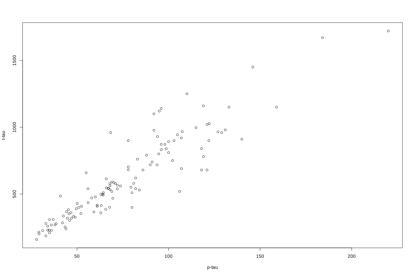
I will remove a chunk of the data randomly to be used for testing later. For the reaming data, i will fit a flexible regression model (LOESS) and one with less flexibility.
par(mfrow=c(1,2))
set.seed(20)
testing_index<-sample(1:length(limited_data$p_tau),50,replace = F)

limited_data4_training<-limited_data[-testing_index,]
limited_data4_testing<-limited_data[testing_index,]


lw1 <- loess(t_tau ~ p_tau,data=limited_data4_training,span = 0.1)
cor1<-cor(limited_data4_testing$t_tau,predict(lw1,limited_data4_testing$p_tau),use = "p")^2

j <- order(limited_data4_training$p_tau)
plot(limited_data4_training$p_tau,limited_data4_training$t_tau,xlab = "p-tau",ylab = "t-tau",main = paste("R2:", round(cor1,digits = 2)))

lines(limited_data4_training$p_tau[j],lw1$fitted[j],col="red",lwd=3)


lw1 <- loess(t_tau ~ p_tau,data=limited_data4_training,span = 0.6)
cor2<-cor(limited_data4_testing$t_tau,predict(lw1,limited_data4_testing$p_tau),use = "p")^2
plot(limited_data4_training$p_tau,limited_data4_training$t_tau,xlab = "p-tau",ylab = "t-tau",main = paste("R2:", round(cor2,digits = 2)))
j <- order(limited_data4_training$p_tau)
lines(limited_data4_training$p_tau[j],lw1$fitted[j],col="red",lwd=3)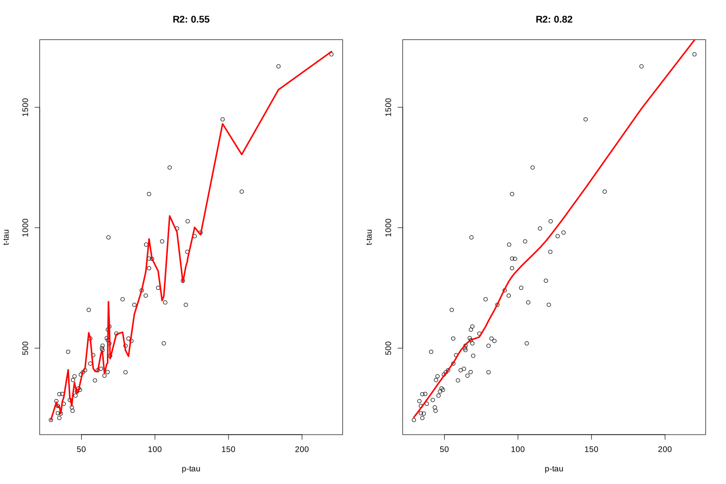
It is clear that the flexible model on the left is following individual data point and lower \(R^2=0.55\) whereas the restricted model on the right captures the pattern and get a better \(R^2=0.82\). Cross-validation can be used to figure out whether our model suffers from the sample problem or not.
The way that the cross-validation is performed is to randomly divide the dataset into several smaller subsets. They do the statistical modelling several times, each time, one subset is used as a validation set and the rest for training. Formally, we divide our dataset into \(k\) different subsets and do the following
- Take one subset of our data and keep it as the validation set.
- Take the remaining \(k-1\) subset and train the model on them
- Take the validation set and measure the performance of the model
- Repeat steps one to 3 but take another set as validation
In the end, the error of the model is the average of all the errors from the cross-validation scheme.
Now the question is, how does this have to do with complexity parameters and decision trees?
The answer is, we can do cross-validation, and every time we build a new model calculate the complexity parameter, then pick the complexity parameter that both minimize the error of the model but also size of the tree. Let’s have a look and see how we can do it in practice. We keep a small part of the data outside of the modelling and will use it for testing later.
par(mfrow=c(1,2))
set.seed(50)
testing_index<-sample(1:nrow(limited_data),20,replace = F)
data2<-limited_data[-testing_index,]
data2$group<-factor(data2$group)
data2$gender<-factor(data2$gender)


tt<-tree::tree(group~abeta+t_tau,data=data2,split="gini")
plot(tt)
text(tt,pretty=1)

set.seed(10)
cv_res = tree::cv.tree(tt, FUN = prune.misclass)

plot(cv_res$size, cv_res$dev / nrow(data2), type = "b",
     xlab = "Tree Size", ylab = "CV Misclassification Rate")
mtext("complexity parameter", side = 3, line = 3)
axis(3,labels = round(cv_res$k,2),at=cv_res$size, cex.axis=0.8)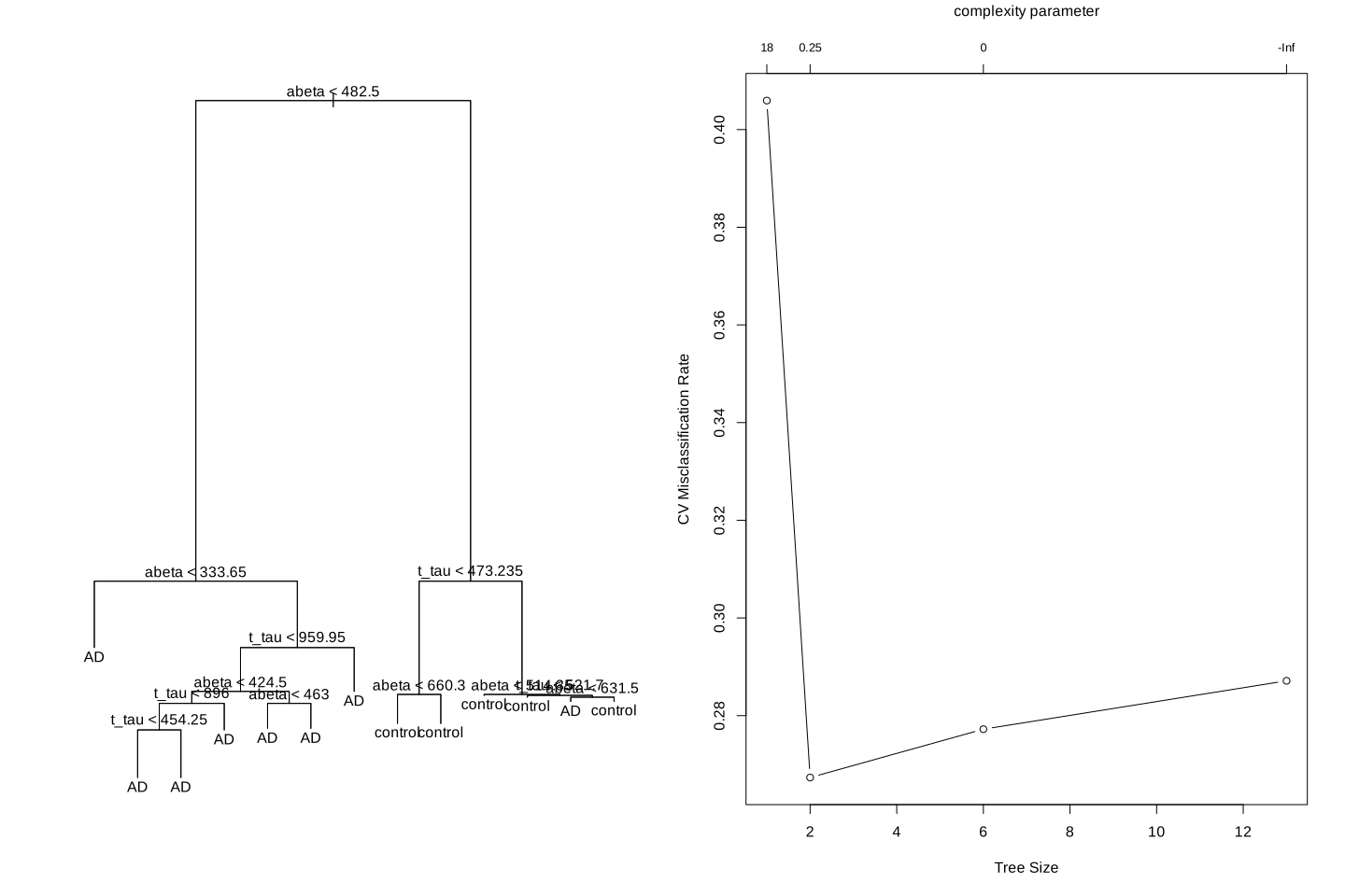
We see that our lowest missclassification error rate is coming from 0.25 leading to a tree with size 2. Let’s do the pruning:
library(tree)
par(mfrow=c(1,1))

tt2<-tree::prune.misclass(tt,k=cv_res$k[which.min(cv_res$dev)])
plot(tt2)
text(tt2,pretty=1)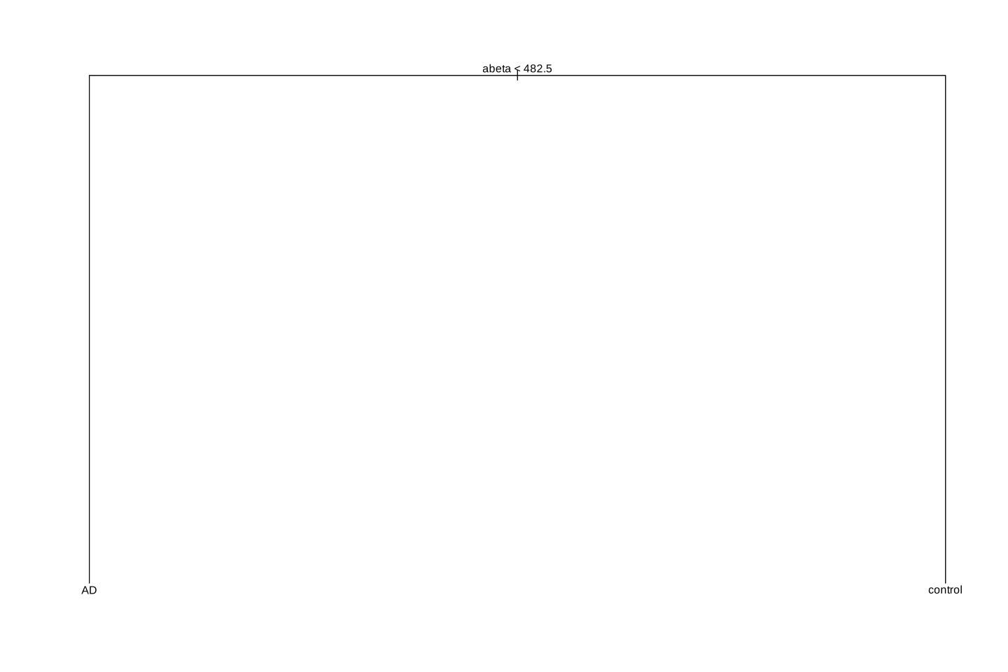
The original tree had an accuracy of 0.75 and the pruned tree has 0.75. Not that much different!? But the pruned tree is obviously more interpretable than the original one. This is what pruning does!
Similar methods that we discussed can be used for regression by changing the MSE to for example:
\[MSE_{\alpha}=\frac{1}{n}\sum_{i=1}^{n}{(y_i-\bar{y_i})^2}+\alpha.|\tilde{T}|\] We are now almost ready to go through bagging!
3 Bagging
3.1 Bias-variance
Let’s first think about the overfitting problem we went through before.
par(mfrow=c(1,2))
set.seed(20)
testing_index<-sample(1:length(limited_data$p_tau),50,replace = F)

limited_data4_training<-limited_data[-testing_index,]
limited_data4_testing<-limited_data[testing_index,]


lw1 <- loess(t_tau ~ p_tau,data=limited_data4_training,span = 0.1)
cor1<-cor(limited_data4_testing$t_tau,predict(lw1,limited_data4_testing$p_tau),use = "p")^2

j <- order(limited_data4_training$p_tau)
plot(limited_data4_training$p_tau,limited_data4_training$t_tau,xlab = "p-tau",ylab = "t-tau",main = paste("R2:", round(cor1,digits = 2)))

lines(limited_data4_training$p_tau[j],lw1$fitted[j],col="red",lwd=3)


lw1 <- loess(t_tau ~ p_tau,data=limited_data4_training,span = 0.6)
cor2<-cor(limited_data4_testing$t_tau,predict(lw1,limited_data4_testing$p_tau),use = "p")^2
plot(limited_data4_training$p_tau,limited_data4_training$t_tau,xlab = "p-tau",ylab = "t-tau",main = paste("R2:", round(cor2,digits = 2)))
j <- order(limited_data4_training$p_tau)
lines(limited_data4_training$p_tau[j],lw1$fitted[j],col="red",lwd=3)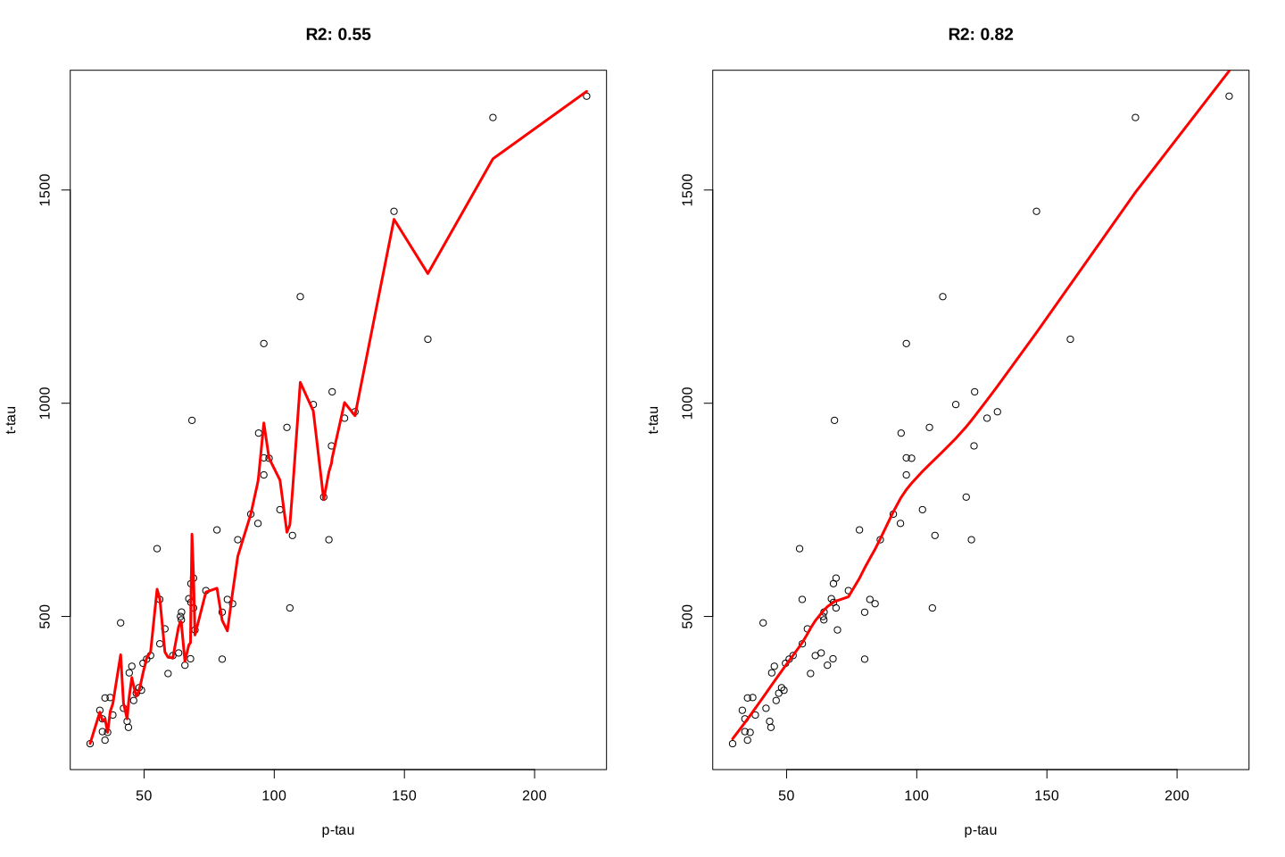
The model on the left fits the training data really good but it performs poorly on the validation set \(R^2=0.55\) whereas the model on the right has a poorer fit on the training data but achieves better performance on the validation set. We tend to say that the model has low bias high variance. That is because it pays too much attention to the training data so that it fails to generalize to what it has not seen before. Decision trees suffer from the same problem. If trained too much, they will have a fantastically low bias but very high variance. The idea behind bagging is to reduce this variance through training multiple models on the same data. Let’s see how it works and why it works.
3.2 Bootstrap aggregating
The idea behind bootstrap aggregating is to subsample the data (with replacement) into different datasets of the same size. These datasets are then independently modelled using for example decision trees. For the prediction, we look at what each of the trees tells us about the value of the new sample and simply accept what the majority of them are saying!
More formally, if we assume that we have \(N\) samples in our datasets we do the following:
Take a random sample of size \(N\) with replacement from the original dataset.
Train a decision tree on this subset (no pruning here. We want this to have a relatively high bias).
Repeat the step 1 and 2 many many times.
Predict each sample to a final group by a majority vote over the set of trees. For example, if we have 500 trees and 400 of them say sample \(x\) is AD, then we use this as the predicted group for the sample \(x\). For regression, we simply take the mean of all the predicted values of all the 500 trees.
Please note that we let each tree to grow reasonably large to capture each tree point of view of our problem. This often leads to high variance in each tree but then we the averaging or the majority of the vote will reduce this variance to a reasonable number. More formally if we define our variance as \(\sigma^2\) for a single variable, having \(m\) variables (independently and identically distributed) will give us \(\frac{\sigma^2}{m}\). In the case of bagging, since we draw from the same pool of samples, we don’t have independently distributed samples so we have to take correlation into account. Thus our variance of average becomes \(p\sigma^2+\frac{1-p}{m}\sigma^2\) where \(p\) is pairwise correlation between different trees and \(\sigma^2\) is the variance. It is easy to see that if we increase \(m\) to a very large number (total number of resampling) we end up have our variance as \(p\sigma^2\). That means that unless we have a perfect correlation between the trees, we will reduce the variance and as the result getting better predictions.
3.3 Out-Of-Bag error
One cool thing about bagging is that it comes with almost a free cross-validation built-in! Remember that when we do resampling, each time, some of our samples will not be selected for modelling. If we do have not too few samples, we can use those samples to estimate what is so-called, out-of-bag error. For example, imagine that we have a dataset with 5 samples (\(x_1,x_2,x_3,x_4,x_5\)) samples. We decide to do decision trees with bagging and 3 resamplings. First we select subsample of the data (\(x_1,x_2,x_2,x_4,x_4\)) and do a decision tree (\(T_1\)). Please note that we did not select \(x_3\) and \(x_5\). We now do another tree (\(T_2\)) and we select these samples to do that: (\(x_1,x_2,x_2,x_2,x_2\)). For the last time, we do \(T_3\) and select (\(x_1,x_2,x_2,x_3,x_4\)). To calculate out of bag error, we look at \(x_3\), we see that we did not use this sample in \(T_1\) and \(T_2\) so we use these two trees to predict the class of this sample. We now look at \(x_4\) and see that we have not used this sample in \(T_2\). We use \(T_2\) to predict \(x_4\). Finally, we see that \(X_5\) has not been used in any of the trees, then we used all the trees to predict \(x_5\). So we have tree samples predicted by the trees that have never seen these samples giving us an estimated cross-validation measure even without doing cross-validation! Given, enough samples, out of bag error will be close to 3-fold cross-validation.
3.4 Application
In R, we can use, ipred together with rpart package to perform bagging.
library(ipred)
library(rpart)
par(mfrow=c(1,2))
set.seed(20)
testing_index<-sample(1:length(data$p_tau),100,replace = F)

limited_data4_training<-data[-testing_index,]
limited_data4_testing<-data[testing_index,]

limited_data4_training$group<-as.factor(limited_data4_training$group)
limited_data4_training$gender<-as.factor(limited_data4_training$gender)

limited_data4_testing$group<-as.factor(limited_data4_testing$group)
limited_data4_testing$gender<-as.factor(limited_data4_testing$gender)

set.seed(10)
bagged_model <- bagging(group ~ ., data = limited_data4_training,nbagg=100)


set.seed(10)
tree_model <- rpart(group ~ ., data = limited_data4_training,
   method="class")
set.seed(10)
tree_model<- prune(tree_model, cp=   tree_model$cptable[which.min(tree_model$cptable[,"xerror"]),"CP"])

acc_bagging<-mean(limited_data4_testing$group == predict(bagged_model,limited_data4_testing,type = "class"))

acc_tree<-mean(limited_data4_testing$group == predict(tree_model,limited_data4_testing,type = "class"))


confMatrix_bagging<-caret::confusionMatrix(predict(bagged_model,limited_data4_testing[,-7],type = "class"),limited_data4_testing$group )
confMatrix_tree<-caret::confusionMatrix(predict(tree_model,limited_data4_testing[,-7],type = "class"),limited_data4_testing$group )


plot_data<-rbind(data.frame(reshape::melt(confMatrix_bagging$table),Method="Bagging"),
      data.frame(reshape::melt(confMatrix_tree$table),Method="Normal"))

names(plot_data)[1:2]<-c("x","y")
plot_data$Color=NA
plot_data$Color[plot_data$x==plot_data$y]<-"red"
library(ggplot2)

ggplot(plot_data, aes(Method,fill=Method)) +
    geom_bar(aes(y = value),
             stat = "identity"#, position = "dodge"
             ) +
    geom_text(aes(y = -5, label = value,color=Method)) +
    facet_grid(x ~ y, switch = "y") +
    labs(title = "",
         y = "Predicted class",
         x = "True class") +
    theme_bw() +
   geom_rect(data=plot_data, aes(fill=Color), xmin=-Inf, xmax=Inf, ymin=-Inf, ymax=Inf, alpha=0.095)+
  scale_fill_manual(values=c("blue", "red","red"), breaks=NULL)+
    scale_color_manual(values=c("blue", "red"), breaks=NULL)+
    theme(strip.background = element_blank(),panel.border = element_rect(color = , fill = NA, size = 1),
          axis.text.y = element_blank(),
          axis.text.x = element_text(size = 9),
          axis.ticks = element_blank(),
          strip.text.y = element_text(angle = 0),
          strip.text = element_text(size = 9))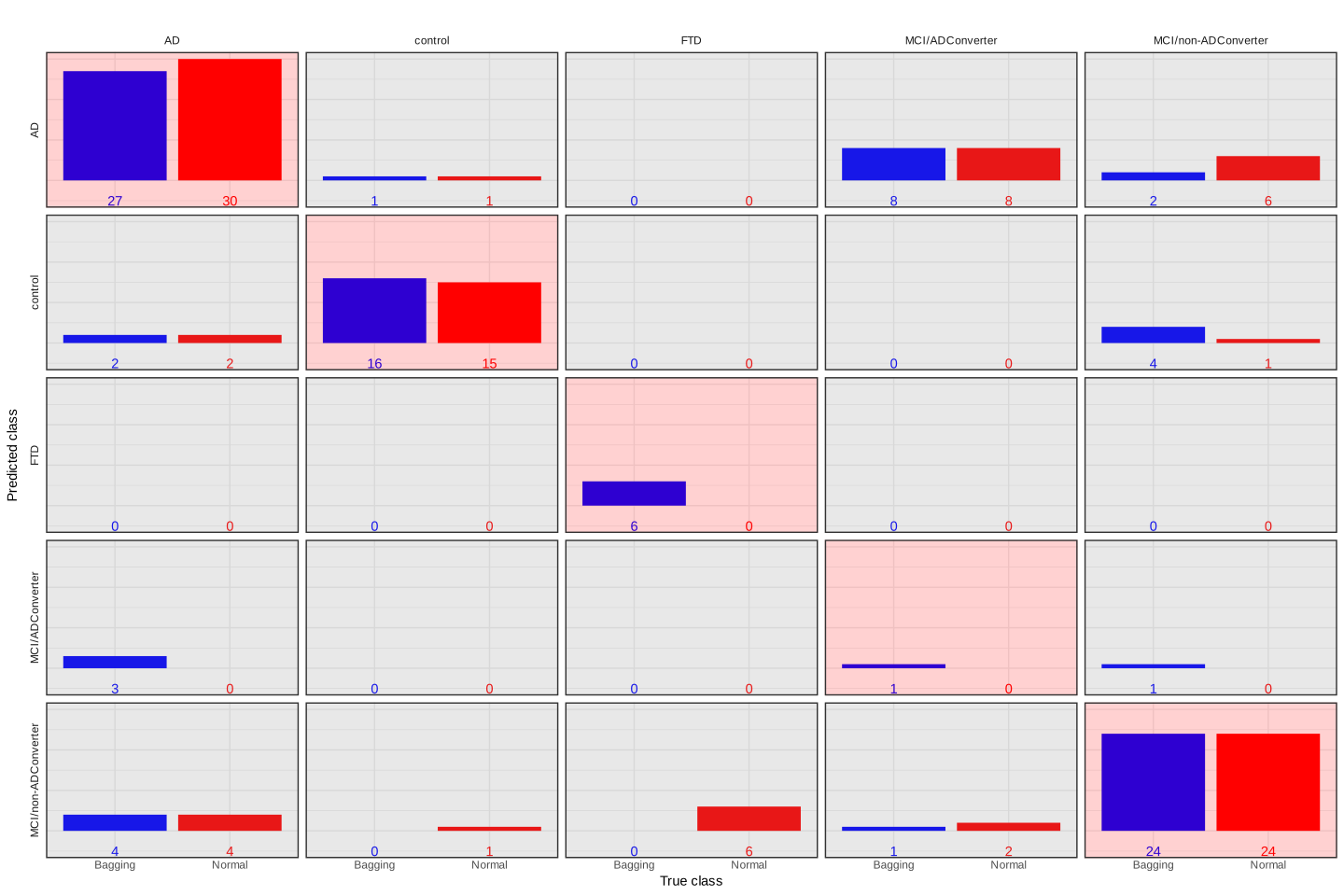
The above plot shows the performance of both models in classification. The observed (true) classes of predicted samples are on \(x\) axis and the predicted class are on \(y\) axis. Let’s give one example to clarify how to interpret this plot. We take the first column which is for samples with classes of AD. We see that bagging classified 27 correctly to AD whereas the normal tree has assigned 30 to AD. Both of these methods have assigned two of the AD samples wrongly to control. No samples have been classified as FTD. Bagging has wrongly predicted 3 AD to be MCI/ADConverter and finally both these methods wrongly predicted 4 AD to be MCI/non-ADConverter. Similarly, we can interpret the other columns. In general, we have the accuracy of 0.69 for the normal tree and the accuracy of 0.74 for bagging. Bagging performs a bit better. One interesting observation here is the MCI/ADConverter. These samples are persons who were suspected to have AD but they did not show the molecular signature at the time of sampling. However, later on, these samples were diagnosed to have AD. Interestingly, our models assign 8 of these samples as AD so correctly predicting the future without even knowing about it!
That was it for bagging. I guess we already noticed that simply doing bootstrapping does not ensure we significantly reduce the variance. Random forest will try to address this problem.
4 Random forest
Before starting let’s have a look at our aggregated variance formula again:
\[p\sigma^2+\frac{1-p}{m}\sigma^2\] We said that if we have a large \(m\), we will end up having \(p\sigma^2\) as our aggregated variance. In this formula, \(p\) is the pairwise correlation between the trees. We know that \(0\le p \le 1\) so obviously as we decrease \(p\) toward \(0\) we at the same time decrease \(p\sigma^2\). So how do we decrease our variance in bagging even further? We decrease the correlation between different trees. That is exactly what Random forest does. Random forest adds another level of randomness to the process of building the tree so that trees have lower correlations. This is how random forest works:
Let’s say we have a dataset with \(N\) number of samples and \(p\) number of features. To build a random forest model we do:
Take a random sample of size \(N\) with replacement from the data (similar to bagging).
Now for finding a split, we take a random sample of \(k\) variables from \(p\) without replacement and use only this subset of variables to find the best split. This is the random part of random forest.
To further split this tree, repeat step 2 until the tree is large enough.
Repeat steps 1 to 3 many times to produce more trees. This is the forest part of random forest
Similar to bagging, we predict each sample to a final group by a majority vote over the set of trees. For example, if we have 500 trees and 400 of them say sample \(x\) is AD, then we use this as the predicted group for the sample \(x\). For regression, we simply take the mean of all the predicted values of all the 500 trees.
So the only additional component here is focusing on a random subset of our features or variables when doing a split. It should be apparent now that random forests can reduce the variance as the direct result of bagging and random splits. In addition, they can also deal with very large datasets especially when the number of variables is large and even greater than the number of samples. Finally, random forests can highlight out-competed variables. The effects of these variables are often cancelled out by other more dominant variables. However, with random forests (with large trees), they will have a chance of to a node in at least some of the trees.
We are now ready to start coding random forests. We will be used randomForest function from randomForest package.
library(ipred)
library(rpart)
par(mfrow=c(1,2))
set.seed(20)
testing_index<-sample(1:length(data$p_tau),100,replace = F)

limited_data4_training<-data[-testing_index,]
limited_data4_testing<-data[testing_index,]

limited_data4_training$group<-as.factor(limited_data4_training$group)
limited_data4_training$gender<-as.factor(limited_data4_training$gender)

limited_data4_testing$group<-as.factor(limited_data4_testing$group)
limited_data4_testing$gender<-as.factor(limited_data4_testing$gender)

set.seed(10)
bagged_model <- bagging(group ~ ., data = limited_data4_training,nbagg=100)


set.seed(10)
tree_model <- rpart(group ~ ., data = limited_data4_training,
   method="class")
set.seed(10)
tree_model<- prune(tree_model, cp=   tree_model$cptable[which.min(tree_model$cptable[,"xerror"]),"CP"])

set.seed(10)
rf_model<-randomForest::randomForest(group ~ ., data = limited_data4_training,ntree=100,importance=T)


acc_bagging<-mean(limited_data4_testing$group == predict(bagged_model,limited_data4_testing,type = "class"))

acc_tree<-mean(limited_data4_testing$group == predict(tree_model,limited_data4_testing,type = "class"))

acc_rf<-mean(limited_data4_testing$group == predict(rf_model,limited_data4_testing[,-7],type = "class"))


confMatrix_bagging<-caret::confusionMatrix(predict(bagged_model,limited_data4_testing[,-7],type = "class"),limited_data4_testing$group )
confMatrix_tree<-caret::confusionMatrix(predict(tree_model,limited_data4_testing[,-7],type = "class"),limited_data4_testing$group )
confMatrix_rf<-caret::confusionMatrix(predict(rf_model,limited_data4_testing[,-7],type = "class"),limited_data4_testing$group )


plot_data<-rbind(data.frame(reshape::melt(confMatrix_bagging$table),Method="Bagging"),
      data.frame(reshape::melt(confMatrix_tree$table),Method="Normal"),data.frame(reshape::melt(confMatrix_rf$table),Method="RandomForest"))
names(plot_data)[1:2]<-c("x","y")
plot_data$Color=NA
plot_data$Color[plot_data$x==plot_data$y]<-"red"
library(ggplot2)

ggplot(plot_data, aes(Method,fill=Method)) +
    geom_bar(aes(y = value),
             stat = "identity"#, position = "dodge"
             ) +
    geom_text(aes(y = -5, label = value,color=Method)) +
    facet_grid(x ~ y, switch = "y") +
    labs(title = "",
         y = "Predicted class",
         x = "True class") +
    theme_bw() +
   geom_rect(data=plot_data, aes(fill=Color), xmin=-Inf, xmax=Inf, ymin=-Inf, ymax=Inf, alpha=0.095)+
  scale_fill_manual(values=c("blue", "red","green","red"), breaks=NULL)+
    scale_color_manual(values=c("blue", "red","green"), breaks=NULL)+
    theme(strip.background = element_blank(),panel.border = element_rect(color = , fill = NA, size = 1),
          axis.text.y = element_blank(),
          axis.text.x = element_text(size = 9),
          axis.ticks = element_blank(),
          strip.text.y = element_text(angle = 0),
          strip.text = element_text(size = 9))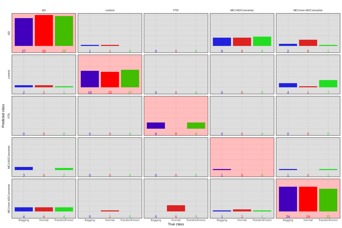
In this case, random forest performs slightly better (accuracy=0.75) than others. Please note that this specific dataset is very small so all the methods are expected to work similarly. Nevertheless, the random forest algorithm is performing fairly good.
Random forests just like many other statistical models have some parameters and need to be tuned. In the case of random forest, these parameters are:
- The number of samples in each leaf node (
nodesizeinrandomForestpackage). - Number of trees (
ntreeinrandomForestpackage). - Number of variables to consider at each split (
mtryinrandomForestpackage).
Please note that we don’t do pruning in random forests and nodesize should be used with care to not building too shallow trees. In the next section, we try to tune mtry and ntree.
4.1 Tuning parameters for random forests
As we discussed before, cross-validation can be used to tune parameters for statistical models. We can also use them for tuning mtry and ntree. An easier way to do so is to use out of bag error. We show both of our approaches here. Although there are packages like caret that automate this process, we use a manual approach so you can see how it is done.
library(ipred)
library(rpart)
set.seed(20)
testing_index<-sample(1:length(data$p_tau),100,replace = F)

limited_data4_training<-data[-testing_index,]
limited_data4_testing<-data[testing_index,]

limited_data4_training$group<-as.factor(limited_data4_training$group)
limited_data4_training$gender<-as.factor(limited_data4_training$gender)

limited_data4_testing$group<-as.factor(limited_data4_testing$group)
limited_data4_testing$gender<-as.factor(limited_data4_testing$gender)


# Create grid of search parameters
hp_grid <- expand.grid(
  mtry       = c(2:5),
  ntree = seq(100, 500, by = 100),
  OOB  = 0,
  CV = 0
)

# loop over each hpyper parameter
for(i in 1:nrow(hp_grid)) {

  # train model
  set.seed(i)
rf_model<-randomForest::randomForest(group ~ ., data = limited_data4_training,ntree=hp_grid$ntree[i],mtry=hp_grid$mtry[i],importance=T)

set.seed(i)
folds <- sample(rep(1:5, length.out = nrow(limited_data4_training)), size = nrow(limited_data4_training), replace = F)

CV_rf <- sapply(1:5, function(x){
  tmp<-limited_data4_training[folds != x,]
  set.seed(i*x)
  model <- randomForest::randomForest(group ~ ., data =limited_data4_training[folds != x,] ,ntree=hp_grid$ntree[i],mtry=hp_grid$mtry[i],importance=T)

  return( 100-(caret::confusionMatrix(predict(model,limited_data4_training[folds== x,],type="response"), limited_data4_training[folds== x,"group"] )$overall[1]*100))
  })

hp_grid$OOB[i] <- round(rf_model$err.rate[rf_model$ntree,"OOB"] * 100, digits = 2)
hp_grid$CV[i]<-median(CV_rf)
}

hp_grid$ntree<-factor(hp_grid$ntree)
oob_plot<-ggplot(data = hp_grid, aes(x=mtry, y=OOB)) +geom_point(aes(colour=ntree))+ geom_line(aes(colour=ntree))+theme_classic()+ylim(min(c(hp_grid$OOB,hp_grid$CV)),max(c(hp_grid$OOB,hp_grid$CV)))
cv_plot<-ggplot(data = hp_grid, aes(x=mtry, y=CV)) +geom_point(aes(colour=ntree))+ geom_line(aes(colour=ntree))+theme_classic()+ylim(min(c(hp_grid$OOB,hp_grid$CV)),max(c(hp_grid$OOB,hp_grid$CV)))
cowplot::plot_grid(oob_plot,cv_plot,labels = c("A","B"))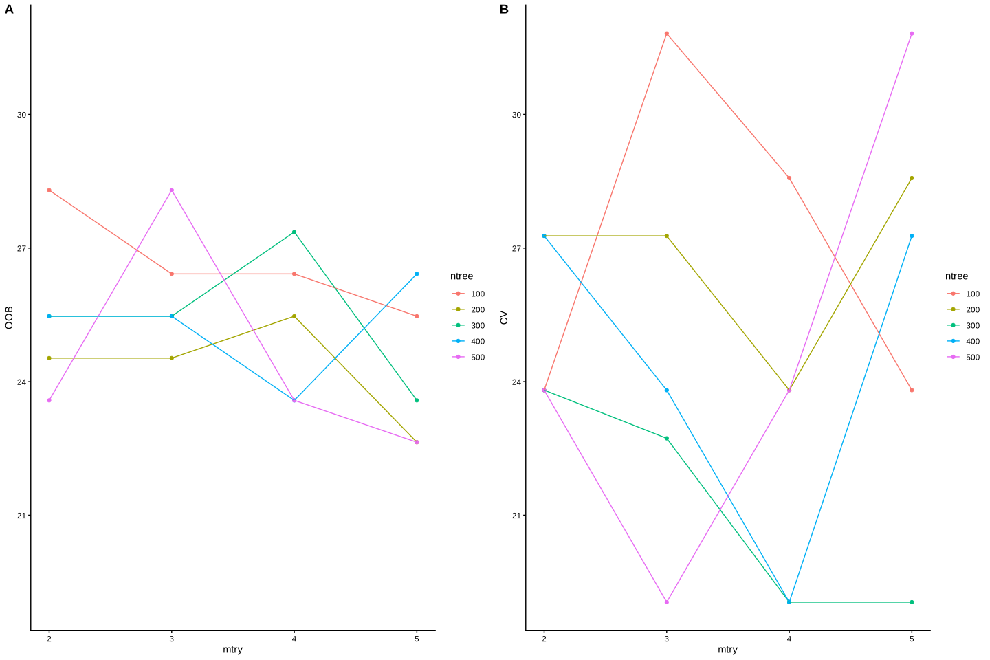
In the plot above, we have plotted out of bag error (OOB) and cross validation error (CV) vs mtry. In out of bag error (plot A), we see that mtry: 5 and ntree: 200 have minimize the error rate: 22.64. In plot B, we present the median error rate of 5-fold cross validation. We see that mtry: 4 and ntree: 300 have minimize the error rate: 19.0476190476191. So cross validation has minimize the error rate so we can probably use the parameters suggested by cross validation. In practice however, having too few samples, out of bag is probably more preferable that cross validation.
4.2 Variable importance
Random forests are not only used for doing prediction but they provide a very powerful framework for variable selection. Variable selection or feature importance refers to the process of finding what variables have the most influence on the outcome of the model. So a researcher might as if I can diagnose a type of cancer with very good accuracy what are the genes that are more important for doing that prediction? This type of question can be answered by variable selection. In random forests, there are two major ways to find the importance of a variable. One is based on the mean increase in prediction error via permutation and the second one is the decrease in node impurity. Both of these can be calculated either by setting importance=TRUE in the main randomForest function or by directly using importance function. Let’s first talk about how they are calculated.
4.2.1 Feature importance by permutation
To calculate the feature importance by permutation, one can use both cross-validation and out of bag errors. Here we focus on out of bag errors:
Let’s say that we trained a model \(f\) on our data \(X\) on response \(y\). As we said before, we can calculate out of bag errors (OOB) for this model. Let’s call this \(OOB^{\ orig}\) and calculate it using an error measure \(E\) so: \(OOB^{\ orig}=E(y-f(X))\). Now, for each of the features \(i=1,...,p\), we do a random permutation (shuffling) and put it back in the original matrix. Let’s call this matrix \(X^{perm}_i\). This means all other features are original ones except feature \(i\) that has been randomly shuffled. We can now calculate the out of bag error for this new data \(OOB^{\ perm}_i=E(y-f(X^{perm}_i))\). In the last step, we calculate the difference between the original out of bag error vs. the permuted out of bag error: \(dif_i=OOB^{\ perm}_i-OOB^{\ orig}\). We do this for all the features, one at a time giving us the list of permuted \(OOB^{\ perm}_i ,\ i=1,...,p\). In the last step, we normalize this by the standard deviation of \(OOB^{\ perm}\) and sorting by descending order.
To put it simply, we ask the question that if we shuffle this specific feature, how much our model become poorer than the original model. If a feature makes our model becomes worse a lot, it has more influence on the model thus it is more important. By sorting these influences we can rank our variables according to their importance. One great this about this way of finding feature importance is that we can also calculate \(OOB\) not only for all the samples but for each class of the samples (e.g., AD or control) giving us feature importance for predicting a specific group of samples.
4.2.2 Feature importance by impurity
Feature importance by impurity does not take into account the out of bag error or cross-validation but rather asks the question of how much throughout the tree a specific feature has been decreasing the impurity.
If you remember, we calculate a node Gini impurity by \(\text{Gini impurity}=1-\sum_{i}^{C}{p(i)^2}\) and entropy by \(\text{Entropy}=1-\sum_{i}^{C}{p(i)log{_2}{p(i)}}\), for classification and for regression by \(MSE=\frac{1}{n}\sum_{i=1}^{n}{(y_i-\bar{y_i})^2}\) or by residual sum of squares. At this stage, no matter what we use, we want to call this \(IMP_j\) where \(j\) can be any node in the tree. And if you remember, we calculate the weighted removed impurity of a parent node as:
\[RI_j=W_j\times IMP_j-W_{left_j}\times IMP_{left_j}-W_{right_j}\times IMP_{right_j}\]
where \(W_{j}\) is the weight of the parent node (e.g \(\frac{N(j)}{N}\); proportion data coming into node \(j\)). \(W_{left_j}\) is the weight of the left child node \(j\) (see aggregating Gini above). Please note that in some implementations \(W_j\) has been removed.
Now what we have is the decrease in impurity for each node but we are interested in features not nodes! We define another measure as average feature impurity decrease:
\[FIMP_i=\frac{\sum_{j \in N_i}{RI_j}}{\sum_{k \in t}{RI_k}}\] Where \(N_i\) is all the nodes where feature \(i\) has been used to split the node and \(t\) is the set of all nodes in the tree. We can then normalize this \(FIMP_i\) by the sum of all \(FIMP_i\) giving us:
\[FIMP^{\ norm}_i=\frac{FIMP_i}{\sum_i^p{FIMP_i}}\] Finally, as we build multiple trees in random forest, we have to calculate the average feature importance across all the trees:
\[FI_i=\frac{\sum_{j\in trees}{{FIMP^{\ norm}_{i,j}}}}{|T|}\] where \(FI_i\) is the feature importance of variable \(i\), \(FIMP^{\ norm}_{i,j}\) is the normalized \(FIMP\) for feature \(i\) in tree \(j\) and \(|T|\) is the total number of trees. What the whole thing is telling us is that for each feature in each tree, we calculate the average decrease in impurity, sum it over the trees and normalize it by the number of trees.
Please note that there are many different implementation feature importance but in principle, most of them are very similar to what we have discussed so far.
We can now have a look at our feature importance in random forest:
library(ipred)
library(rpart)
set.seed(20)
testing_index<-sample(1:length(data$p_tau),100,replace = F)

limited_data4_training<-data[-testing_index,]
limited_data4_testing<-data[testing_index,]

limited_data4_training$group<-as.factor(limited_data4_training$group)
limited_data4_training$gender<-as.factor(limited_data4_training$gender)

rf_model<-randomForest::randomForest(group ~ ., data = limited_data4_training,ntree=100,importance=T)
randomForest::varImpPlot(rf_model)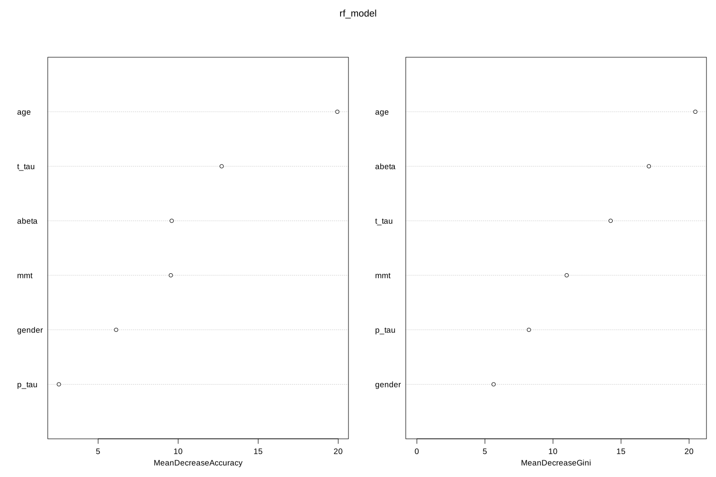
Both mean decrease in accuracy (left plot) and impurity base (right plot) are plotted here. We see that our top tree features are age, t-tau and \(A\beta\). Mean decrease in accuracy tells us that t-tau is more important that \(A\beta\) but Gini tells the opposite. We can use any of these to select our variables.