Independent Component Analysis (ICA)
1 Introduction
In this chapter we are going to learn about Independent Component Analysis (ICA), a dimensionaliy reduction algorithm. But before that we need to revist dimensionaliy reduction and more importantly the meaning of latent variables.
In many types of biological data, such as genomics, transcriptomics, and metabolomics, we collect thousands of measurements for each sample. The data we collect is often very large and complex. It usually comes in the form of a table, where each row is a sample (like a patient or a time point), and each column is a feature (like the expression level of a gene). This kind of data can be hard to understand because there are so many features, and many of them may be related to each other. Dimensionality reduction is a set of techniques that helps us make sense of this complexity by reducing the number of variables we need to look at. It does this by summarizing the main patterns in the data using fewer, simpler variables that still capture the important differences between samples.
A common idea in dimensionality reduction is that the data we observe is shaped by a smaller number of hidden influences, called latent variables. These are factors we do not measure directly, but they affect many features in the data. For example, a person’s immune system activity might increase or decrease the levels of hundreds of genes at the same time. Or a technical factor, like how a sample was processed, might introduce broad changes across many proteins. These kinds of hidden factors are called latent because they are not visible in the data table, but their effects can be seen across the features. Dimensionality reduction methods try to discover these latent variables by looking for patterns in how features change together across samples. Learning about these hidden influences can help us better understand what is driving the variation in the data, whether it is biology, technical noise, or both.
One of the most common ways to do this is with a method called principal component analysis, or PCA. PCA is a good starting point for learning about latent variables and how they can be used to simplify complex omics data. If you have not yet read about PCA, it is a good idea to begin with the PCA chapter before moving on to more advanced methods like independent component analysis.
2 Independent Component Analysis (ICA)
Generally speaking, the aim of dimensionality reduction is to collapse data that sits in a high-dimensional space into a lower-dimensional one, while preserving the essential patterns or structure in the data. Ideally, the new dimensions should have specific meaning and reflect the underlying factors or processes that generated the data. Different dimensionality reduction methods approach this in different ways depending on their assumptions and goals.
The aim of ICA is to go one step further than methods like PCA. While PCA focuses on uncorrelated components that capture variance, ICA tries to identify components that are statistically independent. This means that each component found by ICA corresponds to a signal or source that does not depend on the others. The idea is that the observed data is a mixture of these independent sources, and ICA tries to unmix them to recover the original signals. This is particularly useful in biological data where different processes such as inflammation, metabolism, or technical artifacts act independently but contribute to the overall signal we measure.
2.1 How ICA Works
To understand how ICA works, it helps to think about what it means for signals to be independent. In simple terms, two signals are independent if knowing the value of one tells you nothing about the value of the other. This is a stronger condition than being uncorrelated. For example, two variables can have zero correlation and still not be independent, especially if they follow non-Gaussian distributions.
ICA assumes that the data we observe is a linear mixture of several independent, non-Gaussian sources. If all sources were Gaussian, there would be no unique way to separate them because mixtures of Gaussian variables are still Gaussian. However, if the sources are non-Gaussian, then the central limit theorem tells us that any mixture of them tends to be more Gaussian than the original sources. ICA leverages this property by looking for a transformation of the data that makes the components as non-Gaussian and therefore as independent as possible. We will come back to this later in this chapter.
In biological data, many latent sources are in fact non-Gaussian. For example, an immune response might only activate in a subset of samples, leading to a skewed or bimodal pattern. Cell cycle activity might be binary—either on or off—which is clearly not Gaussian. Metabolic changes, environmental exposures, and even technical effects like RNA quality or processing time can all lead to sharp, non-symmetric changes across features. These kinds of distributions are common in omics data and fit well with ICA’s assumptions. This is why ICA is often more powerful than PCA in situations where the goal is to recover meaningful, interpretable biological signals. While PCA may capture overall variance, ICA is designed to dig deeper, uncovering the independent processes that drive complex datasets.
2.2 Example
It is best to learn ICA through a concrete example. In this section, we simulate single-cell-like data that mimics the structure of real omics experiments. Each simulated sample represents a single cell, and we assume that the gene expression values are influenced by three independent latent processes: immune activation, metabolism, and cell cycle activity.
We introduce five distinct biological clusters of cells, each with different patterns of activity across the three sources. For example, some clusters have high immune activation, others have strong metabolic signals, but all are randomly active or inactive in cell cycle progression. These clusters create variations in the latent sources, which affect gene expression in overlapping ways. Each gene responds to a combination of the latent processes, and we add noise to the measurements to mimic real-world complexity.
- Cluster 1: High immune, low metabolism
- Cluster 2: Low immune, high metabolism
- Cluster 3: Moderate immune, moderate metabolism
- Cluster 4: High in all
- Cluster 5: Low in all
Please note that the three signals we just visualized, immune activity, metabolism, and cell cycle, are what we call latent variables. These are the ground truth sources that drive the variation in our data. In real biological studies, we do not observe these directly. We may suspect that immune processes or cell cycles are involved, but we do not have a clean, numeric value for each sample describing how much it is “immune-activated” or where it is in the cell cycle.
In this simulation, however, we are in control. We have access to the true latent variables that were used to generate the data. This allows us to evaluate how well methods like ICA and PCA can recover these hidden influences.
But in reality, what we observe is something quite different. We don’t see these hidden sources directly. Instead, we measure things like gene expression, protein abundance, or metabolite levels, typically tens of thousands of features for each sample. These features are affected by the latent variables in complicated and overlapping ways.
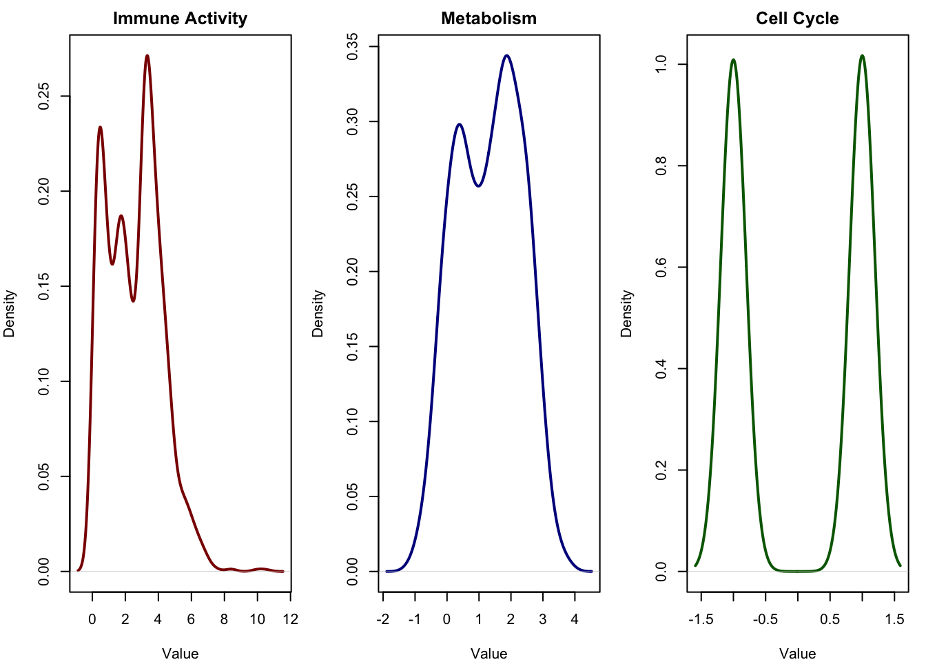
To get a feel for this, let’s randomly pick a few genes (variables) from our simulated expression data and plot their distributions. These are the kinds of variables we actually observe in omics studies.

These curves show the actual data we get in practice noisy, high-dimensional measurements, each influenced by multiple overlapping sources. Our task is to get this data and transform it in a way that we can recover the latent variables (the true sources behind these signals).
2.2.1 Transformation using PCA
Before we start running ICA, it’s probably best to check what PCA can give us. We take our expression matrix and perform a PCA on it (after scaling the data).
scaled_data <- scale(expression_matrix)
pca_result <- prcomp(scaled_data)
pca_scores <- as.data.frame(pca_result$x[, 1:3])
pca_scores$Cluster <- cluster_labels

# plotting the scores

plot(pca_scores$PC1, pca_scores$PC2,
     col = as.factor(pca_scores$Cluster),
     pch = 16, cex = 0.6,
     xlab = "PC1", ylab = "PC2",
     main = "PCA Score Plot (PC1 vs PC2)")
legend("topright", legend = unique(pca_scores$Cluster),
       col = 1:5, pch = 16, title = "Cluster")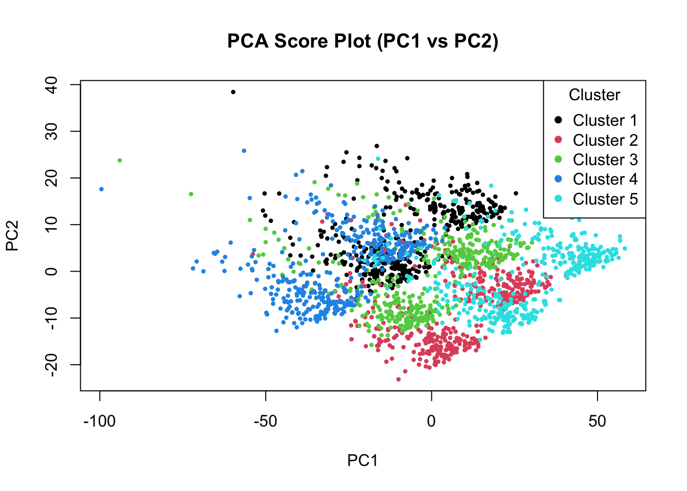
PCA has actually done quite a good job finding our clusters. The first few principal components clearly separate the major groups, showing that PCA is able to capture dominant sources of variation in the data. However, this does not necessarily mean that PCA has recovered the original biological signals (such as immune activity, metabolism, or cell cycle) as separate components. Let’s have a look at the distribution of scores in each components:
# Plot densities of the first 3 PCA components
par(mfrow = c(1, 3), mar = c(4, 4, 2, 1))

plot(density(pca_scores$PC1), main = "PCA Component 1", xlab = "PC1", col = "darkred", lwd = 2)
plot(density(pca_scores$PC2), main = "PCA Component 2", xlab = "PC2", col = "darkblue", lwd = 2)
plot(density(pca_scores$PC3), main = "PCA Component 3", xlab = "PC3", col = "darkgreen", lwd = 2)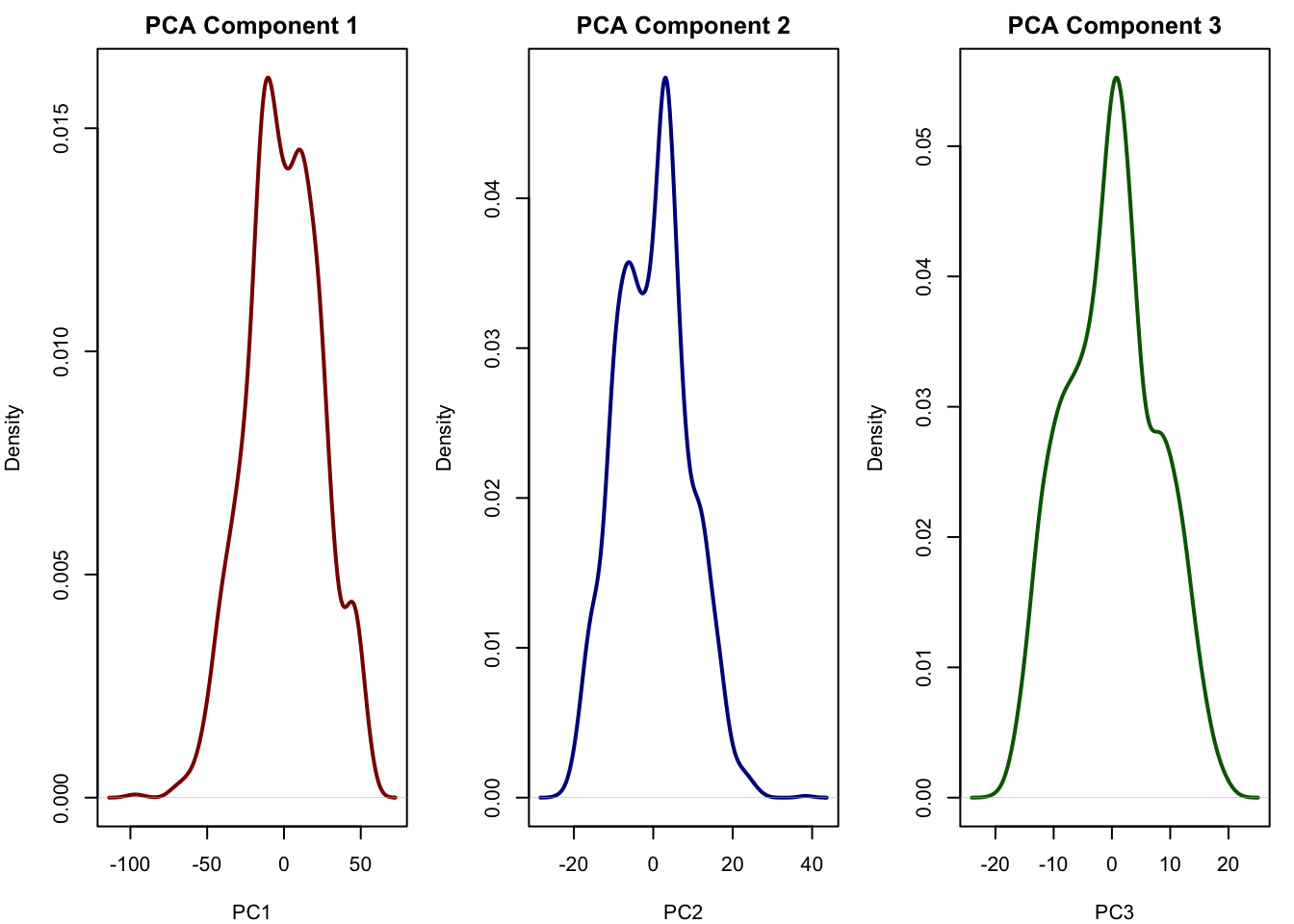
We see that all the components of the PCA more or less look normal and does not really reflect the true latent factors we simulated. We can also plot the relationship between the PCA components with all of our true latent factors:
# Set up 3x3 plotting area: PC1–3 vs latent sources
par(mfrow = c(3, 3), mar = c(4, 4, 2, 1))

for (pc_idx in 1:3) {
  for (latent_idx in 1:3) {
    plot(pca_scores[[pc_idx]], latent_sources[, latent_idx],
         xlab = paste0("PC", pc_idx),
         ylab = c("Immune", "Metabolism", "Cell Cycle")[latent_idx],
         main = paste("PC", pc_idx, "vs", c("Immune", "Metabolism", "Cell Cycle")[latent_idx]),
         #col = as.numeric(cluster_labels),
         pch = 16)
  }
}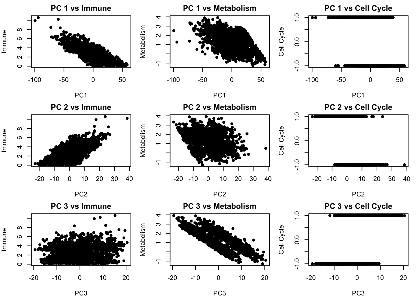
We see that there is some relationship between the PCA components and our latent factors but but PCs are still blended combinations of multiple underlying factors. This means that while PCA helps reveal structure, it may mix together distinct biological processes if those processes happen to contribute variance in similar directions. In the next section, we will apply ICA, which is designed to go further by actively searching for statistically independent signals, a better match for biological systems where different processes often operate independently.
2.2.2 How to run ICA in R
To perform ICA in R, we use the fastICA package, which provides a function of the same name: fastICA(). We can use it to estimate the underlying independent sources (latent variables) that we believe are mixed together in our observed data, such as gene expression.
To run ICA, we simply call the fastICA() function on our scaled expression matrix. In most cases, it’s enough to set the number of components (n.comp) to match the number of signals we expect, and use the default values for the rest:
ica_result <- fastICA(scaled_data, n.comp = 3)This gives us a matrix called ica_result$S, where each column is an estimated independent signal (component), and each row corresponds to a sample. These components can now be interpreted as hidden biological influences like immune activity or cell cycle, and can be visualized or correlated with known variables.
Below is a gentle introduction to the most important arguments of the fastICA() function. You do not need to understand all the mathematics behind it to use it effectively, but it’s important to get a feel for what each parameter does.
fastICA(X, n.comp, ...) – Overview of Arguments
| Argument | Meaning |
|---|---|
X |
The data matrix where each row is a sample (e.g. a cell) and each column is a variable (e.g. a gene). This is your real, observed data. |
n.comp |
The number of independent components you want ICA to extract. This should usually match the number of underlying sources you believe are in the data (e.g. 3 if you believe immune activity, metabolism, and cell cycle are driving variation). |
alg.typ |
The algorithm style. Use "parallel" (default) to extract all components at once, or "deflation" to extract them one by one. In most cases, "parallel" is faster and works well. |
fun |
The function used to estimate non-Gaussianity (a key part of ICA). Choose "logcosh" (default and most stable), or "exp" for an alternative. |
alpha |
A tuning parameter used with "logcosh" to control sensitivity to extreme values. It must be between 1 and 2. You can leave it at 1. |
method |
"R" (default) runs everything in R, which is more transparent for learning. "C" runs faster using compiled C code. |
row.norm |
If TRUE, each sample (row) is scaled to have the same norm. Often set to FALSE. |
maxit |
Maximum number of iterations. Default is 200 — increase this if the algorithm does not converge. |
tol |
Tolerance for convergence. Smaller values mean stricter criteria (default is 1e-4). |
verbose |
If TRUE, prints progress messages while ICA runs. Set to FALSE to keep things quiet. |
w.init |
An optional matrix to manually initialize the ICA algorithm. Normally, you can leave this as NULL. |
2.2.2.1 What fastICA() Returns
Once the algorithm runs, it returns a list with several important results:
S: The most important output — these are the estimated independent components (i.e., the sources we want to find).A: The mixing matrix, showing how the sources combine to form the observed data.W: The un-mixing matrix, used to extract the independent components.K: The pre-whitening matrix used during the internal PCA step.X: The pre-processed version of your original data.
Let’s go forward and apply ICA to our data and plot the first two components:
ica_result <- fastICA(scaled_data, n.comp = 3)
ica_scores <- as.data.frame(ica_result$S)
colnames(ica_scores)<-c("ICA 1","ICA 2","ICA 3")
ica_scores$Cluster <- cluster_labels

# plotting the scores
plot(ica_scores[,1:2],
     col = as.factor(pca_scores$Cluster),
     pch = 16, cex = 0.6,
     main = "ICA Score Plot")
legend("topleft", legend = unique(pca_scores$Cluster),
       col = 1:5, pch = 16, title = "Cluster")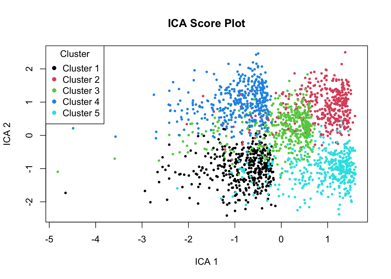
The plot above shows the first two ICA components, where each point represents a sample (or cell), and the colors indicate the true cluster each sample belongs to. These clusters reflect the biological conditions we simulated earlier, different combinations of immune activity, metabolism, and cell cycle behavior.
Unlike PCA, which focuses only on maximizing variance, ICA attempts to recover statistically independent signals that underlie the data. In this plot, we can see that the five clusters have become much more distinct and separated, especially along ICA Components 1 and 2.
Looking at the components, ICA Component 1 shows a strong gradient going from Cluster 1 and 4 to 3 and ending at 2 and 5.
Let’s look at the defintion of our clustering again:
- Cluster 1: High immune, low metabolism
- Cluster 2: Low immune, high metabolism
- Cluster 3: Moderate immune, moderate metabolism
- Cluster 4: High in all
- Cluster 5: Low in all
This suggests that Component 1 likely reflects a biological source that is particularly active in for example, immune activation. Cluster 1 and 4 both have high immune, cluster 3 has moderate (ended up in the middle) and low immune ones at the far right of the plot.
Similarly, ICA Component 2 shows a strong gradient going from Cluster 1 and 5 (from bottom) to 3 and ending at 2 and 4 at the top. Based on our definition this is high metabolism activity.
But let’s see if ICA could recover our original latent signals
# Plot densities of the first 3 PCA components
par(mfrow = c(1, 3), mar = c(4, 4, 2, 1))
plot(density(ica_scores[,1]), main = "ICA Component 1", xlab = "PC1", col = "darkred", lwd = 2)
plot(density(ica_scores[,2]), main = "ICA Component 2", xlab = "PC2", col = "darkblue", lwd = 2)
plot(density(ica_scores[,3]), main = "ICA Component 3", xlab = "PC3", col = "darkgreen", lwd = 2)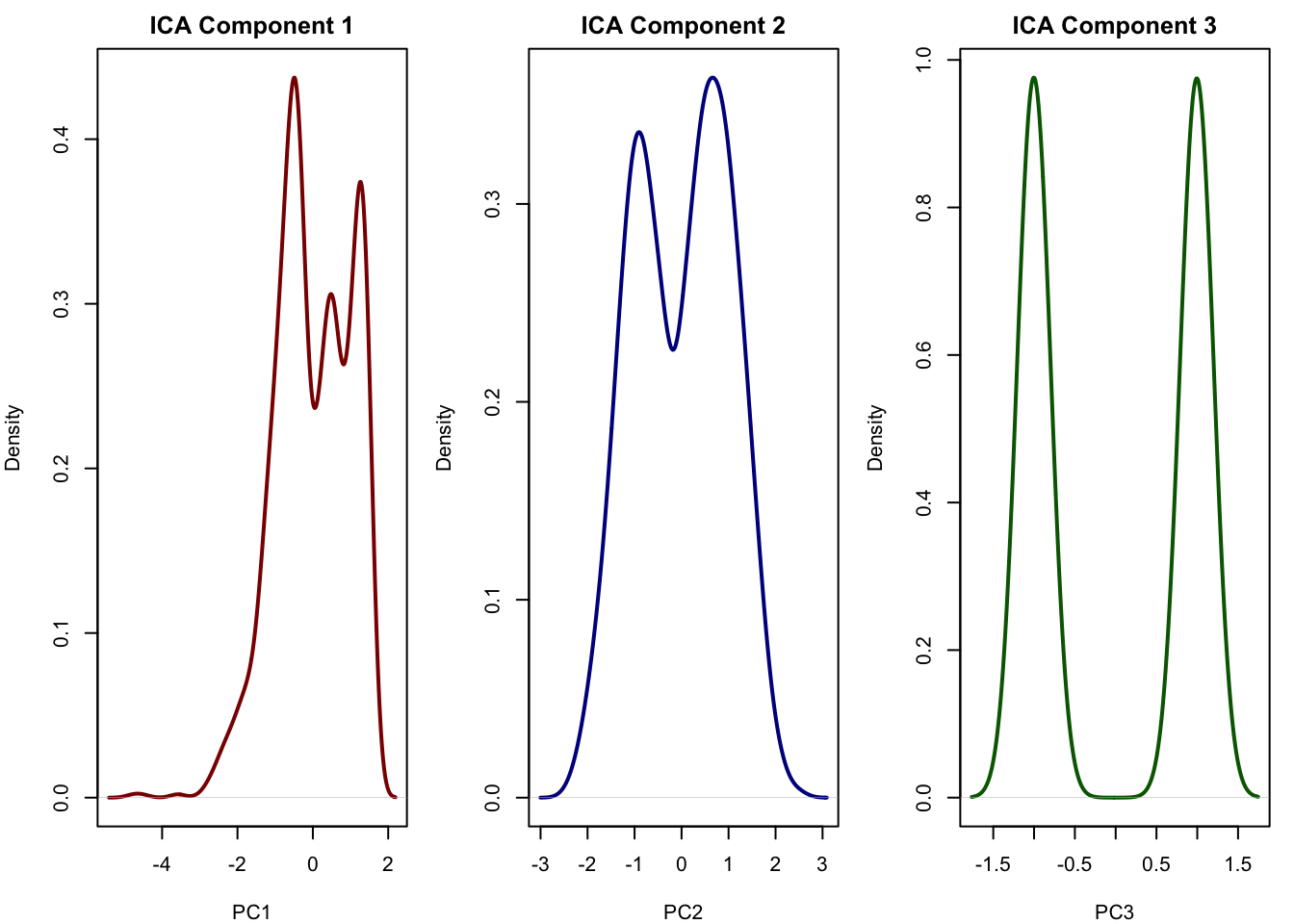
This looks very similar to our true signal the first component is immune, the second is metabolism and the third captured cell cycle. This is exactly what ICA is good at: recovering independent sources that were mixed across thousands of genes. It allows us to reduce the data to a few components that may correspond directly to real biological processes. This is something that PCA often fails to do when the sources overlap or have similar variance.
2.2.3 Interpreting ICA Components: What Do They Mean?
So far, we’ve focused on the scores, the projection of samples into ICA space, which helped us identify independent signals and uncover structure among the samples. But just as important is understanding which genes drive each component.
In ICA, we often use the mixing matrix A, which tells us how strongly each gene contributes to each independent component. You can think of each column of A as a kind of gene signature for one biological signal.
You can interpret ICA loadings by:
- Extracting the rows of
ica_result$A - Looking at the top genes (by absolute value) for each component
- Optionally mapping those genes to pathways or known biological functions
# Example: top contributing genes for component 1
top_genes_comp1 <- order(abs(ica_result$A[1,]), decreasing = TRUE)[1:20]
We can then say for example: ICA Component 1 seems to reflect immune activity, and here are the top genes that drive it.
2.2.3.1 Sorting ICA Components
Unlike PCA, which orders components by variance explained, ICA components are unordered. The algorithm does not rank them by “importance.” This means:
- You may want to sort or label components manually based on interpretation.
- You can match ICA components to known sources (e.g. simulated immune or metabolism signals) using correlation or cluster separation.
# Correlation with true sources
cor(ica_result$S, latent_sources)
This helps you interpret each component: for example, ICA 1 may strongly correlate with immune activity.
2.3 Assumptions Behind ICA
As you saw ICA is a powerful method for separating mixed signals into their original, independent sources. But like all models, it relies on a set of assumptions.
Linearity of the Mixing Process: ICA assumes the observed data is just a weighted mix of hidden signals. Like when two people are talking in the same room and a microphone records a mix of their voices. If the mixing is more complicated (for example nonlinear effects), ICA won’t be able to separate the signals correctly.
The hidden signals are statistically independent: Each hidden signal behaves on its own and doesn’t influence the others. ICA uses this independence to figure out how to unmix the signals. If the hidden signals are not independent, ICA gets confused.
At most one hidden signal can be normally distributed: Most of the hidden signals should have some “shape”. like being spiky, heavy-tailed, or flat but not bell-shaped like a normal distribution.
You need at least as many mixtures as hidden signals: You need enough observed signals to recover the hidden ones. For example, if you want to unmix two sources, you need at least two two genes.
The mixing happens instantly (no time delays): ICA assumes that each observed signal is just a mix of hidden signals at the same time point. It doesn’t handle time delays.
3 Math behind ICA
The foundation of ICA is the assumption that what we observe for example, gene expression levels is actually a mixture of hidden sources. These hidden sources could be biological processes like immune activation, metabolism, or circadian rhythm. Each observed gene expression level is thought to be a linear combination of these sources.
One of the very important things here is that, according to the Central Limit Theorem, when we add together independent random variables even if each of them is non-Gaussian the resulting mixture becomes more Gaussian. The more independent signals we combine, the more the sum will resemble a bell-shaped curve.
Let’s have a look at the our simulation again.
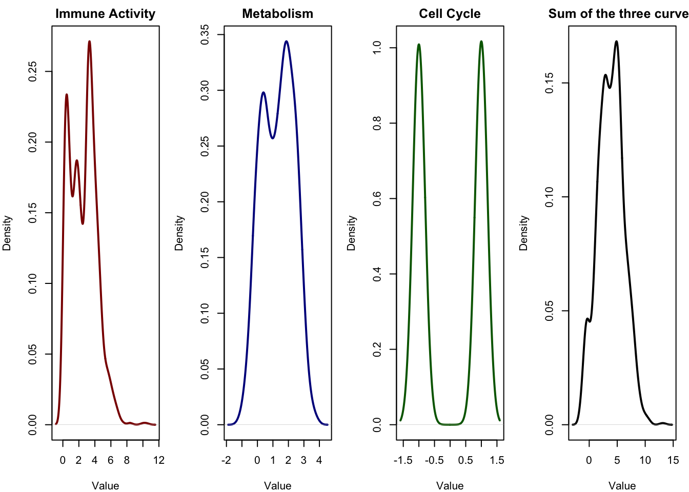
In the first three panels, we see the distributions of the original latent sources the signals that drive the observed gene expression. Each of these signals has a distinct shape:
- Immune activity is skewed and long-tailed (exponential).
- Metabolism follows a symmetric bell curve (normal distribution).
- Cell cycle appears as a binary signal, jumping between two discrete values.
These are clearly non-Gaussian and very different from one another.
In the fourth panel, we see the sum of these three signals, which represents a simplified version of the mixing process that happens in real biological data. The result is a smooth, bell-shaped curve much more Gaussian than any of the individual sources.
This means that what we observe the expression level of a gene, for instance may actually look fairly normal or smooth, not because the biological process is Gaussian, but because it is the result of mixing many non-Gaussian signals. Overlapping effects from immune activity, metabolism, cell cycle, and other hidden processes get blended together. Each gene receives a weighted contribution from these hidden sources.
ICA works by reversing this process. It tries to find new variables linear combinations of the observed ones that are as non-Gaussian as possible. The idea is simple but powerful: If the observed data is a Gaussian-looking mixture, then the most non-Gaussian directions we can extract are the ones closest to the original, unmixed sources.
Which means that ICA does not need to know what the original sources were it simply searches through all possible linear combinations of the observed variables and chooses the ones that are most non-Gaussian. These directions are likely to correspond to independent biological processes like immune response, metabolic state, or cell cycle activity.
There are many different algorithms that implement ICA, each with slightly different assumptions or optimization strategies. However, in R, the most commonly used implementation is the one provided by the fastICA package.
This algorithm uses an approach based on maximizing non-Gaussianity through a fixed-point iteration scheme. We’ve already used this function in our example. Next, we’ll learn how this algorithm works.
3.0.1 fastICA
As we mentioned many times before, almost all dimensionality reduction algorithms have an objective function which means they are trying to come up with a new representation of the data that satisfies a specific goal. In PCA, for example, the goal is to find new axes that capture the most variance while remaining uncorrelated. In ICA, the goal is different: we want to find a new set of components linear combinations of the original variables that are as statistically independent as possible, and as non-Gaussian as possible.
3.0.2 Measuring non-Gaussianity
So if the goal of ICA is to find components that are statistically independent, and we know that independence often implies non-Gaussianity, the next question is: How do we measure non-Gaussianity?
Since we don’t know the true sources in real data, we need a way to evaluate how close each candidate component is to being non-Gaussian. ICA tries many different linear combinations of the observed data and keeps the ones that appear most non-Gaussian.
There are several ways to measure non-Gaussianity. Some are based on classical statistical ideas like kurtosis (how heavy the tails of a distribution are), while others come from information theory, such as negentropy, which measures how far a distribution is from a Gaussian.
3.0.2.1 Negentropy
Entropy is a measure of uncertainty or randomness in a variable.
Imagine this:
- You flip a fair coin. You don’t know whether it’ll land on heads or tails. both are equally likely. That’s high uncertainty, so the entropy is high.
- Now imagine the coin is not fair and always lands on heads. You can always predict the outcome. There’s no uncertainty, so entropy is zero.
So:
- Entropy is high when things are unpredictable.
- Entropy is low when things are predictable.
For continuous variables (like gene expression), the formula becomes:
\[ H(Y) = -\int p(y) \log p(y) \, dy \]
We compute how uncertain the variable is based on how spread-out or “surprising” the values are.
The amazing thing is that among all continuous variables with the same variance, the Gaussian distribution has the highest entropy.
That means if a signal is spread out just like a Gaussian, it is maximally disordered (from an information-theoretic point of view). If the signal is more structured (like a spike, or a heavy tail), it has less entropy meaning it’s more predictable in some way.
Gaussian distribution maximizes entropy (proof)
We want to maximize the entropy of a probability density function \(p(x)\), defined as:
\[ H[p] = -\int_{-\infty}^{\infty} p(x) \log p(x) \, dx \]
Subject to the following constraints:
- Normalization: \(\int p(x) \, dx = 1\)
- Fixed variance: \(\int x^2 p(x) \, dx = \sigma^2\)
(We assume without loss of generality that the mean is zero: \(\mathbb{E}[x] = 0\), since entropy is shift-invariant.)
We introduce Lagrange multipliers \(\lambda_0\) and \(\lambda_1\) to enforce the constraints. Define the functional:
\[ \mathcal{L}[p] = -\int p(x) \log p(x) \, dx + \lambda_0 \left( \int p(x) \, dx - 1 \right) + \lambda_1 \left( \int x^2 p(x) \, dx - \sigma^2 \right) \]
We want to find the function \(p(x)\) that maximizes \(\mathcal{L}[p]\).
To find the stationary point of \(\mathcal{L}\), we compute the functional derivative with respect to \(p(x)\), and set it equal to zero:
\[ \frac{\delta \mathcal{L}}{\delta p(x)} = -\log p(x) - 1 + \lambda_0 + \lambda_1 x^2 = 0 \]
Rearranging:
\[ \log p(x) = \lambda_0 - 1 + \lambda_1 x^2 \]
Take the exponential of both sides:
\[ p(x) = e^{\lambda_0 - 1} \cdot e^{\lambda_1 x^2} \]
Now write this as:
\[ p(x) = C \cdot e^{\lambda_1 x^2} \]
for some constant \(C = e^{\lambda_0 - 1}\).
Recognize the Gaussian Constraint
To ensure \(p(x)\) is normalizable, we require the exponent to be negative. So:
\[ \lambda_1 < 0 \]
Let \(\lambda_1 = -\frac{1}{2\sigma^2}\), and the normalization constant becomes:
\[ C = \frac{1}{\sqrt{2\pi \sigma^2}} \]
Hence:
\[ p(x) = \frac{1}{\sqrt{2\pi \sigma^2}} e^{-x^2 / (2\sigma^2)} \]
which is exactly the Gaussian distribution with variance \(\sigma^2\) and mean 0.
So the Gaussian distribution has the highest entropy among all continuous distributions with the same variance.
Negentropy is just a way to measure how far a distribution is from being Gaussian.
It’s defined as:
\[ J(Y) = H(Y_{\text{Gaussian}}) - H(Y) \]
- \(H(Y_{\text{Gaussian}})\): entropy of a normal distribution with same variance
- \(H(Y)\): entropy of your actual signal
So if \(Y\) is exactly Gaussian, negentropy = 0. If \(Y\) is less Gaussian, negentropy > 0.
ICA finds directions (components) in the data where negentropy is maximized, because that’s where the most non-Gaussian (i.e. independent) signals live.
3.0.2.2 An Approximation of Negentropy
While negentropy definition is elegant, it’s not very practical. Computing \(H(Y)\) requires knowing the true probability density \(p(y)\), and computing the integral:
\[ H(Y) = -\int p(y) \log p(y) \, dy \]
But in real-world data (especially omics) we don’t know \(p(y)\). We only have samples from it, and estimating entropy directly is hard, unstable, and computationally expensive.
So instead of calculating the true negentropy, ICA uses an approximation that’s much easier to compute and works well in practice.
The idea is to compare our signal \(Y\) to a standard normal variable \(Z\), not by directly estimating their full distributions, but by comparing how certain functions behave when applied to them.
FastICA approximation looks like:
\[ J(Y) \approx \left[ \mathbb{E}(G(Y)) - \mathbb{E}(G(Z)) \right]^2 \]
Don’t worry if it looks complicated it has a simple meaning:
Take a function \(G(y)\) that behaves differently depending on the shape of the distribution. Apply it to your signal \(Y\), and compare its average to what you’d expect if \(Y\) were Gaussian. If the result is far from the Gaussian case, then \(Y\) is likely non-Gaussian.
By squaring the difference, we ensure the result is always positive (since negentropy is ≥ 0) and emphasize larger deviations.
What kind of function should we use for \(G(y)\)? It needs to meet three criteria:
- Be non-quadratic, since quadratic functions can’t distinguish Gaussianity.
- Be sensitive to things like heavy tails or skewness.
- Be smooth and differentiable, so optimization algorithms can work efficiently.
Several good choices have been proposed. The most popular and the default in fastICA() is:
\[ G(y) = \log \cosh(\alpha y) \]
This function:
- Is symmetric and grows like \(|y|\) for large values,
- Is less sensitive to outliers than \(y^4\),
- Has a simple derivative: \(G'(y) = \tanh(\alpha y)\), which is fast and stable to compute.
Let’s see an example of this:
This animation shows how a highly non-Gaussian signal starting as a binary ±2 distribution gradually transforms into a Gaussian distribution as random noise is added. At each step, we plot the density of the resulting variable and compute its negentropy using the same approximation used in ICA. At the beginning, the distribution is sharply peaked and far from Gaussian, leading to a high negentropy value. As the signal becomes smoother and more bell-shaped, the negentropy steadily decreases, approaching zero which indicates that the distribution is becoming indistinguishable from a Gaussian.
3.1 FastICA algorthim
As we said the ICA model assumes that what we observe is actually a mixture of hidden signals. In simple terms:
\[ X = S A \]
This equation means:
\(X\) is the data we observe: a matrix where each row is a sample (e.g., a cell or patient), and each column is a variable (e.g., a gene or metabolite). We write this as:
\[ X \in \mathbb{R}^{n \times p} \quad \text{(n samples × p features)} \]
\(S\) represents the hidden sources: the signals or patterns we want to discover. Each row in \(S\) corresponds to a sample, and each column is one independent biological process (like immune activity, metabolism, or cell cycle). So:
\[ S \in \mathbb{R}^{n \times k} \quad \text{(n samples × k independent components)} \]
\(A\) is the mixing matrix: it tells us how much each source contributes to each feature in the data. So:
\[ A \in \mathbb{R}^{k \times p} \quad \text{(k sources × p features)} \]
So basically each observed data point in \(X\) is a weighted mixture of hidden, independent sources in \(S\), combined using the mixing matrix \(A\).
Our ultimate goal in ICA is to recover the hidden signals in \(S\), even though we only have access to the observed data matrix \(X\).
To do this, we try to unmix the data. This means we estimate a new matrix, called the unmixing matrix, which we call \(W\). This matrix does the opposite of what the mixing matrix \(A\) did. It tries to separate the observed mixtures back into their original components.
In mathematical terms:
\[ S = X W \]
This equation tells us if we apply the unmixing matrix \(W\) to our observed data \(X\), we get back the estimated independent sources \(S\).
Given these basics, we can now step by step go try to see what FastICA does to get to the unmixing matrix.
3.1.0.1 Centering and Whitening
ICA tries to find a matrix \(W\) such that \(X W\) are statistically independent components.
But here’s the issue:
- \(A\) is unknown,
- \(S\) is unknown,
- And many combinations of \(S\) and \(A\) can produce the same \(X\).
Let’s say we found one pair \(S, A\) such that:
\[ X = S A \]
But then we can take any invertible matrix \(R\) and rewrite:
\[ X = S A = (S R)(R^{-1} A) \]
So we get new sources \(S' = S R\), and new mixing matrix \(A' = R^{-1} A\), and they still satisfy \(X = S' A'\).
That means without constraints, ICA has infinitely many valid solutions.
So how do we reduce the ambiguity? We use a process that is called whitening.
First, we center the data: subtract the mean.
Then we whiten it. this means we apply a linear transformation so that the resulting data has identity covariance:
\[ Z = X K \quad \text{such that} \quad \text{Cov}(Z) = I \]
Here, \(K\) is the whitening matrix (usually from PCA).
It transformed the observed data \(X\) into new data \(Z\) where:
- All dimensions are uncorrelated,
- All dimensions have variance = 1.
So now ICA becomes:
\[ S = Z W = X K W \]
We already applied whitening \(K\), and now ICA just needs to find \(W\), an orthogonal matrix (rotation).
That means:
- No more scaling,
- No more shearing,
- Just a rotation to align the axes with statistically independent directions.
This is much simpler than solving for an arbitrary \(A\) or even an arbitrary unmixing matrix \(W\). It shrinks the search space to just rotations in \(\mathbb{R}^p\), which is much easier to solve.
we can do that in R using:
# INPUT:
# X       - raw data matrix (samples × features)
# n.comp  - number of principal components to keep

# Step 1: Center the data (make each variable zero-mean)
X_centered <- scale(X, center = TRUE, scale = FALSE)

# Step 2: Compute the sample Gram matrix (X Xᵗ) / n
n <- nrow(X_centered)
p <- ncol(X_centered)
V <- X_centered %*% t(X_centered) / n  # Gram matrix

# Step 3: Perform Singular Value Decomposition (SVD)
s <- La.svd(V)  # V = U D Uᵗ

# Step 4: Construct diagonal matrix with inverse square roots of singular values
D_inv_sqrt <- diag(1 / sqrt(s$d))

# Step 5: Construct whitening matrix (top n.comp components)
K_full <- D_inv_sqrt %*% t(s$u)       # Whitening matrix: D^{-1/2} Uᵗ
K <- K_full[1:n.comp, , drop = FALSE] # Keep only the top n.comp rows

# Step 6: Apply whitening to centered data
X_whitened <- K %*% X_centered        # Whitened data in reduced dimension

# OUTPUT:
# X_whitened - n.comp × p matrix with uncorrelated, unit-variance projections
3.1.0.2 Optimizing negentropy
As we mentioned before, instead of computing negentropy directly, we use an approximation:
\[ J(y) \propto \left[ \mathbb{E}[G(y)] - \mathbb{E}[G(v)] \right]^2 \]
- \(G\): some smooth, nonlinear function (e.g. \(\log\cosh(\alpha y)\)),
- \(v\): a standard normal variable with same variance as \(y\),
- We subtract \(\mathbb{E}[G(v)]\) so that Gaussian values give 0.
Because \(\mathbb{E}[G(v)]\) is a constant (same for all \(w\)), so it doesn’t affect optimization. So we just maximize:
\[ \boxed{J(w) = \mathbb{E}[G(w^\top X)]} \]
This is simpler, faster, and differentiable, and that’s all we need to find the optimal \(w\).
We want to maximize the objective:
\[ J(w) = \mathbb{E}[G(w^\top X)] \quad \text{subject to} \quad \|w\| = 1 \]
To incorporate the constraint, we form the Lagrangian:
\[ \mathcal{L}(w, \lambda) = \mathbb{E}[G(w^\top X)] - \lambda (w^\top w - 1) \]
This Lagrangian allows us to optimize \(J(w)\) while forcing the length of \(w\) to stay fixed at 1. The multiplier \(\lambda\) lets us balance this constraint during optimization.
We now compute the gradient of \(\mathcal{L}\) with respect to \(w\), because we want to find points where the function stops increasing (stationary points).
First term: \(\nabla_w \mathbb{E}[G(w^\top X)]\)
Let:
\[ u = w^\top X \quad \text{(so \( u \in \mathbb{R}^{1 \times p} \) is the projection of the data onto \( w \))} \]
By the chain rule:
\[ \nabla_w G(w^\top X) = \frac{\partial G(u)}{\partial u} \cdot \frac{\partial u}{\partial w} = g(u) \cdot X \]
So, taking expectation:
\[ \nabla_w \mathbb{E}[G(w^\top X)] = \mathbb{E}[\nabla_w G(w^\top X)] = \mathbb{E}[X g(w^\top X)] \]
We’re calculating how the expected contrast function changes as we change \(w\). Since each sample gives a different projection \(w^\top x_i\), the gradient becomes a weighted average of the original data vectors, where the weight is \(g(w^\top x_i)\). This means basically we’re trying to pull \(w\) in the direction of samples that produce large non-Gaussianity.
Second term: \(\nabla_w \lambda(w^\top w - 1)\)
\[ \nabla_w \lambda(w^\top w - 1) = 2\lambda w \]
The gradient of \(w^\top w\) is just \(2w\). This term is enforcing that \(w\) doesn’t grow in magnitude. It’s pulling \(w\) back if it tries to move away from unit length.
Set the total gradient to zero:
\[ \mathbb{E}[X g(w^\top X)] - 2\lambda w = 0 \quad \Rightarrow \quad \mathbb{E}[X g(w^\top X)] = 2\lambda w \tag{1} \]
This is the stationary condition. This equation tells us that the direction in which the expected contrast increases the most is now perfectly aligned with \(w\) itself (up to scaling by \(2\lambda\)). That means \(w\) has stopped “wanting to move” under the constraint we’ve reached an extremum on the constraint surface (unit sphere).
We now want to eliminate the unknown scalar \(\lambda\) from the equation to get an update formula.
We do this by dotting both sides with \(w^\top\):
\[ w^\top \mathbb{E}[X g(w^\top X)] = 2\lambda \cdot w^\top w = 2\lambda \]
This isolates \(\lambda\), since \(w^\top w = 1\). We want everything to be written in terms of data and known quantities.
Now look at the left-hand side:
\[ w^\top \mathbb{E}[X g(w^\top X)] = \mathbb{E}[g(w^\top X) \cdot w^\top X] = \mathbb{E}[g(u) u] \]
Identity (for whitened data):
\[ \mathbb{E}[g(u) u] = \mathbb{E}[g'(u)] \tag{2} \]
For whitened data (i.e., \(\mathbb{E}[X X^\top] = I\)), this identity holds. It’s a known property used in ICA theory and simplifies the update. The derivative \(g'(u)\) gives us an automatic correction for how far we are from optimality.
Therefore:
\[ \boxed{2\lambda = \mathbb{E}[g'(w^\top X)]} \tag{3} \]
Substitute into the stationary condition
Go back to equation (1):
\[ \mathbb{E}[X g(w^\top X)] = 2\lambda w = \mathbb{E}[g'(w^\top X)] \cdot w \]
Subtract the right-hand side:
\[ \boxed{ F(w) = \mathbb{E}[X g(w^\top X)] - \mathbb{E}[g'(w^\top X)] w = 0 } \tag{4} \]
We have now written the gradient condition purely in terms of data and known functions. Solving \(F(w) = 0\) will give us the optimal \(w\), i.e., a direction where the projection is maximally non-Gaussian.
We define a fixed-point iteration:
\[ \boxed{ w_{\text{new}} = \mathbb{E}[X g(w^\top X)] - \mathbb{E}[g'(w^\top X)] \cdot w } \tag{5} \]
Then normalize the new \(w\) to unit length:
\[ w_{\text{new}} \leftarrow \frac{w_{\text{new}}}{\|w_{\text{new}}\|} \]
In FastICA, the default choice is:
\[ g(u) = \tanh(\alpha u), \quad g'(u) = \alpha (1 - \tanh^2(\alpha u)) \]
The \(\alpha\) parameter (often \(\alpha = 1\)) controls the steepness. For most applications, it doesn’t need to be tuned.
We can implement this in R:
# INPUT:
# X       - raw data matrix (samples × features)
# n.comp  - number of independent components to estimate

# Step 1: Center the data (make each feature zero-mean)
X_centered <- scale(X, center = TRUE, scale = FALSE)

# Step 2: Compute the sample Gram matrix (X Xᵗ) / n
n <- nrow(X_centered)
p <- ncol(X_centered)
G <- X_centered %*% t(X_centered) / n  # Gram matrix

# Step 3: Perform Singular Value Decomposition (SVD)
svd_G <- La.svd(G)  # G = U D Uᵗ

# Step 4: Construct diagonal matrix with inverse square roots of singular values
D_inv_sqrt <- diag(1 / sqrt(svd_G$d))

# Step 5: Construct whitening matrix (top n.comp components)
W_whitening_full <- D_inv_sqrt %*% t(svd_G$u)       # Whitening matrix: D^{-1/2} Uᵗ
W_whitening <- W_whitening_full[1:n.comp, , drop = FALSE]  # Keep top n.comp rows

# Step 6: Apply whitening to centered data
Z_whitened <- W_whitening %*% X_centered  # Z = W_whitening × centered data

# --- FastICA single update step (logcosh nonlinearity) ---

# Assume current estimate of unmixing vector: w (n.comp × 1 unit-norm vector)

# Step A: Compute projection of data onto w
u <- as.numeric(t(w) %*% Z_whitened)        # u = wᵗZ (vector of length p)

# Step B: Apply nonlinearity g(u) = tanh(αu)
g_u <- tanh(alpha * u)

# Step C: Expand g(u) to match dimensions for elementwise multiplication
G_matrix <- matrix(g_u, n.comp, p, byrow = TRUE)

# Step D: Compute E[Z × g(u)]
Zg <- Z_whitened * G_matrix                 # Each column of Z scaled by g(u)
v1 <- rowMeans(Zg)                         # v1 = E[Z g(u)]

# Step E: Compute derivative g'(u) = α(1 - tanh²(αu))
g_prime_u <- alpha * (1 - tanh(alpha * u)^2)
lambda <- mean(g_prime_u)                  # Scalar: E[g'(u)]

# Step F: Compute λw
v2 <- lambda * w                           # Second term

# Step G: Update unmixing vector
w_new <- v1 - v2                           # Fixed-point update
w_new <- matrix(w_new, n.comp, 1)         # Ensure it's a column vector

# Step H: Normalize updated vector
w_new <- w_new / sqrt(sum(w_new^2))

# OUTPUT:
# w_new - updated estimate of one independent component direction (unit norm)
The FastICA algorithm requires iterating the update step until convergence. That means:
Start with an initial guess for \(w\), typically a random unit-norm vector.
Apply the update:
\[ w \leftarrow \frac{\mathbb{E}[Z g(w^\top Z)] - \mathbb{E}[g'(w^\top Z)] \cdot w}{\| \cdot \|} \]
Repeat steps 2–3 until \(w\) stabilizes, i.e., the direction doesn’t change much anymore:
\[ \|w_{\text{new}} - w_{\text{old}}\| < \epsilon \]
where \(\epsilon\) is a small tolerance like \(10^{-6}\).
Let’s have a look at how we can implement it:
# Required libraries
library(plotly)
library(ggplot2)

alpha <- 1
n.comp <- 3
n.iter <- 50

# Centering
X_centered <- scale(expression_matrix, center = TRUE, scale = FALSE)

n<-nrow(X_centered)
X_centered<-t(X_centered)
# Whitening
cov_mat <- X_centered %*% t(X_centered) / n
s <- svd(cov_mat)
D_inv_sqrt <- diag(1 / sqrt(s$d))
K <- D_inv_sqrt %*% t(s$u)
Z <- K[1:n.comp,] %*% X_centered  # Whitened data

# --- Step 2: FastICA Iteration ---
w <- matrix(rnorm(n.comp^2), n.comp, n.comp)
w <- w / sqrt(sum(w^2))

projection_df <- data.frame()

for (iter in 1:n.iter) {
  u <- ((w) %*% Z)
  g_u <- tanh(alpha * u)
  g_prime <- alpha * (1 - tanh(alpha * u)^2)

  v1 <- rowMeans(Z * matrix(g_u, n.comp, ncol(Z), byrow = TRUE))
  v2 <- mean(g_prime) * w[1, ]
  w_new <- v1 - v2
  w_new <- w_new / sqrt(sum(w_new^2))
  w <- matrix(w_new, 1, n.comp)

  # Store projected values
  projection_df <- rbind(projection_df,
                         data.frame(iteration = iter, projected = as.numeric(u)))
}


bins <- 60
density_data <- projection_df %>%
  group_by(iteration) %>%
  do({
    d <- density(.$projected, n = bins, from = -4, to = 4)
    data.frame(x = d$x, y = d$y)
  }) %>%
  ungroup()

plot_ly(data = density_data, x = ~x, y = ~y, frame = ~(iteration),
        type = 'scatter', mode = 'lines') %>%
  layout(title = "Convergence of FastICA: Density of wᵗZ over Iterations",
         xaxis = list(title = "wᵗZ"),
         yaxis = list(title = "Density"),
         legend = list(title = list(text = "Iteration")))
We can see that ICA converges very fast to a stable solution. That was the first component.
When we want to extract the second independent component in FastICA, we need to ensure that it captures a different independent signal than the first one not just another direction in the same subspace. This is important because ICA assumes that the sources are statistically independent, so each component should be as unrelated as possible to the others. To achieve this, we use a method called deflation: after extracting the first component, we constrain the second one to be orthogonal to the first. During each iteration of the second component’s update, we subtract out any part of the new vector that points in the direction of the first. This forces the algorithm to find a new direction in the whitened space that reveals a different independent pattern in the data. We then repeat this process again for the third component, orthogonalizing it against both the first and second, and so on.
As you remember, during each iteration of estimating \(\mathbf{w}_2\), we perform a fixed-point update like:
\[ \mathbf{w}_2 \leftarrow \mathbb{E}[\mathbf{Z} g(\mathbf{w}_2^\top \mathbf{Z})] - \mathbb{E}[g'(\mathbf{w}_2^\top \mathbf{Z})] \cdot \mathbf{w}_2 \]
But after this update, we subtract any component in the direction of \(\mathbf{w}_1\):
\[ \mathbf{w}_2 \leftarrow \mathbf{w}_2 - (\mathbf{w}_2^\top \mathbf{w}_1) \cdot \mathbf{w}_1 \]
This ensures \(\mathbf{w}_2^\top \mathbf{w}_1 = 0\), i.e., orthogonality.
Then we normalize:
\[ \mathbf{w}_2 \leftarrow \frac{\mathbf{w}_2}{\|\mathbf{w}_2\|} \]
Because the data is whitened (i.e., \(\mathbb{E}[\mathbf{Z} \mathbf{Z}^\top] = I\)), any orthogonal set of vectors applied to \(\mathbf{Z}\) yields uncorrelated components. While uncorrelatedness is not the same as independence, it’s a good approximation in the whitened space. The ICA update then ensures that each direction found is maximally non-Gaussian.
This is repeated for each subsequent component \(\mathbf{w}_3, \mathbf{w}_4, \dots\), with the general orthogonalization formula:
\[ \mathbf{w}_k \leftarrow \mathbf{w}_k - \sum_{j=1}^{k-1} (\mathbf{w}_k^\top \mathbf{w}_j) \cdot \mathbf{w}_j \quad \text{followed by} \quad \mathbf{w}_k \leftarrow \frac{\mathbf{w}_k}{\|\mathbf{w}_k\|} \]
So in summary, the math behind ICA starts with the idea that what we observe is a mixture of several hidden signals, and our goal is to recover those original, independent sources. Mathematically, this is written as X = S × A, where X is the observed data, S is the unknown source signals, and A is the mixing matrix. Since we only have X, we want to find a matrix W that unmixes the data: S = X × W. To make this easier, we first center the data (subtract the mean) and whiten it (make the variables uncorrelated and have equal variance). This reduces the problem to finding a rotation matrix W.
ICA assumes that the original sources are non-Gaussian, and that mixing them makes the data look more Gaussian — a property explained by the Central Limit Theorem. So ICA tries to undo the mixing by finding directions in the data that are as non-Gaussian as possible. Non-Gaussianity is measured using a quantity called negentropy, which is zero for Gaussian distributions and positive otherwise. Since true negentropy is hard to calculate, we approximate it using smooth functions like log(cosh) or similar, which respond differently to Gaussian and non-Gaussian shapes.
The FastICA algorithm uses a fixed-point method to find the best direction w that maximizes this non-Gaussianity. It computes the expected value of a contrast function applied to the projection of the data onto w, subtracts a correction term involving its derivative, and repeats this process while keeping w normalized. This update is repeated until w stops changing. To find multiple independent components, the algorithm makes sure that each new direction is orthogonal to the ones already found. This ensures that the final set of components are as independent and meaningful as possible.
And this brings us to the last form of ICA:
# Parameters
alpha <- 1
n.comp <- 3
n.iter <- 200
tol <- 1e-6

# expression_matrix <- ...  # rows = samples, columns = features
X_centered <- scale(expression_matrix, center = TRUE, scale = FALSE)
X_centered <- t(X_centered)  # features × samples

n <- nrow(X_centered)
p <- ncol(X_centered)

# Whitening
cov_mat <- X_centered %*% t(X_centered) / p
s <- svd(cov_mat)
D_inv_sqrt <- diag(1 / sqrt(s$d))
K <- D_inv_sqrt %*% t(s$u)
Z <- K[1:n.comp, , drop = FALSE] %*% X_centered  # Whitened data Z: n.comp × samples

# Storage
W <- matrix(0, nrow = n.comp, ncol = n.comp)  # rows = unmixing vectors
projection_df <- data.frame()

# FastICA using deflation
for (i in 1:n.comp) {

  # Initialize weight vector
  set.seed(123)
  w <- rnorm(n.comp)


  if (i > 1) {
    for (j in 1:(i - 1)) {
      proj <- sum(w * W[j, ])
      w <- w - proj * W[j, ]
    }
  }

  w <- w / sqrt(sum(w^2))

  lim <- numeric(n.iter)

  for (it in 1:n.iter) {
    # Fixed-point update
    u <- as.vector(w %*% Z)
    g_u <- tanh(alpha * u)
    g_prime <- alpha * (1 - tanh(alpha * u)^2)

    v1 <- rowMeans(Z * matrix(rep(g_u, each = n.comp), nrow = n.comp))
    v2 <- mean(g_prime) * w
    w1 <- v1 - v2

    # Re-orthogonalize against previous components
    if (i > 1) {
      for (j in 1:(i - 1)) {
        proj <- sum(w1 * W[j, ])
        w1 <- w1 - proj * W[j, ]
      }
    }

    # Normalize
    w1 <- w1 / sqrt(sum(w1^2))

    # Convergence check (cosine distance to previous vector)
    lim[it] <- abs(abs(sum(w1 * w)) - 1)

    if (lim[it] < tol) break

    w <- w1
  }

  # Store final weight
  W[i, ] <- w
  projected <- as.vector(w %*% Z)

  projection_df <- rbind(projection_df, data.frame(
    component = paste0("IC", i),
    projected = projected
  ))
}


par(mfrow = c(1, 3), mar = c(4, 4, 2, 1))
plot(density(projection_df$projected[projection_df$component=="IC1"]), main = "IC1", xlab = "Value", col = "darkred", lwd = 2)
plot(density(projection_df$projected[projection_df$component=="IC2"]), main = "IC2", xlab = "Value", col = "darkblue", lwd = 2)
plot(density(projection_df$projected[projection_df$component=="IC3"]), main = "IC3", xlab = "Value", col = "darkgreen", lwd = 2)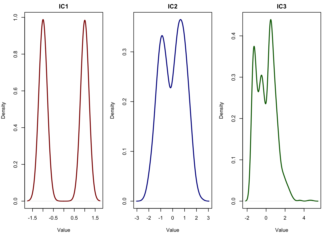
As you see the components are more or less accurately extracted by our implementation.
4 Understanding the Output of ICA
When you run ICA, you typically get two important matrices:
S: the source matrix (also called “scores” or “independent components”), where each column represents one recovered latent signal, and each row corresponds to a sample. These are the hidden influences we aim to discover, for example, immune activity, metabolism, or cell cycle variation across cells.A: the mixing matrix, which tells us how much each feature (like a gene or metabolite) is influenced by each component. Each row ofAcorresponds to one independent component, and each column tells us how strongly that component contributes to a particular gene. You can think of this like a signature of gene weights for each hidden biological signal.
In terms of the ICA model:
\[ X = S A \quad \text{or} \quad S = X W \]
- \(X\): the observed data (samples × features)
- \(S\): the matrix of independent components (samples × components)
- \(A\): the mixing matrix (components × features)
- \(W\): the unmixing matrix, such that \(W = A^{-1}\) (approximately), and \(S = XW\)
In practice:
- You interpret rows of
Sto understand how much of a given latent signal is present in each sample. - You interpret rows of
A(or sometimes columns, depending on transposition) to understand which genes or variables load onto each component. - If a particular component shows high values in
Sfor a certain group of samples (e.g. inflamed tissue), and high weights inAfor immune-related genes, then you can confidently say that the component reflects immune activity.
5 Conclusions
In this chapter, we explored Independent Component Analysis (ICA) from multiple angles conceptually, mathematically, and through hands-on implementation. We showed how ICA can uncover hidden, independent sources of variation in high-dimensional omics data, and how it can outperform traditional methods like PCA when the goal is to recover biologically meaningful signals.
We began with a simulation of latent biological processes and showed how ICA could recover them accurately using the fastICA algorithm. We then went into the theory behind ICA, including how non-Gaussianity and negentropy guide the separation of mixed signals. We walked through the full derivation of the update rule used by FastICA, and even implemented it ourselves in R from scratch.
In real applications, ICA can be a powerful tool to discover hidden structure in transcriptomics, metabolomics, and other complex biological datasets. However, like all methods, its success depends on how well its assumptions fit the data. Understanding those assumptions and the math behind them helps us apply ICA more confidently and interpret the results more meaningfully.